A few suggestions:
- Tone down the nebula backgrounds. Every single one of your images uses some kind of colourful nebula in the background. If used badly, it looks horrible and very computer-game like, which I believe is how your pics look. 95% of Star Trek space scenes are plain black with white stars. Sometimes simplicity is best and lets people concentrate on the subject matter, not some pretty background.
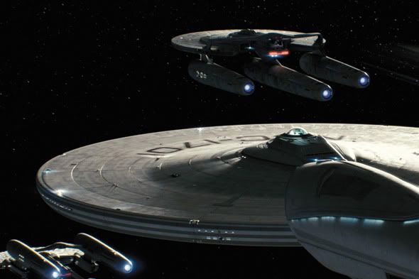
- Speaking of the background, you need to find a better starfield. Yours is very low-res and blurry. Doesn't look good. Pay attention to the starfields in recent Trek movies and the Star Wars prequels and try to recreate.
- Lighting (and texturing) is what makes a scene look good and realistic. Not modelling. The Enterprise can have bumps all along the saucer, or green nacelles and it would still look realistic if you get your lighting right. Work on using shadows to better effect.
- You seem to like using white glows around ships/asteroids and other objects... why? You'll never see anything like it on TV or in Trek films, it just looks odd. If something is very close to a bright sun, then maybe, but just to have these objects with a white border looks strange and totally wrong.
- Your latest Saturn photo is definitely the best you've done and looks nice. Tone down the deflector glow, turn OFF the glow on the rings, get rid of the nebula background, make the shadow on the rings black rather than 30% opaque, and tighten the glow on Saturn, it's too big, cut it in half.
- A lot of your textures are very low-res and it makes the ships look like they're from a computer game. Try tweaking them to get them sharper and with more detail.
- Drop shadows/glows are a HUGE no no in the design industry. So things like having a blue glow around the delta, or around 'May 8' looks terrible. Look at official Trek 2009 designs, no glows, no drop shadows.
- Don't ever use Photoshop lens flares again. Unless they're INCREDIBLY subtle. Cheap, overused and a total cliche.
- Be careful of making the Enterprise too white. It was a fairly dark metallic grey ship in the film. And the extreme white ship combined with the poor lighting means your models look like they're just photoshopped and composited onto backgrounds, rather than part of the scene.
I don't want to sound harsh or patronising, I'm just trying to help and offering some suggestions. I admire your passion for this, and with a little work I think you could come out with some really lovely images. Your Saturn pic is very nice already.

 I'm going to try to answer most of them, with thoughts on why things are the way they are...


