The TMP uniforms definitly loose something when they were on film. I remember thinking that they sucked for years, then I saw a few at some traveling trek exhibit at a museum and seeing them and thinking... "man, if they looked like that on the tape, they would have been much better."
-
Welcome! The TrekBBS is the number one place to chat about Star Trek with like-minded fans.
If you are not already a member then please register an account and join in the discussion!
You are using an out of date browser. It may not display this or other websites correctly.
You should upgrade or use an alternative browser.
You should upgrade or use an alternative browser.
TMP's uniforms
- Thread starter RobertScorpio
- Start date
The TMP uniforms definitly loose something when they were on film. I remember thinking that they sucked for years, then I saw a few at some traveling trek exhibit at a museum and seeing them and thinking... "man, if they looked like that on the tape, they would have been much better."
As I said above, the transfer process to videotape badly washed out the colors, so if you saw it on tape, then you weren't seeing the uniforms as they looked on film.
It wasn't just the colors. The little details were lost, and are still not as present on the DVD.
Those uniforms are best viewed in person.
^ Totally agree!
However one might want to justify or rationalize the TMP uniforms, I do not feel that they succeeded as great wardrobe for Trek. The latter film uniforms did,and are now as iconic as the TOS uniforms. It's important for filmmakers to know what works cinematically, and the brick red jackets did.
I laugh at anyone who tries to pass off the pale color pallette of TMP as poor video transfer, they were pale pastel colors on film too, I've seen MANY film prints, I WORKED with the film prints. They were supposed to be pale, softer and more subtle than the vibrant primary TOS uniforms, it just so happend that choice was a poor one, IMO. And yes, they do look like pajamas. The truth hurts.
I laugh at anyone who tries to pass off the pale color pallette of TMP as poor video transfer, they were pale pastel colors on film too, I've seen MANY film prints, I WORKED with the film prints. They were supposed to be pale, softer and more subtle than the vibrant primary TOS uniforms, it just so happend that choice was a poor one, IMO. And yes, they do look like pajamas. The truth hurts.
trevanian
Rear Admiral
22 STARS
I agree completely. The colors were what they were, which was pastel and awful. A lot of this poor transfer crap is just BS, and that's coming from somebody who saw the usual printed-down theatrical release several times as well as an odd print at a second run house that hadn't been printed down, where you could tell Vulcan was in daylight ... even though everything was brighter, all the SF costumes were still watered down mush.
And best comparison is looking at the 1980 TMP Calendar, which is exactly what the film looked like ... washed out and lit unflatteringly (the pic of Kirk and McCoy pre-warpentry is godawful.)
trevanian
Rear Admiral
More likely "one director and producer vs. another." Roddenberry obviously had his ideas about what the future should look like, and Robert Wise seemed to be touching on a similar aesthetic to his earlier film The Andromeda Strain. With TWOK, I don't know that Harve Bennett had an opinion one way or the other about the uniforms, but Nick Meyer was obviously in love with that whole Prisoner of Zenda look.(I'd originally thought another possibility was "one costume designer vs. another," but it was Bob Fletcher in both cases.)
Fletcher has said he'd wanted to go more in the TWOK route on TMP, but he already knew that the previous costumer had been fired because he wasn't doing what Wise wanted, so he did what Wise wanted and stayed.
to me it is just an unsuccessful revisiting of the ANDROMEDA STRAIN look, without the crispness and snap that made the sets and costumes work in that pic (whaddya expect, when you have no way to light the sets without washing out the monitor graphics?)
I have to admit that I haven't read all the posts. Just too much reading for me right now, so if this has been covered before, sorry.
Anywho, I kinda liked TMP uniforms, but they sure could have been improved if they had the TWOK-type black pants, instead of the same color as the shirts.
I don't know how I feel about the shoe/pant combo. My opinion on that changes every 20 minutes. However, since many people seem to dislike the flick, it seems to me that many just look for every and any reason they can find - or work up to criticize. Had the film been more eagerly accepted by more fans, I doubt that the uniforms would have been much of an issue.
Also, I personally wasn't fond of the "belly warmer", but that's just my personal taste.
Well as for one I can tell you all that the TMP uniforms are a very well tailored costume! I own a actual screen used costume and for some reason folks do not like them. I have seen many costumes from trek over the years and most are cheaply made. The fabrics and tailoring in TMP uniforms are first class! As for them looking like PJs, well nothing looks more like a PJ than the first and second seasons of TNG! I love TMP and I like the uniforms in the film but I have to say it took a while back in 79 for them to grow on me!
Back in '79, they DID remind me of the Space:1999 uniforms...but that was not a bad thing to me. I was a big 1999 fan.
I likie 1999!
the transfer process to videotape badly washed out the colors, so if you saw it on tape, then you weren't seeing the uniforms as they looked on film.
and Data Holmes wrote:
The little details were lost, and are still not as present on the DVD.
On May 12th you will be able to see TMP on Blu-Ray disc.
HD has 10x the color depth and 6x the resolution of DVD. If you have already seen TOS on HDDVD you will see the level of detail in the TOS uniforms in HD. If not then on April 28th you can see TOS on Blu-ray.
Just make sure the HD monitor you view it on is not set to VIVID but some sort of STANDARD or CINEMA picture quality. On Sony LCD HD screens VIVID uses the maximum settings for contrast and saturation and cranks the brightness up.
I likie 1999!
Then you should check this out:
http://space2099.tv/welcome.htm
This guy is wants to officially remaster the series with enhanced effects. He had video clips up there but Carlton (the company the now owns the rights to Space:1999) made him take them down. I think there may be some stuff for this still out on YouTube...but not sure. At the least a "promo" for his concept is still out there.
This guy does professional quality work. Overall, really outstanding stuff.
He's currently lobbying Carlton to support a "Space:2099" remaster. There's a link to a yahoo group for "2099" as well.
I am on record as a fan of the TMP uniforms when this subject has come up before. To me, it has nothing to do with how they look, but how they work conceptually, and the TMP wardrobe is the highest concept in all of Trek. Having different choices of uniform styles and colors on a long space voyage does seem like a futuristic concept, as well as being more semi-civilian or para-military rather than like a traditional military service as we know today. And think of how popular short sleeved shirts are, their inclusion in TMP seem more likely to me than their exclusion in the rest of Trek (OK, McCoy had a set for sickbay wear).
I don't think that the TMP stuff was perfect, either. I don't like the "shirt tail" cut at the bottom of the tunics, for instance. I like the idea of the shoulder rank in TMP, but it was pretty hard to see except at close range, something a little larger would be more useful. But that's just personal opinion, it doesn't take away from the overall concept.
The color palette of the TMP uniforms may look a little drab to some, however it was rather stylish at the time. The subdued tones remind me of the stuff Halston was designing for Braniff International Airways around that time:
http://www.braniffpages.com/1965/images/halstonlookbp.jpg
Fashion trends change.
Do the TMP uniforms look like pajamas? Maybe they do today, but what has that got to do with guessing at the future? Here is an image I posted in a similar earlier thread:
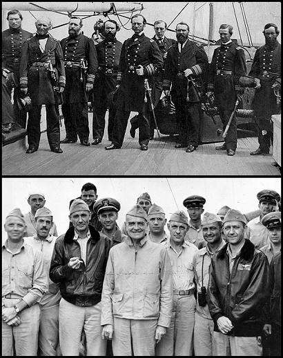
Would someone in the 1860s be able to guess that the two photos are the exact same type: US Navy admirals and their staffs? Or might they think that the lower photo looks like laborers, or some kind of sportsmen, or men standing around in their pajamas?
As for the TWOK maroons, I don't like them, but again not because of how they look. They just represent such a radical break with Starfleet's established uniforms that they are not credible to me. Unless there was a major "cultural revolution" between TMP and TWOK, I guess.
--Justin
I don't think that the TMP stuff was perfect, either. I don't like the "shirt tail" cut at the bottom of the tunics, for instance. I like the idea of the shoulder rank in TMP, but it was pretty hard to see except at close range, something a little larger would be more useful. But that's just personal opinion, it doesn't take away from the overall concept.
The color palette of the TMP uniforms may look a little drab to some, however it was rather stylish at the time. The subdued tones remind me of the stuff Halston was designing for Braniff International Airways around that time:
http://www.braniffpages.com/1965/images/halstonlookbp.jpg
Fashion trends change.
Do the TMP uniforms look like pajamas? Maybe they do today, but what has that got to do with guessing at the future? Here is an image I posted in a similar earlier thread:
Would someone in the 1860s be able to guess that the two photos are the exact same type: US Navy admirals and their staffs? Or might they think that the lower photo looks like laborers, or some kind of sportsmen, or men standing around in their pajamas?
As for the TWOK maroons, I don't like them, but again not because of how they look. They just represent such a radical break with Starfleet's established uniforms that they are not credible to me. Unless there was a major "cultural revolution" between TMP and TWOK, I guess.
--Justin
Bright color coding probably makes good sense in an environment like the deck of an aircraft carrier, where it can be helpful to know who's who at a distance. It doesn't seem quite as practical in the corridors of a starship.
Unless it's the mid-1960's and you're trying to sell color television sets.
True. But the bright colors thing doesn't bother me much. Drab colors in military dress comes mainly from camouflage consderations, dating from the late 1800s when rifles and smokeless powder became prevalent. In the 1700s, bright colors and high contrast was the norm so one could keep track of forces on a battlefield shrouded in musket smoke. I don't have a problem with some kind of safety issue making it desirable to tell who is who at a glance on a spacecraft.
--Justin
^Yeah, 'cause musket smoke is a big problem on spacecraft... ")
GodThingFormerly
A Different Kind of Asshole
I like the idea of the shoulder rank in TMP, but it was pretty hard to see except at close range, something a little larger would be more useful.
"If you notice the tabs at the shoulders they are new also. They are a device which tells by color what a person's job or designation onboard ship is. For example, gold for security, green for medical, etc. Gene [Roddenberry] felt it was more important to indicate a person's job rather than his rank." - ST:TMP costume designer Robert Fletcher as interviewed in Fantastic Films (February, 1980).
")
TGT
I've never liked them, far too Space-1999 for me. After TOS's colourful palate it just didn't feel right for Trek to me.
I agree!!! I liked that TOS's uniforms they were very colorful.
 I think this idea could have come from color being added to B&W television. If you rewatch the original series, all the sets from the bridge, to sick bay, to the halls on board ship were all very colorful. This was great way to show the new look for television in 1966. I'm glad that they changed the uniforms in
  Star Trek II The Wrath of Khan, it was a big improvement over The Motion Picture type uniforms. I'm glad to see the previews for upcoming STAR TREK movie will return to the original look from TOS.
^Yeah, 'cause musket smoke is a big problem on spacecraft...
Hey, you've seen how those consloes spark and blow up!
I like the idea of the shoulder rank in TMP, but it was pretty hard to see except at close range, something a little larger would be more useful.
"If you notice the tabs at the shoulders they are new also. They are a device which tells by color what a person's job or designation onboard ship is. For example, gold for security, green for medical, etc. Gene [Roddenberry] felt it was more important to indicate a person's job rather than his rank." - ST:TMP costume designer Robert Fletcher as interviewed in Fantastic Films (February, 1980).
That makes sense. And as I think about it, the collar rank devices worn by the USN aboard ship today are not distinguishable from much of a distance, either. Criticism withdrawn!
--Justin
A good site with a breakdown of the uniform colors (not division colors) and what they mean:
http://www.st-spike.org/pages/uniforms/2273-2277/uniforms.htm
http://www.st-spike.org/pages/uniforms/2273-2277/uniforms.htm
Similar threads
- Poll
- Replies
- 22
- Views
- 1K
- Replies
- 1
- Views
- 1K
If you are not already a member then please register an account and join in the discussion!