opsVery nice. I like it. Very 2001-ish or somethink that NASA would build.
"...Some Think that NASA..." will never build Anything!... :rolleyes:")
 , i can easily blame this mistake on my ieSpell programmer. Correct line is something that NASA
opsVery nice. I like it. Very 2001-ish or somethink that NASA would build.
"...Some Think that NASA..." will never build Anything!...
, i can easily blame this mistake on my ieSpell programmer. Correct line is something that NASATHANK YOU J.J. I love this!!! very 2001ish, ( ONE of my top ten favs!Those corridors look good overall, even though I'm not too fond of the polished floors.
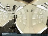
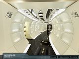
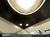
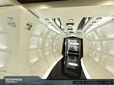
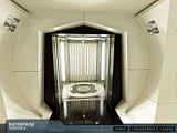
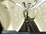
Some screenshots. Click thumbs for bigger pictures
") )GOODDD! when I first heard they were doing a reboot of classic trek, I was afreid my eyes would be assaulted by the ENTERPRISE'S technicolor dreamcorridor again!
)GOODDD! when I first heard they were doing a reboot of classic trek, I was afreid my eyes would be assaulted by the ENTERPRISE'S technicolor dreamcorridor again! 
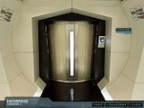
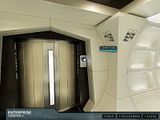
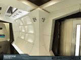
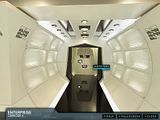
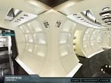
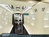
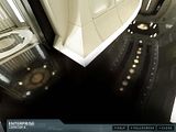
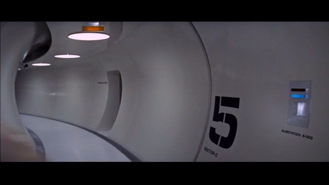
absolutly. first thing ive seen from this movie i like.The official Star Trek movie site now has two panoramas you can view of the Enterprise interior. So far, it's just some corridors, but hopefully later we'll get something more interesting.
Panorama 1
Panorama 2
Very 2001ish.
Kinda like it. It does look very 2001 - and that's a good thing.
I only zoomed down one corridor, but was surprised and disappointed to see that texture-wise, this is very much like the later TOS flicks, with fiberglass texture.
 )
)
It's an uncomfortable compromise between a clean aesthetic reminiscent of 2001/Andromeda Strain with the interior design equivalent of greeblies all over it.
It's an uncomfortable compromise between a clean aesthetic reminiscent of 2001/Andromeda Strain with the interior design equivalent of greeblies all over it.
When was the last time you watched 2001? Just curious.
It's an uncomfortable compromise between a clean aesthetic reminiscent of 2001/Andromeda Strain with the interior design equivalent of greeblies all over it.
When was the last time you watched 2001? Just curious.
Yeah, probably back in 2001.
Why, does Discovery have a light fitting every six inches too?

Serves your childhood right for getting drunk and walking the streets in a miniskirt, six inch heels, and spandex halter top.I don't like it. It doesn't look like Star Trek. Therefore it rapes my childhood.
 *don't judge the movie on the sets* *don't judge the movie on the sets* *don't judge the movie on the sets*
 You don't know that.I'm warming to the the new design. But it is a bit too bright and stark. Very Kubrick. At least there are no glowing red HAL eyes around to read my lips.

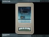
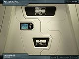
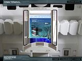
That access panel looks like an iPod. No doubt about it!


We use essential cookies to make this site work, and optional cookies to enhance your experience.


