deg3D_TOS.5 Enterprise

Discussion in 'Fan Art' started by deg3D, Jun 1, 2008.

  1. deg3D

    deg3D Captain Captain

    Joined:
    Jun 1, 2008
    Location:
    Hollywood, CA
    Thanks dude. :)

    The vanes are reflecting, in my view, the impression of heat build-up from the plasma swirling and churning all around them, and I didn't want them to stand out too much, as I am a "less is more" type of guy. That is the reason I redid them, as I felt they were way too garish and over-the-top. As it is, I am quite happy with them, but thanks for your suggestions.

    I look forward to seeing what you come up with on your E. :)

    deg
     
  2. FatherRob

    FatherRob Rear Admiral Rear Admiral

    Sweet Zombie Phobos! That's a fine piece of starship! The blue looks outstanding on the bussards, and the ship really has come together in this picture. I think it looks absolutely amazing.

    Rob+
     
  3. deg3D

    deg3D Captain Captain

    Joined:
    Jun 1, 2008
    Location:
    Hollywood, CA
    I had a feeling you would approve Rob+. ;)

    Glad you like her. I look forward to seeing your practical that CH comes up with. :)

    deg
     
  4. JBElliott

    JBElliott Commander Red Shirt

    Joined:
    Jul 24, 2006
    To give you some more publicity, I posted your images (with links to this thread and your web page) over at The Official Star Trek Movie Forum. The reception there was good just like it has been here. The only odd comment was that the design was a bit "to low res for a film" although I'm not sure what that means. It's perfect res for a film in my opinions. :D
     
  5. deg3D

    deg3D Captain Captain

    Joined:
    Jun 1, 2008
    Location:
    Hollywood, CA
    Ah thanks dude, I posted it up over there as well. Now where is your thread on her, so I can respond and or inquire as to this low resolution comment? Got a link?

    deg
     
  6. Outpost4

    Outpost4 Vice Admiral Admiral

    Joined:
    Oct 22, 2004
    Location:
    Upper Mississippi River
  7. deg3D

    deg3D Captain Captain

    Joined:
    Jun 1, 2008
    Location:
    Hollywood, CA
  8. Outpost4

    Outpost4 Vice Admiral Admiral

    Joined:
    Oct 22, 2004
    Location:
    Upper Mississippi River
    You're welcome.

    And wonderful work, BTW. Some of the best I've seen. Right up there with Vektor's Enterprise. :bolian:
     
  9. c5maier

    c5maier Commander Red Shirt

    Joined:
    Aug 10, 2007
    Location:
    La ville rose
    I am deeply impressed by your creative choices made in detailing the Enterprise. I think it really is about the right amount in order to believe she always looked like that, had we only inspected her close enough. This is also true for the inner workings of the bussard collectors.

    The 23rd-hour change in colour, however, I find a bit startling. It is difficult to mistake blue for red even in the blurred image, so there is no easy explanation. (I guess in the bad old days of NTSC, anything could happen, but there is just too many material around that shows the Enterprise with red collectors (probably because bussards, when finely sliced, look quite red ;)). For sure, I agree that it makes sense for plasma to look blue and it looks cool but I really thought you were not that kind of guy that went just for the look of things.

    Maybe the high-end radiation really is harmful to the people in the primary hull and needs to be somehow filtered out by the caps so only the less energetic radiation from the lower end of the spectrum is seen? Just my two Euro-cents.

    In any case, I am looking forward to seeing an animated version of the propulsion system and would really like to have a look at the red and peach version in comparison.

    P.S. Will you be making the model available for fan productions to use, so it may somehow fanonize itself over time?

    Anyways - thanks for sharing your work with us and keep up the good work!
     
  10. deg3D

    deg3D Captain Captain

    Joined:
    Jun 1, 2008
    Location:
    Hollywood, CA
    Thanks very much gents, glad you like 'er. :)

    Here's the peach version, which I do very much like also, for tradition's sake. :)

    [​IMG]

    But sorry c5maier, my mesh catalog is not available for public use, for personal and professional reasons.

    deg
     
  11. Redfern

    Redfern Rear Admiral Rear Admiral

    Joined:
    Sep 28, 2006
    Location:
    Georgia, USA
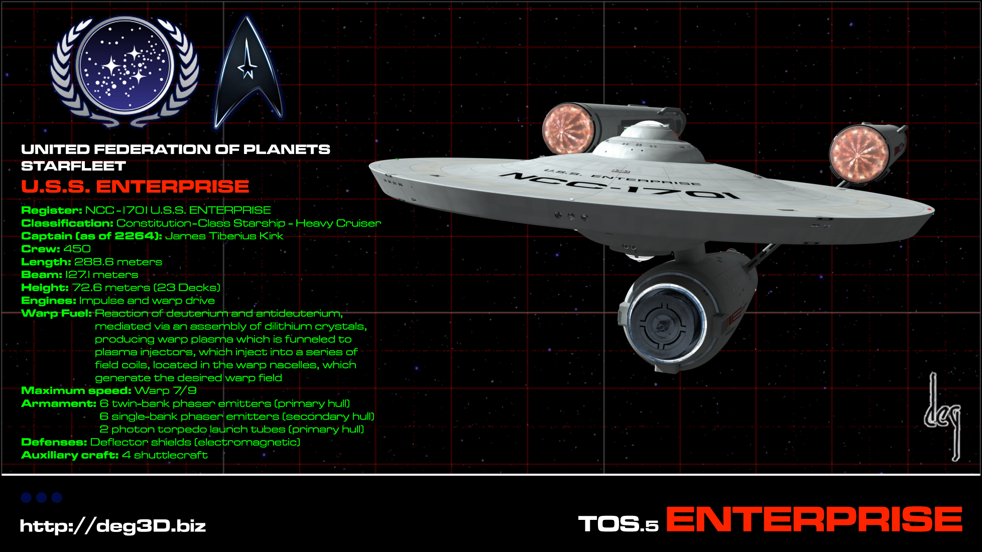
    Ah! Yes, the "peach" sets off the nacelle domes perfectly! Funny, I never before read that color name to describe the hue, but it makes so much more sense than "red".

    What started the business of using red for the domes, anyway? As a kid when I'd assemble my succession of AMT kits, that's what I'd use, as well as my buddy, Kyle. But even the box art with the photo of the model didn't use red, more of an amber with an instense specular value of white. Anybody have any theories?

    Sincerely,

    Bill
     
  12. GilmourD

    GilmourD Commander Red Shirt

    Joined:
    Dec 12, 2007
    Actually, I like the red and peach versions better. What's red look like with the new Bussard collector internals?

    I think c5maier meant to ask if you intend for this to be used for a production like how New Voyages/Phase II has their own model.
     
  13. Q2UnME

    Q2UnME Commodore Commodore

    Joined:
    Sep 3, 2003
    Location:
    Inman, SC
    Put me down in the "I like the peach better" camp. More like the original, but yet different enough. Hey, deg, any chance of seeing a small animation of the engines to see what the effect looks like with "motion"? We all have seen the original VFX of the Big E's engines a million times over, it would be cool to see how your take compares/looks..

    Great work!

    Q2
     
  14. deg3D

    deg3D Captain Captain

    Joined:
    Jun 1, 2008
    Location:
    Hollywood, CA
    Thanks guys. :)

    Ah yes, I do tend to like it more and more the more I gaze at it. I may have to officially shift over eh, and just keep the blue as an alt version. It does hold to tradition more tightly, while updating the cheesy Christmas-tree efx.

    Agggrh, another 15 hours or so of re-rendering out perhaps, LOL. Hey, but the is no ordinary mesh eh! The is, as my Mom put it, my Holy Grail of models, and I have to always go the extra light-year for E, my first love.

    Well, I'm a color-analyst from way back, and peach is just my natural call on it Bill. As to the red, I could be incorrect, but I believe that concept most probably emerged mostly out of TNG. When I was building the AMT kits in the late 60s and early 70s, I never even considered red for the bussards.

    Sorry GilmourD, the red is, as stated previously, o-u-t, out. Way too cartoon-y, garish and 80-ish IMO. Peach is as reddish as TOS.5 E's bussards will ever get at this point. No goin' back eh.

    As to your mention of NV/PII, as I love those Neo-Trek productions, I of course would be open to the idea, but only as long as she was guaranteed to never be made to do barrel-roles and/or made to maneuver like a fighter-jet in any way, shape, or form. WTF was up with that? I'm mean, those guys obviously love Trek. Why would they do that to E? Still amazes me to this day. :confused:
    I forgive them though, and I have not seen them do it again since.

    Oh yeah Q2, there are of course plans to animate her. All in good time guys. I have a definite idea of what and how the bussard(s) efx will end up looking once they are set in motion. :)

    Thanks again guys!

    deg
     
  15. Redfern

    Redfern Rear Admiral Rear Admiral

    Joined:
    Sep 28, 2006
    Location:
    Georgia, USA
    Guess I should have dated some general dates. My friend Kyle and I did most of our AMT kit assemblies from 1972 to 1977, so "Next Gen'", the "E"-D and its (RGB 255,0,0 value) red nacelle caps were still over a decade away. If one looked at most of the box art for toys or coloring book colors from the early to mid 70s, the Enterprise was often given apple red nacelle domes, occasionally "orange" orange, and infrequently lemon yellow. (Sounds like I'm doing a "Trix" cereal commercial. :rolleyes: ) I was trying to discern when that kind of inaccurate simplification of the dome color was started. As I was only 10 when I built my first "classic" AMT Enterprise kit, I didn't give much thought to that kind of accuracy. We were still leaving the models white, never giving consideration the ship might actually a kind of soft grey, a muted battleship hue.

    Sincerely,

    Bill
     
  16. deg3D

    deg3D Captain Captain

    Joined:
    Jun 1, 2008
    Location:
    Hollywood, CA
    Well, you were ahead of your time then Bill. :)

    Oh, I was painting my E(s) (several actually) stem to stern eh. Even fiber-optic light-rigged one myself, before AMT even came out with their lighted-up version. ;)

    As to the red, another consideration may have been that The Smithsonian pulled an in-house redo/restore on E when she first arrived there (the domes were actually missing completely or broken when she arrived), and they painted her new domes a bright red.

    Only those who saw her there at that time (in the pre-Internet days) would have been mostly aware of this fact, but I'm sure some newspaper and/or TV news programs would have featured the event of E being at The Smithsonian as well, perhaps in some way visually proliferating the idea through the mass populace.

    Trix are for kids eh! :)

    I still like my Captain Crunch w/Crunch Berries to this day. :)

    deg
     
    Last edited: Sep 10, 2008
  17. GilmourD

    GilmourD Commander Red Shirt

    Joined:
    Dec 12, 2007
    Yeah, "In Harms Way" had some goofy physics for the ships. And didn't they actually have the deflector dish move in some cartoonish way?

    I liked the subtle motions that Chekov led Lady Enterprise through in the original version of "To Serve All My Days". I haven't seen the new version with the updated effects, yet, though.

    Regardless, your model is sexy. :drool:
     
  18. GilmourD

    GilmourD Commander Red Shirt

    Joined:
    Dec 12, 2007
    On the topic of the Bussard collector color... On the original iteration of the big E under Pike's command, when the collectors still had those spires on them, weren't they just painted red? I believe it was after "Where No Man Has Gone Before" that they replaced the collector caps on the model with the translucent caps with lights behind them.
     
  19. deg3D

    deg3D Captain Captain

    Joined:
    Jun 1, 2008
    Location:
    Hollywood, CA
    Not sure dude, but good point. I'll have to go back and check The Cage eh. ;)

    deg
     
  20. Redfern

    Redfern Rear Admiral Rear Admiral

    Joined:
    Sep 28, 2006
    Location:
    Georgia, USA
    I'm reminded of a slightly "saucy" joke, (no way relating to Trek).

    A young goat and a bunny approach a lady of "ill repute". The goat presents an offer and the hooker agrees. The bunny also propositions her, but the prostitute politely refuses, and gently patting him on the head, she replies, "Silly rabbit, 'tricks' are for 'kids'."

    As for "The cage" nacelle domes with the spires, for some time I've heard several fans agree it was some hue of metallic copper rather than just plain red. Of course, different snaps of the 3 foot model, depending upon their processing can suggest a variety of tones.

    Sincerely,

    Bill