• Welcome! The TrekBBS is the number one place to chat about Star Trek with like-minded fans.
    If you are not already a member then please register an account and join in the discussion!

Enterprise E

Atomic_Monkey

Lieutenant
Premium Member
I'm new to Trek fandom and Trek BBS, so please forgive me if I'm rehashing topics that have already been discussed to death.

I like the Enterprise E, but don't love it. Here are the issues that prevent me from embracing it more fully.

1.) The impulse engines are too big. Generally speaking, as technology evolves and gets more powerful it simultaneously gets smaller. (Roddenbery pushed this idea, arguing, correctly, that the smaller the tech, the more futuristic it looks.) Yet we went from the single small horizontal impulse engine on the D to two giant squares on the E. Consequently, the E's impulse engines look less sophisticated, as though impulse tech devolved.

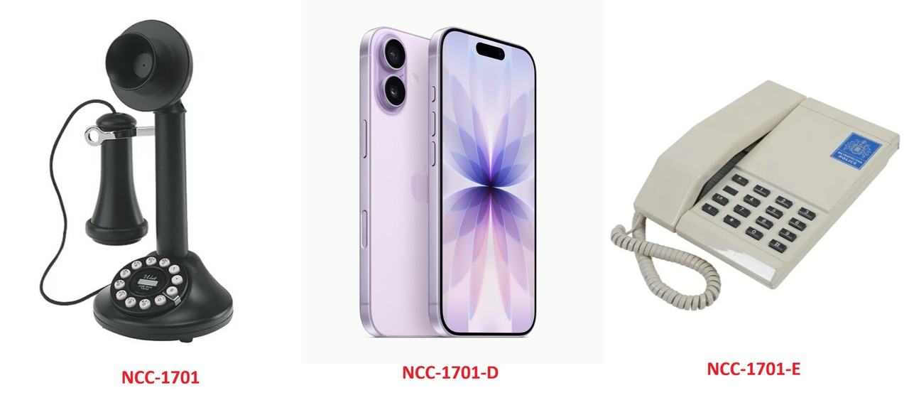
2.) To drive home the point that TNG took place ~75 years after Kirk's era it need a drastically different design language. (An incrementally different design language would have suggested the passage of a mere decade, not three-quarters of a century.) Roddenbery achieved this by approving an organic, curvilinear design for the D. That makes sense. In the real world, the more advanced tech becomes, and the more consideration is given to its form, the more likely it is to adopt an organic appearance. Think of the evolution of a candlestick phone from the 1930s to an iPhone is 2026. That's why the design language of the E, geometric and angular, strikes me as a step backwards. It looks like a streamlined version of the B/Excelsior, which is nice looking, but only incrementally different from Kirk's era. Consequently, it doesn't look as advanced as the D.

To put it yet another way, the E has conventional good looks, but conventional doesn't suggests futuristic. The more futuristic something is, the weirder it would look. That's why the D, with all its glorious weirdness, looks more futuristic.

3.) I dislike that the E looks agressive and is intended to be more of a battleship. The premise of Star Trek is a group of scientists exploring the galaxy, not the space army policing the galaxy. I understand there's an in-universe explanation (the E was designed in the context of conflicts with the Borg and the Dominion). So? That just means they used a storyline to rationalize changing the underlying premise of the franchise. As a result, they made the Star Trek universe less unique and more cliched.

I've seen people argue that Roddenbery was inconsistent on this point. I disagree. Yes, there was more of a military feel to TOS, but Roddenbery regretted that and made a point to move away from it in TNG. And yes, despite that, there were still elements of militarism in TNG. But pointing to a handful of examples of militarism in TNG does not mean Roddenberry was inconsistent. He never disputed the idea that Starfleet serves a defensive function. He just wanted it to be secondary and de-emphasized. That vision allowed for there to be some militarism in TNG; it was just meant to preclude defense from being Starfleet's primary mission. Inarguably, once you change the Enterprise from a research vessel into a battleship, defense becomes its primary function and drives the stories.
 
Here's an analogy to illustrate what I mean about the aesthetics of technology becoming more integrated and cleaner as is evolves.

ST-Design-Languages.jpg
 
Welcome — and you’re not wrong. I did like the E, but in retrospect I preferred the D not so much for the outside (though the more organic look is nice, from the right angles), but for the inside. For better or worse, I like the “cruise ship” interior decor and architecture, and I did regret that later films and series stepped back from that.
 
If you start with the Matt Jefferies basic design elements (saucer, neck, star drive, nacelles), the Enterprise-E is representative of John Eaves moving more and more towards removing the neck and changing the saucer to an arrowhead on Federation starships. I don't know why, but whenever I look at it now I get the feeling it's very dated to the 90s era of action "X-Treme." Particularly in comparison to the Enterprise-D, the Enterprise-E feels like someone said we want something that looks sleek and action-y.

In the commentary for Star Trek: Generations, Ron Moore and Brannon Braga claim part of the reason for destroying the Enterprise-D was they were told ILM didn't like the Galaxy Class design and felt it didn't work well on film.
 
I think the E looks very of its time... both in-universe and out, it's very badass and 90s, and it's also very similar to Voyager. I don't think getting rid of the neck should've been a permanent evolution for Starfleet ships, but it's following trends and that makes it look like part of an era.

They were smart with the D to make it curvier and more organic, it really looks a lot more advanced than any movie-era ship it's next to, but I feel like they would've ended up in a dead end continuing down that route. Modern phones are a good example, as they're pretty much just a shiny rectangle with rounded edges and where do you go from there? Phone manufacturers will have to add complexity back in if they want their phones to look different and more futuristic.

ent-E.jpg

Also the impulse engines aren't actually that big if you see them from behind. I don't know what the red glowy bit actually is, but if it's expelling something backwards that generates forward thrust, then it's only the rear angle that matters.
 
Agreed on all your points, @Atomic_Monkey ! And as @Ray Hardgrit mentioned, I wish they didn't continue the trend of losing the neck and flattening the designs. I like my tall ships!

Enterprise-E Just looks... John Eaves. You can spot his ships a mile off, regardless of supposed Trek era or whatnot.

I like it, but I can't unsee it's John Eaves Trek Design 101.
Also this. Eaves is a talented creator, but he has definitely got a style. Unfortunately it's a limited style, and his ships tend to look the same regardless of era or whether they're Starfleet or alien. (I will say that I can also spot a Sternbach or Probert design a mile off, but but their design language isn't near as limited.)
 
Also the impulse engines aren't actually that big if you see them from behind. I don't know what the red glowy bit actually is, but if it's expelling something backwards that generates forward thrust, then it's only the rear angle that matters.
Which is why it’s probably not generating thrust of any conventional sense. We often hear talk of “reverse impulse”, but there aren’t equivalent jets on the front of ships. It’s usually lit up exactly the same, even when stationary. Some ships have no visible impulse exhaust at all. I guess it’s more likely to be about dissipating heat or radiation*, so therefore a larger red glowy bit might suggest a more powerful engine.

* This is basically what Spock and Uhura say in TUC - it’s a “tail pipe” spewing waste plasma.

I would guess they are usually on the back of the ship because that’s far away from any kind of interference with the forward main sensors or navigational deflectors.


Here's an analogy to illustrate what I mean about the aesthetics of technology becoming more integrated and cleaner as is evolves.

ST-Design-Languages.jpg

Counterpoint: the Enterprise isn’t a telephone.

Real world examples exist of technology seeming to come back around, especially when something is experimental or ahead of its time. e.g. streamlined locomotives of the 1930s gave way to more traditional designs, but later high speed electric trains look more like their 1930s predecessors. Would you think this looks “wrong” when taken in isolation?


1938

6229_Duchess_of_Hamilton_at_the_National_Railway_Museum.jpg


1960

Evening_Star_%285441415938%29.jpg


2015

Class_800_in_testing_2015.jpg


The EntD and EntE are different ships performing different roles using different technologies. Their form follows function.

Personally I much prefer the EntD, but I don’t think there’s anything wrong with the way Starfleet’s designs evolved. Much is made of the Galaxy-class being a huge leap forward and an experiment. Sometimes experiments overreach or prove to not have the benefits that were anticipated, and a return to more familiar forms follows.

And sometimes people nostalgically return to retro throwback designs, like the Constitution III. :lol:
 
Last edited:
ent-E.jpg

Also the impulse engines aren't actually that big if you see them from behind. I don't know what the red glowy bit actually is, but if it's expelling something backwards that generates forward thrust, then it's only the rear angle that matters.

Thanks for your reply. I agree with most everything you wrote, but I'm not sure I'd sold on your defense of the impulse engines. I understand what you mean about the thrust -- it's only directly backwards, so the rear view would appear to be most relevant. But regardless of the direction of the trust, the engines are using very large surface area to generate that thrust. Tilting the engines backwards masks that surface area.

Come to think of it, it was an odd choice to angle the faces of the engines. Had they been integrated vertically (by making notches in the saucer) they could have been much smaller in surface area, yet looked exactly the same when view from directly behind.
 
Last edited:
Welcome — and you’re not wrong. I did like the E, but in retrospect I preferred the D not so much for the outside (though the more organic look is nice, from the right angles), but for the inside. For better or worse, I like the “cruise ship” interior decor and architecture, and I did regret that later films and series stepped back from that.

I wholeheartedly agree. The interior of the D is its best feature.

To me, it's the most realistic. If you're stuck in a confined space for years at a time you're going to want your environment to be as comfortable as possible. Certainly as spaceships become more advanced more thought would be given to things like comfort and style. I'm confident a space ship 400 years from now isn't going to have the interior of WWII submarine, even if the spaceship was designed for a utilitarian function.

I also love that the bridge is sparse because that suggests how advanced it is. Most systems are automated. You don't need a large bridge crew to be constantly monitoring and adjusting things.

And finally, I love that the D's interior is less militaristic. It's clearly a ship designed for science and diplomacy first and foremost, with defense being a distant second. Having the captain's chair mostly in-line with the his two senior officers (rather than raised above them) stresses collaboration rather than hierarchy.
 
Last edited:
The thing is, cruising itself has evolved over the years. A cruise ship in the late 80s is closer to military ships today in some ways, with wider corridors, carpeted floors in some living spaces, and more creature comforts than a Cold War-era navy vessel. Similarly, some of modern Trek ships have a modern cruise liner aesthetic, with all sorts of glitzy lighting, big artistic spaces with artistic touches (seriously, you can compare the USS Athena's atrium with the Royal Promenade on the Icon of the Seas) that a 1980s or 90s cruise ship never had. A Galaxy-class ship, if realized today for a long-term deep space assignment, would absolutely be closer to a 2026 cruise ship look and feel, for better or worse.

Mark
 
In some of the original concept art, there was a "captain's chair" on the Enterprise-D, but they would have merged elements of the observation lounge with the bridge. The captain's chair would have sat in front of a conference table at the center of the bridge.

Also, the Ops and Helm consoles would've had wrap around couches for people to sit on the bridge and observe. The concept art also has a second story observation deck too.
probert-early-concept-sketches-for-a-galaxy-class-bridge-v0-mvlt2b1ve0eg1.jpeg
I know this was from early in the concept phase, but I love how some of the details and lines around the viewscreen/window and back along the walls eventually made it into the nacelle design!
 
The EntD and EntE are different ships performing different roles using different technologies. Their form follows function.
Indeed, yes. I like the Enterprise E slightly more because it looks better than the Enterprise D, but that's not saying much. The E's design follows the form and engineering ideas of Voyager to me so I didn't find it off putting but an extension of an in universe trend, especially with a war on.
 
I've always looked at the Sovereign-class as simply a more economical Galaxy-class. Even in a supposed post-scarcity society, the Galaxy-class requires a considerable amount of resources to build. Starfleet may have wanted a design that could do the same kind of missions, but at a cheaper "cost." The result was a leaner design without the provisions for civilians. Personally, I don't think the Enterprise-E is any more a warship than the Enterprise-D was--I think they were both meant to be long-range multipurpose starships--but the Enterprise-E was maybe a more efficient design, IMO.
 
The Galaxy-class was designed to go on long, deep-space missions for years at a time. But in the event, all of those ships stayed close to the Federation and ended up playing key roles in wars against the Borg and Dominion.

The original Galaxy-class mission profile was no longer relevant. The Sovereign-class was more fitting for that kind of mission. It didn't need the same kind of redundancy and scale as the Galaxy-class.
 
I preferred the D not so much for the outside (though the more organic look is nice, from the right angles), but for the inside. For better or worse, I like the “cruise ship” interior decor and architecture, and I did regret that later films and series stepped back from that.

Also, I think the D's bridge is consistent with the aesthetics of the D's exterior. Both are soft, organic, curved and non-aggressive. I can't imagine the D's bridge on an angular, aggressive ship like the E. The styles clash.
 
(I will say that I can also spot a Sternbach or Probert design a mile off, but but their design language isn't near as limited.)

Well I can guarantee that neither Sternbach nor Probert would have dusted off an old design they created years before for one era, made minimal changes to it, and presented it as a new ship for a completely different era, when given a job to make a new ship.
 
Last edited:
If you are not already a member then please register an account and join in the discussion!

Sign up / Register


Back
Top