-
Welcome! The TrekBBS is the number one place to chat about Star Trek with like-minded fans.
If you are not already a member then please register an account and join in the discussion!
You are using an out of date browser. It may not display this or other websites correctly.
You should upgrade or use an alternative browser.
You should upgrade or use an alternative browser.
Spoilers Starship Design in Star Trek: Picard
- Thread starter pst
- Start date
Mark Rademaker skeeted some of the early concept art (not by him) of a Vesta class bridge MSD for the U.S.S. Hikaru Sulu from early planning for season 3.

 bsky.app


Holland Space Yards (@yard2380.bsky.social)
Some concept art from Picard (not by me) showing a Vesta class starship on an MSD. I personally would have picked a very different bridge layout, but within the show this would have been a "quick" set redress. That Vesta, (USS Hikaru Sulu) + Captain Harry Kim part was dropped from the story.


Some concept art from Picard (not by me) showing a Vesta class starship on an MSD. I personally would have picked a very different bridge layout, but within the show this would have been a "quick" set redress. That Vesta, (USS Hikaru Sulu) + Captain Harry Kim part was dropped from the story.
I think that's a placeholder graphic (wasn't that or another weird four-nacelled version of an existing design in the photo of the bridge set Drexler posted before season 2 that he ended up redacting? I don't think it was the real Stargazer design, whatever it was). Rademaker also posted an test animation of the CG model of the Sulu, and aside from some color/texture changes (IIRC), it looked like the standard Vesta design.Also, that version of the ship has four nacelles. I don’t know if that was to get out of having to pay Rademaker any royalties because it wouldn’t have been 100% his design?
ETA: No, wait! I thought I'd renamed it but figured I was wrong when it wasn't in my downloads folder. I just remembered I made a folder specifically for all the Picard BTS ship stuff. Here's the video as well as a comparison of the original and revised color schemes.


Last edited:
Some have pointed out TNG had at least one example of a mirrored layout to show both nacelles on a single MSD.Also, that version of the ship has four nacelles. I don’t know if that was to get out of having to pay Rademaker any royalties because it wouldn’t have been 100% his design?
If the STO model is accurate and these renders aren't distorted in some way, the aft airlock of the Type 14 shuttle is elliptic. Shouldn't it be circular (like that of the Eleos XII)?
Last edited:
lolthe captain's ziggurat
It's been a while since I watched it, but maybe there was one of those extend-o-matic™ tubesIf the STO model is accurate and these renders aren't distorted in some way, the aft airlock of the Type 14 shuttle is elliptic. Shouldn't it be circular (like that of the Eleos XII)?
It was images of the Titan-A he blurred. He recorded the video after the set had to been modified for Season 3. You can hear Dave Blass talking about how it's been changed into a new ship.(wasn't that or another weird four-nacelled version of an existing design in the photo of the bridge set Drexler posted before season 2 that he ended up redacting? I don't think it was the real Stargazer design, whatever it was)
Other details, the railings have blue lights instead of white, and the chairs flanking the captain's chair have swinging consoles, which the Stargazer's didn't. I think some of the standing transparent consoles were also moved around.
Here's an image from the uncensored version of the video someone grabbed before Doug replaced it.

Too blurry to really tell it was a modified Shangri-La class at a glance at the time, maybe people with intimate knowledge with the design could of recognized it.
Terry Matalas also posted an image of the Titan-A's saucer before the season aired, but it's extremely close up that I doubt anyone could tell it was a modified Shangri-La. He posted this in January 2022, 2 months before S2 aired and a year before Season 3 aired.

Last edited:
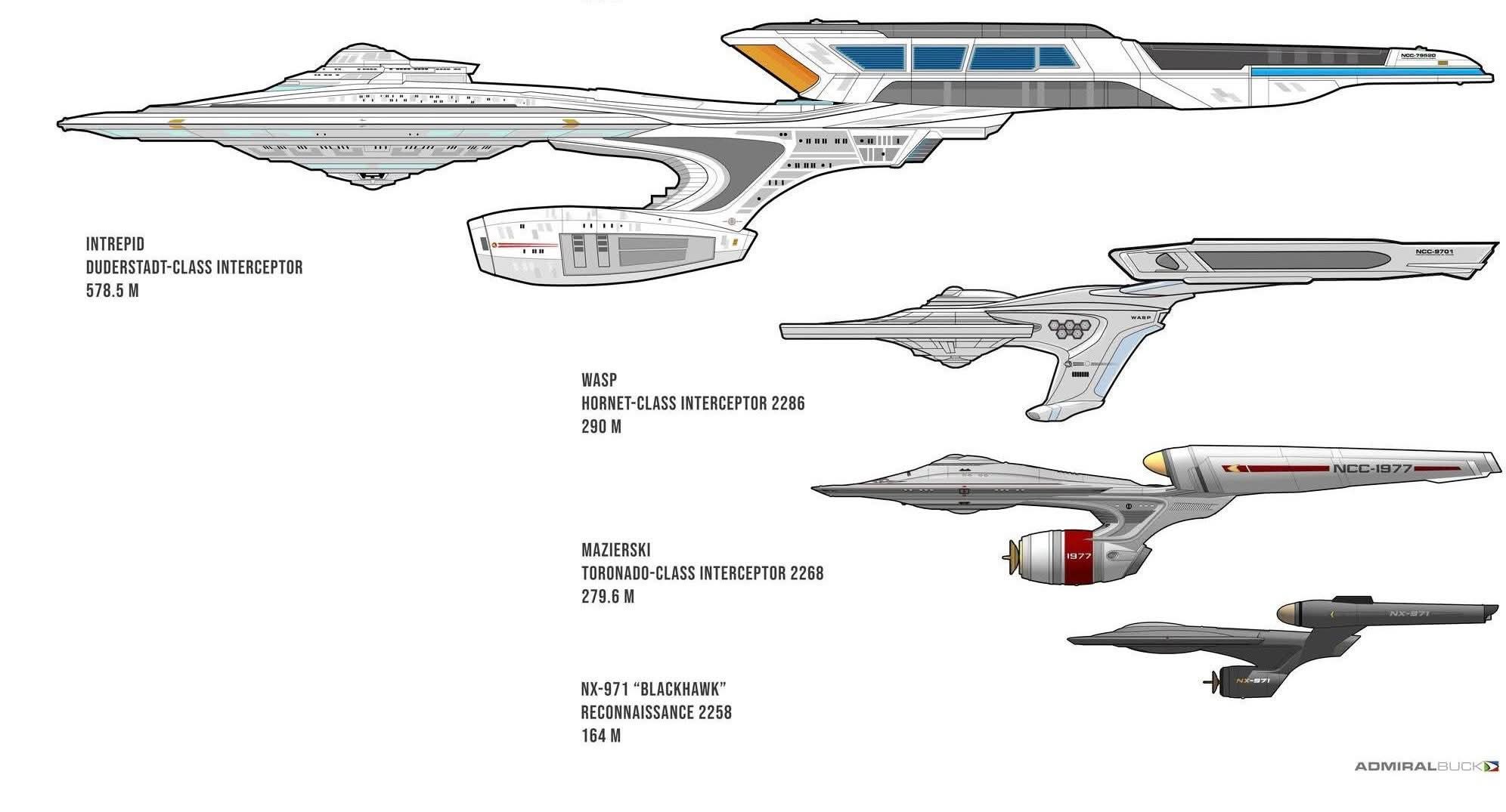
And here are some more views by Bill Krause of the Chaparral concept stage for the Duderstadt class.
 bsky.app


Bill Krause (@admiralbuck.bsky.social)
This author has chosen to make their posts visible only to people who are signed in.
Chaparral concept renders, AUG21.


The Enterprise-G is THE ugliest Enterprise yet, and I realize that list includes the Enterprise-J.
The Duderstadt was changed a lot from the 23rd century design it was based off, a lot more than the Connie 3 was. There's nothing minimum about these changesand minimally change them to ships from the 25th century' schtick they did.

The Duderstadt was changed a lot from the 23rd century design it was based off, a lot more than the Connie 3 was. There's nothing minimum about these changes

It's the same basic layout. It's as if Andrew Probert had just made a larger version of the TMP Enterprise for the Ent-D in TNG.
He pretty much did. The starting point was a drawing he'd done during production of TMP for a future Enterprise. It evolved until it became the familiar Galaxy class.
All the Enterprises are just variations of Matt Jefferies' work anyway.
The Intrepid was a great design, probably the best new Starship in Picard. The Titan certainly had some incongruous elements left over from the original Shangri-la, but the Intrepid is a really well developed design. IMO of course.
I'd agree that the Intrepid is probably the best of the 25th century designs. It feels like its own thing instead of just an update of a ship seen in an earlier series, while still being instantly recognisable as a Starfleet vessel. And the reuse of the Stargazer nacelles and bridge module firmly places it in its era.
The Titan, on the other hand, looks like a Motion Picture era ship with the Stargazer nacelles and bridge module planted on to fake that it's a new design.
The Titan, on the other hand, looks like a Motion Picture era ship with the Stargazer nacelles and bridge module planted on to fake that it's a new design.
Similar threads
- Replies
- 117
- Views
- 11K
- Replies
- 35
- Views
- 811
- Replies
- 3
- Views
- 376
- Replies
- 0
- Views
- 3K
If you are not already a member then please register an account and join in the discussion!
