• Welcome! The TrekBBS is the number one place to chat about Star Trek with like-minded fans.
    If you are not already a member then please register an account and join in the discussion!

3D interiors in Blender

@Finn: They aren't just about 20cm wider than the standard TNG conn/ops stations, and the curvature makes them easier to each than if they were straight. They are quite thin near the end, and that adds to the illusion of them being too long. :)

@TOMFAN: Thanks! I mean, it's alright if they think the Ross battle bridge is a bit too nice, as the ship is designed to be a showcase of Starfleet and the Federation for diplomatic overtures.

@David cgc: The divider between the consoles and lift door actually doesn't prevent looking at that console at all on the Till battle bridge. The standing console does tho, you're right there. :lol:

@cardinal biggles: Well, hope you like them gone! :p

It was suggested elsewhere to have openings instead of the doors there, kinda like the alcoves at the back of the DS9 Prometheus and Odyssey bridges. I really liked the idea, it's obvious in hindsight. I had tried to do alcoves before but fully open to the bridge, rather than framed by those openings, and that just didn't work.

Removing the doors also allowed me to make the openings bigger as I didn't need to fit the mechanism in there. There's now a full-size door for both the small ready room and the head, plus a replicator on the starboard side alcove and two phaser storage lockers on the port side one.

tadeo-d-oria-c0-07.jpg

tadeo-d-oria-c0-06a.jpg

tadeo-d-oria-c0-08.jpg
 
Last edited:
Agreed - the alcoves work much better! I like the addition of a replicator there, which I would think should be a necessary amenity.
 
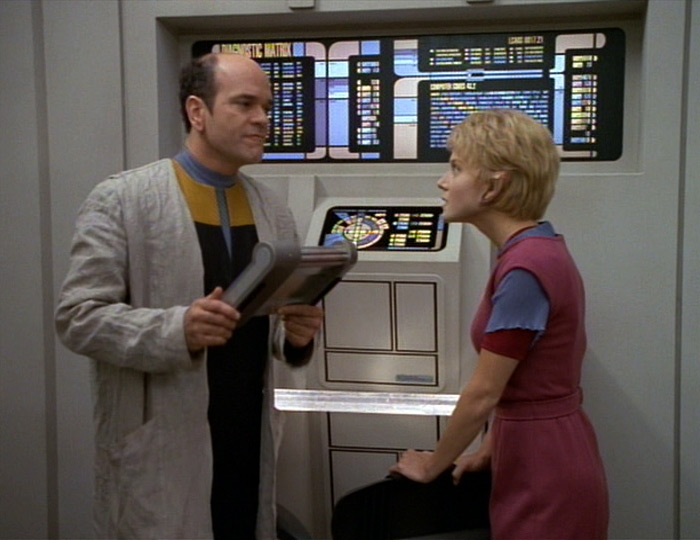
A loooong time ago I started a bridge for an Olympic-class medical ship, which I named the USS Leloir. I showed some renders of it but I never moved past that stage as I didn't know on which direction to take the style. Recently I rewatched 'The Swarm', and the color combination of the Jupiter Station holographic lab clicked as perfect for the Leloir.
304-the-swarm-286.jpg

304-the-swarm-599.jpg


So I'm now aiming for those colors (with some tweaks) in both paint and LCARS. Other than that, I've worked some more on the helm station and shortened the bridge somewhat, as there was too much empty space between the helm and viewscreen before. I also lowered the ceiling significantly. I intend to remove one of the doors on the starboard side to make the bridge somewhat asymmetrical, but that's once I have all the basics in place. Still not sure which chairs to use for the consoles or the Captain, so I'm testing things out on that front.

Old renders:
tadeo-d-oria-c1-01.jpg

tadeo-d-oria-c2-01.jpg


New renders:
tadeo-d-oria-c1-02.jpg

tadeo-d-oria-c2-02.jpg
 
That lighting scheme is a bit much though.
Can one assume that that is the light level used to only to perform repairs in drydock and not the standard operational output.
The glare from the overhead lighting would make trying to read the LCARS panels impossible at most angles.
Plus spending 8 hour shifts (or longer) under those conditions would be exhausting on the eyes.
 
@Firebird: RIP cans of paint. :lol:

@DaveyNY: Yes, the ceiling is a flat lit surface right now so it's obviously not done yet, it'll be darker once there's less surface emitting light.

Still playing around with floor layout, handrails, etc, so don't consider any of it final, but it is the direction I'm leaning towards. Unsure about the brown, I might try to make it wood, or go to a different color, perhaps contrasting rather than the similar earth tones. Metal was just too hard to read IMO, but that might be due to the bright lights which obviously aren't finalized yet.

tadeo-d-oria-c1-03.jpg

tadeo-d-oria-c2-03.jpg
 
@FormerLurker: Thanks! I wasn't sure I liked having what's essentially a wall there, but the more used I become to it, the more I like it. :p

@danellis: I did test the space out with some dummies, it's a bit more compact than the larger Pasteur helm, but it's still more than large enough for a person to comfortably use. :)

Started working on the ceiling structure, with large light panels near the center and aft walls, and spotlights around that. I'll add grated light panels to the remaining area, similar in style to the Defiant's, with the hope that they'll add some interesting shadows along the walls.

tadeo-d-oria-c3-01.jpg
 
Maybe you've explained it elsewhere, but I'm curious why you're so enamored of the style of Defiant consoles used in "The Search" (with the aluminum paneling on the middle tier) as opposed to what we saw during the rest of the series? I notice you've also used this on your Thunderchild bridge.
 
I love the ceiling you did for this. It almost feels like it might mimic the saucer section itself. Really nice! And you are right, the colors work perfectly for this. Well done!

I find coming up with "unique" color schemes for ship interiors is difficult. Which makes me curious @Rekkert - do you have a favorite color scheme? I REALLY like the Enterprise E interior scheme - it's warm and soft, yet feels very advanced and "techy"
 
@cardinal biggles: I... literally used them on ONE bridge...? How's that being enamored by them? They're also here because I used the Thunderchild consoles as a base for this one, so when I applied the proper material the UV map is still set up to generate the pattern, but I wasn't planning on keeping them there.

@Mr. Phreez: Thanks! I go back and forth on favorite colors. Often times I work too long on a single style so I start seeing it as boring until I go do something else for a while. I do really like the Enterprise-E colors too; I somewhat like the Voyager colors as well (but not the styling of those sets, they're a bit generic IMO). The Enterprise-B colors too, just because they're unique and interesting.

Modeled those ubiquitous Starfleet wall greebles from late-TNG and Voyager for the sides of the viewscreen, and decided to add the same vertical patterns as these have to the bottom of the helm console. Still playing around with colors, as you can see.

tadeo-d-oria-c4-01.jpg
 
@cardinal biggles: I... literally used them on ONE bridge...? How's that being enamored by them? They're also here because I used the Thunderchild consoles as a base for this one, so when I applied the proper material the UV map is still set up to generate the pattern, but I wasn't planning on keeping them there.
Yeah, that was probably the wrong word to use there. I'm not sure what word I should have used. I guess more like "Well, that was a curious design choice" for the Thunderchild, and this is still a WIP. Just ignore that comment.
 
@cardinal biggles: I... literally used them on ONE bridge...? How's that being enamored by them? They're also here because I used the Thunderchild consoles as a base for this one, so when I applied the proper material the UV map is still set up to generate the pattern, but I wasn't planning on keeping them there.

@Mr. Phreez: Thanks! I go back and forth on favorite colors. Often times I work too long on a single style so I start seeing it as boring until I go do something else for a while. I do really like the Enterprise-E colors too; I somewhat like the Voyager colors as well (but not the styling of those sets, they're a bit generic IMO). The Enterprise-B colors too, just because they're unique and interesting.

Modeled those ubiquitous Starfleet wall greebles from late-TNG and Voyager for the sides of the viewscreen, and decided to add the same vertical patterns as these have to the bottom of the helm console. Still playing around with colors, as you can see.

tadeo-d-oria-c4-01.jpg
BURGLARY AT THE PAINT FACTORY!!! :D

It's a great start, and I'm sure I"ll love it once you're done. It's truly a shame that I can't just walk through it....
 
I'm interested in what you have in mind for the rest of the ceiling, I'm picturing like a dome structure with upward facing led lighting or something.
 
If you are not already a member then please register an account and join in the discussion!

Sign up / Register


Back
Top