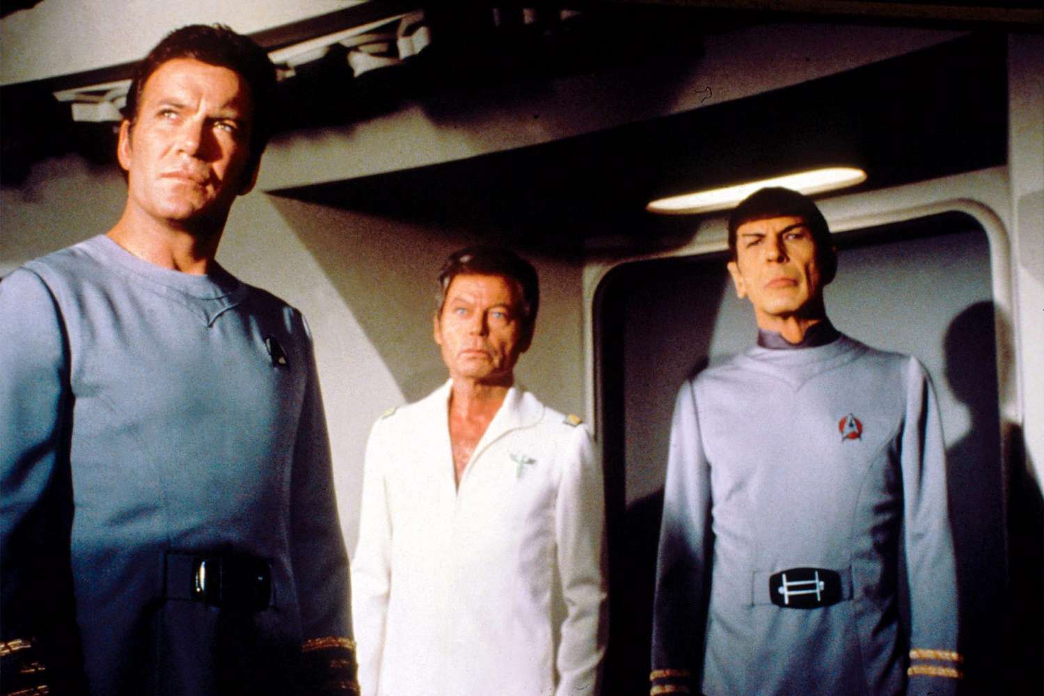
Well...I can't say I'm a fan of the SNW monster maroons. I think the costume department tried their best to recreate it, but I found myself frequently staring at the right shoulder strap and thinking that it was too long and that the tiny deltas were unnecessary. I know it's nitpicky, but I wish they could have just found an original monster maroon somewhere, but I suspect they've all been sold at auction.Can we talk about how they screwed up the Monster Maroons with those dumb Discovery shoulder treatments and tiny deltas?
-
Welcome! The TrekBBS is the number one place to chat about Star Trek with like-minded fans.
If you are not already a member then please register an account and join in the discussion!
You are using an out of date browser. It may not display this or other websites correctly.
You should upgrade or use an alternative browser.
You should upgrade or use an alternative browser.
Strange New Worlds Costuming
- Thread starter Mudd
- Start date
The only thing I don't like is the angle of the flap, which is too low and means the shoulder strap is too long. In the concept art it's higher and looks fine, but for some reason while making it they chose what they chose.Can we talk about how they screwed up the Monster Maroons with those dumb Discovery shoulder treatments and tiny deltas?

(right click open in new window for huge size)
The shoulder bits and deltas didn't bother me in the slightest.
And in a show where EVERY SINGLE THING looks different, you really expected a Wrath of Khan uniform to remain unchanged? With the ridiculous bell bottoms?
Well...I can't say I'm a fan of the SNW monster maroons. I think the costume department tried their best to recreate it, but I found myself frequently staring at the right shoulder strap and thinking that it was too long and that the tiny deltas were unnecessary. I know it's nitpicky, but I wish they could have just found an original monster maroon somewhere, but I suspect they've all been sold at auction.
I guess the point here is that they deliberately weren't trying to re-create the TWOK uniforms. Had that been their intent then they could have done it easily enough... but they chose not to do so.
They have opted to deliberately include features from the SNW uniforms. From a narrative point of view, it very much looks like they're trying to show the link from current SNW to the future Pike. I'm actually really not a great fan of the printing on the sleeves anyway; to me it just looks over-designed, like they're trying too hard... but, having said that, I accept that it's an integral part of the SNW uniforms and it therefore makes sense to bring that element forward to create a stylistic and visual link between the "current" SNW uniform and the "future" SNW maroon uniform. In that respect, it actually creates a better link between the two eras that we had between TOS and the movies!
Aesthetically, I don't particularly like the low angle on the front flap and the excessively long shoulder strap. That element definitely doesn't work so well for me. Again, I can get that this was likely also a deliberate change to the look from the original TWOK version of the jacket but I think this is one area where they could have done better.
It’s such a sweet Easter egg that I didn’t want to say anything…That is really hard to tell. It looks hollow to me, but I guess it could be filled, I dunno.
EDIT: But on second look, those are some monster turtlenecks on those tunics, far bigger (and obnoxious) than those worn in the TOS pilot episodes. Now those aren't an improvement...
…But since you brought it up, I agree. I think that those uniforms are patterned after Spock’s. I’ve read that his collar was different (Velcro enclosures on both sides to avoid damaging the ear appliances) and I’ve also seen that Nimoy preferred high collars.


IIRC, the WOK uniform pants are closer in cut to sweat pants, but look like "bell bottoms" when tucked into the boots. I think the SNW version eliminated this by having much taller boots.And in a show where EVERY SINGLE THING looks different, you really expected a Wrath of Khan uniform to remain unchanged? With the ridiculous bell bottoms?
I think it was an improvement to an already good looking uniform.
Yep, this.The only thing I don't like is the angle of the flap, which is too low and means the shoulder strap is too long. In the concept art it's higher and looks fine, but for some reason while making it they chose what they chose.
The shoulder bits and deltas didn't bother me in the slightest.
And in a show where EVERY SINGLE THING looks different, you really expected a Wrath of Khan uniform to remain unchanged? With the ridiculous bell bottoms?
Although I liked the cuffed-pants look though.


Which is saying something, since the monster maroons were over designed to begin with.Love seeing The Cage/WNMHGB style unis.
I like the SNW uniform sets except for the patterns on the shoulder/arms. It just makes them look over designed. And even moreso on the SNW-verse Monster Maroons.
I didn’t like the similar feature on the Kelvin-verse uniforms either.
")
Given it's an alternate future I'd say "screwed up" is a bit much.Can we talk about how they screwed up the Monster Maroons with those dumb Discovery shoulder treatments and tiny deltas?
(right click open in new window for huge size)
Indeed. That design needed some dialing back.Which is saying something, since the monster maroons were over designed to begin with.
I always loved the monster maroons, but also always felt like they would have been more appropriate as dress uniforms.
I guess the point here is that they deliberately weren't trying to re-create the TWOK uniforms. Had that been their intent then they could have done it easily enough... but they chose not to do so.
Exactly so.
They should have streamlined and simplified the jacket more, IMO. Those outfits never belonged to the same visual continuity as any other Starfleet uniform, and as decades have added more and more layers to Trek costume design they seem old-fashioned and anachronistic. They were one producer and director's idea of treating Trek as a kind of naval swashbuckler, and that's dated, too.
One of the best things about the design of TOS's uniforms is the simplicity. Not a whole lot of flash. Even the dress uniforms keep it simple. TMP followed that idea. SNW has for the most part done this, with the exception of the Admiral's uniform which would be more at home on the Orville.
The only thing I don't like is the angle of the flap, which is too low and means the shoulder strap is too long. In the concept art it's higher and looks fine, but for some reason while making it they chose what they chose.
The shoulder bits and deltas didn't bother me in the slightest.
And in a show where EVERY SINGLE THING looks different, you really expected a Wrath of Khan uniform to remain unchanged? With the ridiculous bell bottoms?
The bell bottons were cool. Just like the navy. That's what they were going for.
It’s such a sweet Easter egg that I didn’t want to say anything…
…But since you brought it up, I agree. I think that those uniforms are patterned after Spock’s. I’ve read that his collar was different (Velcro enclosures on both sides to avoid damaging the ear appliances) and I’ve also seen that Nimoy preferred high collars.
The high collar for nimoy was because of his makeup. The collar had to be opened before he put the shirt on over his head so the makeup wouldn't be marred. The later tunics had the side zippers so in later eps that high collar disappears.
Last edited:
Prefer the simplicity to the maroons. SNW does this pretty well. Though I like Admiral April's uniform too.One of the best things about the design of TOS's uniforms is the simplicity. Not a whole lot of flash. Even the dress uniforms keep it simple. TMP followed that idea. SNW has for the most part done this, with the exception of the Admiral's uniform which would be more at home on the Orville.
One of the best things about the design of TOS's uniforms is the simplicity. Not a whole lot of flash. Even the dress uniforms keep it simple. TMP followed that idea. SNW has for the most part done this, with the exception of the Admiral's uniform which would be more at home on the Orville.
Agreed; the flag officer uniform, apart from anything else, is just too different from the other uniforms It bears little resemblance to anything we have seen before or since. The shoulder insignia are laughably huge. They needed to be a little more sympathetic to the originals here.
One thought that occurred to me was to use the standard V-neck uniform top, but make it the same colour as Pike's green wraparound jacket, (effectively as a senior Command colour), keep the Discovery-type Admiral chest badge (as they have done) and then use the TOS pattern of admiral stripes (as they have sort of used on the shoulders of April's top) but in the usual place on the sleeves. If they wanted to be really clever, they could then use the ten-point Starfleet Command starburst symbol for the sleeve printing in place of the normal elongated five-point star that Pike has. To be honest, this same approach would also have worked in standard Command gold and would have been perfectly in-keeping with TOS.
The other option would have been to give Pike the same formal grey jacket as April in some senes, but with a standard badge and a version of the captain stripes on the shoulders instead of April's admiral stripes, making it more obvious that both were wearing a more formal uniform than the coloured tops.
Given it's an alternate future I'd say "screwed up" is a bit much.
Indeed. That design needed some dialing back.
"Screwed up" in the sense that the new design is worse than the original.
Nobody's debating whether the design comports with established canon (which would be a pretty pointless argument where SNW is concerned), but that they took an already too-busy and fussy design and made it even busier.
I’ve read that (Spock's) collar was different (Velcro enclosures on both sides to avoid damaging the ear appliances) and I’ve also seen that Nimoy preferred high collars.
Interesting. Wonder if "actor preference" explains his uniform variant from TMP?
Last edited:
I don't see them as being worse; just different. The only thing I find annoying is the overlong strap. But, overall, the design looks the same, continues the business and illegibility of the original."Screwed up" in the sense that the new design is worse than the original.
I think they're worse.
Adding tons of extra details to an already-fussy uniform was pretty much guaranteed to make them worse.
Adding tons of extra details to an already-fussy uniform was pretty much guaranteed to make them worse.
Ok. Agree to disagree, etc.I think they're worse.
Adding tons of extra details to an already-fussy uniform was pretty much guaranteed to make them worse.
Adding texture is not something I find as distracting as the sleeve decorations.
Similar threads
If you are not already a member then please register an account and join in the discussion!