Counseling one looks very sharp ")
No Dr. Selar?2 additions today
Vulcans --- Retro Trek #1
Chakotay & Kim --- Retro Trek #1
")
Sharp and professional looking. Looks great. Really like the Bonaventure one.todays updates
Axanar Insignia ---Logo's #1
Bonaventure Insignia --- Logo's #1
Starbase Insignia --- Logo's #1
Good ones!Captain Pike TNG --- Random #1
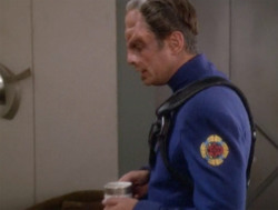
The Doctor -ST Beyond --- Random #1
- Can't go wrong with Captain Pike (in my eyes, anyway)! I notice that in Random #1, Deanna Troi seems to be suffering from some sort of allergic reaction in the fourth pic along - the poor love is swelling up something chronicCaptain Pike TNG --- Random #1

Agreed. There can always be more Pike! Even if one is not a fan of Discovery, having more Pike is greatCan't go wrong with Captain Pike (in my eyes, anyway)!
So, I don't generally do this, but I am curious as to what the elements are that make up the New Sydney Police one and what inspired the Children of the Son one.First Updates of July
Bank of Bolias --- Logo's #3
Children of the Son --- Logo's #3
Tigan Mining --- Logo's #3
New Sydney Police --- Logo's #3
TOTAL IMAGES
1877
Wow, I didn't even remember those logos. Good eyes.Both like every logo in the logo #3 section are all exact replicas of logos that appeared on screen.
The new sydney police has been spruced up a little and the children of the son , I just added a metal effect.
Screencaps of the images from the show
No problemThanks Terran Imperial
cool!Thanks Terran Imperial
Tonights additions
UFP --- Logo's #2
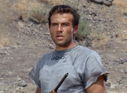
Harry Kim --- Retro Trek #2
I meant the logo from Discovery.Not sure which logo of the 2250s you mean ...
But my most recent logo is a version from the 2250s as seen in the new discovery series.
The star trek "into Darkness" 2250s logo has 3 stars but is basically a reuse of the ds9 24th century logo
What is the inspiration for the side spikes?Marine Corps --- Logo's #2
We use essential cookies to make this site work, and optional cookies to enhance your experience.
