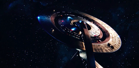
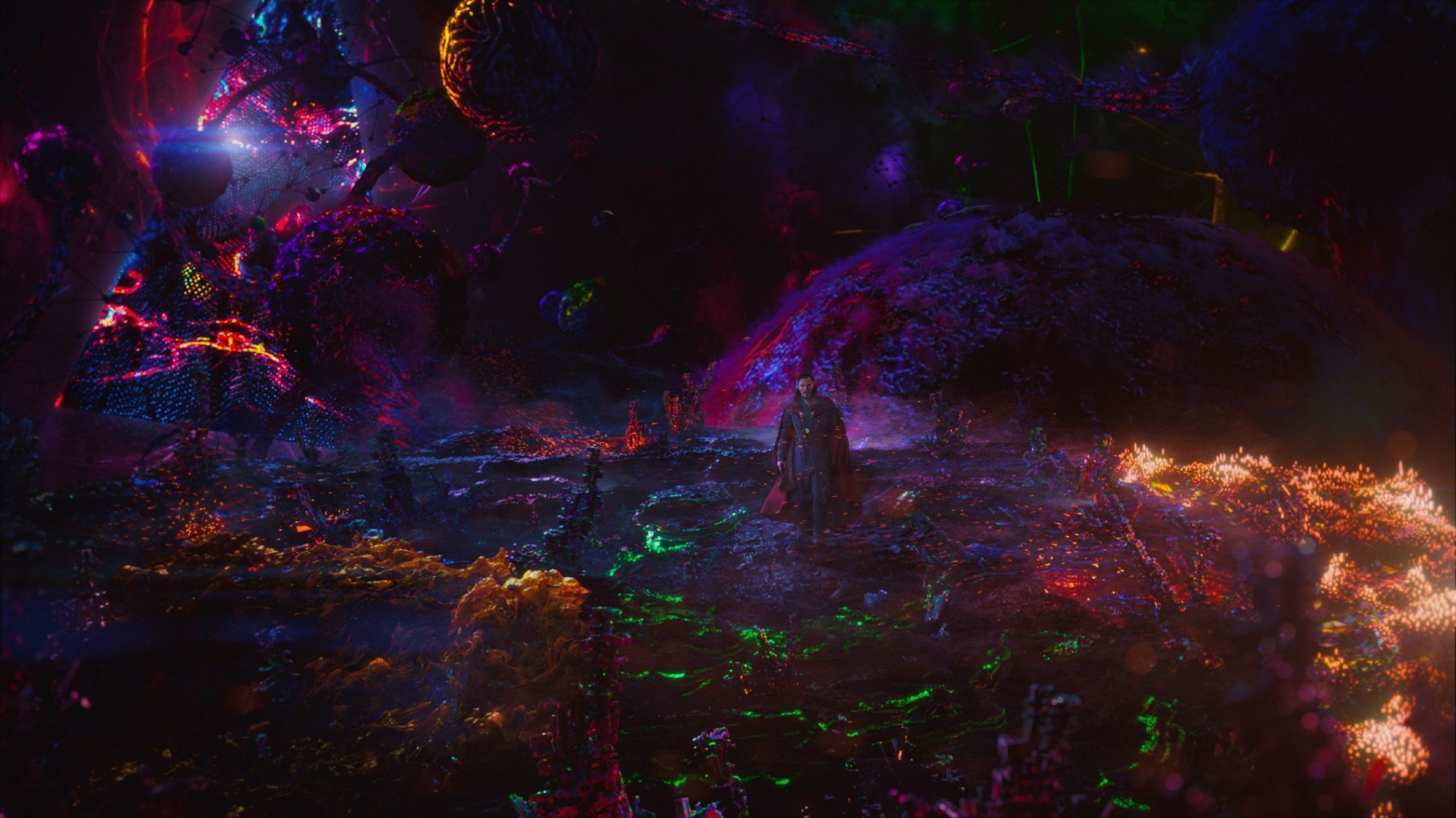
i find that they throw discovery into some loud, colorful nebula a little too often. sort of detracts from a design that is growing on me.There's been a couple of nice beauty shots (nowhere near enough though), this one is my favourite
-
Welcome! The TrekBBS is the number one place to chat about Star Trek with like-minded fans.
If you are not already a member then please register an account and join in the discussion!
You are using an out of date browser. It may not display this or other websites correctly.
You should upgrade or use an alternative browser.
You should upgrade or use an alternative browser.
Discovery ship design
- Thread starter Apollo7
- Start date
I mocked up what I personally think of as an "improvement" on the Discovery design. Take it or leave it but I decided to "fix" what I didn't like about the ship, namely the nacelles not being raised, the blue collectors and a flat secondary hull.
Discovery Heavy Cruiser by barraganap on Sketchfab
Discovery Heavy Cruiser by barraganap on Sketchfab
I mocked up what I personally think of as an "improvement" on the Discovery design. Take it or leave it but I decided to "fix" what I didn't like about the ship, namely the nacelles not being raised, the blue collectors and a flat secondary hull.
Discovery Heavy Cruiser by barraganap on Sketchfab
I love that ventral fin, it's a brilliant addition! And I agree the nacelles need that slight bump up. But keep the nacelles long. It's a distinguishing feature of the Discovery that I initially hated, but now love.
Also, has anyone else noticed the running lights on these Starfleet ships are the wrong colors? They're not using the traditional red/green, port/starboard coloration that has been consistent since the very first Federation starship.
Thank you
")
And yes, I've noticed the error in running lights. They should be green on port side, red on starboard side and white on the centerline (per nautical naval standards, and I should know since I'm in the US Navy lol).
That fin is a really cool addition.
Thank you
And yes, I've noticed the error in running lights. They should be green on port side, red on starboard side and white on the centerline (per nautical naval standards, and I should know since I'm in the US Navy lol).
Indeed! If anything, I believe they're using flashing red lights on the centerline!
This also may be evidence that the series launches in a parallel universe. Or, it could be clueless art direction.
Indeed! If anything, I believe they're using flashing red lights on the centerline!
This also may be evidence that the series launches in a parallel universe. Or, it could be clueless art direction.
Bad/clueless/ignorant art direction. 100%
This is just an example of someone not bothering to use Google or simply not knowing that such a thing as standardized running lights exists.
I was looking at those first reveal images again, and it's interesting to note that the space between the outer ring and the inner section where the bridge is was solid originally, not open like it is now. That first impression didn't leave much of an impression, though the ship now can be quite striking given the right angle. The view directly behind the ship still looks a little too Klingon to me -- at least what we used to think of as Klingon.
There's a lot to like about the Discovery. I was a fan of the McQuarrie-esque design from the start, I like the flat/wide look. I'm not the biggest fan of the concentric-ring saucer or the spinning, but I can buy it as some kind of gimmick that's necessary for the spore drive to work correctly. The nacelles to me are slightly too long, I think cutting them down by maybe 25% would actually improve the overall look. But, on the whole, very pretty ship.
There's a lot to like about the Discovery. I was a fan of the McQuarrie-esque design from the start, I like the flat/wide look. I'm not the biggest fan of the concentric-ring saucer or the spinning, but I can buy it as some kind of gimmick that's necessary for the spore drive to work correctly. The nacelles to me are slightly too long, I think cutting them down by maybe 25% would actually improve the overall look. But, on the whole, very pretty ship.
Agreed about the spinning saucer. A gimmick like Voyagers flappy nacelles. They can explain it all they want, but it still seems pointless to the actual operation.
I have always loved the McQuarrie concept art too.
Discovery concept is good, I just don't the nacelles and the hump connecting the bridge and the engine section
When I saw the original promo for the DSC ship design, I was unimpressed. However, now seeing it in 8 episodes and liking the spinning saucer section, I think the Discovery is a very cool looking ship. Anyone else feel the same way?
My opinion of it really hasn't changed. It looks like a rushed kitbash made for Wolf 359, sticking together two parts that have no relation to the other. It's like a stealth plane that got a really large UFO hood ornament. It looks better than the Intrepid class and more federation than the Defiant, but I'd have preferred any of the new Discovery Federation ships to it.
Maybe they'll run into a mirror Constitution, have to abandon ship and end up with... Okay, that's beyond hopeful.
Didn't realize until I saw this that two parts of the saucer spin in opposite directions.you seriously haven't at least seen the gifs floating around?
...Plus, the bottom of each ring spins in a direction opposite to the top.
One really wonders about those boxes on the spinners. Why install these features that make it much more difficult to pass the spinner through the hole in the neck? Why do the inner ring ones have rails? What are these for?
(Where do the torpedoes come from? The most recent episode would suggest saucer, both top and bottom. Does this mean that when preparing for a mushroom jump, the ship will have aiming problems comparable to those faced by classic Cylons?)
Timo Saloniemi
It would also appear that the phaser emitters are on the inner spinning portion of the saucer, so those are useless immediately before and after a jump as well.
Of note, during Episode 8 when the USS Discovery comes to the aid of the USS Gagarin, the inner ring of the saucer is not spinning when she jumps in. Perhaps this is something that can be adjusted depending on the situation or maybe the production staff realized that they'd made a mistake on the inner ring spinning deal...
Of note, during Episode 8 when the USS Discovery comes to the aid of the USS Gagarin, the inner ring of the saucer is not spinning when she jumps in. Perhaps this is something that can be adjusted depending on the situation or maybe the production staff realized that they'd made a mistake on the inner ring spinning deal...
You know what the space shots remind me of now? The Dark Dimension from Doctor Strange.Sadly that's pretty much the only nice beauty shot in 8 episodes so far.
These two are ok I suppose...


Nope, the phasers don't spin. They are just outboard of the seam of the spinner, nicely enough. And glowing red so that this can be verified, although I don't know what's up with that when, say, the hand phasers don't glow.
No idea whether the boxes are supposed to be the torp launchers. Could be the launchers, too, are on the outer wall of the inner ring. All kinds of holes there, most of them glowing and probably portraying portholes.
Timo Saloniemi
No idea whether the boxes are supposed to be the torp launchers. Could be the launchers, too, are on the outer wall of the inner ring. All kinds of holes there, most of them glowing and probably portraying portholes.
Timo Saloniemi
I hate the design personally.
I had no idea the nacelles were that long (beauty shot) and I've seen every ep. It's so dark in space (now) it's hard to see the ship. Probably more realistic than the bright white Enterprise, though the big E looked a lot prettier, being, well, visible. (And the Enterprise!)
I like the design, I think the long nacelles lend themselves to the effect of the spore drive, I think shorter, fatter ones wouldn't look as elegant during a spore jump. It gives the ship a bit of a movie feel too. The spinning saucer is in some ways very cool and in other ways just tacky. From different angles it's either beautiful or a bit clunky but it does feel like something from an earlier era to me from the front.
Similar threads
- Replies
- 35
- Views
- 15K
- Replies
- 482
- Views
- 60K
If you are not already a member then please register an account and join in the discussion!