Smooth is not in and of itself the issue. Its the lack of detail, combined with the easily dated 60's styling and its rather primitive hallmarks. It was the first ship designed, the design was refined and such after so its always gonna look the most primitive, because linage wise it is.
The ship you show here, is not old looking, it has some of those retro styling SW is known for, but its not easily marked by era. I would not be opposed to a TOS ship redesign that was sleek in this manner, although that would make anything post TOS no longer fit.
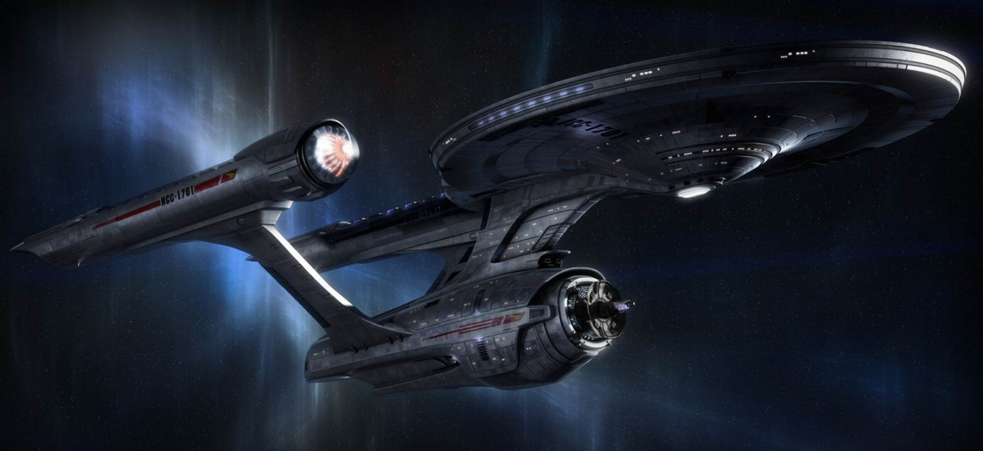
Personally, I would rather a TOS Connie look more like this
Its a bit dark, and I would lighten it more personally, but its a good mix and closer to what comes later.
")

")

 :rolleyes:")