Re-imagined Connie (2240's Kelvin/Prime)

Discussion in 'Fan Art' started by Fandango831, Aug 30, 2016.

  1. Fandango831

    Fandango831 Commander Red Shirt

    Joined:
    Aug 28, 2016
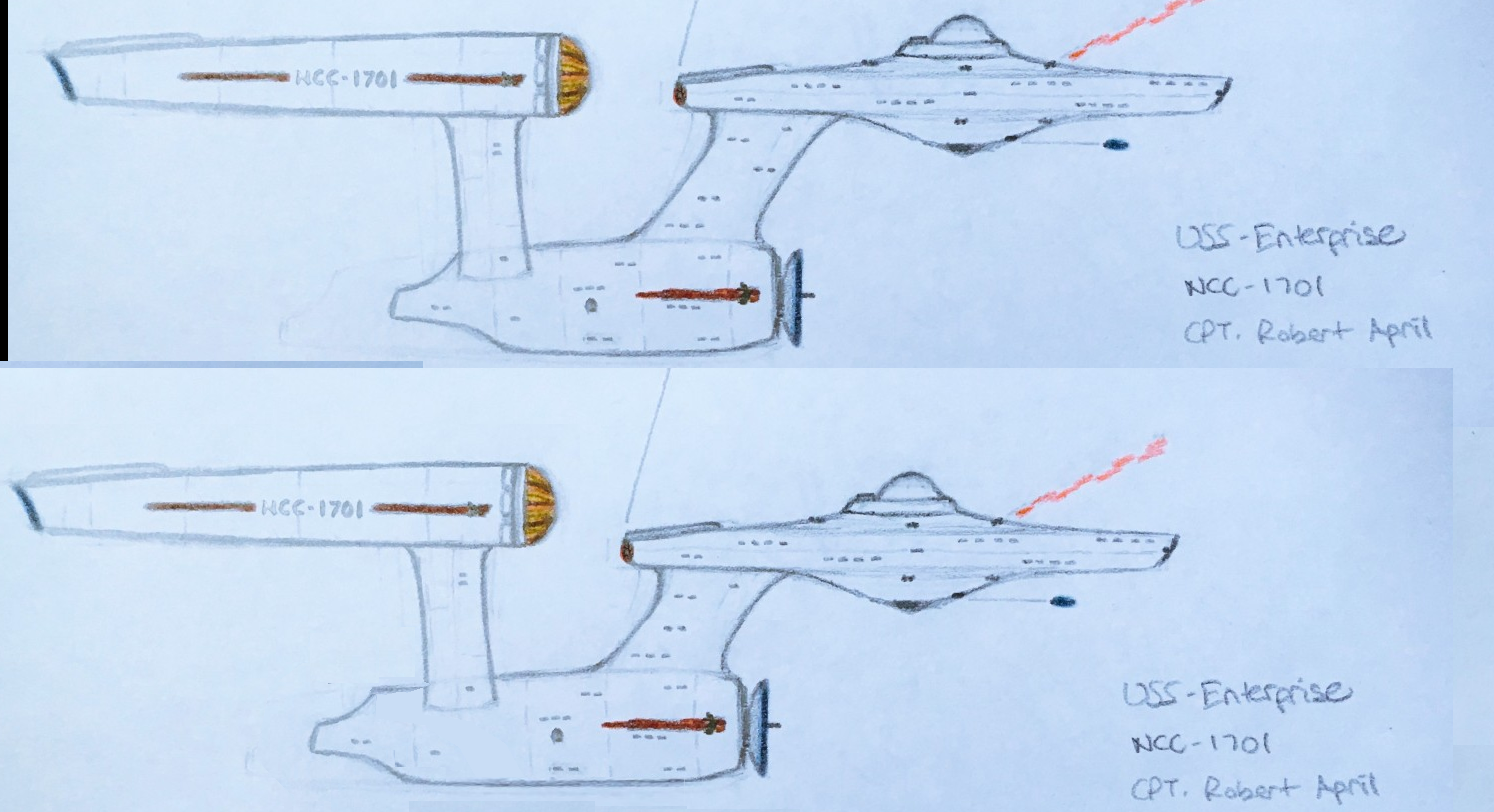
    Posted it up on a Discovery thread earlier. I had some down time and decided to draw a Connie that could be a modern take on the ship if we were to see it again in Discovery. I kept some of the Pilot era ship elements and blended them with looks from the Kelvin along with changes that I personally felt made sense tech wise for the time period. I feel she looks older thanks to the Kelvin influences but still embodies a sleeker, smarter, and faster ship that we'd expect to see in Starfleet come the 2240/50's.
    [​IMG]

    Would love to hear what you all think of it. I plan on fleshing it out some more and maybe working on a formal 3D model in Blender.
     
    OpenMaw likes this.
  2. Ar-Pharazon

    Ar-Pharazon Admiral Premium Member

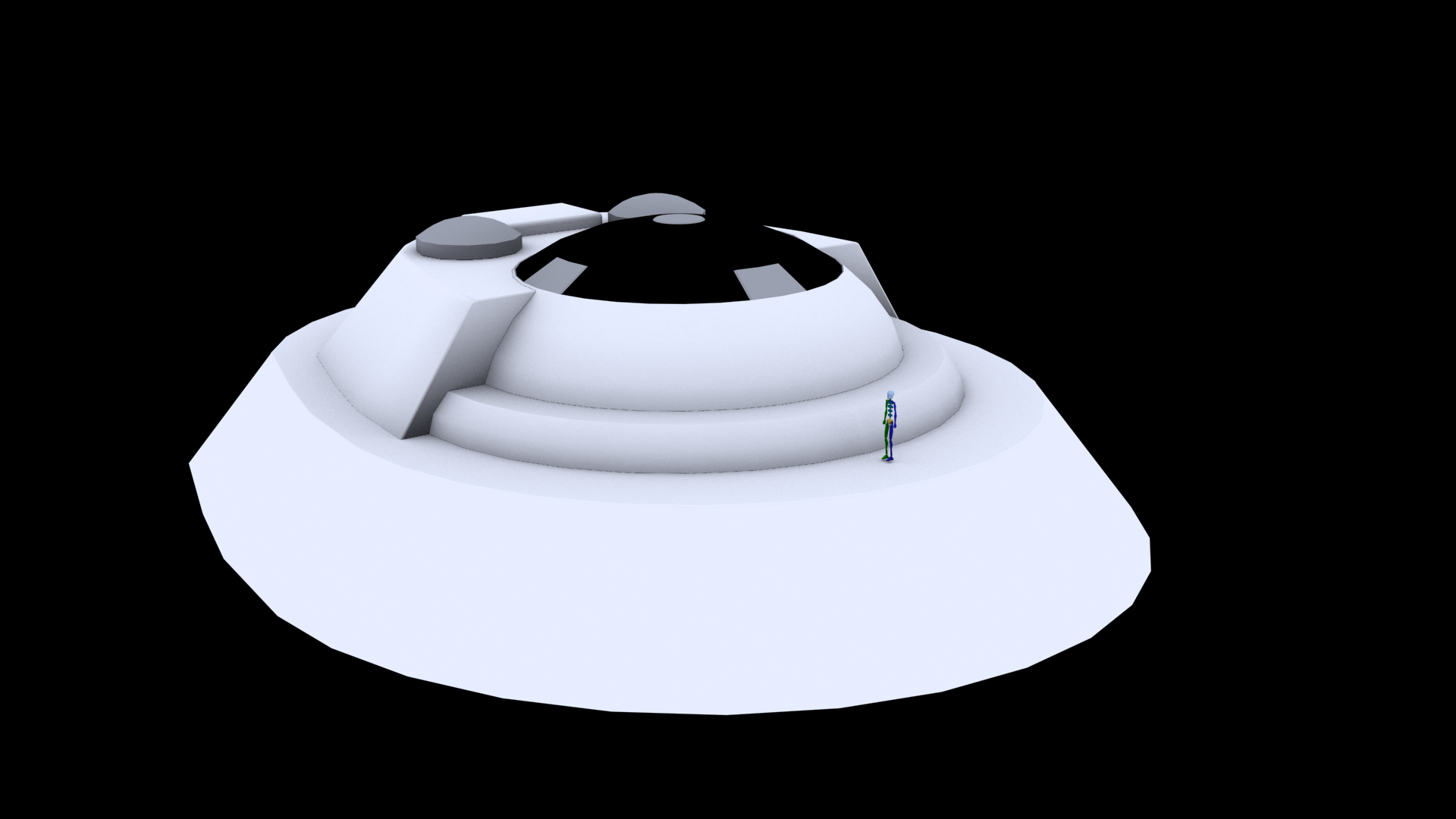
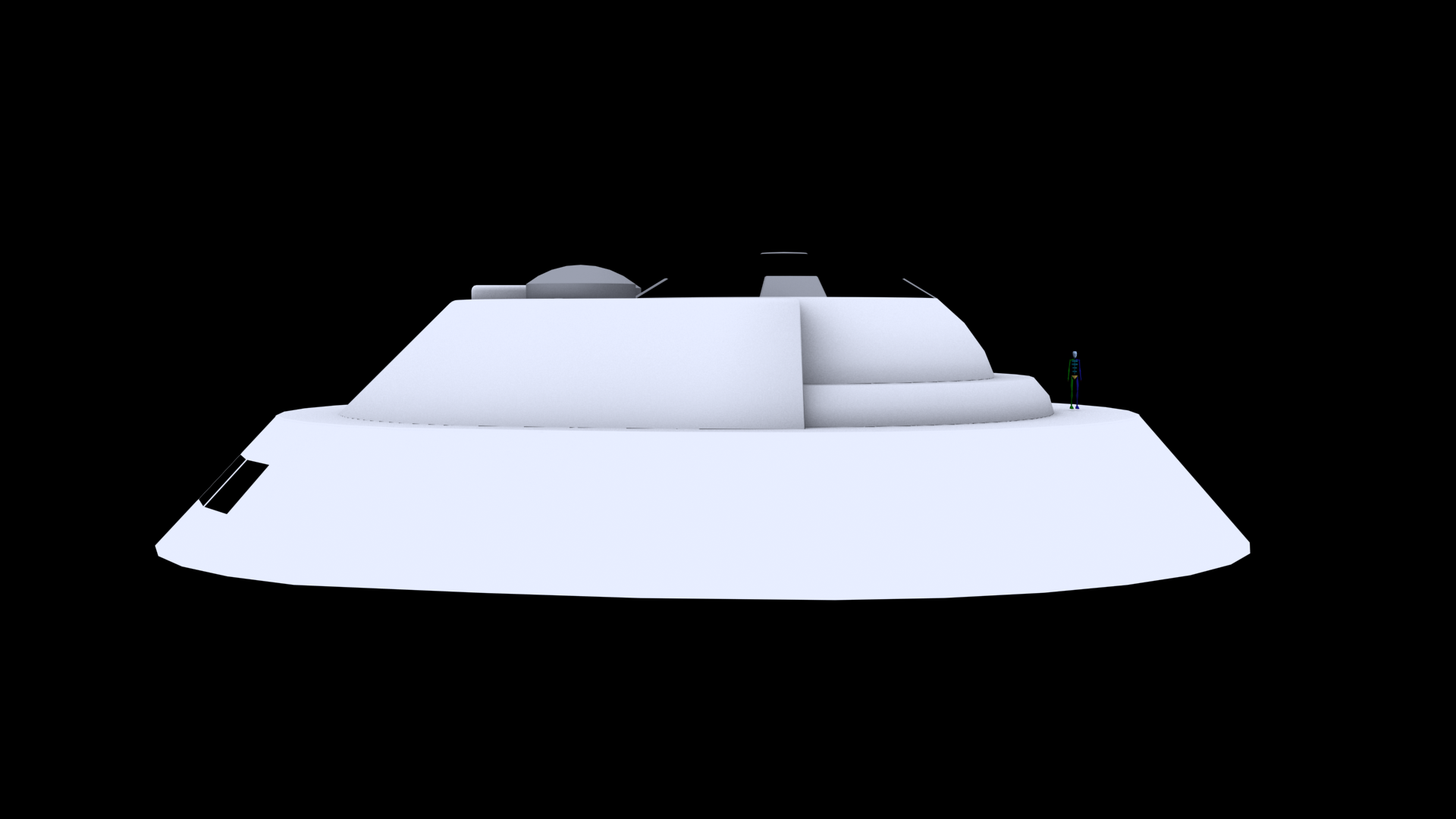
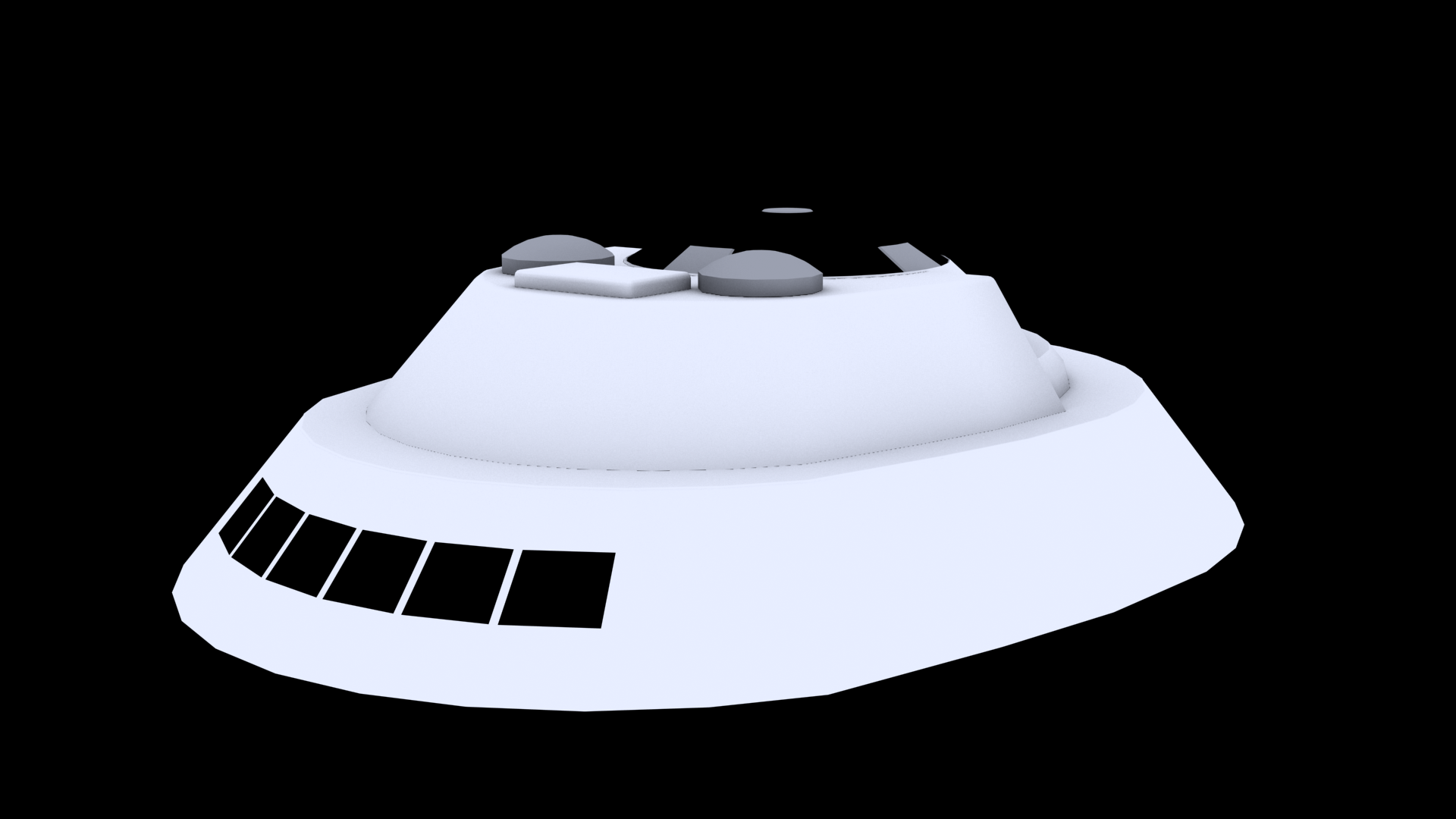
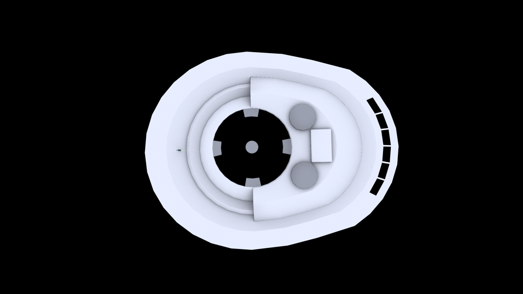
    Joined:
    May 19, 2005
    Location:
    Far North Chicago Suburbs
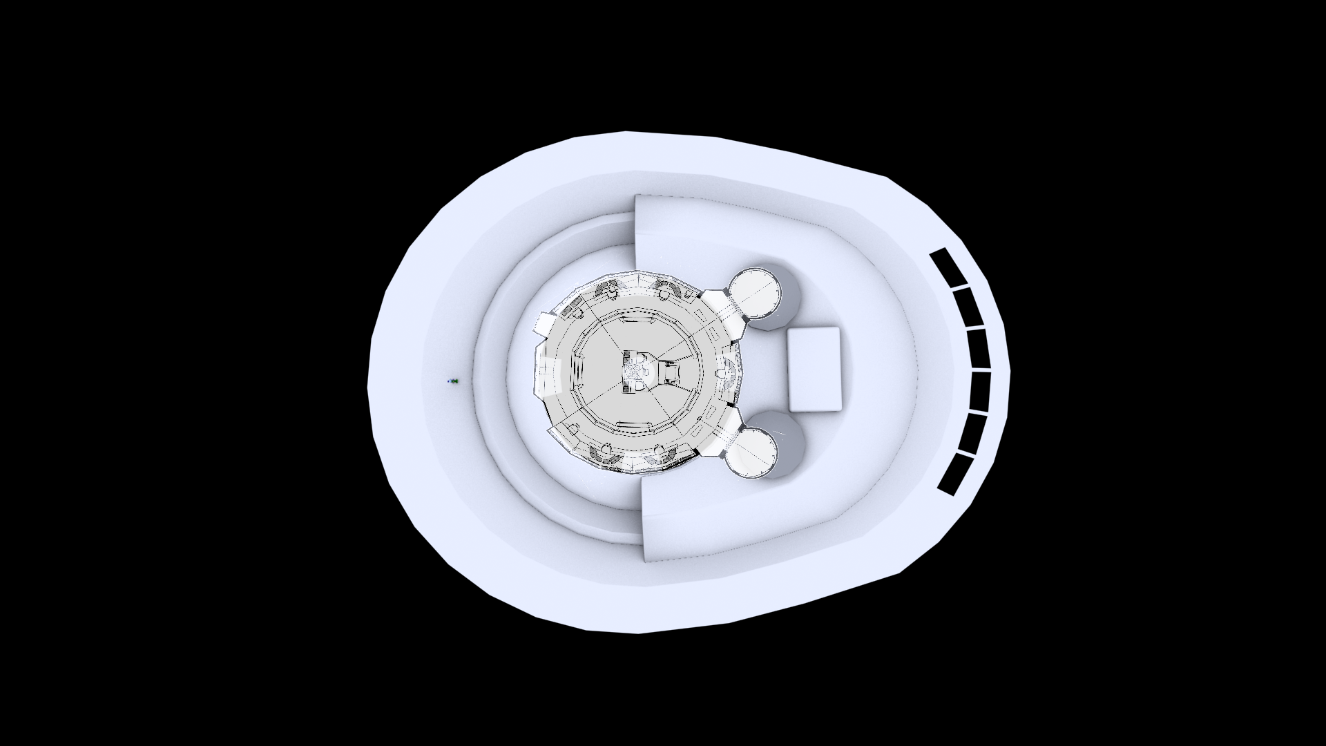
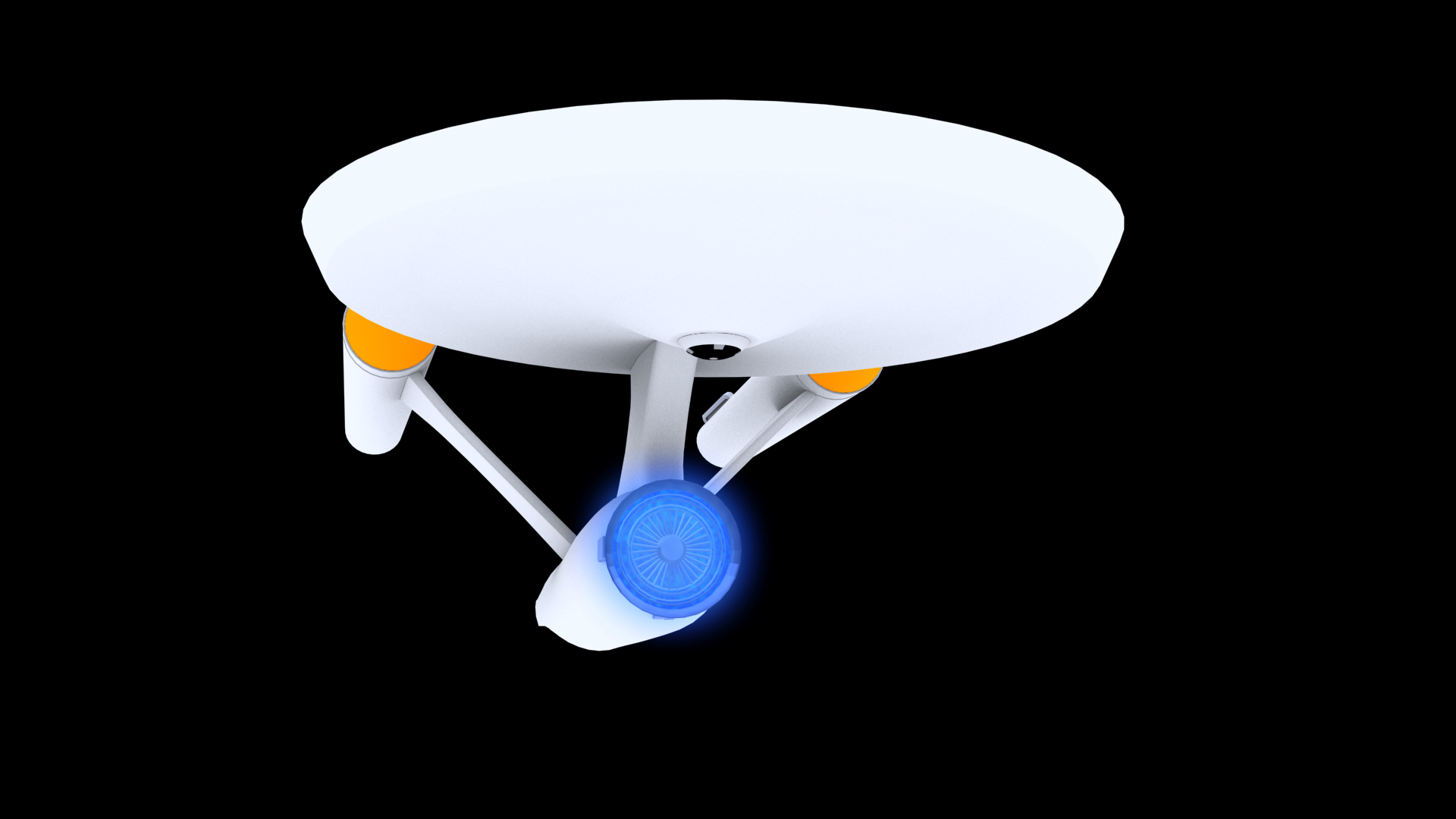
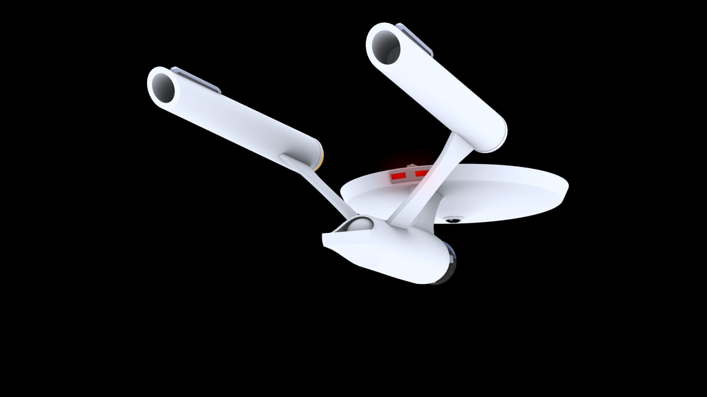
    It looks proportionately short and a little tall, but beautiful work.

    You've got the right idea.
     
    OpenMaw likes this.
  3. Fandango831

    Fandango831 Commander Red Shirt

    Joined:
    Aug 28, 2016
    Thank you very much! Yeah the lens on my camera distorted it a tad. I appreciate the comment.
     
    OpenMaw likes this.
  4. OpenMaw

    OpenMaw Fleet Captain Fleet Captain

    Joined:
    May 26, 2013
    Location:
    Everett, Washington
    That's pretty dang cool. I like your ideas there! This would be a pretty awesome Enterprise.

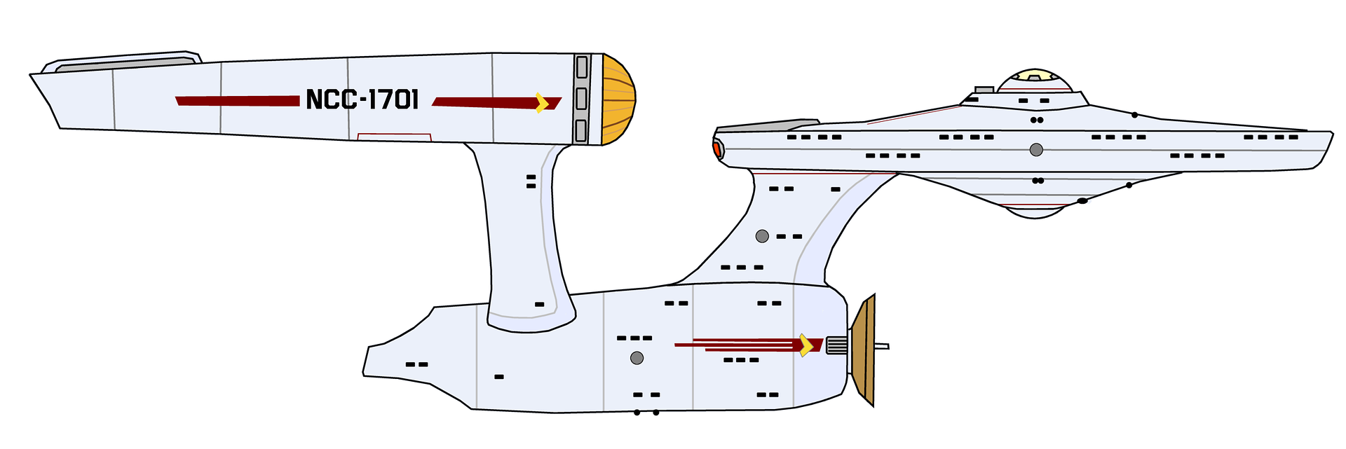
    I took your sketch and tweaked it slightly. Here's a comparison:
    [​IMG]

    Did this in about an hour to show:
    [​IMG]

    Chief change was shortening the neck and pylons. I also drew the hull back farther.

    Although I admit I rather like the idea of putting the engines all the way back on the secondary hull, like they did with the Beyond E, it definitely gives you that speed feel, it's all in how you mount them. Where they're mounted on the TOS E configuration doesn't really allow for that as all of that dangerous equipment would then be routing right through the shuttle bay.

    The Dish is more of a placeholder there. For my money i'd want to have a dark copper dish with milar accents, and then you'd have glowing radial tubes, like an oven almost, except blue, or something that would light the thing up.

    Coloring wise I threw on some of that Probert "blue accents" for the neck and pylons. I always liked that on the TMP-E, and it gives it a little more business. If I were going to do a real guess at a "realistic" color pass on this i'd go for a main base color similar to the 1950s jet planes. Like a Lockheed Starfighter[SIZE=4]. Silvery,[/SIZE] and then accent that with the TMP style pearlescence. Also I put on some racing stripe stuff here and there. I'd really love to take a crack at modeling this now...
     
    Last edited: Sep 8, 2016
    saddestmoon and rRico like this.
  5. Fandango831

    Fandango831 Commander Red Shirt

    Joined:
    Aug 28, 2016
    OpenMaw that is phenomenal, and I fully agree with the changes you made. Really bringing it to life with the improved proportions, better strut placement on the stardrive section, and added hull details. I kind of agree with the deflector dish idea in terms of a copper body, but I feel the front should still be very much along the lines of the Kelvin just in terms of how the tech would develop from the 2230's blue dish to the blue integrated dish of the 2270's. Otherwise the changes are fantastic, and i'm honored you took time out of your day to make just a simple idea grow even further. Two-Billion thumbs way up.
     
    OpenMaw likes this.
  6. OpenMaw

    OpenMaw Fleet Captain Fleet Captain

    Joined:
    May 26, 2013
    Location:
    Everett, Washington

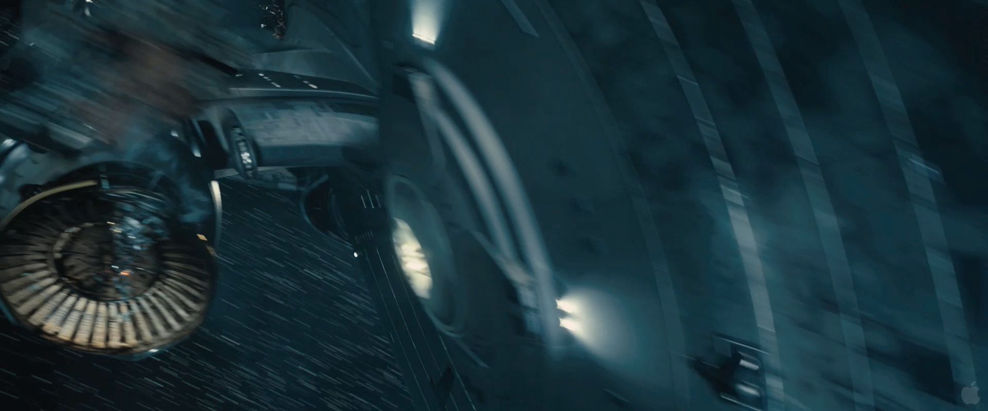
    Some shots and variations. Very rough idea. I used a classic style dish in terms of shape, but something similar could be done with the Kelvin-esque dish too.

    (Into Darkness dish in powered down state for ref)
    [​IMG]

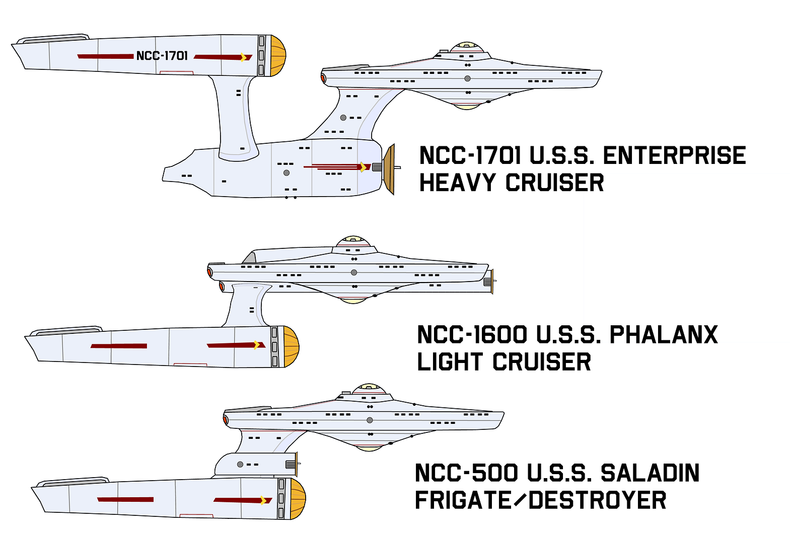
    Conceptual ideas of 'bash variations for the Federation fleet.
    [​IMG]

    Unrelated to the ship, but I couldn't help myself; Captain April played by Paul McGann.
    [​IMG]
     
    Last edited: Sep 8, 2016
  7. Fandango831

    Fandango831 Commander Red Shirt

    Joined:
    Aug 28, 2016
    I see what you mean with the glowing grills. I love the look at the 0:15 mark. Really revitalizes the original dish, and would also be a welcome addition to the Kelvin style dish. All in all I feel the vision and design is appropriate as a TOS era re-imagining. Paul would be a neat choice as April, he could definitely portray the experienced space veteran persona of April. Hopefully if Discovery does decide to do era cameos they'll follow this line of thinking over a complete overhaul of what existed before.
     
    OpenMaw likes this.
  8. Fandango831

    Fandango831 Commander Red Shirt

    Joined:
    Aug 28, 2016
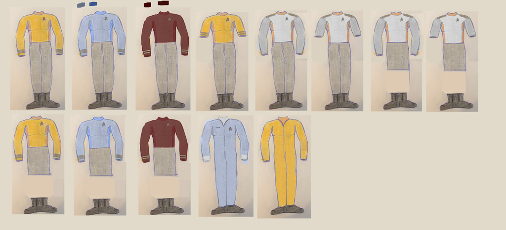
    Since I took the time to draw the re-imagined April Era Enterprise/Connie I figured why not do a uniform to boot. Again, please feel free to give any and all input. I stuck with the high collar with respect to the turtle neck of the pilot while keeping it a solid tunic that instead uses two tones to emphasize the parts of the top. I went with Gold for the rank braids and metal Starfleet badge as to me gold has a more antiquated look over a more brilliant silver (less high speed). The pants and boots have a more ST:B profile that looks more ergonomic and duty comfortable while keeping to the pilot era color scheme of gray on black. For the division colors I enjoyed and preferred the distinctiveness of the Gold, Red, and Blue of TOS but chose darker color variations such as a Wine/Burgundy, Navy Blue, and Goldenrod to give a more utilitarian vibe whilst maintaining the more distinct difference between the divisions. Also on a side note the Starfleet badge is the same as the ST:Discovery delta which is solid with the right hand break since I didn't see a reason to put the Div. symbols on the badge making it more of a universal emblem. I have other details in my head as to why I chose to make certain design choices but I'd rather hear everyone else's input and make a fun discussion of it all. Cheers!
    [​IMG]
     
    OpenMaw likes this.
  9. starburst

    starburst Fleet Captain Fleet Captain

    Joined:
    Mar 8, 2007
    I like it, pretty good mash of styles presented by both The Cage/TOS and Beyond for both the Enterprise and the uniform.
     
    OpenMaw likes this.
  10. OpenMaw

    OpenMaw Fleet Captain Fleet Captain

    Joined:
    May 26, 2013
    Location:
    Everett, Washington
    Really nice, actually. As Starbust said, It mixes the strengths of Cage, TOS, and Beyond.

    Some ideas
    [​IMG]

    Upper left are the standard duty uniforms. Next is a short sleeve variant that officers can wear, this would also come with department colors. Then we have variants for Flag officers/Admirals/Fleet Captains. Both long and short sleeve and pants and skirts. Longer skirts, similar to Uhura's skirt in TWOK-TUC. I was thinking of moving the delta to their belt buckle, and havingt he pants be white with gold stripes.

    Lower left are the duty uniforms with skirts. Again, you could match short sleeve with that.

    Next is the medical jumper that the doctor's sometimes might wear in place of a duty uniform. Features a pocket for hypos and other small equipment. One thing that's not immediately apparent is the white under-shirt. I should have emphasized that a little better, particularly around the wrists...)

    The last one is a completely bare jumper in duty gold. Those would likely be worn by petty officers and non-coms in engineering.

    The away team jackets were really good in The Cage. I'd also have "proper" surgical outfits for the medical staff. Maybe some hats for starfleet brass. (Pike actually had a hat in his cabin in The Cage.)
     
    Last edited: Sep 8, 2016
  11. Fandango831

    Fandango831 Commander Red Shirt

    Joined:
    Aug 28, 2016
    Love the duty uniforms but I feel the short sleeve look isn't quite utilitarian enough for era and is a radical departure from what makes sense as a transitional uniform from the 2230's into the 2260's. The flag uniforms are gorgeous again minus the short sleeve variant. I fully agree with full length skirts. Just has an appropriate conservative feel that suits a uniform. Probably with give the ladies a higher height boot just to better accent the calf and close the gap of exposed skin. I absolutely dig the jumpers and are appropriate for working in environments such as medical and engineering. I'll probably take our work and start working on a formal pattern. I have a nice sewing machine here at home and want to put it to use. Time to get to work! I'll post up progress pics as they come along.
     
    OpenMaw likes this.
  12. OpenMaw

    OpenMaw Fleet Captain Fleet Captain

    Joined:
    May 26, 2013
    Location:
    Everett, Washington
    I was fiddling with some ideas for the A/B deck.
    [​IMG]
    [​IMG]
    [​IMG]
    Double turbo shafts ala TMP. The greebly in between the two might be a disaster pod for the command crew, or some kind of a deployable distress beacon.

    [​IMG]
    [​IMG]
    Roughly how the bridge should fit inside the module.
     
  13. Bry_Sinclair

    Bry_Sinclair Vice Admiral Admiral

    Joined:
    Sep 28, 2009
    Location:
    Scotland
    Looks far better than the JJprise.
     
    OpenMaw likes this.
  14. Fandango831

    Fandango831 Commander Red Shirt

    Joined:
    Aug 28, 2016
    Love the look it, I like how the dome is like the Discovery's, makes a good time relationship in terms of vessel design. I also really like the layout of the module and twin turboshafts. I'm not too particular of the rear observation deck, feels too TMP less 2240's/Pilot. Otherwise looking grand. Started to work on the uniforms. Bought material for the tunics and pants as well as gold braiding for the cuffs. Just gotta work on the badge and find appropriate boots. Also started a sketch of the re-imagined bridge that i'll post up later tonight. Loving the work OpenMaw, and honored to be sharing in this with a talent such as yourself.
     
    OpenMaw likes this.
  15. Fandango831

    Fandango831 Commander Red Shirt

    Joined:
    Aug 28, 2016
    Here's the bridge sketch I planned to upload. The layout is pretty much the same as the TOS/Pilot Enterprise except with the addition of the twin turboshafts and a much larger viewscreen (Yes it's not a window). Other than the addition of modern panels and controls to the layout and some reshaping of the furniture all is meant to stay fairly close to the original bridge. The chairs are now all mounted to the deck and utility lights/comm pieces can be found on each station including the command chair. The color of the bridge would be mostly grays and blacks accented by a darker burgundy red to give a splash of color while still feeling more utilitarian in design. As for the panels the lighting would be reminiscent of the Kelvin bridge which looks similar to modern displays in tankers/naval ships today.
    [​IMG]
     
    OpenMaw likes this.
  16. OpenMaw

    OpenMaw Fleet Captain Fleet Captain

    Joined:
    May 26, 2013
    Location:
    Everett, Washington
    Exactly! Well, assuming that part of the design survives the revisions Discovery is undergoing behind the scenes. :D

    It's a bit of a retcon that overrides everything up to TMP, I can't really see them going back and forth. It just makes more sense to have at least two main ways off the bridge in case of a catastrophic emergency, though.

    I shall remove it! :) I always assumed the stern of B deck was where the briefing room was in The Cage/WNMHGB anyway.
    That'll be really really awesome to see! :)

    Ah and I am honored as well. It's... fascinating, to coin a phrase, to bounce ideas like this back and forth.

    That looks really really nice. The goosenecks were always a love it or hate it piece of the pilot bridge, and there is wiggle room with the pre-cage bridge to have a variation on that. Having it be less identifiable as a piece of 1960s handmedowns is a good choice. I love the view screen! that looks really good. Also the helm and navigation console looks much better. There seems to be a little more there in terms of actual function. Which, I hate to admit, both Pilot I and Pilot II Helm/Nav stations are lacking in controls.


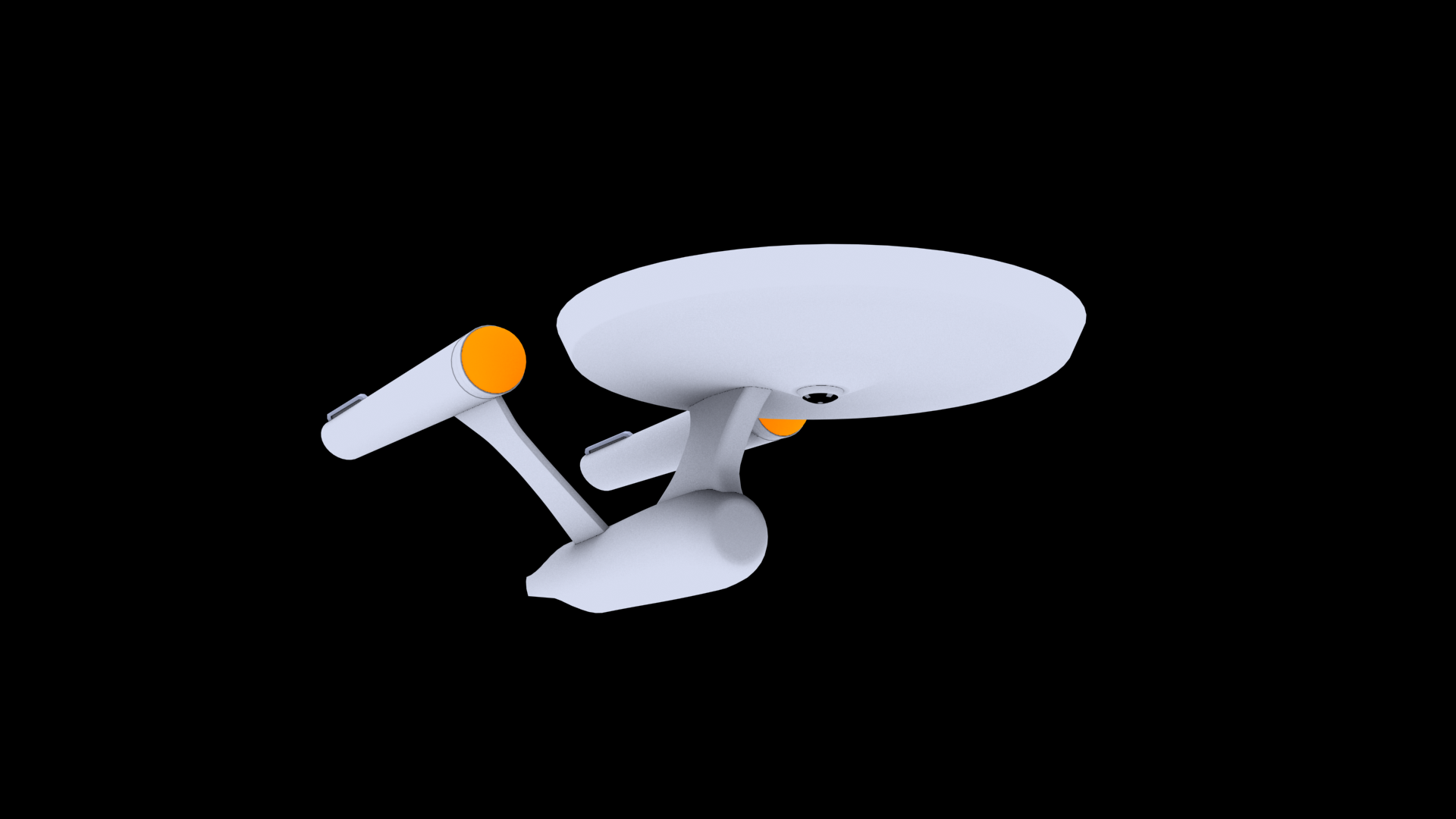
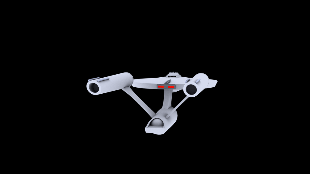
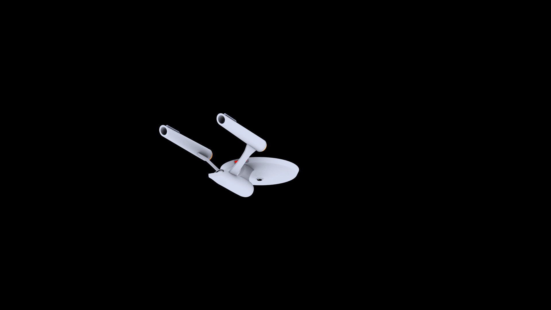
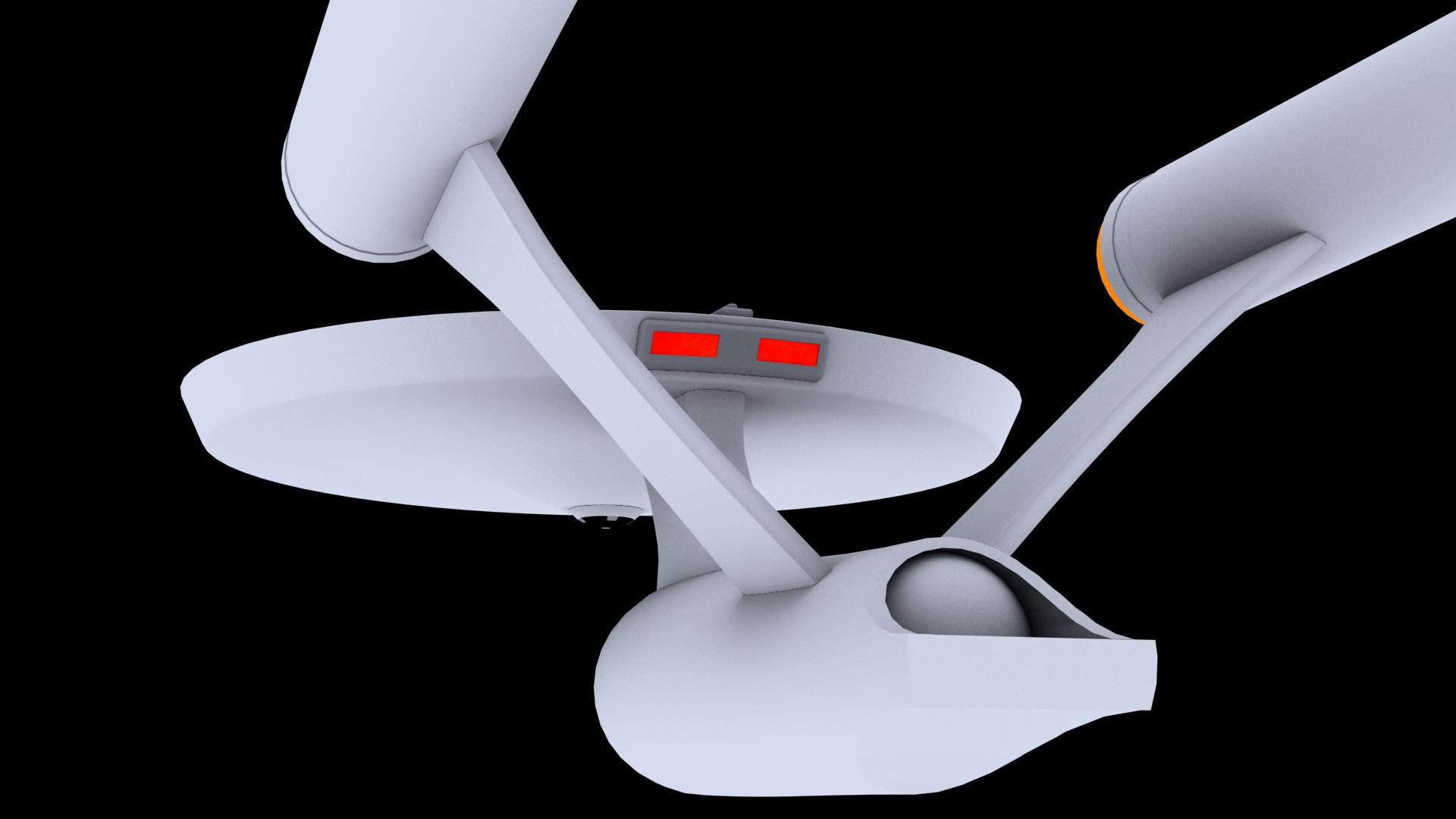
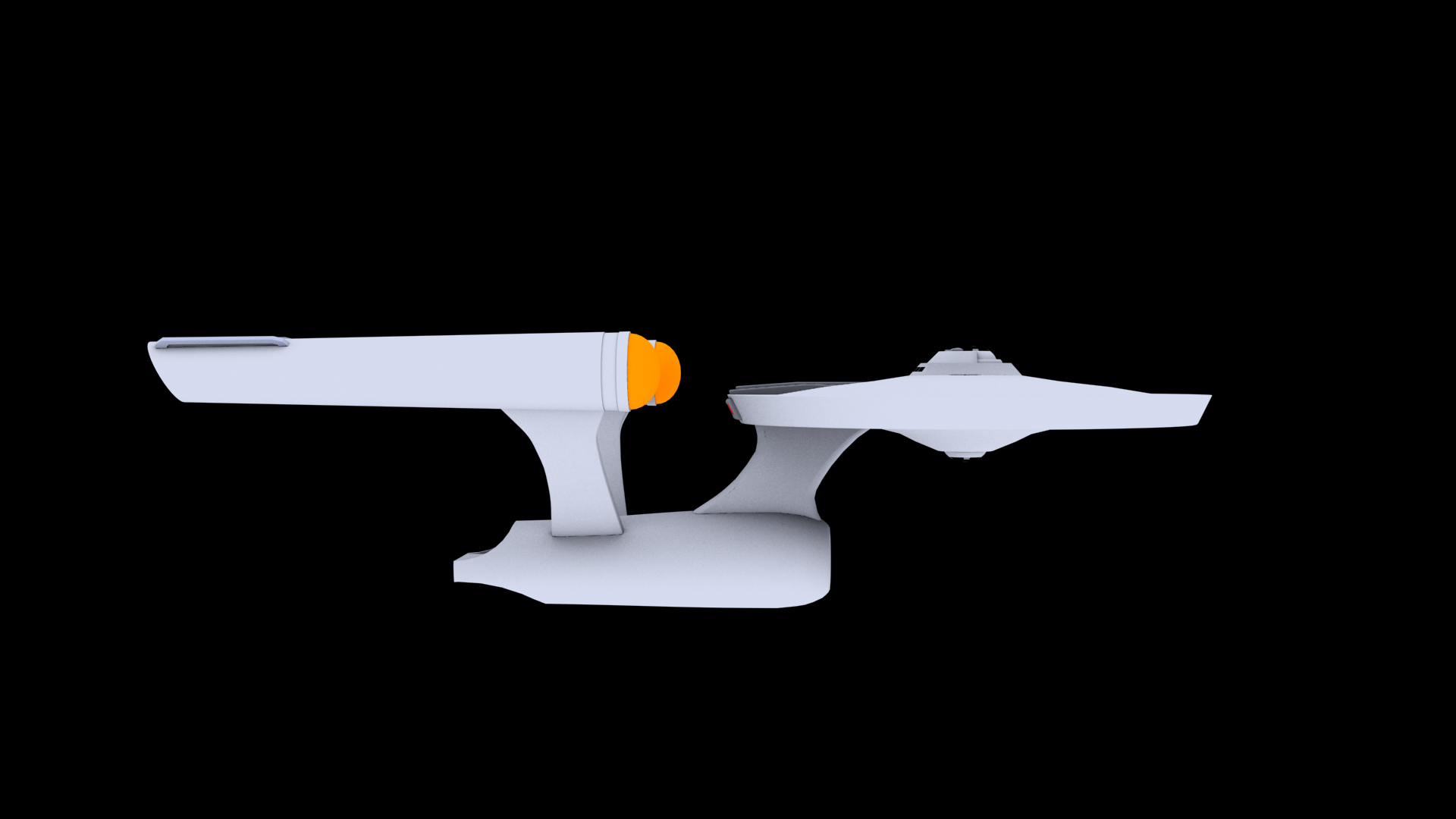
    So I did a little more work on the Enterprise herself...

    [​IMG]
    [​IMG]
    [​IMG]
    [​IMG]
    [​IMG]
    [​IMG]
    [​IMG]
    [​IMG]

    Things to be changed/done/worked on/etc
    : B deck. The lower sensor dome is just the bridge dome flipped down. Detail in the aft end of the nacelles. Tweaking the dish. I'm rather happy with the final glow I got, it's nice and alive, but the structure of the dish is somewhat chaotic. She still needs lights, windows, docking ports, weapons, hull texturing, all the decals... Something should be added to the inboard side of the nacelles I think.


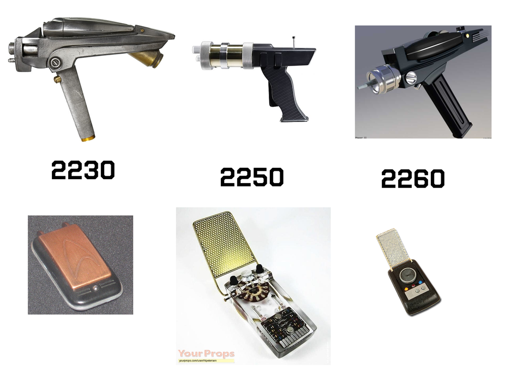
    One last thing, since you are actually making the uniform itself, just something to ponder:

    [​IMG]
    The communicators and hand phasers of each era. I have to admit I love the Kelvin communicator. Not a big fan of the Kelvin hand phaser, but their communicator was actually cooler than the main "hero" version used on The Enterprise.

    I saw a video and some images of a really cool hand phaser that had been done as a concept for Star Trek Into Darkness. It was essentially a "real" looking phaser 2. Like if the TOS Phaser had been constructed by Glock.


    Just throwing around some ideas...!
     
    Last edited: Sep 6, 2016
    Fandango831 and Blip like this.
  17. Fandango831

    Fandango831 Commander Red Shirt

    Joined:
    Aug 28, 2016
    First of all thank you for the kind words on the bridge design i tossed together. Really meant to bring that 1960's design into the modern age without just throwing away good design elements.

    Secondly the WIP April Enterprise looks phemonenal!!! I love the glow of the dish as it radiates and how she's shaping up. I'm thoroughly excited to see how she comes along with time. Puts a massive smile on my face thinking about what started on paper as a simple concept is now a fully fledged render. Again my hat off to you OpenMaw, a true artist.

    Looking at ordering the boots today, and i'll start ground work on the tunic. Also gotta spin the lathe up to work on the badge! Also funny enough I was looking at phasers and communicators yesterday :D I'm currently bouncing around ideas on design but I figure right now they'll look more Kelvin/TOS than original Pilot. Once I make a happy concept i'll finalize and post it up. If I have more time following that i'll work on wood models of both to tag along the uniform. [updates to follow]
     
    OpenMaw likes this.
  18. Fandango831

    Fandango831 Commander Red Shirt

    Joined:
    Aug 28, 2016
    Quick idea of the boots i'm ordering for the uniform. I chose a pair similar to those imaged mainly in part to the retro look that suits the era while keeping them black and ankle high still keeps a utility look to them. They look like boots you'd catch in space but kind of hint back to the 1960's retro we'd all come to expect from a TOS like Trek.
    [​IMG]
    [​IMG]
     
    OpenMaw likes this.
  19. Captain of the USS Averof

    Captain of the USS Averof Commodore Commodore

    Joined:
    Jul 26, 2016
    Location:
    Greece
    If that's "fiddling" I'd love to see what your definition of "finished" looks like! :techman:
     
    OpenMaw likes this.
  20. Fandango831

    Fandango831 Commander Red Shirt

    Joined:
    Aug 28, 2016
    @OpenMaw Threw together my re-imagining of the phaser/communicator pair. For the communicator I stuck with the layout of the Pilot shell but made the body rounder and black with no translucency along with a gray face. I added the TOS signal piece in the center, and kept the two signal gain knobs the pilot era communicator had just streamlining them to fit better in a more modern shell. Then finally the I/O grill in the bottom reminiscent of the TOS communicator. All in all I fits the gap between the Kelvin and TOS while keeping some neat little Pilot era traits for the picky fans.

    I found the phaser to be a much harder design as in the Pilots they were technically "laser" weapons not phasers. To start I decided to keep the barrel shape of the pilot but add it to a phaser housing similar to the Kelvins. The barrel of the phaser now has a bronze power cell in it that hints towards what becomes the type 1 & 2 combo phaser mount while keeping the cell practical to the design of the barrel piece. I kept the cylindrical power setting ring on the barrel to homage the Pilot twist settings while again giving a practical reason being that the ring controls the focus of the phaser to increase or reduce power out of a more accurate emitter tip. The emitter is also bronze and harkens back to the singular TOS emitter.
    [​IMG]
    As always input, feedback, ideas, and criticisms are more than welcome :D
     
    Go-Captain and OpenMaw like this.