-
Welcome! The TrekBBS is the number one place to chat about Star Trek with like-minded fans.
If you are not already a member then please register an account and join in the discussion!
You are using an out of date browser. It may not display this or other websites correctly.
You should upgrade or use an alternative browser.
You should upgrade or use an alternative browser.
Star Trek Discovery
- Thread starter JoeZhang
- Start date
This is not about the details, it is about the basic shape. No amount of polishing will save this.
And that design was abandoned for a good reason.
In your opinion.... Other like both this design and the one from Planet Of The Gods. Don't asume that because you have an opinion, it becomes fact.
That's a weird statement. All aspects of the design of a fictional spacecraft are by definition superficial. People are just reacting to the look of the thing. Some like it, others don't. Barely anyone is saying they won't watch the show because of that first rendering.
Did you even read the post I was replying to? Those were their words.
The greatest sin in the star trek universe, is being forced to ride in an ugly ship. Khan Noonien Singh had that indignity with the Miranda class.
There are literally HUNDREDS of concept ships that look better than that monstrosity, for the sake of all that is good just and holy in this world, spare us that hideous hulk.
If they wanted a science/discovery type cruiser, they should have gone with a modified reconnaissance class
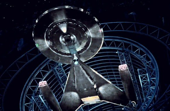
Or something like this with the pod stripped off the top would look a thousand times better:
Does NO one working at CBS care about beauty in the world anymore ?!?!??!??!??!??
The Miranda class is awesome, they're like the VW Beetle of Starfleet.
I like the title Star Trek Discovery.
Discovering new worlds and new civilizations...")
Fuller said that Janeway was his favourite captain.
Who knows, maybe the captain of the Discovery will be a woman. That would be really fantastic.
I like that saucer section of the Discovery. The drive section, between de nacelles is a bit large, I have to get used to that, but I'll wait and see what the ship will look like in the pilot.
Still really looking forward to this new series.
Discovering new worlds and new civilizations...
Fuller said that Janeway was his favourite captain.
Who knows, maybe the captain of the Discovery will be a woman. That would be really fantastic.
I like that saucer section of the Discovery. The drive section, between de nacelles is a bit large, I have to get used to that, but I'll wait and see what the ship will look like in the pilot.
Still really looking forward to this new series.
I'm still a fan of Star Trek, and other show/movies. But fandoms in general have been getting on my nerves more and more lately. Everybody's always whining and complaining and fighting amongst eachother. I'm part of a Alien/Predator forum, and I love Prometheus. You wouldn't believe how some people there treat fans of Prometheus. It's insane.
I think the internet has just made the whole world more polarized. You can see it in politics, sports, and even movies. It's getting ridiculous.
Not entitled. The trailer promised us new crew, new villains new ship. And they want us to subscribe to and look at a 40 year rejected ship that barely resembles Federstion aesthetics.
The ship was never used in Trek. It's new, as promised.
If the powers that be can approve this design for the hero ship which is also a character in its own right, then I dread to think what else they will do.
Yeah, heaven help us if they don't pick a design you like, personally.
After watching the video again this morning, I LOVE the ship design. I mean, it looks awesome.
A bit early to be drinking don't ya think?

I am dumbfounded by how bad this ship is. Heaven help me; I hadn't noticed that I'd started to hope they'd finally get something right. It's like a B-movie design they would have tossed out before deciding to go ahead with ENT. The design is not only cheese, but rusty cheese. And by that I not only mean that it looks like it's cheese that was found in vending machine on Babylon 5 (for how real I feel this is actually a massive ship in actual outer space), but for how totally devoid of anything new has to bring Star Trek, circa 2016/17. There are more realistic and original designs in the Trek Art section of this site or on Deviant Art than there are apparently at CB freaking S.
What a steampunk rejected-McQuarrie worse-than-its-own-GalaxyQuest-satire desiccated piece of shit this is.
Oh, and PS: that it takes place in the "Prime" Universe (oooooooooh) means so little seeing this latest lackluster - shitluster - contribution to it. I don't especially care about the Abramsverse, and they could have created yet another 'verse to put this in for all I care, but that they don't have the whatever to play with their own latest toy is also a little repugnant.
Last edited:
From the ship alone, I'd say it was set post-TOS pre-TNG. It has the TOS-movie era phaser emitters, the TOS-movie era deflector dish, Ambassador class style warp nacelles (rather than the spinning turbine like bussard collectors of TOS or the TMP collectors).
As for the NCC-1031, the USS Constellation had NCC-1017 and lets not forget that a lot of ships underwent a major refit (which is what the phase 2 design was going to be).
As for the NCC-1031, the USS Constellation had NCC-1017 and lets not forget that a lot of ships underwent a major refit (which is what the phase 2 design was going to be).
The ship was never used in Trek. It's new, as promised.
Because I'm an arse
[yt]
It's there on the left at 1:14.
Ambassador class style warp nacelles (rather than the spinning turbine like bussard collectors of TOS or the TMP collectors).
No such thing as bussard collectors in TOS or TMP.
As for the NCC-1031
A nod to or hint at Section 31 maybe?
No such thing as bussard collectors in TOS or TMP.
How do you figure? Canon said nothing about what we'd find out were Bussard Collectors (regardless what fans conjectured) until canon called them Bussard Collectors.
Even that piece of excrement, isn't this piece of excrement.Because I'm an arse
[yt]
It's there on the left at 1:14.
That Trek emblem... It being split has to mean something.
Exactly! The Arrowhead or Delta insignia, which represents Starfleet, has a SECTION split off it. Is someone hinting at a Section 31 story? NCC-1031?

")
Looks interesting, cant wait to find out more about the show, not 100% sure about the ship but it's test footage!
Nooo ... not another prequel! And that ship looks ugly as hell! I feel so disappointed ...
I love the look of the ship, but I agree with your sentiment about another prequel. Hopefully if (big IF as well) this is the route they are going, it could be something wonderful! They have a totally different creative team behind it, and don't have the same sort of pressures that ENT did on a network.
Amen to that. I expected something cool or interesting. But not only is it a bad looking, the effects look like it was done by someone who just discovered 3D rendering software a month ago.
I mean... just look at this low-polygon horror:
In terms of how the ship looks at the moment, it's still early days yet. I imagine the rough shape will stay the same but there's plenty of time to finalise things and make it look special. I'm biased because I already love it I think.

Also bear in mind that they wanted to show the progress of the show so far at comic con, even if that meant doing a quick knock-up for the benefit of giving us an idea of what it's like.
Similar threads
- Replies
- 152
- Views
- 37K
- Replies
- 32
- Views
- 6K
If you are not already a member then please register an account and join in the discussion!