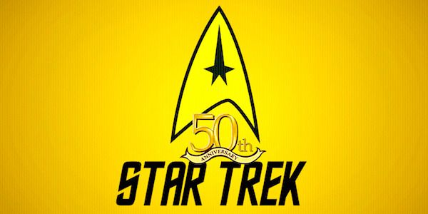
Or rather how the most shouty fans think Paramount thinks about it: "Star Trek: So?"The "50" looks like the word "SO." If the 5 were smaller and more like a 5 instead of like an S it wouldn't be so jarring.
Thanks, now I can't unsee it saying STAR TREK SO
Lol
-
Welcome! The TrekBBS is the number one place to chat about Star Trek with like-minded fans.
If you are not already a member then please register an account and join in the discussion!
You are using an out of date browser. It may not display this or other websites correctly.
You should upgrade or use an alternative browser.
You should upgrade or use an alternative browser.
That God-awful ST50 logo...
- Thread starter lewisniven
- Start date
This confirms what I've known for decades-
Star Trek fans will bitch and moan about anything. ANYTHING.

My favourite was back when Enterprise was in production, and the announcement came through that the season 2 premiere would be titled "Shockwave, Part 2" and some people actually started going on about this showed that Berman and Braga were burnt-out hacks who couldn't figure out how to properly title episodes. Despite the fact that aside from DS9, every preceding two-parter of every Trek series always used the same title for both parts. Hell, even DS9 did it a few times (The Maquis, The Search, Past Tense).
The "50" looks like the word "SO." If the 5 were smaller and more like a 5 instead of like an S it wouldn't be so jarring.
Thanks, now I can't unsee it saying STAR TREK SO
Lol
Just like I can't unseen the STAR TREK: NERO comic from a few years ago being STAR TREK: NERD.
"Make it NOT "SO"!
"Make it NOT "SO"!
Good one!
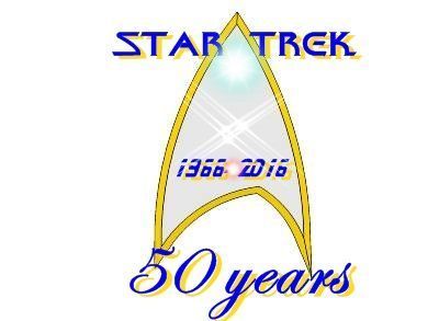
Since the consensus —even from those who don't think this is an abomination before Goddenberry— seems to be that this Star Trek 50th Anniversary logo is at best kind of bland and unoriginal, does anyone want to take a crack at designing a better one here just for fun? Maybe if we get enough submissions we can have a voting thread to pick a winner?
The line of the logo is the least of the problems -- the whole thing looks terrible. It looks like some beginner designer's output with no professional programs and much in the ay of skills. I could have done almost exactly this with MS Paint, Google images and ezimba.com.
"This far, no further!" Ugh.
Every fan transcript I find shows it this way.
Picard would not mix up his grammar like that.
I've played the clip several times on YouTube and it really sounds like:
"This far, no farther!"
https://www.youtube.com/watch?v=Jln3mi0vfJU
Sheldon got it right:
https://www.youtube.com/watch?v=UUMcABvgoIg#t=1m20s
"This far, no further!" Ugh.
Every fan transcript I find shows it this way.
Picard would not mix up his grammar like that.
I've played the clip several times on YouTube and it really sounds like:
"This far, no farther!"
https://www.youtube.com/watch?v=Jln3mi0vfJU
Sheldon got it right:
https://www.youtube.com/watch?v=UUMcABvgoIg#t=1m20s
Farther and further both mean at a greater distance, and they are used interchangeably in this sense. In the United States, though, farther is more often used to refer to physical distances, and further more often refers to figurative and nonphysical distances. For example, we might say that one mountain is farther away than another, while we might say the price of a stock (a nonphysical thing) fell further today than yesterday. This is not a rule, however, and further is often used for physical distances. The distinction does not exist in the U.K. and elsewhere in the (British) Commonwealth of Nations, where further is preferred for all senses of the word and farther is rare.
Many counterexamples could be found, however, and using further in place of farther is never an error.
http://grammarist.com/usage/farther-further/
I recall a scene in NuBSG about "farther" vs "further"
 I miss that show...
And yes, I also agree that the logo looks like an amateurish piece of junk. Whoever designed it should be ashamed and given the "Cersei Walk". Shame! SHAME! Da-DING!
Helo: How much further?
Sharon: Farther.
Helo: What?
Sharon: "Farther" describes actual distance. "Further" is more figurative.
Helo: You're a dictionary now?
Sharon: I'm sorry I'm smarter than you.
 I miss that show...
And yes, I also agree that the logo looks like an amateurish piece of junk. Whoever designed it should be ashamed and given the "Cersei Walk". Shame! SHAME! Da-DING!
Since the consensus —even from those who don't think this is an abomination before Goddenberry— seems to be that this Star Trek 50th Anniversary logo is at best kind of bland and unoriginal, does anyone want to take a crack at designing a better one here just for fun? Maybe if we get enough submissions we can have a voting thread to pick a winner?
Great Idea!!!
Here is mine, in just its basic Black and White form:

I know the grammar well. In the fan transcripts (and the graphics in this thread), their use is inconsistently mixed no matter which is preferred."This far, no further!" Ugh.
Every fan transcript I find shows it this way.
Picard would not mix up his grammar like that.
I've played the clip several times on YouTube and it really sounds like:
"This far, no farther!"
https://www.youtube.com/watch?v=Jln3mi0vfJU
Sheldon got it right:
https://www.youtube.com/watch?v=UUMcABvgoIg#t=1m20s
Farther and further both mean at a greater distance, and they are used interchangeably in this sense. In the United States, though, farther is more often used to refer to physical distances, and further more often refers to figurative and nonphysical distances. For example, we might say that one mountain is farther away than another, while we might say the price of a stock (a nonphysical thing) fell further today than yesterday. This is not a rule, however, and further is often used for physical distances. The distinction does not exist in the U.K. and elsewhere in the (British) Commonwealth of Nations, where further is preferred for all senses of the word and farther is rare.
Many counterexamples could be found, however, and using further in place of farther is never an error.
http://grammarist.com/usage/farther-further/
By the way, I like the idea of using this thread to suggest better fan versions of the logo... since it was my idea first. A contest is a great way to go about it.
Since the consensus —even from those who don't think this is an abomination before Goddenberry— seems to be that this Star Trek 50th Anniversary logo is at best kind of bland and unoriginal, does anyone want to take a crack at designing a better one here just for fun? Maybe if we get enough submissions we can have a voting thread to pick a winner?
Great Idea!!!
Here is mine, in just its basic Black and White form:


+1It would have helped slightly if the OP has said what s/he was getting at instead of the Where's-Waldo approach.
This is probably the best artistic evaluation so far.My only thing is that the "50" looks like it's hidden and trying to get through, which doesn't exactly scream "celebration" in any form.
Now with the problem(s) established, this thread needs graphical suggestions for a better design.
 This was my immediate first impression.
Looks to me like those Bad Robot hacks designed it - most likely for far less than the publicly released project budget.
No symmetry, no artistry, no celebration.
No symmetry, no artistry, no celebration.
A
Amaris
Guest
Sure! I'm not the greatest, but I can give it the old college try.


Similar threads
- Locked
- Replies
- 2
- Views
- 2K
- Replies
- 48
- Views
- 5K
- Replies
- 133
- Views
- 7K
If you are not already a member then please register an account and join in the discussion!


