-
Welcome! The TrekBBS is the number one place to chat about Star Trek with like-minded fans.
If you are not already a member then please register an account and join in the discussion!
You are using an out of date browser. It may not display this or other websites correctly.
You should upgrade or use an alternative browser.
You should upgrade or use an alternative browser.
TOS-R Top 5 Best Remasters
- Thread starter toonloon
- Start date
I'd say these mattes are nice:
1. Mojave ("The Cage")
2. Tantalus V ("Dagger of the Mind")
3. Pyrus VII ("Catspaw")
4. Planet surface ("By Any Other Name")
5. Sigma Draconis VI ("Spock's Brain")
I'd never be able to call any of the new CGI spaceships and such "improvements", but those mattes are alright.")
1. Mojave ("The Cage")
2. Tantalus V ("Dagger of the Mind")
3. Pyrus VII ("Catspaw")
4. Planet surface ("By Any Other Name")
5. Sigma Draconis VI ("Spock's Brain")
I'd never be able to call any of the new CGI spaceships and such "improvements", but those mattes are alright.
1. The Rigel 7 landscape in "The Cage."
3. The Romulan Bird of Prey in "Blaance of Terror.
3. Pretty much everything in "Tomorrow is Yesterday" even though the sun doesn't look right, it makes the sequence make sense and it pretty exciting. And the daylight shot of Christopher's jet "under cloud cover" is photo realistic.
4. Eminiar 7's capital city
5. Delta Vega Lithium Cracking Station.
Bonus pick: The Botany Bay as the Enterprise releases it in Space Seed is great.
I actually like what was done with The Doomsday Machine, even with the errors in matching the effects with the dialog. But the stuff above was really spot on for me and truly helped the episodes. TDDM was perfect even with the old effects.
As for sound: meh. I don't like a lot of the changes, but I really don't mind them against the new effects. When watching the original effects, I want the original sounds. I do totally loathe the new theme recording used in the second season. The first season is okay, but either way, Shatner's intro is mixed way down.
Overall, I love how the image looks, the colors pop! Not nuts about seeing Shatners toupee and Nimoy's ear seams, but damn...
Pike's hospital window on Starbase 11 in "The Menagerie" is greatly improved.
Stratos City in "The Cloud Minders" needed help badly, got it.
City backdrop on Scalos in "Wink of an Eye."
Supernova at the end of "All Our Yesterdays."
"Tomorrow is Yesterday"
also:
http://tos.trekcore.com/gallery/albums/1x19/Tomorrow_is_Yesterday_356.JPG
http://tos.trekcore.com/hd/albums/1x19hd/tomorrowisyesterdayhd186.jpg
Different typs of obvious fakery. The former looks like a real object badly bluescreened onto a unconvincing backdrop , the latter looks like an unreal object beautifully composited on a more convincing backdrop.
YES!
In all fairness as well, TOS-R used actual videos of the Earth.
They didn't have those back in 66.
I liked the new shots from "Amok Time" orbiting Vulcan and the landscaping shots when they beamed down. Also the shuttlecraft approaching the Enterprise in "Journey to Babel" but not when it was landing in the shuttle bay that was too murky. The shot of the Tantalus colony in "Dagger of the Mind" was a vast improvement of the original retread from WNMHGB. I liked the Antares from "Charlie X." The Gorn blinking in "Arena" was cool, too.
My biggest misfires were "Ultimate Computer," "Doomsday Machine," the bird-of-prey sneaking back in "The Enterprise Incident," the Tholian ships from "Tholian Web," and the original "non-blue" blue beam from the obelisk from "Paradise Syndrome."
My biggest misfires were "Ultimate Computer," "Doomsday Machine," the bird-of-prey sneaking back in "The Enterprise Incident," the Tholian ships from "Tholian Web," and the original "non-blue" blue beam from the obelisk from "Paradise Syndrome."
Maurice said:
Different types of obvious fakery. The former looks like a real object badly bluescreened onto a unconvincing backdrop , the latter looks like an unreal object beautifully composited on a more convincing backdrop.

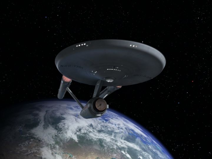
Getting better, but the blacks are too black and it needs grain like the original.
")
Maurice says: Getting better, but the blacks are too black and it needs grain like the original.
Spockboy says: Up yours! er..I mean...there you go buddy, all fixed up.

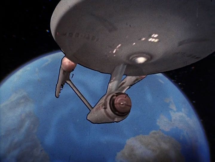
Of course, the ship couldn't be lit like that that with the sun behind it....
KIDDING!
Of course, the ship couldn't be lit like that that with the sun behind it....
KIDDING!
In real NASA missions, it was pretty clear that you can't see the stars at all when the sun is up. It's just a velvety blackness, because broad daylight plus all that reflected Earthlight drowns out the stars.
Still a great picture, Spockboy. And TOS-R made the same choice, apparently because people want and expect to see the stars whenever they aren't "blocked" by looking up at a daytime sky (they're really just overwhelmed again, not blocked).
Overall, the remastered ships--especially starships--were poorly conceived--they look way too cartoonish, especially compared with the Defiant as seen in "In A Mirror, Darkly." What they did to the Constellation's saucer section was abominable... and the four starships in "The Ultimate Computer" seemed off in dimension in certain shots.
Conversely, the new matte work for planet scenes was very well executed.

Conversely, the new matte work for planet scenes was very well executed.
I love this shot-
http://tos.trekcore.com/hd/albums/2x18hd/theimmunitysyndromehd0446.jpg
http://tos.trekcore.com/hd/albums/2x18hd/theimmunitysyndromehd0446.jpg
Me too.
Similar threads
- Replies
- 34
- Views
- 2K
- Replies
- 1
- Views
- 279
- Replies
- 32
- Views
- 2K
If you are not already a member then please register an account and join in the discussion!