^^[Referring to the table reflection shot in WNMHGB] Seriously, though, something like this didn't need to be fixed.
I think it did, and it was not a stylistic change. It was fixing something that was wrong. While others have shown how easy it is to fix the shot with common desktop video tools, the demonstration is still not quite right. The demo reflection is too bright, since a lit panel was used on the set. A new desktop should be match-moved in so that a dimmer reflection, showing only the brighter areas of the screen, is visible.
I did something like this to fix a continuity error in a feature film. A hurricane is tearing a house apart, and framed photographs are seen to fall off a hallway wall. In shot 1, a medium CU, the photos drop on cue when actuators in the wall pull away. Then along comes shot 2, a long shot looking down the hall, and the photos are suddenly back up. I had to match-move a new wall into the shot—and it was a wood paneled wall with lots of detail. On top of that, I had actors ducking from the wind and leafy debris blowing around them. Both the actors and their shadows were moving about right over the area where the photos were still on the wall. So I had to add rotoscoping to the fix, too. Oh, did I mention that it was also a hand-held shot, shaking about in the violence of the storm?
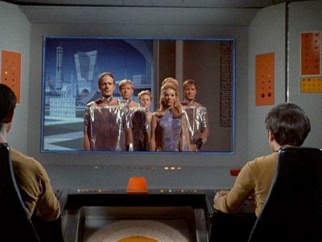
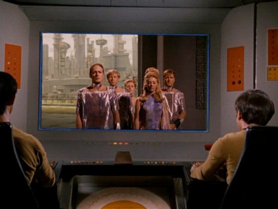
Here's one that drives me nuts - the arbitrary changing of the color scheme of Scalos in "Wink of an Eye"... What were the remastered people thinking? "Oh, those poor dumb people in the 60s
obviously didn't mean to make this cityscape blue -- We'll fix it"?

Don't be so snarky. The original set designers worked with limited facilities and time. The primary change here is making the sky brighter. The new city could have been a night or twilight shot, too. But then realistically not much of the city would be seen... unless lights were added, which is exactly what the
artists who were paying attention to the script didn't want. They wanted a city that looked dead.
Perhaps the CBS artists tried bluish daylight, as it would be on Earth. On the other hand, I think the dusty yellow looks "more dead" (as opposed to mostly dead or all dead

). Remember, Scalos had been destroyed by the dust and radiation from volcanic eruptions.
Does the new shot "match" the production design of the show? That's debatable. While I grumble about all the "miniature" animation in TOS-R, the scene extension ("matte paintings") are generally an improvement.


 ). Remember, Scalos had been destroyed by the dust and radiation from volcanic eruptions.