-
Welcome! The TrekBBS is the number one place to chat about Star Trek with like-minded fans.
If you are not already a member then please register an account and join in the discussion!
You are using an out of date browser. It may not display this or other websites correctly.
You should upgrade or use an alternative browser.
You should upgrade or use an alternative browser.
TOS Class F...
- Thread starter Warped9
- Start date

Looking at photos from screencaps as well as the recent restoration from what I can see the lower hull isn't a lot darker than the upper hull. The fact the lower hull is angled downward and always somewhat in shadow makes it look darker than it really is. At least that's how it looks to me. The studio might have painted it the way they did to try making the ship look longer than it is.
I just thought of it as a design exercise. As I said before when I thought of it I was trying to think of a TOS equivalent to the TAS shuttlecraft we saw in "Slaver Weapon." There was no way TOS could have done something like that--particularly given the apparent size--so I tried to envision something not far off from what they already had.As to your shuttle variant, I don't get the rationale for it. What does moving the nacelles back and rearranging the landing pads do other than make the ship take up more room in the hangar? Just to make a different ship they could have used on the show?
Of course, if TOS had actually filmed a story like "Slaver Weapon" then they most likely would have just used the existing mockup they had.
As you continue to add detail, you may want to include seams along the inner winglet where it runs along the main fuselage, as seen in "The Galileo Seven". (Unless you're applying artistic license there.)
A pair of two-tone shuttlecraft: a Class F (top) and a Class H (bottom).
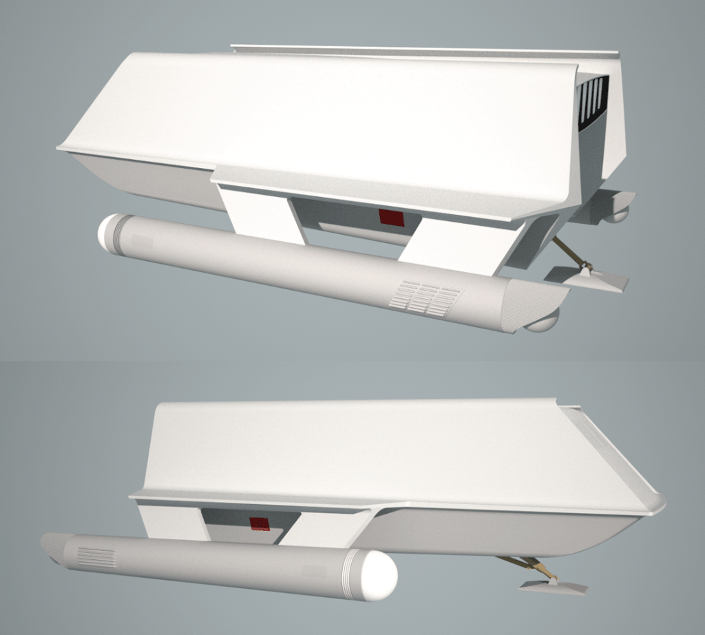
It might look white, but it's actually very light grey and the lower hull is a slightly darker tone of the same grey. And it's not a pure grey either but has a hint of green to it (and which has nothing to do with the green background in the images). Indeed the hint of green doesn't seem to show up in the images, but it's definitely there when you set the CMYK or RGB numbers.
These images are basic renders and they'll look better when I assign materiels to the surfaces. I still have to finish all the asymmetrical detail as well as the signage.
Last edited:
I'm not sure about the seams. Just as it's obvious the support braces (under the stabilizers) were there to strengthen the mockup the seams are so obvious were the stabilizers attached to the main hull. On a real craft I just don't think they'd be so obvious or if you would even see them unless really up close.As you continue to add detail, you may want to include seams along the inner winglet where it runs along the main fuselage, as seen in "The Galileo Seven". (Unless you're applying artistic license there.)
I always liked the two-tone paint job. Don't have any particular reason why, it just pleases me aesthetically.
As for the full-size prop of Probert's shuttlecraft versus this one, the Probert design was a pain to create since it had a lot of complex curvature, whereas this one has mostly flat surfaces or simple curvature. They just weren't able to make something with those kinds of curves easily out of your typical prop construction materials, usually plywood.
As for the full-size prop of Probert's shuttlecraft versus this one, the Probert design was a pain to create since it had a lot of complex curvature, whereas this one has mostly flat surfaces or simple curvature. They just weren't able to make something with those kinds of curves easily out of your typical prop construction materials, usually plywood.
One could rationalize that the darker colour of the lower hull and nacelles represents a different materiel or perhaps a thermal coat for additional protection during atmospheric re-entry.
Candidly I'm approximating the two colours because it's hard to get an accurate representation of what the colours really are because of varying lighting conditions.
Candidly I'm approximating the two colours because it's hard to get an accurate representation of what the colours really are because of varying lighting conditions.

To distinguish the access hatch I chose to outline the panels with a very fine recessed groove in the hull to create a more realistic seam even given that such a fine seam should be almost unnoticeable. I went this way rather than recessing the panels slightly from the surface of the main hull or colouring the panels a slitghtly different tone from the rest of the hull.
So I'm being challenged in matching the two tones of grey for the hull when it hits me that part of the problem I'm having is not taking the temperature of the light into consideration. In photos of the full size mockup after restoration I've been trying to match the colouts and yet when I render my model the ship comes off with a hint of yellow to the colours. But if I increase the temperature of the lighting in my render the colours start to look more like they're supposed to.
The shuttkecraft onscreen could often have a green or blue or magenta tint to what otherwise looks like white and grey because of the hot studio lights and the paint reflecting colours in the surroundings.
Also, in studying pics of the restored mockup I discovered that the openings in the nacelles for the retractable landing pads have rounded off corners rather than sharp corners as I believed them to be from Phil Broad's drawings. You never know when you'll learn something new.
I've also inquired if there is any information regarding the lighting originally planned for the shuttlecraft. The full size mockup was supposedly rigged to have its nacelle domes light up (though never used), but it's unknown what colour or what effect (if any) would be used. The two small rectangles under the port bow were also supposed to light up as landing lights but, again, this was never done onscreen.
Last edited:
No. And I don't know if they will be even after the model's release just as his TOS E drawings aren't out there either.Are Gary Kerr's drawings / research for the Galileo available anywhere online ?
From what he's said Gary doesn't really know what the lighting effect would or could have been if the nacelle caps had been lighted. He only said that since they were simplified version of the Enterprise's warp nacelles then they might have had a similar spinning light effect.
Also he suggested trying to match colours from photographs could be a massive headache. I have to somewhat agree. I think I will have to approximate the colours by eye as best as I can..

Do you ever have one of those moments when you find yourself thinking, "Oh, no! I think I seriously fucked up.!"
I had one of those moments laying in bed and the thought occured to me that I had done something drastically wrong with this model. And if so I really hope I can fix it without too much grief because it would mean redoing about a day's work.
Imagine my relief the next morning when I checked and realized I hadn't made a mistake and that everything was fine. Talk about relief even as I thought, "What ever made me think I had screwed up like that?"
Hmm. I've found an interesting inconsistency. And Gary Kerr did suggest that I should watch out for some.
The restored mockup has small inconsistencies with the way it appeared ionscreen. In this particular example I can see that the large aft service panel that we've often seen opened is different onscreen than how it appears today.The detail as drawn by Phil Broad is accurate in detail where the restoration is wrong and seems to have detail not visible onscreen.
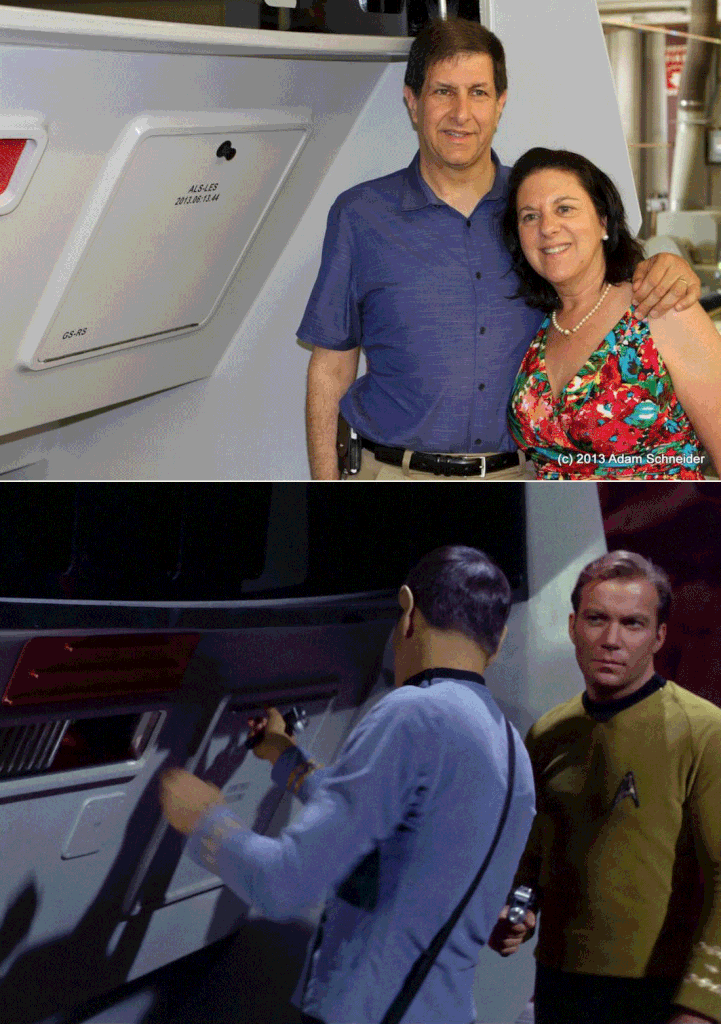
The upper image shows us the panel as it's been restored. While it's overall shape and placement are correct the detail is not. The long handle used to open the panel is inexplicably now at the bottom and a new small round knob as handle has been added to the top of the panel. In the lower image we see Spock about to open the panel and the long thin handle is at the top and with no small round knob visible (in other unobstructed pics it's obvious there is no knob there). The lettering detail is off, too. The restoration has the main lettering moved upward and some added numbers on the lower left of the panel while the original form has only a few letters and numerals in the centre of the panel. With these changes I'm not sure I can trust the lettering as being accurate that I can read in the image of the restored mockup.
There is also added detail to those small square red panels underneath the stabilizers that I simply can't mak out from any image.
Last edited:
It was opened and used in its very first appearance in "The Galileo Seven."I can't remember, was that panel functional from the very beginning, or was it maybe modified later for the actors to be able to use it?
Must have been modified, because there is no handle (or knob) here (Galileo Seven):
Standard def
High Def
Standard def
High Def
Similar threads
- Replies
- 87
- Views
- 20K
- Replies
- 13
- Views
- 2K
If you are not already a member then please register an account and join in the discussion!