• Welcome! The TrekBBS is the number one place to chat about Star Trek with like-minded fans.
    If you are not already a member then please register an account and join in the discussion!

WIP - Need Input

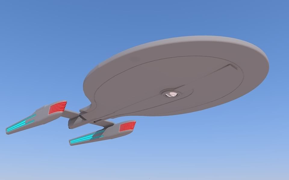
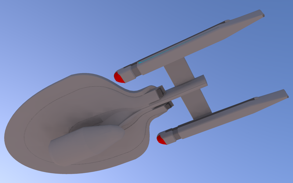
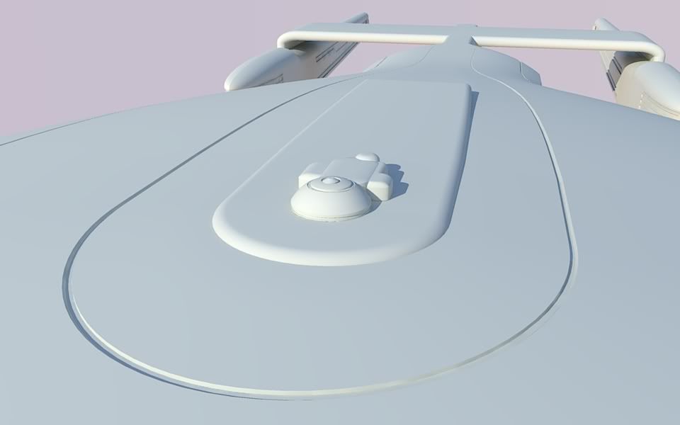
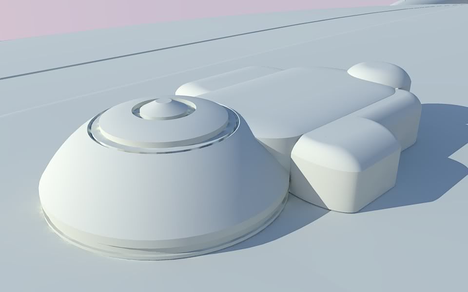
Well maybe 'evolution' was the wrong word, we just seemed to have a similar idea with the extension off the rear of the saucer and the engineering hull (in your case) or nav deflector (in my case) sitting down under the middle of the saucer.

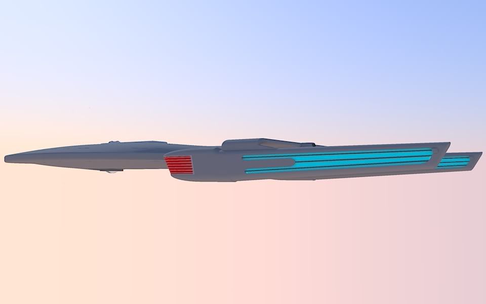
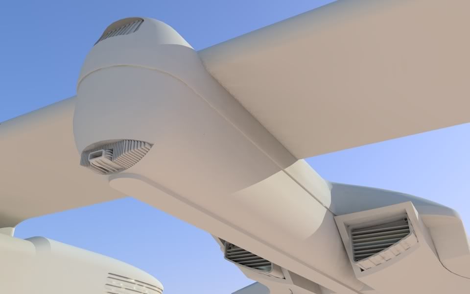
Seeing yours with the two nacelles kinda makes me wish I'd done that with mine, but it was my first try at scratch-building and frankly the idea of making two nacelles and having them end up looking the same gave me a case of the screaming willies...
 
OK, 3 new images. Think I finally have the major forms the way I want them. Except for the nacelle orientation, hehe, but that can be easily flipped. Changes since last set of images: New primary hull, new impulse engines (the new location is a major improvement in integration I think), pylons cleaned up a bit.

Funny thing I am learning doing this project is that most of the parts get redrawn 2 or 3 times as I figure out better methods and eliminate problems.

newhullimpulsebottom.png

newhullimpulseclosein.png

newhulltop.png
 
Well, I may be the only person in this thread, but I will still keep posting. Couple more shots. I have replaced the nacelles. The existing ones looked fine, just not right for the ship. Too retro. So I came up with some new ones with some John Eaves influence to them.

These images are fairly big as I was just playing around , so I am only attaching thumbnails in the thread. Click to see in larger size.


hmmm, photobucket seems to have shrunk them a bit. Leemesee what I can do.

Well, the first image is in png format and too large for photobucket, I was able to resave the second as jpg so it should show large after clicking. I will switch out the png for a jpg tomorrow.
(as promised, here is the jpg of the first one)
 
Last edited:
Looking at the new nacelles now, I think there is a classic 50's car missing it's tail lights out there somewhere.:lol:


Here is a size comparison using the Ent-C and Ent-D from google 3d warehouse. This also gives a pretty good indication of the "more aggressive" stance I was going for. Does look like something that might have been built around 2347?

 
i think if your aiming for the 2347 time then id suggest a round deflector seeing as the newish ambassadors had round deflectors, i don't think theres any odd shaped deflectors from before the galaxy's though i could be wrong.
also you'd have an extra place to stick a couple of torpedo tubes in the 2ndry hull.
mind you if you were to place the ship into late 'c' era around 2355 then I'd keep the odd shaped deflector.
saying that i like how your ships coming along
 
I like the nacelles either way but engineering section ain't working.

It looks quite awkward.

I would keep it but remove the dorsal section.
 
NEIN!!!!

Keep the neck, it gives it a unique look.

It makes absolutely no sense in with this design or with any established Trek starship concept.

It's busy enough and has its own great unique qualities without it. The "neck" (as you kids want to call it ;) ) is overkill and throws the whole thing off.

It's like I've said about the Abrams Enterprise: if they just moved the "neck" forward, I could get over every other issue I have with it. IMHO, the neck on this makes the whole thing look like a jumbled mess and it wouldn't look like that if that engineering section was just flush to the hull.

I actually love all of the elements of this except the "neck."

Just my opinion, though.
 
It makes absolutely no sense in with this design or with any established Trek starship concept.
Yes, because we have never seen a trek ship with a saucer, secondary hull attached by a neck and 2 warp nacelles on pylons.:rolleyes:

It's busy enough and has its own great unique qualities without it. The "neck" (as you kids want to call it ;) ) is overkill and throws the whole thing off.

It's like I've said about the Abrams Enterprise: if they just moved the "neck" forward, I could get over every other issue I have with it. IMHO, the neck on this makes the whole thing look like a jumbled mess and it wouldn't look like that if that engineering section was just flush to the hull.

I actually love all of the elements of this except the "neck."
Flush with the hull has been done. It's called Voyager. I am trying a layout I have yet to see in Starfleet ships. The Abrams Ent was actually part of the inspiration for this design. I thought they didn't take the "forward" look far enough. No, I wouldn't want a ship named Enterprise to be designed this way, but I still think it has an interesting feel to it. I think it evokes the sense of power that we see when we look at a jet engine hanging off an airliner's wing.

Also, have you looked at the Enterprise from an engineering perspective? talk about "jumble"! It is not a very rational layout of the major components. At least on this ship they all originate from a central core.:techman:

You don't have to take it personally. You wanted opinions. That neck simply isn't aesthetically pleasing. Sorry.
 
Started some work on the main deflector:
sensorclay.jpg

sensorclay2.jpg


And did a couple of quick renders for CaptainHawk1 so he can see how it looks without the engineering hull. I think it looks too flat. Like a pancake.
captain1.jpg

captain2.jpg

captain3.jpg

captain4.jpg
 
That looks wicked cool sans dorsal and engineering but I still think it would look cool with just the engineering section and no dorsal. ;)
 
Looks better without the large engineering-hull.

Why not put a streamlined bulge under the saucer to mount an engineering section and navigational-deflector like the Akira Class does?


CuttingEdge100
 
If you are not already a member then please register an account and join in the discussion!

Sign up / Register


Back
Top