• Welcome! The TrekBBS is the number one place to chat about Star Trek with like-minded fans.
    If you are not already a member then please register an account and join in the discussion!

(WIP) Enterprise D Interiors

Still super impressed with your work on these sets! The photo-realism is off the charts with some of these shots. I especially love that you even realized the matte painting part of the corridor as an actual 3D part of the set. Interesting approach I don't think I've ever seen anyone do. (The closest thing was probably when @Donny recreated the forced perspective parts of the TMP engineering set as a regular part of the set.)

Oh, and I really appreciate those 360° panoramas! So cool to play around with. That’s probably the child in me talking, but I will admit that my favorite part was standing in the holodeck. It’s interesting to realize how tall the walls are in there.

Thanks for the feedback! I’ve been trying to achieve photo realism for some time in my renders. It is one of the things I hope becomes synonymous with my work.

With the matte part of the set - I love when I spy places on the show like this - it is canon, but it gives you the ability to have a little artistic liberty.

I think for that very reason I’ll be doing Cetacean Ops next. It is never seen on TNG, but how cool it would be to see it.

I’m glad I can help make the little kid in you happy. Being able to build these myself and walk around them - it’s the closest thing I’ll ever have to being on the ship, and I feel lucky to be able to make these. It’s even that much better because I know people like you are enjoying them too!
And I’m genuinely thankful that you put in the work for others to enjoy these sets like this. Honestly, one of the best things about this fandom is stuff like this. :)
 
^ Yep, the carpet being perfectly imperfect is probably the main thing that lets me see this as realistic. Also, the soft carpet, the warm beige color scheme and all the rounded edges are what make this set look so damn cosy and homely.
 
Are you building them from scratch, or using Stage 9 as a starting point?

This was, minus a few PBR textures, all done from scratch. About 90% of this was done via comparing hundreds of screenshots and characters (Riker, Picard, etc) against my model. This got it close, and from there I found various blueprints online to hone it in.

Honestly, and no offense to those who worked on the Stage 9 project as it is an amazing piece of work, but I found Stage 9 to be too inaccurate when going for a recreation. Screenshots. Hundreds upon hundreds of screenshots. That is honestly how much of this was done. Trekcore.com is a God send! Lol.
 
Last edited:
^ Yep, the carpet being perfectly imperfect is probably the main thing that lets me see this as realistic. Also, the soft carpet, the warm beige color scheme and all the rounded edges are what make this set look so damn cosy and homely.

I am getting a kick out of everyone enjoying the carpet so much. Lol. I didn’t expect, of all things, the carpet to be such an eye catcher. Picard was right - the carpet!

My wife loves the carpet as well. It’s one of her favorite things. You all have me really relooking at my carpet.

These are so freaking well done. Lighting, texturing, spot on. That carpet looks exactly right. So freaking good!

Thanks! The lighting and color was so important to get right. It didn’t take but a few shades off to completely lose that nostalgic feel.
 
The carpet looks like people walk on it a lot, so it makes the whole thing look populated like we just missed people who are just around the corner :D
Doing this from scratch makes it even more impressive. But it's a shame S9 is now outdated. There was an even earlier attempt, 3DTrek or something like that, that was also great for its time.
Hopefully this one can be 'saved' from oblivion by integrating it into OTOY :cool:
Oh also: What is the font for the labels? I've read different opinions and got the impression there are at least 2 separate ones for the labels and LCARS. One source says it's Swiss 911 Ultra Compressed (MA), another more credible one says it's Helvetica Ultra Compressed, or Letraset Compacta, or a few others (Okuda) :D
 
Last edited:
I already mentioned this to you on our ArtStation conversation, but this looks absolutely incredible! The rendering/post processing in particular makes it look real, great job!

Honestly, and no offense to those who worked on the Stage 9 project as it is an amazing piece of work, but I found Stage 9 to be too inaccurate when going for a recreation. Screenshots. Hundreds upon hundreds of screenshots. That is honestly how much of this was done. Trekcore.com is a God send! Lol.

It definitely didn't look as good as we would've liked, but keep in mind it's an entirely different beast when you've gotta take into account poly counts for things running in real time, especially with the lighting solutions Unreal had at the time and the limited optimization experience a team of hobbyists had. My own models for instance had to be heavily decimated to go into S9.

I'd say that we could do better now, but I know we can as @scragnog who did the S9 corridors worked on most of our TNG stuff at the Archive, including the corridors which you can take a sneak peak on this GTC video, and I'm sure you'll see more off soon.

Anyway, I digress, great work and looking forward to what you've got planned for Cetacean Ops!
 
It definitely didn't look as good as we would've liked, but keep in mind it's an entirely different beast when you've gotta take into account poly counts for things running in real time, especially with the lighting solutions Unreal had at the time and the limited optimization experience a team of hobbyists had. My own models for instance had to be heavily decimated to go into S9.

First - thanks for the complements on these renders. Especially coming from you, that means a lot. I discovered your work about 5 months ago, and wow! It set a benchmark for me.

In regards to the S9 project: I downloaded a version of it a few months back (had Santa hats on everyone, lol.) and ran it on an old 2015 Asus laptop. It ran a little laggy but still amazing on that old thing. You all optimized it very well considering.

Having to make sacrifices for optimization makes total sense, and you all did amazing work for the capabilities at the time. My mind was blown away and I was like a little Kid again running around that thing.

I'd say that we could do better now, but I know we can as @scragnog who did the S9 corridors worked on most of our TNG stuff at the Archive, including the corridors which you can take a sneak peak on this GTC video, and I'm sure you'll see more off soon.

That is some top notch work! @scragnog is definitely a talented individual. Thanks for showing me this. It would be amazing to see another S9 project with all of the new technology and capabilities, but we all know how that would end, unfortunately.

I’ll be starting up Cetacean Ops soon. So keep a look out for it.
 
Hopefully this one can be 'saved' from oblivion by integrating it into OTOY :cool:

You flatter me. Lol. If that happened it would be a life goal and I’d die happy. Lol. But it means a lot that you feel it to be worthy of that and good enough for OTOY.

Oh also: What is the font for the labels? I've read different opinions and got the impression there are at least 2 separate ones for the labels and LCARS. One source says it's Swiss 911 Ultra Compressed (MA), another more credible one says it's Helvetica Ultra Compressed, or Letraset Compacta, or a few others (Okuda) :D

There seems to be no definitive answer. However I did read an interview with Mr. Okuda and he mentioned Compacta Light. I will say that of all the fonts I’ve used Compacta Light seems to be the most accurate to the show.

I tried Okuda font: Perhaps it was due to its creator but the kerning (spacing) wasn’t right on the version I was using and didn’t hold its columns very well. I tried manual kerning and it became a nightmare. The number 4 throws the spacing off completely. Which is unfortunate because I couldn’t throw in the infamous number 47 without things looking off. I joke slightly but it was one of the reasons I didn’t go with it.

In the end - Compacta, when overlaid on actual LCARS screenshots, lines up the best.

Mr. Okuda himself did say he used multiple fonts in different places, but for ease and consistency, I do all my LCARS with Compacta Light. Now that I think about it I believe I used that font for all text.
 
Last edited:
Two examples: The label has a thicker font, and the C has the clearest difference compared to the LCARS display. Is the label the same font and just bold?

HnuhnaQ.png
 
Two examples: The label has a thicker font, and the C has the clearest difference compared to the LCARS display. Is the label the same font and just bold?

HnuhnaQ.png

You made me start to question my font choice so I had to double check my .psd files.

So a correction:

The font on the label is Compacta set to Sharp and then slightly squished around and it’s original ratio changed to size it.

I also have Compacta Light. The version I have doesn’t look too different from regular Compacta, only slightly narrower.

I’m not sure what font is on the top image. I wanna say Letraset Compacta, but even slightly thinner than what is commonly seen for that font type.
 
Absolutely gorgeous work as always! Can't wait to see your take on Cetacean Ops!

Also curious if you ever plan to do the Bridge? I'd love to see you do the Generations version, which I wish more modelers would tackle.
 
Absolutely gorgeous work as always! Can't wait to see your take on Cetacean Ops!

Also curious if you ever plan to do the Bridge? I'd love to see you do the Generations version, which I wish more modelers would tackle.

Thanks for the complements and checking out my work.

I have considered doing a bridge. I have made a few non canon bridges for personal projects, but nothing set accurate. Down the road it will most likely happen. And maybe Generations will be the one I do. Not sure.

For now, I’m really looking forward to Cetacean Ops.
 
There seems to be no definitive answer. However I did read an interview with Mr. Okuda and he mentioned Compacta Light. I will say that of all the fonts I’ve used seems to be the most accurate to the show.

At work we discuss this a lot with Mike himself. The problem is that current day fonts didn't exist back in 87, so a lot of little details exist on the sets due to the manual process they did back then, and that's simply impossible to be replicated via fonts.

They used a variety of fonts, essentially what was available in the shops at the time. It wasn't until late TNG when a lot more things were first done digitally. Lots of early LCARS were indeed Compacta Light, while others were Helvetica Ultra Compressed (of which Swiss 911 is a clone, so MA is half-right). But yeah unless you go in there and adjust kerning and do some resizing to make up for the fact that we're essentially using digital reproductions, there's no perfect font for these.
 
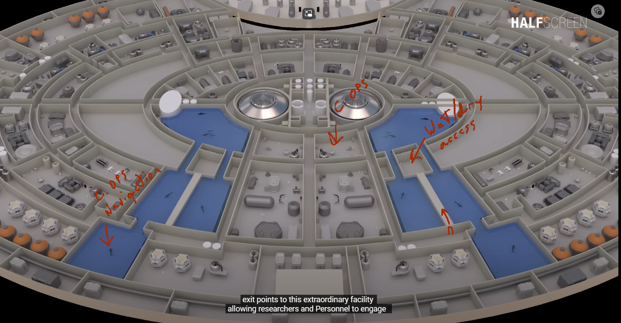
I'm beginning work on my Cetacean Ops for the Enterprise D and I was wondering: Is there anything anyone would particularly like to see included? Seeing as how this part of the ship was never seen directly there is a lot of artistic liberty that can be taken here.

I have some ideas in mind of how I would like it to look, though I want it to be within the confines of what is canon. I have a few references, the two best ones that I may draw on for inspiration are below:

deck-13.png


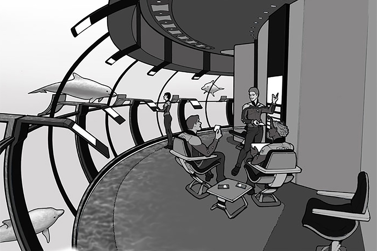
Enterprise-D-Cetacean-Ops-concept-art.jpg


This last image is concept art of the Enterprise D's Cetacean Ops created for STO by Andrew Probert.

While I like this last image, I don't see how it would fit into the floorplan above. It also doesn't quite have that Enterprise D vibe. I do like the idea of the two-way interfaces at the glass.

I'll probably be following the Grey/Blue color scheme (with shades of the traditional TNG) that I used for the hallways and corridors. That color just works in my mind.

I will be focusing on Cetacean Ops itself and the hallways outside. It seems (for some odd reason) that the Wet/Dry Access is a bit of a jog down the hallway from Cetacean Ops itself. I am trying to figure out a way if I could merge the two rooms into one, but still maintain a near similar layout to the floorplan. It doesn't look possible at first glance, but... maybe I can find a way to make it work.

If anyone has any additional ideas or references, feel free to share!

Out.
 
I think tackling Cetacean Ops on the Enterprise sounds like an awesome endeavor and I’m very curious to see where you are taking this.

Probert’s concept for STO looks like a cool starting point to me and it definitely has that early TNG vibe. Doesn't really look like anything they would have ever realized on the show, though. Maybe a smaller section of that large rounded glass, but never the whole thing.

I must admit I really like the design they came up with for Cetacean Ops on Lower Decks. Might be a good place to look for inspiration, too, considering it’s roughly the same in-universe era and the only canon occurrence of the set …

I especially like the inclusion of natural rock elements and the way the layout allows for directly interacting with the aquatic crewmembers.

xQBaOk6.jpg


haQ7bvo.jpg


cesqSaw.jpg


m8NcF20.jpg


Mbj3tJ8.jpg


24Ni5tu.jpg


lhkhBUF.jpg


vKJ6KCL.jpg
 
If you are not already a member then please register an account and join in the discussion!

Sign up / Register


Back
Top