• Welcome! The TrekBBS is the number one place to chat about Star Trek with like-minded fans.
    If you are not already a member then please register an account and join in the discussion!

Which Uniforms Do You Prefer

I thought it was so when they flipped the film for id-Kirk, he wouldn't have the insignia on the wrong side.

Until the DVD's "corrected" it, the opening shot of the planet set was flopped, with Kirk and Sulu's hair parted on the opposite sides. Kirk had no insignia and Sulu's was covered by the Space Spaniel, so we wouldn't notice. This was apparently done to make the set seem larger. Or something. The only thing to otherwise betray the trick was the writing on a box on a rock was backward. However, until the clarity of HD, we could never clearly see the label. SO now, it's flopped back, but not what was originally done back then. Just sayin'.
Usually such flops aren't "mistakes" per se but conscious editorial decisions to make eyelines or directional continuity work (see the end of The Way to Eden), which appears to be the case in The Enemy Within. The way it was changed by unflopping the opening shot, Kirk and Sulu look off camera right on hearing the crewman's cry and hurry off in that direction. In the subsequent shot, then enter from screen right heading left, which is technically a directional mismatch. So, the recent rework broke the directional continuity in order to "fix" something that was intentional on the editor's part.
 
. . .My favorite uniform, however, is Kirk's first season wraparound with the scrambled eggs on the shoulder. In fact, I own replicas of both these uniforms. . .[cool pix of shirts]. . .
While the wrap is a fairly good replica made by a costumer — the braid and insignia aren't as screen accurate.

Does wearing the wraparound make you want to work on your biceps? Apparently Shatner was always exercising with stage weights between takes. ;)

Kirk can look good in the wraparound, but sometimes it goes too far. In "The Trouble with Tribbles," his plunging neckline shows so much skin, it's absurd as a uniform. It was the Season 2 version with black piping in the neck that got out of control.
 
I had always preferred the "warm" cinematography of the first and second season.

By Season Three the "colder" cinematography gave the studio set a rather sterile touch and the polyester costumes added to this impression, IMHO.

Bob
 
I had always preferred the "warm" cinematography of the first and second season.

By Season Three the "colder" cinematography gave the studio set a rather sterile touch and the polyester costumes added to this impression, IMHO.

Bob

Jerry Finnerman left the show, that's what you're seeing. His assistant Al Francis got promoted, largely because all the better-qualified DPs were unavailable. Francis was okay but not an accomplished artist by any means.
 
My favourite uniform is Kirk's first season command alternate tunic. I, too, liked the velour shirts, but the polyesters made more sense.

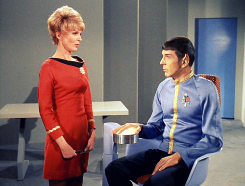
I like this dress uniform on Shaw here...even though it looks kinda crumpled up on her.

tumblr_l222e3Plpy1qavzqeo1_500.jpg


Did anyone ever notice how horribly fitting the TOS-movie uniforms were on TNG actors whenever they made an appearance? C'mon wardrobe, at least try and refit those.

Well, I guess they're "TOS-movieish", but they still appear so ill-fitting.
 
The main problem with the TOS movie uniforms on TNG was the elimination of the turtleneck underneath, which made the wearers look underdressed.
 
Did anyone ever notice how horribly fitting the TOS-movie uniforms were on TNG actors whenever they made an appearance? C'mon wardrobe, at least try and refit those.

Well, I guess they're "TOS-movieish", but they still appear so ill-fitting.

The main problem with the TOS movie uniforms on TNG was the elimination of the turtleneck underneath, which made the wearers look underdressed.

The reason the Monster Maroons were ill-fitting was because the costume department just grabbed whatever of the uniforms in storage that best fit the actor rather than constructing new ones specifically tailored to the actor.
 
I prefer the look of the third season uniforms, but wish they had also made a green wraparound version of them as well. I also liked the look of The Motion Picture uniforms over the uniforms in II, III, IV, V and VI. They remind me more of naval uniforms.
 
I prefer the look of the third season uniforms, but wish they had also made a green wraparound version of them as well. I also liked the look of The Motion Picture uniforms over the uniforms in II, III, IV, V and VI. They remind me more of naval uniforms.

"They" being the later ones, right? I think that was Nick Meyers' intention.
 
That's the interesting thing about the Nicholas Meyer style. I think he managed very well to transport the "Hornblower Effect" into the Star Trek universe, except - for the uniforms.

In Nelson's Navy blue was the color for ship's officers and red was the exclusive color of the Lobsters, i.e. the marines. In a certain sense the choice of red for the TOS "marines" (security crewmen) was fitting.

Bob
 
I prefer the look of the third season uniforms, but wish they had also made a green wraparound version of them as well. I also liked the look of The Motion Picture uniforms over the uniforms in II, III, IV, V and VI. They remind me more of naval uniforms.

"They" being the later ones, right? I think that was Nick Meyers' intention.


No, I think the uniforms from TMP have that naval look. I really don't care for the uniforms in the rest of the movies. To me they don't look like a daily duty uniform.
 
How do the TMP look naval? Do you mean like navy crackerjack enlisted unis?

I like both movie versions, by the way. 1979 looks very '70s sci-fi, a good thing, if you ask me, especially if you asked me in 1979. And I like the formal, admiralish quality of the Kahn-and-later ones. Fence-sitter on this one.
 
For good or bad, I suppose TMP uniforms would have to be changed as the movie sequels continued. As the cast aged and changed, I don't know how those TMP could have accomodated them.

Nothing against the cast or TMP uniforms. But it seems those beige PJs wouldn't have had a long run in the movies anyway.
 
If you are not already a member then please register an account and join in the discussion!

Sign up / Register


Back
Top