• Welcome! The TrekBBS is the number one place to chat about Star Trek with like-minded fans.
    If you are not already a member then please register an account and join in the discussion!

Visual Effects in Discovery

I don't know much about special FX, but it seems to me models look more realistic than CGI most of the time.

CG render engines are so advanced these days that a starship could be made to look 100% real if enough time, effort, and talent is put in. That said, yeah, that screenshot you posted looks pretty bad. I did this CG render of nightfever's Enterprise 1701-A last night, and I think it looks as good as a model shot. Perhaps I am bias/wrong, though. Certainly better than some of Discovery's shots.

wf1KjOn.jpg
That looks good. I pretty sure the Star Destroyers in Rogue One were all CGI and they looked very realistic. So why does the CGI in Discovery look so bad in comparison? This show has one of the biggest budgets of any show ever made. I expect better.
 
Discovery always puts this freaky purple/blue filter on top of every exterior shot, and then they turn up the contrast 100% and add in a blur effect. Nothing ever looks "natural". I don't know if this was a directorial choice or what.
http://memory-alpha.wikia.com/wiki/File:ISS_Charon.jpg
File:ISS_Charon.jpg

It's space, it inherently has a load of contrast because there's no atmospheric diffraction to add fill light.

If anything, it's the DS9 shot that looks unrealistic. Where is all that light coming from?

For my money BSG effects are still very good (considering this is about 2004?)
To view this content we will need your consent to set third party cookies.
For more detailed information, see our cookies page.

Good mix of steady and shaky cam, zoom-in and zooming out

They'd sometimes overdo it with he shaky-cam and the zooms, but yeah, it holds up pretty well. I man, the in-atmo jump scene was epic.
 
Last edited:
Discovery.jpg

23b-conspiracy-r.jpg


You think the Discovery ship looks more realistic?

(The top image is lower resolution and doesn't look as sharp because it's a screen shot. I'm talking about the CGI itself.)

I think in general that model photography looks way better (in general, not just a DSC vs TNG thing), but static screenshots and f/x in motion are two very different things.

TNG models were frequently over-lit and the matte work was meh.

For me, nothing beats the TOS films asthetic when it came to model work.
 
That looks good. I pretty sure the Star Destroyers in Rogue One were all CGI and they looked very realistic. So why does the CGI in Discovery look so bad in comparison? This show has one of the biggest budgets of any show ever made. I expect better.

Could be many factors. Perhaps time and budget were shortened. Perhaps artists had to rush through. I know some VFX peeps who worked on Discovery. The CGI model of the Discovery was originally started at CBS Digital but then had to be handed off to Pixomodo before it was finished. Maybe Pixomodo had to rush to get the model done for season 1.

Could otherwise be that the vfx art director told the artists to make it look like a stylized Guardians of the Galaxy like effect. Wanted it to look "cool" more than he wanted to look real.

The lighting and rendering doesn't look bad to me, I think the ball is getting dropped in compositing. They are trying to keep all the shadows lit and all the highlights from blowing out. But in real photography, shadows get black and highlights blow out to white. What's funny is that bloom should only happen on blown out highlights, but they are letting it happen on dim highlights...lol. Over saturated colors on everything too.

Take for instance this shot from Star Trek Beyond. The hull is allowed to blow out to white on the nacelle, washing out detail as what happens in NASA photography. But even then it's not blooming/glowing. The colors are within a natural range and not too saturated. Not everything is glowing. Only the brightest engine parts. Some of the shadow areas are going pitch black. This looks far more realistic.

star-trek-beyond-movie-screencaps.com-1994.jpg


OGaeyw7.jpg
 
Last edited:
I agree with that. I like the way the TOS films look for the most part. Especially TUC.

I just find it frustrating that a movie from 27 years ago (TUC) has more realistic space shots than Discovery.

I think that's a very fair point.

It's weird. The space shots in the first two DSC episodes were pretty good. Not perfect, but decent. After that, everything got weaker it seems. You hardly ever even see the Discovery moving. It's very static. That frustrates the piss outta me. I'm a ship geek and I like my starship porn.
 
I agree with that. I like the way the TOS films look for the most part. Especially TUC.

I just find it frustrating that a movie from 27 years ago (TUC) has more realistic space shots than Discovery.
Unfortunately, money and computers are a double edged sword.
 
Could be many factors. Perhaps time and budget were shortened. Perhaps artists had to rush through. I know some VFX peeps who worked on Discovery. The CGI model of the Discovery was originally started at CBS Digital but then had to be handed off to Pixomodo before it was finished. Maybe Pixomodo had to rush to get the model done for season 1.

Could otherwise be that the vfx art director told the artists to make it look like a stylized Guardians of the Galaxy like effect. Wanted it to look "cool" more than he wanted to look real.

The lighting and rendering doesn't look bad to me, I think the ball is getting dropped in compositing. They are trying to keep all the shadows lit and all the highlights from blowing out. But in real photography, shadows get black and highlights blow out to white. What's funny is that bloom should only happen on blown out highlights, but they are letting it happen on dim highlights...lol. Over saturated colors on everything too.

Take for instance this shot from Star Trek Beyond. The hull is allowed to blow out to white on the nacelle, washing out detail as what happens in NASA photography. But even then it's not blooming/glowing. The colors are within a natural range and not too saturated. Not everything is glowing. Only the brightest engine parts. Some of the shadow areas are going pitch black. This looks far more realistic.

star-trek-beyond-movie-screencaps.com-1994.jpg

The shots of the Enterprise approaching the planet in Beyond are the best in all the JJfilms. Absolutely gorgeous.
 
I think that's a very fair point.

It's weird. The space shots in the first two DSC episodes were pretty good. Not perfect, but decent. After that, everything got weaker it seems. You hardly ever even see the Discovery moving. It's very static. That frustrates the piss outta me. I'm a ship geek and I like my starship porn.
Yeah, and I think the Discovery is a pretty nice looking ship. I want to see some simple shots of it moving past the camera with the sound of its impulse engines humming along in the background.
 
Whenever the Discovery uses the spore drive it looks really cheap and silly when it spins. Plus how are the crew now thrown across the room the instant it happens? Cool idea but the execution isn't that good.
 
Whenever the Discovery uses the spore drive it looks really cheap and silly when it spins. Plus how are the crew now thrown across the room the instant it happens? Cool idea but the execution isn't that good.

I always assumed that it was a visual distortion of sorts, not that it was literally spinning. Kind of like the stretch effect the Ent-D undergoes upon entering warp
 
You think the Discovery ship looks more realistic?

(The top image is lower resolution and doesn't look as sharp because it's a screen shot. I'm talking about the CGI itself.)

It's cheating to use the HD recomposite as an example of TNG's effects. I'm sure if I redid that shot of Discovery using the same model in twenty years (or, um, tonight), I could make it look ten times better. But, then, someone behind the scenes really seems to love this candy-colored Guardians of the Galaxy look.
 
The VFX in Discovery aren't great. The problem is that they're weird and stylised and it massively clashes with the aesthetic of the rest of the show. The contrast is way too high, the bloom is set to 110%, everything is smeared in vaseline, there is this weird blue glow to everything, the aztecs bloom like crazy. It's like they actually went out of their way to make it look like Mass Effect or something. (Wouldn't surprise me, the ship designs are very video gamey as well)
ncc-1701-e_first_contact.jpg

I don't get why they just don't make it look like this.
 
Since I do CGI Visual Effects for a living, and starships vfx as a hobby, I'll chime in. I have to agree with the OP, I'm disappointed in almost all of Discovery's exterior starship shots. There are a few in the Battle of Binary Stars that look great, but every episode after that has this weird shift in the image aesthetic. Colors way too constrasty and over saturated. The bussards glow like the sun. The highlights on the aztecs are far too bloomy/bright.

Pixomondo is one of the best VFX studios in the world, so it's not because of lack of talent. They could nail it. Someone in the production pipeline wants these shots to look the way they do. I say if you aren't going to stylize the live action footage, then don't stylize the CG either. Otherwise they don't go together.

In my work, I put photorealism as priority one. After I have hit that mark, THEN I worry about making it "beautiful." I did this flyby of the Shenzhou just as a little test of how I would do the shots if I worked on the show. I feel like it's realistic looking, but also works with the "look" of the rest of the show. I didn't add all the crazy blooms and saturated as hell colors.

To view this content we will need your consent to set third party cookies.
For more detailed information, see our cookies page.

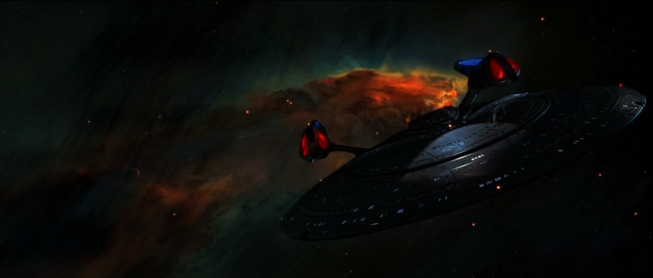
I will say, one starship shot I thought Discovery NAILED was this close up of the Gagarin. It looks very real and natural.

8UuQtOE.jpg
Man your flyby looks awesome
Yes in my opinion the Discovery spaceship effects look mostly cheap but then again Discovey is a relatively low budget show
Can they just hire you?
And can you do a slightly tweaked 800 m long Connie flyby with the Discovery?
And did I tell you how awesome your flyby is
 
To be fair, I think it's pretty safe to say that most of Discovery's money went to their 3 Bridge sets. I mean that Ship of the dead Bridge is like a cathedral.
 
If you are not already a member then please register an account and join in the discussion!

Sign up / Register


Back
Top