• Welcome! The TrekBBS is the number one place to chat about Star Trek with like-minded fans.
    If you are not already a member then please register an account and join in the discussion!

TREK MOVIE POSTERS

What one was your favorite..which one do you think wasn't so hot?

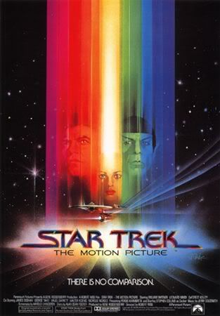
For me? After all this time I still love TMP's poster. The with Kirk/Spock/ILya, kind of in a warp blur, just above the Enterprise...I also liked UNDISCOVERED COUNTRY poster as well..worst? Hmmmmmmmm.....that is a tough one. But, just like the movie it came from, Nemesis poster with Shinzon's back to us like some kind of biker dude was pretty weak...Insurrection was okay, but looked to much like Undiscovered Country...

And I do like TREK V's poster. The one where an army of horses are coming at you in a warp field blur..

Robert
 
star_trek_the_motion_picture1.jpg


Neil
 
Yeah, the TMP poster is by far the best. The FC one with the Enterprise flying away from the Borg cube was nice too. TWoK, TSFS and TVH were OK, didn't particularly like the TFF one or GEN and I seem to have forgotten the others.
 
Agreed the TMP one is the best (I have an original One Sheet framed on my wall). Also like the alternate Borg cube First Contact poster, with an assimilated Earth in the background and the tag line "Population Nine Million... None Human".
 
I can't remember what TWOK or TSFS posters looked like. I like TMP the best. Probably NEM was the worst IMHO.
 
Awhile ago, I found online the art for posters for ST:2 through ST:6 before the graphics were added. I have posted them below. Also posted here are two rejected posters for ST:6.

Mods, I hope this post is not too image intensive. I put up the pictures here, instead of the links, as they are rare and worth seeing. I completely understand if you want to turn these into links instead.

ST:2
posterst2.JPG


ST:3
posterst3.JPG


ST:4
posterst4.JPG


ST:5
posterst5.JPG


ST:6
posterst6.JPG


Rejected Poster #1, ST:6
posterrejected1st6.jpg


Rejected Poster #2, ST:6
posterrejected2st6.jpg
 
I always preferred this poster which adorned previous VHS/Laserdisc covers here in Britain, but unfortunately not the current DVD. Not sure, but I think it must be the International Poster. It matches the art style of the previous ones better than that crude line drawing of Kirk and Spock, at least imo.

Star_trek_iv_ver3.jpg
 
^ I do like that, too.

EDIT: Looking around the Internet, I found this alternate graphics, higher rez verison of that poster:

st4alternateposter.jpg


Here's another alternate poster, this one for the Director's Cut of ST:TMP. Obviously very similar to the original but cleaner and simpler.

posterst1.jpg
 
Last edited:
The best, TMP. I also think the GEN one looks pretty nice. The worst, INS, chiefly for its total lack of originality.
 
The international one sheets often had more creative artwork. I have a few great Japanese one sheets, 3 and 4 I think that are very interesting. Also, the Euro IV with Kirk and Spock on the street with the O in VOYAGE home is the probe's eye thingy.

Other than those, the II shown above with Kahn's arms crossed are my faves.
 
The TMP poster have always been a favorite of mine. One of the things I loved about the TUC poster is that is--to my eyes--evoked the imagery of the TMP poster, which seemed appropriate as it was to be the last TOS Movie.
 
^ I do like that, too.

Here's another alternate poster, this one for the Director's Cut of ST:TMP. Obviously very similar to the original but cleaner and simpler.

posterst1.jpg
It's not simpler...it's just a PhotoShop job using the original reference photos of the actors instead of Peak's more interesting graphical representations of them. Phooey.
 
^ Heh, yeah. Spock is so badly photoshopped in that TMP DE poster, it doesn't even resemble Nimoy no more.

Peak is a legend and his Bond movie posters were more exciting than the films themselves.
 
If you are not already a member then please register an account and join in the discussion!

Sign up / Register


Back
Top