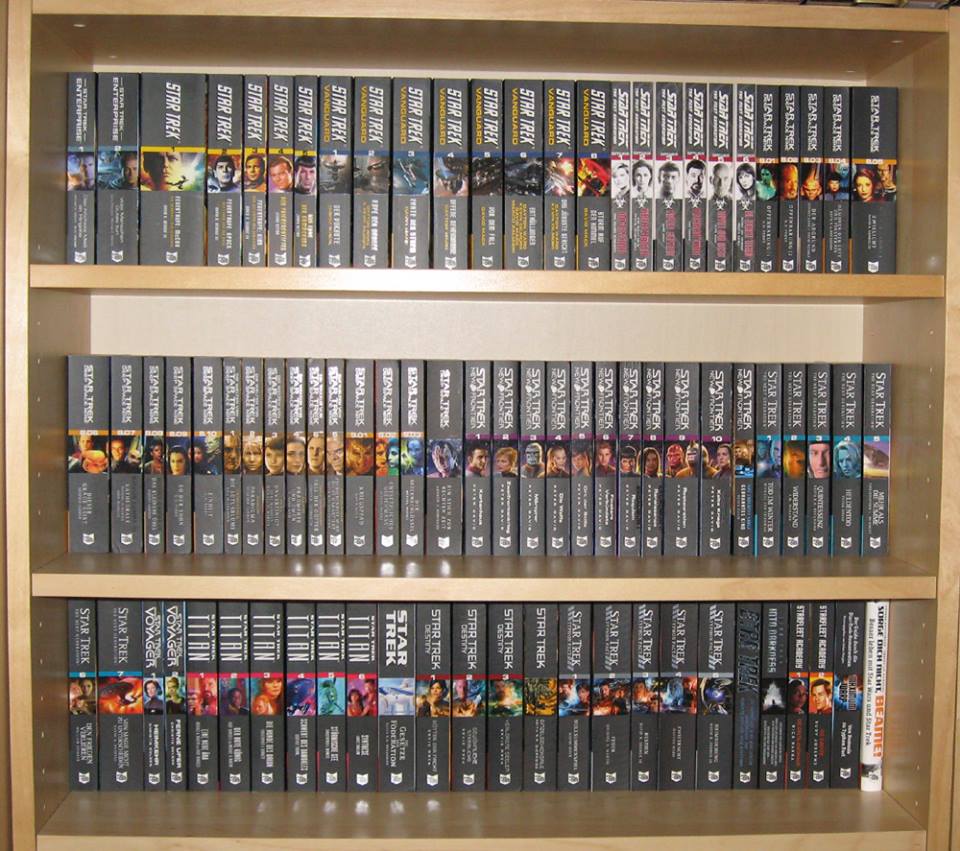
A few things to remember/consider. The first original novel from Pocket was "The Entropy Effect", which had a white spine to go alongside the US novelization of TMP, but the next few novels all had blue spines. Very consistent for a while. A rerelease of "The Entropy Effect" ended up with a blue spine but, by then, a few novels were popping up with a distinctly different colour spines/covers. Cover/spine design is all about catching the attention of the
casual browser. I was quite excited about the arrival of the green-spined "Black Fire", for example, after a long drought between original novels. When the colours began to change regularly, it was a bit disappointing when they slipped back to a blue one.
To keep spine designs consistent in a very long-running series creates the problem that designs can look out-of-fashion with new non-Trek books being produced, and which might attract the casual browser. Dedicated Trek fans are going to buy the books no matter the spine design. Spine design becomes very important in high-turnover shops that can't afford the luxury of "cover out" displays.
The German-translation novels are made for a small, discerning group of fans, so consistency is more controllable, not fighting the same market forces as US MMPBs, and would have a more relaxed production cycle that permits the German designer at Cross Cult to maintain consistency. They also have the benefit of hearing the critiques of each US cover, and can respond to them with "better" alternatives if they desire.
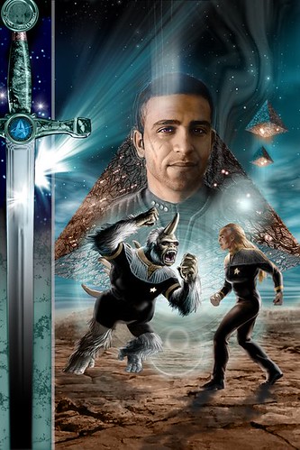
 Ensign Janos the Mugato
 by
Therin of Andor, on Flickr
I really, really appreciate the German version of "New Frontier" featuring Janos
(above). I love it!
(But I much prefer Pocket's Calhoun, as played by Keith Birdsong's handsome neighbour, to the German guy.)
I've also bought the German "Andor: Paradigm" and "Paths of Disharmony", with altered Shar artwork, and can't wait for:
 Cross Cult's German cover of Titan: Fallen Gods
 by
Therin of Andor, on Flickr
