The German Bookshelf

Discussion in 'Trek Literature' started by Tarheel, Mar 20, 2014.

  1. Tarheel

    Tarheel Lieutenant Commander Red Shirt

    Joined:
    Jan 29, 2014
    I've seen the alternate covers for German editions over the years and always found them interesting, but I never knew how different the covers truly are. Over at thetrekcollective.com, someone posted a picture of the collection all togther:

    http://www.thetrekcollective.com/2014/03/books-bits-sce-tos-and-rise-of.html

    I wish the US collection had this uniformity, cause it looks cool.

    [​IMG]
     
  2. Tirius

    Tirius Captain Captain

    Joined:
    Mar 27, 2003
    Location:
    The Netherlands
    Very cool indeed; bookshelves with many different colors and sizes of books can become a bit of an eyesore. I won't be changing to the German versions (goodness, it's been years since I last read anything of length in the language) but this is certainly impressive.
     
  3. Deranged Nasat

    Deranged Nasat Vice Admiral Admiral

    That does indeed look impressive. Very neat and formal-looking. While I like the range of colours on my Trek shelf, I think greater conformity would have been nice.
     
  4. bbailey861

    bbailey861 Admiral Admiral

    Joined:
    Oct 14, 2009
    Location:
    Kingston, ON Canada
    That display looks magnificent. I appreciate how much thought was put into the spines of the books. It is pleasing to the eye.
     
  5. Stevil2001

    Stevil2001 Vice Admiral Admiral

    Joined:
    Dec 7, 2001
    I'd like it if S&S could just maintain a consistent spine design within each series.
     
  6. JarodRussell

    JarodRussell Vice Admiral Admiral

    Joined:
    Jul 2, 2009
    What's the time range of the book releases? Ten years? It's pretty amazing that it's so consistent. Probably indicates that the people in charge didn't get laid off and replaced all the time.
     
  7. Starbreaker

    Starbreaker Fleet Admiral Admiral

    Joined:
    Feb 19, 2001
    Location:
    Birmingham, AL
    That's awesome. I would start reading paper books again if my bookshelf could look like that.
     
  8. F. King Daniel

    F. King Daniel Fleet Admiral Admiral

    Joined:
    Nov 5, 2008
    Location:
    A type 13 planet in it's final stage
    I think spine art like that would be wonderful, but I'd go with an epic mural pic across all the novel spines - it would probably encourage more sales, if only so everyone's shelf would have the complete pic and look as pretty as possible.
     
  9. Patrick O'Brien

    Patrick O'Brien Captain Captain

    Joined:
    Feb 9, 2012
    Location:
    Brooklyn NY
    It does look great and very organized, and I agree the book spines should match within a series. On the other hand, I would think that some US covers are better than the German counterparts?
     
  10. Markonian

    Markonian Fleet Admiral Moderator

    Joined:
    Jun 2, 2012
    Location:
    Derbyshire, UK
    Maybe we could hijack this thread to post all the German covers and their original US counterparts side-by-side?
     
  11. BritishSeaPower

    BritishSeaPower Captain Captain

    Joined:
    Dec 13, 2005
    Location:
    New Jersey
    With a few exceptions and discounting the German covers that are just reuses of US Market covers, the German covers are largely better.
     
  12. Defcon

    Defcon Rear Admiral Rear Admiral

    Joined:
    May 9, 2003
    Location:
    Germany
    You mean something like this?

    Enterprise: Last Full Measure

    [​IMG] [​IMG]

    Enterprise: The Good That Men Do

    [​IMG] [​IMG]

    Enterprise: Kobayashi Maru

    [​IMG] [​IMG]
     
  13. Deranged Nasat

    Deranged Nasat Vice Admiral Admiral

    ^ Objection! You've chosen for your example one of the few series where the American covers are superior to the German ones! ;)
     
  14. tomswift2002

    tomswift2002 Commodore Commodore

    Joined:
    Dec 19, 2011
    Which TNG novel did the Germans begin their TNG series with? I see that Tasha Yar's picture is on the novel in the photo, so I'm assuming that it is probably "Survivors", but I can't make out what the German title is by enlarging the photo.
     
  15. Stevil2001

    Stevil2001 Vice Admiral Admiral

    Joined:
    Dec 7, 2001
    The six tNG books are the Double Helix miniseries.
     
  16. anthony_lynch15

    anthony_lynch15 Lieutenant Junior Grade Red Shirt

    Joined:
    Mar 21, 2014
    My haphazard collection doesn't look anywhere near as nice on my shelf.
    My Deep Space Nine and Enterprise sections have a few oversized books that just add to untidiness.
    That said I'm just happy to have tracked the majority of the Relaunched Trek books down.
     
  17. JD

    JD Fleet Admiral Admiral

    Joined:
    Jul 22, 2004
    Location:
    Arizona, USA
    That German collection is definitely a lot nicer looking than my American release collection. I agree that it would be nice if the American covers were so uniform. I'm just glad they are sticking with the same cover style for the Titan books.
     
  18. Therin of Andor

    Therin of Andor Admiral Moderator

    Joined:
    Jun 30, 2004
    Location:
    New Therin Park, Andor (via Australia)
    A few things to remember/consider. The first original novel from Pocket was "The Entropy Effect", which had a white spine to go alongside the US novelization of TMP, but the next few novels all had blue spines. Very consistent for a while. A rerelease of "The Entropy Effect" ended up with a blue spine but, by then, a few novels were popping up with a distinctly different colour spines/covers. Cover/spine design is all about catching the attention of the casual browser. I was quite excited about the arrival of the green-spined "Black Fire", for example, after a long drought between original novels. When the colours began to change regularly, it was a bit disappointing when they slipped back to a blue one.

    To keep spine designs consistent in a very long-running series creates the problem that designs can look out-of-fashion with new non-Trek books being produced, and which might attract the casual browser. Dedicated Trek fans are going to buy the books no matter the spine design. Spine design becomes very important in high-turnover shops that can't afford the luxury of "cover out" displays.

    The German-translation novels are made for a small, discerning group of fans, so consistency is more controllable, not fighting the same market forces as US MMPBs, and would have a more relaxed production cycle that permits the German designer at Cross Cult to maintain consistency. They also have the benefit of hearing the critiques of each US cover, and can respond to them with "better" alternatives if they desire.

    [​IMG]
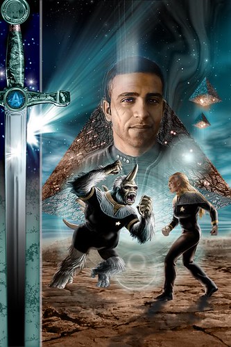
    Ensign Janos the Mugato by Therin of Andor, on Flickr

    I really, really appreciate the German version of "New Frontier" featuring Janos (above). I love it! (But I much prefer Pocket's Calhoun, as played by Keith Birdsong's handsome neighbour, to the German guy.)

    I've also bought the German "Andor: Paradigm" and "Paths of Disharmony", with altered Shar artwork, and can't wait for:

    [​IMG]
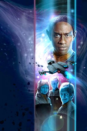
    Cross Cult's German cover of Titan: Fallen Gods by Therin of Andor, on Flickr
     
  19. Defcon

    Defcon Rear Admiral Rear Admiral

    Joined:
    May 9, 2003
    Location:
    Germany

    That was one reason why I chose it to be honest, because I think Cross Cult doesn't have a much higher hit ration than Pocket to be honest.

    And for consistency I assume it also helps that practically all covers are made by the same guy.

    BTW I did a little article about the German covers a couple of months ago for the G&T Show website: http://www.gandtshow.com/?p=3016
     
  20. Tarheel

    Tarheel Lieutenant Commander Red Shirt

    Joined:
    Jan 29, 2014
    That's an excellent overview and I really enjoyed the gallery. There were several covers in there that I had never seen. Thanks!