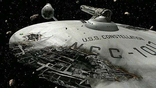
I never noticed that before. "U.S.S." is in the correct military-style font while "Constellation" is in a more generic signage font. That's simply unforgivable.
It shows even better in this shot:
I never noticed that before. "U.S.S." is in the correct military-style font while "Constellation" is in a more generic signage font. That's simply unforgivable.
Agreed, it was good to see Eddie Paskey in this documentary.
That is sloppy. And I agree they overdid the battle damage.I never noticed that before. "U.S.S." is in the correct military-style font while "Constellation" is in a more generic signage font. That's simply unforgivable.
It shows even better in this shot:
I must be one of the few who don't mind the way the planet killer looks with the original f/x. I like the rough hewn alien look.
I never noticed that before. "U.S.S." is in the correct military-style font while "Constellation" is in a more generic signage font. That's simply unforgivable.
It shows even better in this shot:
Maybe so. I thought the letters in "CONSTELLATION" didn't look like the correct block lettering with 45-degree corners (Amarillo USAF font?). But I could be wrong.Looks like they just crunched the width of the letters in "Constellation" a little to make it fit.
Yes, it's a cute avatar. But everyone knows Vulcans are vegetarians!MGagen, love your avatar! Cmdr. Spock's secret recipe, 19 herbs and spices!
Maybe so. I thought the letters in "CONSTELLATION" didn't look like the correct block lettering with 45-degree corners (Amarillo USAF font?). But I could be wrong.Looks like they just crunched the width of the letters in "Constellation" a little to make it fit.
I've just been watching the remastered FX reel of "The Doomsday Machine" on YouTube. As limited as the original physical model work was, I'll take it any day over that horrible, cartoony-looking CGI stuff.
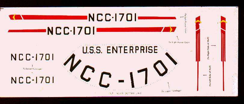
Interestingly enough, the original '67 AMT model of the Constellation used in the episode has a slightly different font (more of an Arial type) than the Enterprise's for the name plate. It stands to reason that they used the decal sheet from the model kit (simply rearranging the registry number) for all the other decals placed on the model, but they had to create the ship's name decal from scratch. It certainly came out looking OK, and of course they (Matt Jeffries?) did have the same font for both "U.S.S." and "CONSTELLATION."
Have a look-see:
While I don't know about the 1967 model, but I had one from the 70s and they had all the names of all 14 ships on the decal sheet. including the CONSTELLATION. There seemed to be the assumption that all the registery numbers began with 17.. not just any random four numbers. Though they had a lot of spare numbers on the sheet to play with.
OK, however "bad" the CBS-D CGI model may be, it is certainly better than this poorly detailed, unpainted AMT kit that someone took a pair of pliers and a propane torch to.
Yeah, a little paint work would have gone a long way.
How would you feel if you took your 10 year-old car into the shop to simply be re-painted, and when you went to pick it up, you found that they added horns from a steer on the hood, fins on the back and removed the roof in order to add Batmobile bubble windows--all because someone thought they would look cool? Well, that's how I feel when I see the CGI Constellation.
While I don't know about the 1967 model, but I had one from the 70s and they had all the names of all 14 ships on the decal sheet. including the CONSTELLATION. There seemed to be the assumption that all the registery numbers began with 17.. not just any random four numbers. Though they had a lot of spare numbers on the sheet to play with.
That multi-ship decal didn't exist then.... they didn't even start thinking of the "official" names for the other Starships until the second production season.
Here's a scanned copy of the actual decal sheet that came with the AMT Enterprise model circa 1967, from which the filmed version of the Constellation was built:
We use essential cookies to make this site work, and optional cookies to enhance your experience.