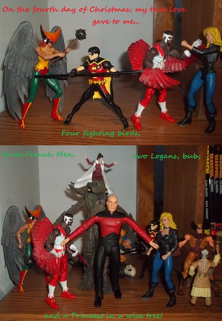
Actually, this is day four....

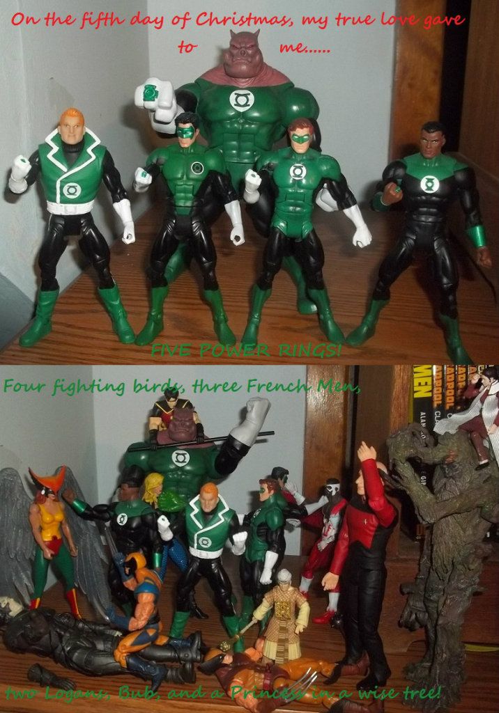
 Things are going to escalate quickly around here. I'm not sure Picard and Treebeard can hold off what is to come.

")
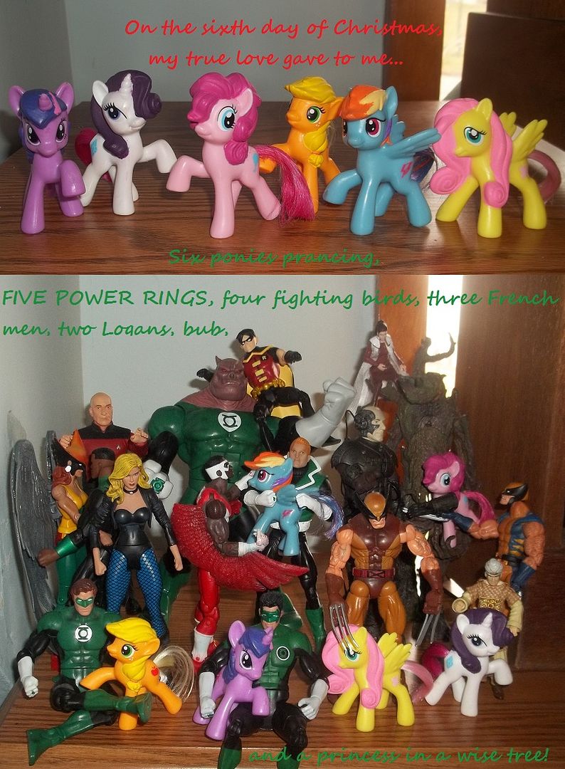
 Apparently they're selling like hot cakes.
We use essential cookies to make this site work, and optional cookies to enhance your experience.