He does give a damn. Just not the same way all fans look at it.In fact, if JJ had actually given a damn we probably would have had something similar in the Kelvin-verse films.
-
Welcome! The TrekBBS is the number one place to chat about Star Trek with like-minded fans.
If you are not already a member then please register an account and join in the discussion!
You are using an out of date browser. It may not display this or other websites correctly.
You should upgrade or use an alternative browser.
You should upgrade or use an alternative browser.
Spoilers Starship Design in Star Trek: Picard
- Thread starter pst
- Start date
I’ve never had an issue with the design of the Discoprise, inside or out (except for the bridge window). It’s a fantastic looking update of the original design. In fact, if JJ had actually given a damn we probably would have had something similar in the Kelvin-verse films.
That said, I still prefer the Classic TOS design 10 times outta 10.
Abrams didn’t design the ship. Ryan Church did.
It was great design for me and many other people.
I'm talking about the rendering of the video, not the design.
And joke is not moronic.
It certainly is. It was dumb the first time back in 2009, and it's been driven into the ground by a succession of fanboy artists who think they're clever - or just figure it's a good way to get some views on Youtube.
i really enjoyed when they distroyed Discovery and killed that strange crew.
That's uncalled for. I think that show is terrible, myself, and haven't watched it in years, but what of it? And just exactly what do you mean by "strange crew," anyway?
Abrams didn’t design the ship. Ryan Church did.
True, though the Art of Star Trek (2009) book does show that Ryan Church's earlier designs were more conservative, and he was regularly directed by JJ Abrams to push it into a more extreme direction (these annotations are Abrams's):

I have to admit, lukewarm as I am on the Abrams movies in general and the Enterprise design in particular, I did like some of Church's original concepts that never made it to screen. Like the idea that the Enterprise's engines would glow from within when at warp, allowing us to see the warp coils and plasma – I thought that would have been a cool evolution of the traditional glowing grilles:
So, like Burton and Amos in "Roots".Except that younger actor isn’t going to look like the older actor once 2265 hits.
So, like Burton and Amos in "Roots".
I’ve never seen Roots so I’ll take your word for it.
If you know who John Amos and Levar Burton are....I’ve never seen Roots so I’ll take your word for it.
Venom Geek Media on YT is pretty good too.There's another similar fan-fic project I'm enjoying, an oral history of Wolf 359. They've been posting preview chapters on their Facebook for the last few days. Their adaptation of Shaw's story from a couple episodes ago into an interview with a historian was really good, really nicely fleshed out while keeping the spirit (TV writers; I know it makes more work for legal clearances, but please use names when characters are telling stories from their past, it's good for verisimilitude).
The interior of the Discoprise is one of the best starship sets I’ve ever seen. The bridge, engine room, corridors, uniforms, props, etc. all look fantastic.
SNW Enterprise interior to the Kelvinprise exterior would be peak mid century retro futurism inspired 23rd Century to me.
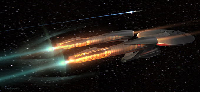
That 50's/60's fighter jet/experimental aircraft look is pretty sexy.I can respect your opinion, but I can't help but disagree. To me the "new" Enterprise is the most gorgeous ship in Trek. And I cannot understand the hate that she gets. But that's me. Opinions may vary.

The ships this season look so good, I'm particularly taken by the Intrepid; can't wait for that size chart!
I’ve never had an issue with the design of the Discoprise, inside or out (except for the bridge window). It’s a fantastic looking update of the original design. In fact, if JJ had actually given a damn we probably would have had something similar in the Kelvin-verse films.
That said, I still prefer the Classic TOS design 10 times outta 10.
The New Jersey just shows that the design still works with modern FX.
Looked static and underendered to me.The New Jersey just shows that the design still works with modern FX.
mm, no.The New Jersey just shows that the design still works with modern FX.
Looked static and underendered to me.
Yeah, it wasn't a flattering presentation of the design, and there were some artifacts that suggest it was a low-detail model (the panel-y metallic texturing, the segmentation of the saucer around the bridge dome). It's strange, either of the TOS-R models or even the Defiant from ENT were cleaner, more detailed, and more precisely faithful to the original design, never mind fan-made and fan-adjacent versions.
I'm still curious where this model came from. It's not from STO, it's not any of the ones that have been in any of the earlier shows. It's got some idiosyncratic details that should make it easy to identify if it's ever been used publicly, there are extra windows along the saucer edge and engineering hull, the missing lighted rectangles, and the extra formation lights on the top. It itches at me, I feel like I've seen it before.
The curves and proportions seem off, too...Yeah, it wasn't a flattering presentation of the design, and there were some artifacts that suggest it was a low-detail model (the panel-y metallic texturing, the segmentation of the saucer around the bridge dome). It's strange, either of the TOS-R models or even the Defiant from ENT were cleaner, more detailed, and more precisely faithful to the original design, never mind fan-made and fan-adjacent versions.
I'm still curious where this model came from. It's not from STO, it's not any of the ones that have been in any of the earlier shows. It's got some idiosyncratic details that should make it easy to identify if it's ever been used publicly, there are extra windows along the saucer edge and engineering hull, the missing lighted rectangles, and the extra formation lights on the top. It itches at me, I feel like I've seen it before.
As much as people are excited to see it, I'm kinda disappointed it's so crappy.
I also think it should have been a canonical ship, such as Yorktown, which would have been a more fitting tribute.
Eh... I dunno about that. If I'm being honest, it kinda looks like crap. Low detail ships never really look great in CGI. Always makes them look like something outta Babylon 5.The New Jersey just shows that the design still works with modern FX.
the segmentation of the saucer around the bridge dome
What's odd is the hull is smooth above and below that segmented ring, bounded by panel lines, which makes me think it was an intentional detail. Why they would do that I don't know, but maybe they just wanted to make it look like a class variant.
Some of the changes for the New Jersey seem deliberate, like the windows, and others seem like they ran out of time, like the nacelles. It's not the most impressive depiction of a Constitution-class ship I've ever seen to be honest, but I can live with the TOS Enterprise being prettier than her sisters!
I'm just glad they're making a firm statement that no one's trying to retcon the TOS design, or say that it's too dated to put on TV in 2023.
I'm just glad they're making a firm statement that no one's trying to retcon the TOS design, or say that it's too dated to put on TV in 2023.
Similar threads
- Replies
- 0
- Views
- 480
- Replies
- 1
- Views
- 580
- Replies
- 479
- Views
- 23K
- Replies
- 18
- Views
- 658
If you are not already a member then please register an account and join in the discussion!