I'm reluctant to harp on this point, but I guess I can't help myself (and please accept my sincere apologies for having been snarky earlier; I try to edit all the books that I work on with a very close touch and a hands-on approach, and this can often lead to my being, admittedly, a bit too defensive about the finished product). I do promise that this will be my last word on the subject of the front cover, though:
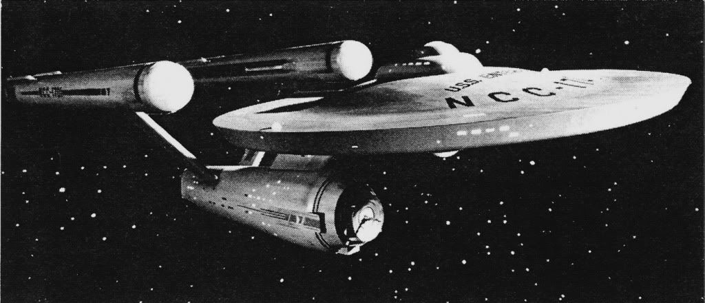
The image on our front cover simply shows an angle on the model and a lighting set-up that no one is used to seeing onscreen; in fact, this angle has never been shown onscreen. Neither the Smithsonian's model nor our front-cover image suffer, however, from a "droopy" nacelle.
")
The top left and top right images below are both completely unaltered shots from the photography sessions at the SI. Same room, same model, same photographer. The image at top left uses a different lighting set-up, a different focal length, and has the internal displays on the model turned off; it was also shot at a "hero angle" (top left) as opposed to straight-on (top right). The image at bottom left is the model as it hangs in the Institution; the image at bottom right is the one that you posted previously for comparison. Note that the "droop" isn't evident on the two shots of the model (top right and bottom left) that closely mirror the angle on the reference shot that you posted.

We could have easily composited and re-touched the image at top right for our front cover, which does feel much more familiar, but that image also, in the opinion of our designer and me, is very flat and boring—exactly what we've all seen over and over again on the show, on and in other books, etc. Instead, we went with the more dramatic choice, even if it varies from the angle that we're all used to (but still is, I contend again, technically accurate).
Of course, I wouldn't want to deny anyone their opinions or judge them based on it—if you don't like the cover, you don't like the cover, end of story, and if you think that it's off-model or hideous-looking that's your right—and I respect anyone's opinion as such. It does sting a bit, though, to be accused of sloppy or thoughtless or amateur work when it was, in my opinion, anything but.
At the end of the day? A minor issue. I hope, at the very least, this look behind the scenes of the publishing process and at the kinds of decisions that are made on the levels of cover design and image selection is of some interest to the boards here.
")


 ).
). *owned!*