Quick question: Does the NX-01 Refit with a book/magazine? Big so, is it print and/or PDF?
Yes, the NX-01 Refit comes with a printed magazine.
Quick question: Does the NX-01 Refit with a book/magazine? Big so, is it print and/or PDF?
Was that at FB? I was just in there and missed it if so! Drat!Apparently there's also a new line of Star Trek starship model/toys. Titans Vinyl Figures has recently produced a 4.5" vinyl USS Enterprise-D ship. Has anyone bought it? Is it a good toy for kids? (Just to keep the Eaglemoss models safer?)
I'd guess it's still more of an "adult collectible" than a kid's toy. They sell a TOS Enterprise as well, but it's more weirdly proportioned.Apparently there's also a new line of Star Trek starship model/toys. Titans Vinyl Figures has recently produced a 4.5" vinyl USS Enterprise-D ship. Has anyone bought it? Is it a good toy for kids? (Just to keep the Eaglemoss models safer?)
I'd guess it's still more of an "adult collectible" than a kid's toy. They sell a TOS Enterprise as well, but it's more weirdly proportioned.
^ The Johnny Lightning Connies look pretty normal tonne. Did I miss something?
Oh yeah:Weirder than the Johnny Lightning one?
Oh yeah:
http://titanmerchandise.com/star-trek-titans-the-original-series-45-enterprise/
I assume it's too keep with the aesthetics of their figures (heh, guess they figured the 1701-D was close enough in its natural state).

Admittedly, I'm just going by the Defiant 1764 (though I'm assuming the Excalibur and the 1701 come form the same molds) but it looked terrible. The saucer was too thin, the deflector dish stuck out way too much, and the font for the name and registry on the hull were all wrong. Eaglemoss did a far better job on the Connie. (Though interestingly, I think Johnny Lightning did a far better job on Voyager than Eaglemoss did, so no one's perfect).
Question too- I know it originated in TNG The Defector, but is the Romulan ship in The Next Phase exactly the same model or was it altered?
Wait, what? JL produced the least splendid rendition of Voyager, except maybe the Revell miniature. It's lanky and the proportions are wrong.
The JL were my first proper Connies, so maybe that's they set the standard for me. The dish looks funny but the rest is fine. Plus, I prefer that the JL 1764 and 1664 are white, whereas the JL and Eaglemoss are too grey, IMHO.
Though interestingly, I think Johnny Lightning did a far better job on Voyager than Eaglemoss did, so no one's perfect
The Eaglemoss Voyager has this weird little serif on the "7" that it's not supposed to have
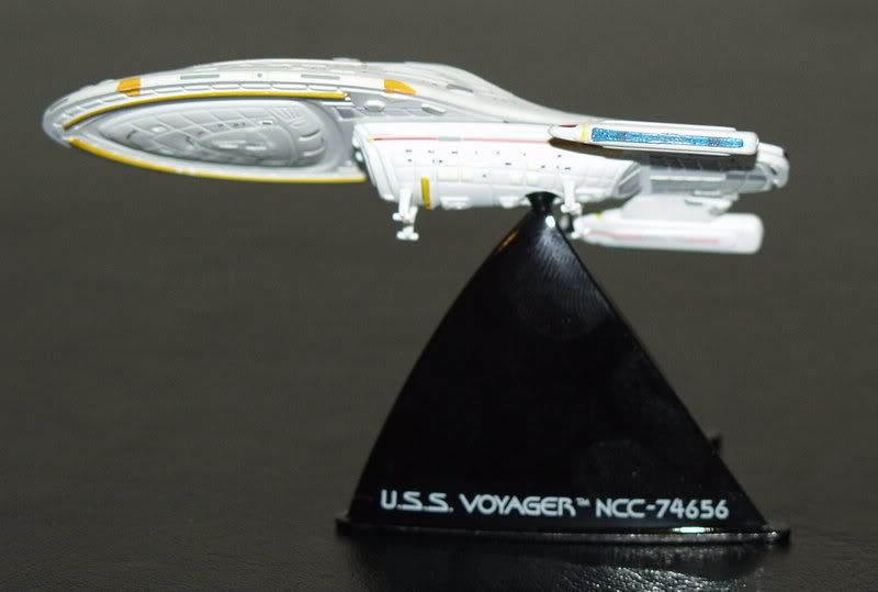
You care more about the "little serif on the 7" than the wrong shape and proportions of the ship that the Johnny Lightning Voyager has? Not too mention those annoying drooping nacelles!
We use essential cookies to make this site work, and optional cookies to enhance your experience.


