But I want to hold it in my hand!i want this to be real, and to be captain.I want this to be a toy, and I want to play with it.
-
Welcome! The TrekBBS is the number one place to chat about Star Trek with like-minded fans.
If you are not already a member then please register an account and join in the discussion!
You are using an out of date browser. It may not display this or other websites correctly.
You should upgrade or use an alternative browser.
You should upgrade or use an alternative browser.
Star Ship Polaris
- Thread starter aridas sofia
- Start date
That's what she said.But I want to hold it in my hand!i want this to be real, and to be captain.I want this to be a toy, and I want to play with it.
Though, admittedly, it -is- gorgeous. I approve.
This is better than I could ever have asked for. Thank you. We'll do our best to live up to her.
Oh, and she has a captain.")
The airlock is indeed an important story point, and I thank you for getting out ahead of that - this makes that sequence easier to visualize, as well.
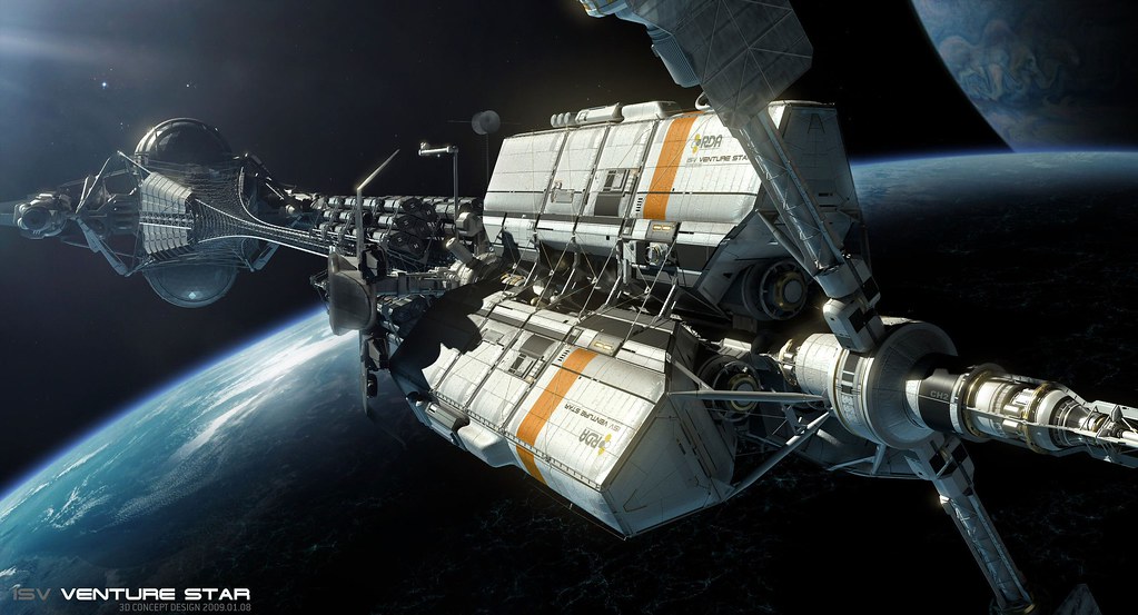
On the subject of the registry and emblems, we should probably look at aviation and naval references - not so much at the way these things are placed and illuminated in Star Trek. For that matter, there are alternative approaches even in science fiction - do Star Wars ships even have markings? I'm personally fond of the colors and look of the markings on the Venture Star in Avatar:
Oh, and she has a captain.
The airlock is indeed an important story point, and I thank you for getting out ahead of that - this makes that sequence easier to visualize, as well.
On the subject of the registry and emblems, we should probably look at aviation and naval references - not so much at the way these things are placed and illuminated in Star Trek. For that matter, there are alternative approaches even in science fiction - do Star Wars ships even have markings? I'm personally fond of the colors and look of the markings on the Venture Star in Avatar:
For that matter, there are alternative approaches even in science fiction - do Star Wars ships even have markings?
Sort of. Their approach is occasional panels or stripes of contrasting color, with the exception of Episode III, where all the capital ships suddenly sprouted large colorful graphic markings.

Episode III:

I really like the bright-color-with-trim approach of this one:

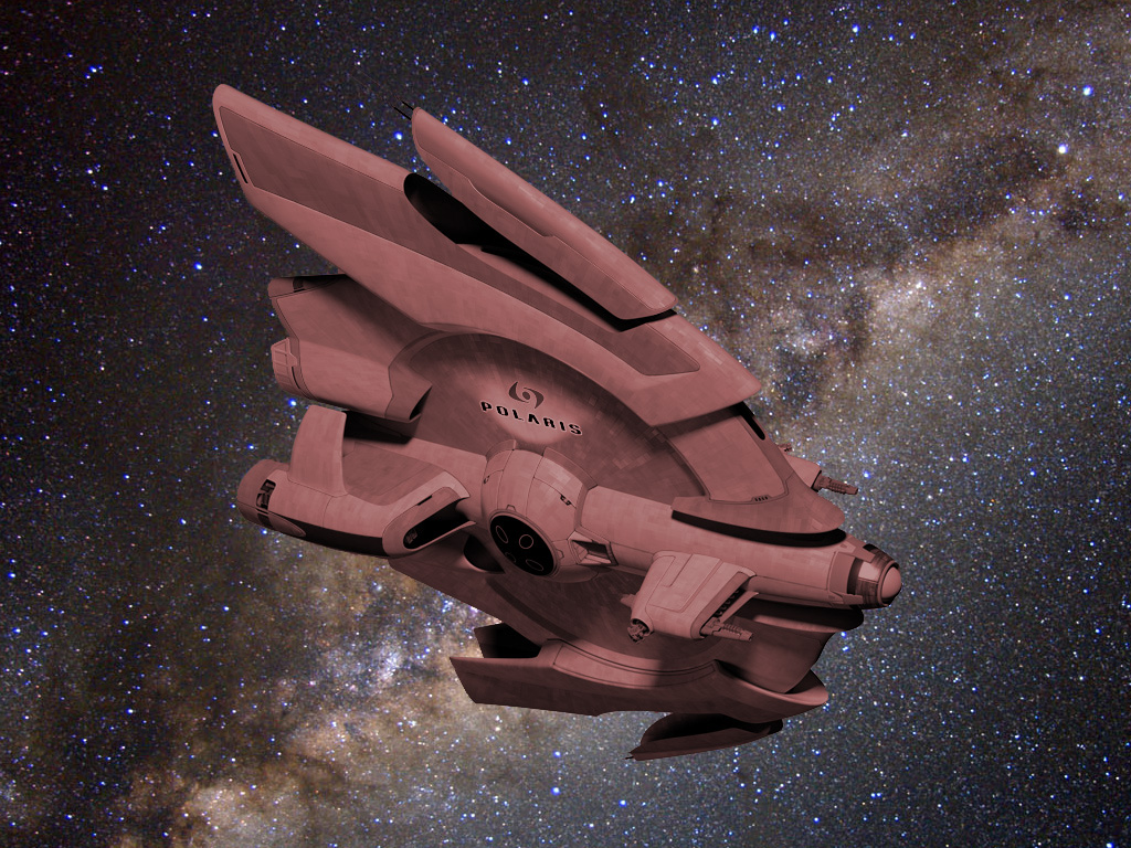
I wonder how the Polaris would look in maroon...
I wonder how the Polaris would look in maroon...
Sort of. Their approach is occasional panels or stripes of contrasting color, with the exception of Episode III, where all the capital ships suddenly sprouted large colorful graphic markings.
Right...Vektor has done a number of renderings with color panels/contrasts and I'm very interested in seeing where he goes with that. What I'm thinking is that on real vessels it seems common for numeric markings and (on commercial vessels) livery to be visible from a distance, but not so much the names of vessels. I think maybe the ship's name would be emblazoned and illuminated near points of entry and at a scale to be read on close approach.
I love the way all the various parts on this version combine in a very sculptural look - I mentioned to Vektor in an email, I think, that this is like the "Motion Picture Refit" of his earliest versions of the design, which were pretty amazing themselves.
Alright. That's it. You need to make a model of this for us plastic lovers to put together. The best part is that you don't have no stinkin' studio breathing down your neck claiming copyright infringement.
Beautiful work Vektor.
Beautiful work Vektor.
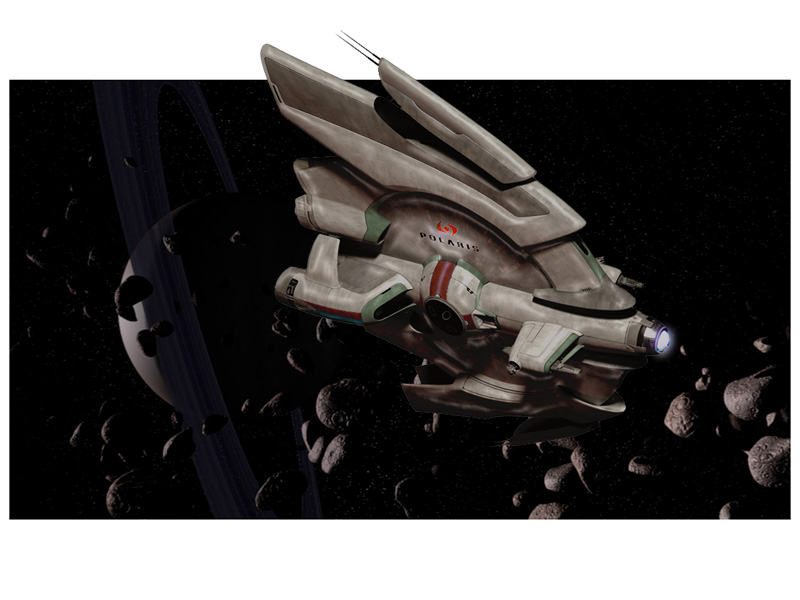
I really like the orange.
So do I. I really want to stay away from red, scarlet, etc. I don't think the vertical stripe on the central globe works, but carrying some kind of thin, dual stripe forward along the fuselage might be cool.
Which is really getting ahead of things - as Vektor notes, he's still working on the modeling itself.
Between aridas' original design layouts and all of the super design work that Vektor's done to make the ship come alive I like this as much as any fictional spaceship design I've ever seen. It has the sense of "thingness" that the Enterprise or C57-D do; there are clearly design inspirations from many places without being derivative. I love it.
I'd also love to see a plastic model of it myself. To be clear, any arrangements, income etc. from that kind of thing are for Vektor and aridas to work out between them - what I've asked for Polaris is only the right to use the ship in the movie and in any promotional and associated materials for it.
Last edited:
I went back to page 1 of this thread today to retrace the evolution of this design. What a great looking and well thought out ship this is. Thanks for sharing and I look forward to the final product!
Last edited:
A different color scheme using the Venture Star orange:

Hot. Orange.
Worked for the Venture Star, worked for the Normandy, and it works for Polaris.

I encourage folks to go back and scan this thread from page one through to now. The different approaches and techniques used ... the dead-ends ... it's fascinating to watch that all play out. Fortunately, it doesn't look like many links to images have been lost, so the full story remains intact.
Well, the biggest leap forward after aridas designed the vessel was when I got out of the way and Vektor took over. 
I felt that there ought to be the kind of unexpected details and elements that look as if they arise from some functional demands that aren't immediately apparent, rather than just added out of whimsical imagination - my favorite example of that is the engineering cove on the Enterprise. But I didn't have a clue how to do that.
I felt that there ought to be the kind of unexpected details and elements that look as if they arise from some functional demands that aren't immediately apparent, rather than just added out of whimsical imagination - my favorite example of that is the engineering cove on the Enterprise. But I didn't have a clue how to do that.
Last edited:
Well, the biggest leap forward after aridas designed the vessel was when I got out of the way and Vektor took over.
I felt that there ought to be the kind of unexpected details and elements that look as if they arise from some functional demands that aren't immediately apparent, rather than just added out of whimsical imagination - my favorite example of that is the engineering cove on the Enterprise. But I didn't have a clue how to do that.
You say that, but I really liked some of your variations. Yes, Vektor is an amazing artist and all that, but the designs you were settling on when you started experimenting with animation would have worked just fine.
Similar threads
- Replies
- 2
- Views
- 4K
- Replies
- 5
- Views
- 766
If you are not already a member then please register an account and join in the discussion!