Ah, the step down in the foreground makes more sense, now.
I'm having fun working out the profile of those vertical pillar-things surrounding the central control banks.
The railing and deck height change also eliminates the question of why there aren't controls on both sides of the console.
As for the vertical "pillar-things," I can probably draw you a detail that will help them make more sense. Look for it some time this afternoon.
Also, I should probably mention that I never intended to have control banks on all six sides of that central cluster. I was thinking only two on opposite sides. The other four would be taken up by machinery and equipment. I was able to avoid having to deal with any of that in this illustration because the only one of those sides that happens to be facing the camera is conveniently obscured by the vertical strut Petri is working at. I just felt that six monitoring and control stations would be massive overkill, especially with the additional consoles scattered around the perimeter
In the support beam over the console are six red things that could be lights or pipes. It doesn't make much sense for them to be pipes, and they don't look like an effective arrangement of lights, either. Do you have any specific thoughts on what they are, or did you just texture in that space with something that looks technological?
The original placeholder background plate the team was using for this scene had an archway with banded red lights along the inside. It was a feature that everybody liked so I did my best to preserve it as I went along with these design iterations. They have no designated function, but they might be something as simple as condition indicators, like all the cove lights and illumination strips that turn red on Trek starships when they go to red alert. They might also convey information about specific systems. Or maybe they're great big fuses or something. Take your pick.
")
The foreground console looks gorgeous now -- even more photorealistic.
Cool, I'm glad it appears convincing. Ironically, I'm not actually going for photorealism here. This is truly just a concept sketch, not a matte painting intended to appear in the actual shot.
Dennis is working on the 3D modeled virtual set right now and I'm eager to see how it turns out.
I'm also fond of the cobalt shock absorbers (or whatever they are) attached to the ring. That does a nice job of breaking up the uniform grey of the compartment while still looking metallic.
Yeah, I was trying to inject more color into the space so I decided to just paint the things blue. I used a lot of photo references of actual engine rooms and noticed that most of them tend to be fairly bright and clean with freshly painted pipes and conduits and railings and such. I haven't actually dirtied this image up yet, which I still intend to do, but I probably won't be going overboard with it because it's literally dangerous for these kinds of spaces not to be kept clean.
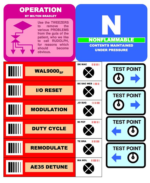
You probably already know this, but you need signage. Lots of yellow and black "WARNING -- Lorem ipsum dolor" stuff on various bulkheads and gizmos.
Yeah, I'm already working on a reference sheet of signage and indicators, many of them borrowed from photos of the physical sets, that will be scattered around in appropriate places.
It occurs to me that if I lived on a spaceship like this, I'd want posters and calendars of ... trees. Forget naked women, cars, motorcycles, and popular stars, I'd just want to let my eyes fall on a beautiful landscape where I can imagine warm sun and twittering birds.
Alright, and maybe naked women.
Hey, I've already got a welcome mat painted on the deck outside one of the EVA bays, so why should Main Control be strictly regulation?
")