Likewise. I'm really looking forward to seeing her fly.
-
Welcome! The TrekBBS is the number one place to chat about Star Trek with like-minded fans.
If you are not already a member then please register an account and join in the discussion!
You are using an out of date browser. It may not display this or other websites correctly.
You should upgrade or use an alternative browser.
You should upgrade or use an alternative browser.
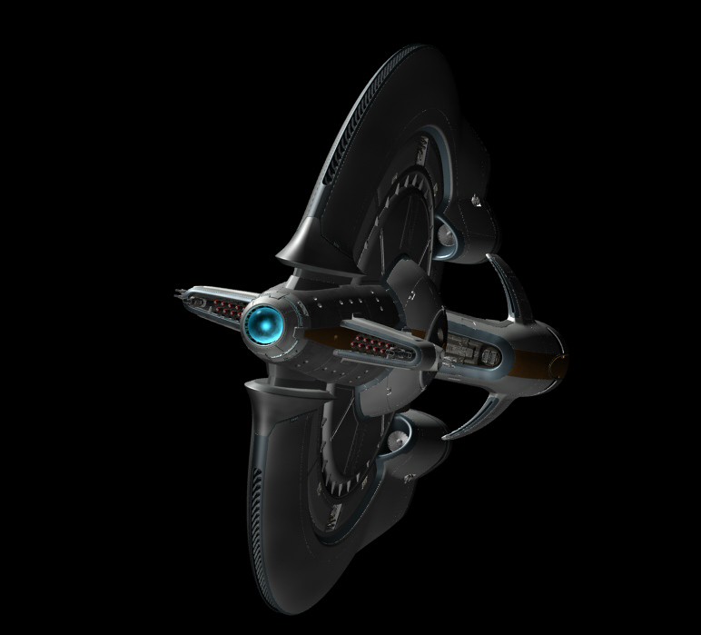
Star Ship Polaris
- Thread starter aridas sofia
- Start date
Did some more playing around with the Polaris engine room over the long weekend. Here's a slightly different concept for the shell of the space. Note that the heavy mechanical components and/or console clusters previously shown in the center of the room will still be there, I've just omitted them for clarity--not to mention the fact that I haven't repainted them yet.

And here is a version with live action elements added, tighter cropping, some color correction and some steamy engine room atmosphere. This is a patchwork of multiple people from multiple scenes intended to provide reference for console/equipment locations and lighting effects. Basically, I've redesigned this whole space in order to put stuff where it needs to be in order for the positions and actions of some of the on-screen characters to make more sense.

With luck, I may be able to get all the bulky stuff in the middle of the room added by tomorrow night.
And here is a version with live action elements added, tighter cropping, some color correction and some steamy engine room atmosphere. This is a patchwork of multiple people from multiple scenes intended to provide reference for console/equipment locations and lighting effects. Basically, I've redesigned this whole space in order to put stuff where it needs to be in order for the positions and actions of some of the on-screen characters to make more sense.
With luck, I may be able to get all the bulky stuff in the middle of the room added by tomorrow night.
I like it - particularly the big gadget with throw switches and Krell gauges. ")
That is one cool mockup. And I agree with Legion about the Krell gauges. Unfortunately, the practical console and the sketched one look like different technologies/eras. As though the practical one came from Star Trek:Enterprise and the mockup came from Flash Gordon. Each looks good in its own right, but it'll take some work to make them visually compatible with each other.
Whats wrong with different technologies/eras when this ship was a civillian ship refitted for military use. I think mixed technology would be prevalent in the ships engine room.
I like it - particularly the big gadget with throw switches and Krell gauges.
I thought you might like that.
You'll also note that I couldn't keep the archway in its previous form, but I did manage to preserve a suggestion of it in multiple places.
Unfortunately, the practical console and the sketched one look like different technologies/eras. As though the practical one came from Star Trek:Enterprise and the mockup came from Flash Gordon. Each looks good in its own right, but it'll take some work to make them visually compatible with each other.
I don't think they're that far apart, but we've been talking about a CGI replacement of the practical console anyway, so we'll see what shakes out.
Neat.
Anyone who's even been in an actual Navy ship's CIC or an air base's computer center knows that it's a mish-mash of equipment by different manufacturers and from different eras. A few common elements or colors from one device to the other are all it would take to make these feel like they belong together.
My only comment is that the room feels a little too deep, but that's possibly an illusion based on the empty nature of the room beyond. If it helps in calculating the perspective, the console is about 6' wide.
The practical console has some extra red in the midtones that I have not yet replicated on the adjacent console, which would definitely help to integrate the two.
Haven't decided yet what to do with the supports for the practical console. Will probably depend on how much of it gets replaced or augmented with CG. Might need to give it a solid front if you want to do something like a wider angle establishing shot and the live action elements need to move up from the bottom of the frame. Otherwise the legs of the person standing behind the console (or lack thereof) will present a problem.
While we're on the console subject, I noticed it rocks and jiggles slightly when poked and prodded in the clips you sent me. Whether or not it gets replaced with CG, might be worth locking down the image of it so it doesn't do that.
Finally, the space shown above does look fairly cavernous, but it's going to be filled with all kinds of machinery and equipment in the next iteration that will likely banish--or at least obscure--that impression.
This might be covered in one of the Polaris threads, but is the ship suppose to have a steam punk vibe to it?
I like it, I'm just curious. Because the outside isn't very steam punk but the inside is.
I like it, I'm just curious. Because the outside isn't very steam punk but the inside is.
Weeelllll... I'm not sure "steampunk" is quite applicable. I might go with "retro" in certain aspects, including some of the costume and prop design. The ship's exterior actually includes a few elements of classic car design with a dash of '50s aeronautics. For the interior stuff I've worked on, I've been trying to adhere to the theme established by the bridge set, a balance of high-tech sleekness and Golden Age sci-fi retro.
In the end I'm not totally sure what you would call the overall look of this production, but I hope it turns out to be something fairly unique.
In the end I'm not totally sure what you would call the overall look of this production, but I hope it turns out to be something fairly unique.
The Command Deck:
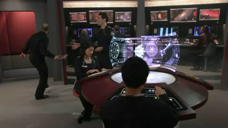

The railing, the levels and the valve wheel in the b.g. are the only things I can think of that might hint at steampunk...and the steam. ") But unless those railings are brass we're probably safe.
But unless those railings are brass we're probably safe.
Yeah, the console wobbles when handled. I didn't bother doing anything to it in post because Dennis was suggesting a digital replacement, so I didn't seem the point in touching it until we decided what to do with it.
I'd personally hate to lose the ability to see under the console at all. It would make the set feel like a muppet set with everyone speaking behind a wall. The only time the legs would be a problem is if we shrink down a shot where area under the console is out of frame. If necessary, we could fake in Petrie's legs there where you have him legless. Hell, we'd just need to shoot some legs!
I like that you matched the lighting alcoves from the Command Deck (once the "transporter" texture is applied it'll feel very connected). An additional suggestion to maybe tie these sets together...what about a matching hatchway?
But unless those railings are brass we're probably safe. Yeah, the console wobbles when handled. I didn't bother doing anything to it in post because Dennis was suggesting a digital replacement, so I didn't seem the point in touching it until we decided what to do with it.
I'd personally hate to lose the ability to see under the console at all. It would make the set feel like a muppet set with everyone speaking behind a wall. The only time the legs would be a problem is if we shrink down a shot where area under the console is out of frame. If necessary, we could fake in Petrie's legs there where you have him legless. Hell, we'd just need to shoot some legs!
I like that you matched the lighting alcoves from the Command Deck (once the "transporter" texture is applied it'll feel very connected). An additional suggestion to maybe tie these sets together...what about a matching hatchway?
Last edited:

Oh, I like that! The big pipes are nice and you still manage to make it not look like a brewery. One suggestion maybe. Continue the overhead beam with the red lighting past the column and on into the core structure. It'll tie the live action area into the cgi backdrop better.
The bridge looks nice. Are those all lcd screens that we can see or are some of them static backlit plates?
One suggestion maybe. Continue the overhead beam with the red lighting past the column and on into the core structure. It'll tie the live action area into the cgi backdrop better.The bridge looks nice. Are those all lcd screens that we can see or are some of them static backlit plates?
I haven't seen any pics of the bridge, but the physical console in the above pics looks very solidly TOS Trek to me with maybe a hint of ST:Ent.
Thought it was just me too. Including the command deck being very TOS and the uniforms having a 50's vibe.
It's funny though because the exterior of the ship just looks amazing and completely non-trek.
Oh yeah, I like the feeling of that design. Crowded.
The Command Deck set used a combination of LCDs and backlit graphics. The lighting guys spent some time getting the illumination balanced so that it's not so easy to pick out the difference at a glance. And then there are times when we replace a static graphic with an animation in post.
I definitely wanted an old-fashioned look to the set - physical buttons and switches, etc.
Nice work on the engineering deck. Certainly fits the feel of the thing, at least from my rather limited perspective.

Similar threads
- Replies
- 2
- Views
- 4K
- Replies
- 5
- Views
- 755
If you are not already a member then please register an account and join in the discussion!