• Welcome! The TrekBBS is the number one place to chat about Star Trek with like-minded fans.
    If you are not already a member then please register an account and join in the discussion!

ST: (Untitled) Concept Art.

JoeRalat

Fleet Captain
Fleet Captain
Hello All. With all the crazy things happening with fan films, I wanted to show off some concept art for something we are working on. We want to wait for the fall to go into full details about it. We still need to register domains...etc

Please let me know what you think. Will have more soon!
Thanks again.

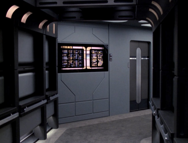
But for now I will be posting concept art for it.
You can find a larger version in the link below.
http://startrekreference.com/UploadImages/STUntitled1.png
STUntitled1A.png
 
Last edited:
The one I like best is the one on the left, because those circular graphics rather evoke old reel to reel computer tape, which gives it a vaguely retro feel without literally being retro. I'd encourage you to explore that direction more.
 
I agree with Maurice's comment about there being too many logos. But assuming we're talking about standardized parts here, then the lower panels probably ought to be near-uniformly decorated.

And if you're looking for recommendations, I think the third panel gets it about right. It's simple, not overly done, and works for whatever identification purposes are needed.

I would scale down the logo in relation to the text though -- it doesn't need to stick out quite so much.
 
Too many logos. You don't see American flags on every other panel on a Navy ship.

No but you would see the corporate brand (HP, Dell), the operating system (Windows, Linux) and even the processor logos (Intel, AMD) on nearly every server panel today.
 
Wowbagger
Hey Wowbagger, its be and a few locals in NY.

Maurice
"Too many logos. You don't see American flags on every other panel on a Navy ship."
:D Maybe its not clear in the photo, its 4 versions. I wanted to try different versions to see which one I would like best. So the final stations will not have 4 different designs on the panel.

To be honest at the last minute I made the large label and I happy with that one. Still have all the elements and fits better with the style!

Dennis
Thanks!

Maurice
"The one I like best is the one on the left, because those circular graphics rather evoke old reel to reel computer tape, which gives it a vaguely retro feel without literally being retro. I'd encourage you to explore that direction more."

Good Eye... I based them on the NASA Reel to Reel from the apollo mission. Its what gave me the idea to update the station from Star Trek 6.
154746main_moonwalk_tapes_1_516px.jpg


Shikarnov Shawnster Squiggy

Thanks for the feedback!

The idea behind the station mockup is to show that with changing the backlit and adding a few simple items that they could be reused in different places with a different feel at a very low cost. :D
 
Wowbagger
Maurice
"Too many logos. You don't see American flags on every other panel on a Navy ship."
:D Maybe its not clear in the photo, its 4 versions. I wanted to try different versions to see which one I would like best. So the final stations will not have 4 different designs on the panel.
Maybe it's not clear in my message, but I meant I doubt you'd have Starfleet logos on such panels at all. Real military equipment is rarely marked in that manner. I've walked through a few Navy ships and been at the Strike/Top Gun computer facility and there's nary a logo to be seen.
 
Hey Maurice
Its one of the reason, why I did a few of them in difference sizes and styles. Most US Equipment has some kind of info on it. I wanted to balance of all and new.

Some ideas came from the following images. Below of a Name Plate/Tag and Nasa Labels. Again I like the final panel with the larger label (Open Hatch Panel) You have the logo, the text and it fits better with the look from the movies.
dp2.jpg

dp1.jpg
 
Yeah, but note that some of those are manufacturer's labels. My point is simply "beware of too much of a good thing." ;)
 
nice work as always. Any concept art for how the corridors will look? Assuming with it having design elements of the TUC that this production will be in the late movie era - lost era?
 
nice work as always. Any concept art for how the corridors will look? Assuming with it having design elements of the TUC that this production will be in the late movie era - lost era?

Thank You. I am working on a few designs of the corridor. I am modeling them in Cinema 4D. This production is more into the Enterprise-B style. I would say that TUC got 85% to the style that I liked. Enter-B (Generations) took it to 95% Been looking over some art from generations and watching the movie to get ideas to have my design fit into that movie/Era
 
Nice! yeah regarding generations the I wish the Ent-B sickbay scenes they would have pulled the camera back, all of the shots were in the actors faces, and unfortunate it does not look like much concept art was ever released (2 images) which made it look like they were going to use Biobeds that were close in style to voyager's biobeds, with two consoles that appear to be from from consoles used in the defiant's sickbay. I'm sure you have seen these 4 images already, (so putting spoiler tags to hide them):

Enterprise-B-sickbay-sketch.jpg

Enterprise-B-sickbay-detail.jpg

22409550899_3e1bc378f3_o.jpg
22775734776_57c7d9bce1_o.jpg

I always imagined the ENT-b and lost era corridors would look like a cross between the TUC corridors, TNG corridors (Minus the black terminal displays running the corridor) and the frequently reused miranda class corridor as seen in TNG- Interface, Pegasus, and was also used in DS9 Emissary. My other thought about this era, would be if they would have redressed the Voyager corridors for TUC rather than the TNG sets.

Will this production be using physical sets or CGI? I know you said you are modeling them in C4D
 
Thanks, I love the Enterprise-B Sickbay. As for the version of Sickbay seen in the movie, they seem to reuse the corridors from the scene before Kirk enters the deflector room. The walls and a few items seem to match.

As for the TUC corridors, TNG corridors its hard to do an in-between because its the same set. I have a few I am working on based on the corridor seen before he goes into the deflector room. Im trying more to bring an updated look to the TOS corridors to TUC version. Wall Plant-ons, Round Jefferies Tube...etc. Been working on them in Cinema 4D. Hope to post something soon. :D
 
Nice, you know looking at those sets I am also reminded of some sections sections of the voyager corridor:
twisted216.jpg

CorridorIntrepid1.jpg

If this production does go with physical sets I feel like a layout similar to the defiant sets would be very easy to accomplish, cheap and compact.
 
If you are not already a member then please register an account and join in the discussion!

Sign up / Register


Back
Top