Like the blasters in "Forbidden Planet?" Uh...mebbe. ")
I already tested that. We'll just have to adjust the blast color to look consistent regardless of the background, which is no big deal to do.Maybe we'll add more blue. In any event this is pretty awesome to see, Maurice. Thanks!
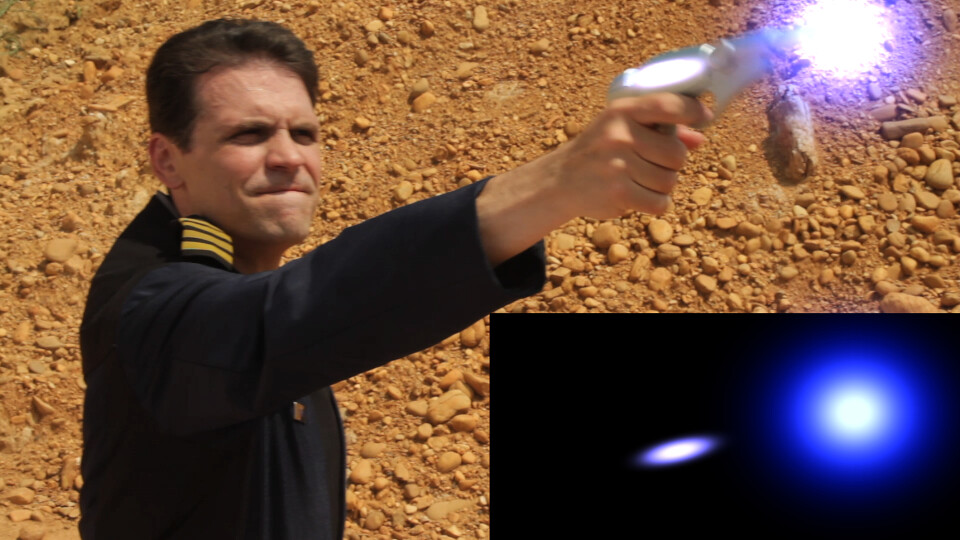
This image illustrates an issue that occurs when trying to add soft edged effects to footage, wherein the color of the background can affect the color of the effect. In this case, the weapon glows should be purplish, but because of the color of the background, the effects elements need to be tinted way into the blue in order to result in purple when composited. The actual effects elements are seen in the black box, and you can see how the apparent color changes when they are composited.
Thanks. We're not settled on a final look for the weapons effects, but I think Dennis and I are in agreement that it's not going to look like a phaser beam or a Star Wars blaster shot. My feeling is the shots should look like something that would kill you instantly on contact, which means speed, heat and OOMPH!Either way - pink or purple, it's still pretty badass. Well done all!
I've seen their trailers - looks awesome. They got some financing for that puppy, too.

Distributors for US are Entertainment One but no date yet for release.Is that movie out in the US yet? I've been semi intrigued by it since I saw the first trailer a few months ago.
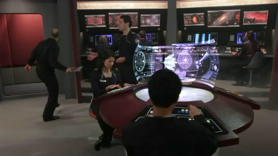
Very nice compositing of the viewscreens. I just think it might be a bit confusing for the operators that they are so transparent - you see the display on the opposite side of the table as well (even though it is 120 degrees).
We use essential cookies to make this site work, and optional cookies to enhance your experience.