I have had this sitting in my hard drive for a long time. I thought I'd dig it out and see what everybody thinks about it. This was made in paint. I don't have a clue how to use Photoshop or any other art suite to make it look better, so if anyone wants to take a crack at, feel free.
Way back when Enterprise started, one of the many things that bugged me was the mission patch. It seemed to lack something special. I also think it was a missed opportunity to show the origin of the familiar Delta thingy. Course everybody has an opinion on it. and yes it was inserted in the UESPA logo in Voyager... But my thought was that if Enterprise was about exploration, then the Delta could have evolved from a compass rose. I saw one somewhere that had an arrow that looked kinda like a delta, so I played around with this idea and the result is this...
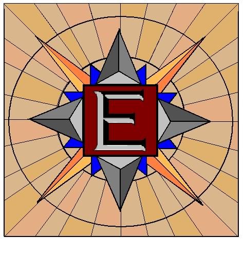
Now, I am no artist. My skills are below average at best. But I think this is closer to what the mission patch should have looked like. It just needs the name and number encircling the rose or something like that. Let me know what you think. Is the coloring right and so on.
Way back when Enterprise started, one of the many things that bugged me was the mission patch. It seemed to lack something special. I also think it was a missed opportunity to show the origin of the familiar Delta thingy. Course everybody has an opinion on it. and yes it was inserted in the UESPA logo in Voyager... But my thought was that if Enterprise was about exploration, then the Delta could have evolved from a compass rose. I saw one somewhere that had an arrow that looked kinda like a delta, so I played around with this idea and the result is this...
Now, I am no artist. My skills are below average at best. But I think this is closer to what the mission patch should have looked like. It just needs the name and number encircling the rose or something like that. Let me know what you think. Is the coloring right and so on.
")
 and yes i can imigine this bing where we really get the Starfleet Delta symbol from