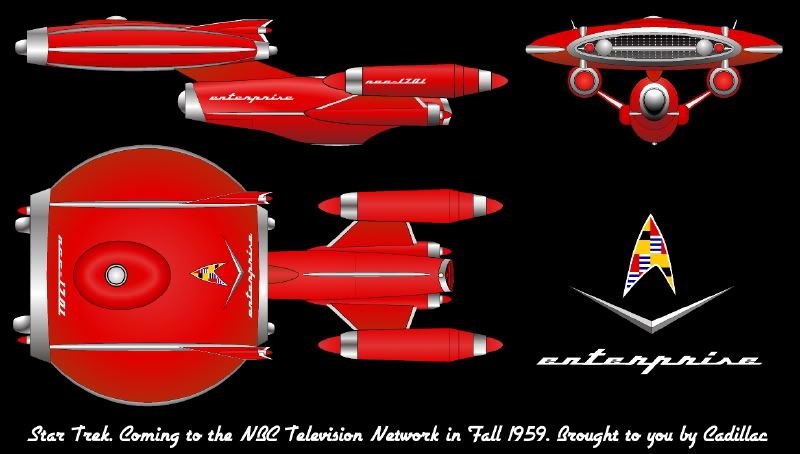
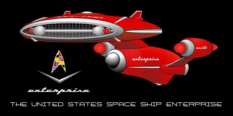
Needs more chrome.
-
Welcome! The TrekBBS is the number one place to chat about Star Trek with like-minded fans.
If you are not already a member then please register an account and join in the discussion!
You are using an out of date browser. It may not display this or other websites correctly.
You should upgrade or use an alternative browser.
You should upgrade or use an alternative browser.
NuEnt scraps 60s design for modern 50s look
- Thread starter chardman
- Start date
The originnal Enterprise is a timeless design, imo, for several reasons already mentioned. It gives the illlusion of being functional. Some parts have a tiny amount of 60's looking styling, but I feel that it is outweiged by the elegance of the rest of the ship. And the design just feels real to me.
The JJprise, on the other hand, is the exact oppposite of timeless to me. Its design seems to reflect modern sci-fi design trends of having unneccesarily swoopy and curvy designs. It looks like it was made with aesthetics in mind, which ruins my ability to suspend disbelief. It just looks to me like the product of fads that will pass. I would have said the same if it was the 1970's and it was covered in pointles Star Destroyer-esque greebles.
No other ship in Trek holds up as well as the original Enterprise, imo.
Right. The New design abandons the utilitarian look that lent the original it timeless quality in the first place. The iconic nature of the original Jefferies has endured for 40 years, and there's absolutely no reason to think it won't continue to do so well into the foreseeable future. One the other hand, the NuEnterprise has too many non-utilitarian, purposeless design elements that will probably make the design look laughably dated in just a few years.
The originnal Enterprise is a timeless design, imo, for several reasons already mentioned. It gives the illlusion of being functional. Some parts have a tiny amount of 60's looking styling, but I feel that it is outweiged by the elegance of the rest of the ship. And the design just feels real to me.
The JJprise, on the other hand, is the exact oppposite of timeless to me. Its design seems to reflect modern sci-fi design trends of having unneccesarily swoopy and curvy designs. It looks like it was made with aesthetics in mind, which ruins my ability to suspend disbelief. It just looks to me like the product of fads that will pass. I would have said the same if it was the 1970's and it was covered in pointles Star Destroyer-esque greebles.
No other ship in Trek holds up as well as the original Enterprise, imo.
Plus, the bowing of the nacelle support pylons makes it look like the ship has rickets.
How can anyone not love Masao's design? I may have to model this one.
I did it a few years ago for an Art Forum contest for an Enterprise designed by someone other than Matt Jefferies. My designer was Harley Ray Earle.
If you're interested, here are the full plans

Thanks. 

How can anyone not love Masao's design? I may have to model this one.
I did it a few years ago for an Art Forum contest for an Enterprise designed by someone other than Matt Jefferies. My designer was Harley Ray Earle.
If you're interested, here are the full plans

I must have missed that one. Did you win that contest? This is a really, really neat, satirical design that almost holds up as a "real" Trek design. It certainly proves the point that taking these design elements to excess results in caricature.
Mea culpa from me as well -- when I designed the Kiaga, I certainly drank from the Harley Earle fountain a few times. Good stuff. Of course, I was trying to design something that would sell as a "real" design, so I tried to exhibit as much or more restraint as the designers of the refit 1701 did when they perused old car designs.
Whether that's the case with the new design is a valid question. I trend to think not, but I admit to being excessively fond of the original design's spartan styling.
I must have missed that one. Did you win that contest? This is a really, really neat, satirical design that almost holds up as a "real" Trek design.
Nope, I lost. Boo hoo!
I think an Enterprise that looked like a bright red Cadillac Eldorado would have been laughed off the screen in 1959. Seems that a more techno-cool style, as typified by the satiny aluminum spaceships of Chesley Bonestell and George Pal, was more in vogue, at least for the movies. I didn't mean this as a serious design, by any means. But something like this could be used today in a retro-futuristic pulp-SF semiparody (enough qualifiers?). You'd also have to have skintight spacesuits with fishbowl helmets, jetpacks, and tentacled, bug-eyed monsters. I'd pay good money to see something like that onscreen.
When the Enterprise was first revealed, I posted this at TrekMovie:

Ford made it huh? It'll be on the side of the space lane overheating.
Okay, this thread has taken the absolute best turn! 
Grabbin' the popcorn and waitin' for more.

Grabbin' the popcorn and waitin' for more.

Similar threads
- Replies
- 482
- Views
- 61K
Contest: ENTER
September 2025 Art Challenge - Suggest Your Themes!
- Replies
- 4
- Views
- 8K
If you are not already a member then please register an account and join in the discussion!

