-
Welcome! The TrekBBS is the number one place to chat about Star Trek with like-minded fans.
If you are not already a member then please register an account and join in the discussion!
You are using an out of date browser. It may not display this or other websites correctly.
You should upgrade or use an alternative browser.
You should upgrade or use an alternative browser.
NuEnt scraps 60s design for modern 50s look
- Thread starter chardman
- Start date

Well, I'm just glad they kept the disco-balls on the engines.
Other than those, the TOS design does have a timeless quality, mainly because it doesn't actually have much in the way of design. It's just a collection of basic shapes with little windows and a few bits of tech on it. Sensor dishes are pretty basic tech, for example. I think that's a strength of the TOS design - it looks like it was built to do a job, not enter a car show. But it still looks good.
The new design is somewhat overbuilt. It has a lot of mindless arty details, like the folds and curves pasted all over the neck and engine hull. I don't hate the design, but it certainly looks more like 'art' and less like a 'ship' to me. With a few minor adjustments I wouldn't have any real problems with it though. As is, it certainly has the 'hot rod' look which I'm not sure is really the best, but I don't really have the energy to bitch about it. I'm not the picky sort.
Last edited:
^^^ Right. The original was fairly spartan. There weren't that many aspects of the design that could really date it. It was utilitarian, which, to some extent, is always in style, but is rarely considered stylish. This new design is very stylish, and because styles invariably change, I'm afraid that this new design will soon look quaint and dated, while the starker utilitarian original will maintain its iconic timelessness.
Nope. I'd always recognize Deco as Deco. And that's at least one period of design that still looks somewhat futuristic. Lando's pad on Bespin was mondo cool, and futuristic as heck, and it was a veritable Deco shrine to Deco itself. It's a shame that style prematurely petered out when it did, (Curse you Great Depression) and that it's never made a bigger comeback.
Yeah, Deco is probably one of THE best forms of art there ever was.
But in MY opinion you can find Deco in the Trekiverse--just check out the Cardassians. Their work SCREAMS "dark Deco," and man, it is GORGEOUS.
^I like it!
Wouldn't it make more sense for the grill to be the deflector? haha
It has that retro 50's charm.
Hmm, the original 1701 isn't a 60's design, its a design made by people from the 60's for the 23th century, as for the rest, Jefferies had an airplane background, he had flown the B-17, the B-24 and was a flight test engineer for some years and thats where the original 1701 has its roots, the shape, the cleannes and everything else was designed for a purpose just like an aircraft.
I can't pinpoint an era for the Rebootprise,to me its just a bad piece of CGI created by somene who was ordered to make it look cool and not bother with anything else.
I can't pinpoint an era for the Rebootprise,to me its just a bad piece of CGI created by somene who was ordered to make it look cool and not bother with anything else.
This I like!

Hmm, the original 1701 isn't a 60's design, its a design made by people from the 60's for the 23th century...
It's a 60s design and looks it. Neither Jefferies nor anyone else involved had any idea what a spaceship will look like in the 23rd century (hell, at the time they didn't even have any idea what century the show took place in) and neither have any other designers working on Trek including the current ones.

Good points, chardman. I didn't see the 1950s syle in the new Enterprise before this thread but you are exactly right.
It is not surprising that in the past, the Enterprise has reflected its era. Classic 1960s style can be seen in Helvetica type, Kennedy's Air Force One and the original Mustang. Jefferies' NCC-1701 fits right in there, just like your observation that the refit is a product of the 1970s. I also agree that the new Enterprise is growing on me, too. And given your observations, I respect that they've gone back to an earlier era for design clues rather than give it a modern esthetic, whatever that is. You think people are upset over the current ship? Imagine an Enterprise that looked like it was designed by Frank Gerry.
I appreciate your eye for style, chardman. Right now I'm remodeling a Craftsman style house, with some early Arts and Crafts influences. Talk about a classic style. Everytime I come up with a new design element, I simplify it about two steps and then it's right. The clean lines of Jefferies' Enterprise would fit right in.
And my kitchen table, buffet and nook are solid Art Deco.
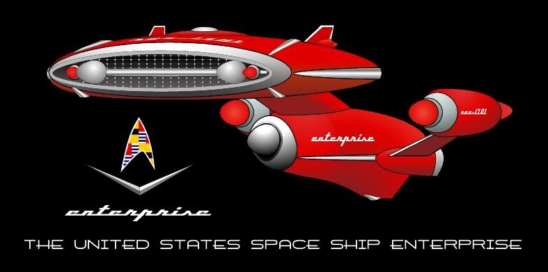
How can anyone not love Masao's design? I may have to model this one.
You know what it really reminds me of, though? Supercar!
http://www.youtube.com/watch?v=WL2vaSNbPbo
Didn't Mike Mercury go on to play Mannix? Or was he the guy who played Sinclair on "Babylon 5?"
You know what it really reminds me of, though? Supercar!
http://www.youtube.com/watch?v=WL2vaSNbPbo
Didn't Mike Mercury go on to play Mannix? Or was he the guy who played Sinclair on "Babylon 5?"
Maybe JMS was a big Supercar! fan and hired O'Hare because he looked like Mike Mercury! The resemblance is uncanny.
When the "Star Trek" exhibit opened here at the NASM back in 1992 or thereabouts, one local reporter described the TOS Enterprise as "looking more like some ungainly piece of dental equipment than a spaceship."
People Magazine once said that the Enterprise refit--like the original--looked like something that should be used "to dry hair." The design--in all its permutations--has always been an acquired taste (or non-acquired) for those who think a spaceship should like like a wedge, a rocket (cigar), an airplane or a saucer. (Of course, the Enterprise just combines two or three of those elements so...)
As a kid, I loved Supercar! I even started acquiring used canister type vacuum cleaners with the intention of building my own. Now I was under ten years old at the time, so give me a break on not figuring out how to solve the Power Cord Conundrum.You know what it really reminds me of, though? Supercar!
I could have made it work. I'm sure of it.

I agree with the OP, the new ship has definitely taken a cue from 50s automotive design, and as such does have something of a predecessor flair to the classic ship's clean 60s style aesthetic. Despite the inherent problems that may exist in figuring out how it would be refit to TOS specs, in the 50s context, I've grown to accept the nuEnterprise.
I'm still of the theory that the new ship is either built later, or is built as a 'partial-refit' compared to the TOS ship in an earlier period. So in that regard, I think of it as a not unlike a 1950s concept car of what a 1979 model car might look like- with all the seemingly unnecessary bells and whistles that would have seemed like good ideas at the time.
The originnal Enterprise is a timeless design, imo, for several reasons already mentioned. It gives the illlusion of being functional. Some parts have a tiny amount of 60's looking styling, but I feel that it is outweiged by the elegance of the rest of the ship. And the design just feels real to me.
The JJprise, on the other hand, is the exact oppposite of timeless to me. Its design seems to reflect modern sci-fi design trends of having unneccesarily swoopy and curvy designs. It looks like it was made with aesthetics in mind, which ruins my ability to suspend disbelief. It just looks to me like the product of fads that will pass. I would have said the same if it was the 1970's and it was covered in pointles Star Destroyer-esque greebles.
No other ship in Trek holds up as well as the original Enterprise, imo.
No other ship in Trek holds up as well as the original Enterprise, imo.
QFT. I'll raise you to say no other ship in all sci-fi.
Similar threads
- Replies
- 482
- Views
- 61K
If you are not already a member then please register an account and join in the discussion!