• Welcome! The TrekBBS is the number one place to chat about Star Trek with like-minded fans.
    If you are not already a member then please register an account and join in the discussion!

My homebrew kitbashes

Love the Galaxy, the only weird view is the Front view. just seems off. but that happens with alot of ships you get a view that looks a little weird in the Orthos. The other views are sweet.

The Medical ship is very well done.
 
^I've noticed that...a lot of starships have at least one "bad" ortho angle...the Excelsior-class is another such from the bow.
 
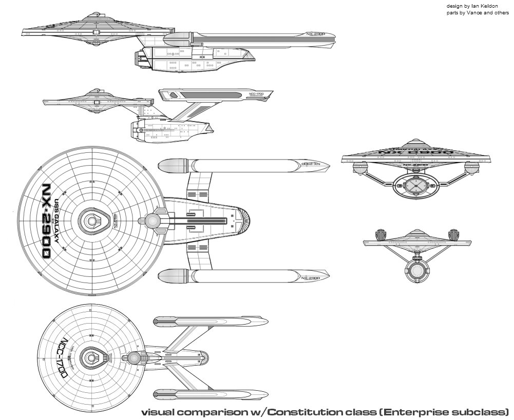
She's back again...USS Galaxy, now with 95% original parts

galnewagain.png


2900comparisonwithConstitution3c.png
 
I think this Galaxy idea is only improving! With each iteration, it looks even better.

If I may suggest:

1) The deflector dish area seems to screw with the visual flow of the overall design... maybe draw it into the hull halfway, so only the lower half of the dish area is visible from the side? Or else leave it sticking out but alter the lower profile of it to more cleanly transition into the lower lines of the ship? It just looks weird to me the way it is now.

2) You can really sell the scale of this thing by scaling down the actual bridge dome. If it were the same as on the Connie-refit next to it, we'd be able to just look at it and say "whoa, that's a big ship!" Right now, without the context of the other ship next to it, there's nothing to really suggest the size of this thing.

Food for thought!

--Alex
 
My one suggestion would be do re-draw portions of the secondary hull so that it doesn't look as if it was stretched out by PhotoShop. It should have the same line density that you're using for other parts of the ship. It's especially noticeable on the top view, where the lines are extremely blurry, whereas the primary hull and nacelle lines are quite crisp. Other than that, I'm really liking this design.
 
My one suggestion would be do re-draw portions of the secondary hull so that it doesn't look as if it was stretched out by PhotoShop. It should have the same line density that you're using for other parts of the ship. It's especially noticeable on the top view, where the lines are extremely blurry, whereas the primary hull and nacelle lines are quite crisp. Other than that, I'm really liking this design.

Ugh...I might at some point. It was enough of a PitA to do the first one though...I might be able to shortcut things by doing a layer trace at some point.
 
I think this Galaxy idea is only improving! With each iteration, it looks even better.

If I may suggest:

1) The deflector dish area seems to screw with the visual flow of the overall design... maybe draw it into the hull halfway, so only the lower half of the dish area is visible from the side? Or else leave it sticking out but alter the lower profile of it to more cleanly transition into the lower lines of the ship? It just looks weird to me the way it is now.

2) You can really sell the scale of this thing by scaling down the actual bridge dome. If it were the same as on the Connie-refit next to it, we'd be able to just look at it and say "whoa, that's a big ship!" Right now, without the context of the other ship next to it, there's nothing to really suggest the size of this thing.

Food for thought!

--Alex
I might pull the deflector back just a tad.

The bridges are supposed to be in scale with each other, and are within about 3% by my calculations...I "fixed" the scaling, but it's barely noticable. She isn't supposed to be the size of the 24th century Galaxy, she's supposed to fall in between Connies and Excelsiors.

By my calculations (using the dimensions of a Connie as reference), shes: 377m x 156.25m x 62.5m in this incarnation.
 
I dont think it needs any further refinements, the flaws and imperfections of ambitious prototype ships makes them interesting to look at and is sort of amusingly dangerous.
 
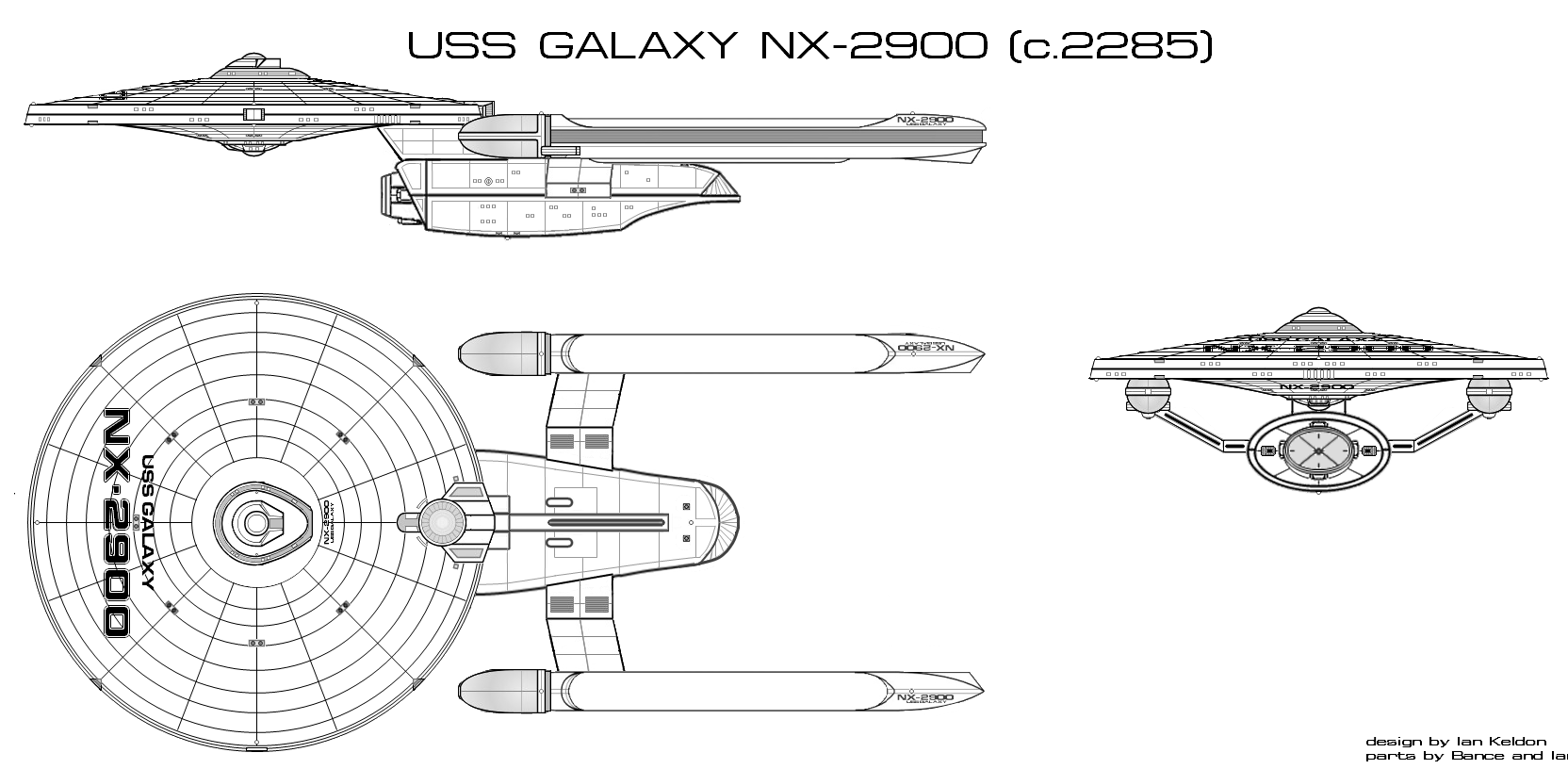
Ok, took the advice and redid the line work on the dorsal view. Still have to do a "full size" of the larger version, but it's no longer a blow up of a blow up of a low rez origina, and looks better.

I also went ahead and gave the 2ndary hull a "nose job" as suggested.

galnewagain3.png
 
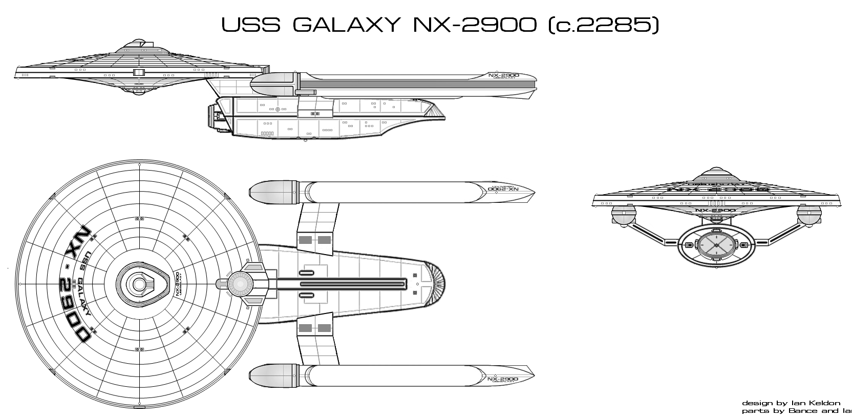
Ok, last and final edit...fixed profile and dorsal views. There isn't enough distortion on the bow view for me to bother going in and hand-correct it, which I'd have to do pixel by pixel.

I will admit the lines on the other two views cleaned up pretty good.

galnewagain4.png
 
Now thats a Pretty ship :) :techman:

is there a loose version of those new nacelles on this and the Cerberus class? :)
 
Now thats a Pretty ship :) :techman:

is there a loose version of those new nacelles on this and the Cerberus class? :)

I've got several different sizes and styles of the nacelle on the Galaxy, and the Cerberus one as well...give me a bit and I'll post it to my parts page.
 
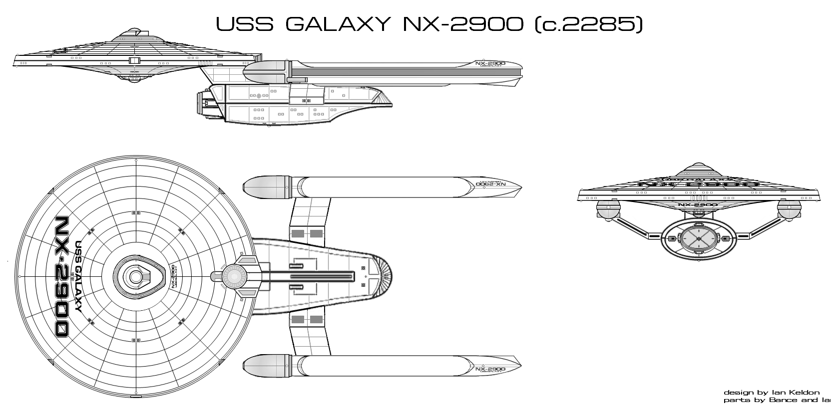
I keep getting suggestions that I try using a curved text tool. None of the ones I had seemed to work right in my opinion, but I found one that, after a lot of tweaking and fine-tuning, does an acceptable job.

Does this look any better? (Yes, I used her again...)

galnewagain4a.png
 
Ian:

I noticed that your D'artagnan-class fast frigate design, as well as the refit design w/ PF-12 nacelles are missing. Could you please repost?
 
If you are not already a member then please register an account and join in the discussion!

Sign up / Register


Back
Top