Ian Keldon
Fleet Captain
Very Awesome new Kitbashs especially that lil scout")

Which one?
Very Awesome new Kitbashs especially that lil scout
Very Awesome new Kitbashs especially that lil scout
Which one?
Yeah, I like the Chippewa-class scout - chunky and powerful looking.
Does it have a landing bay?
Very Awesome new Kitbashs especially that lil scout
Which one?
Chippewa-class
Cool...thanks!
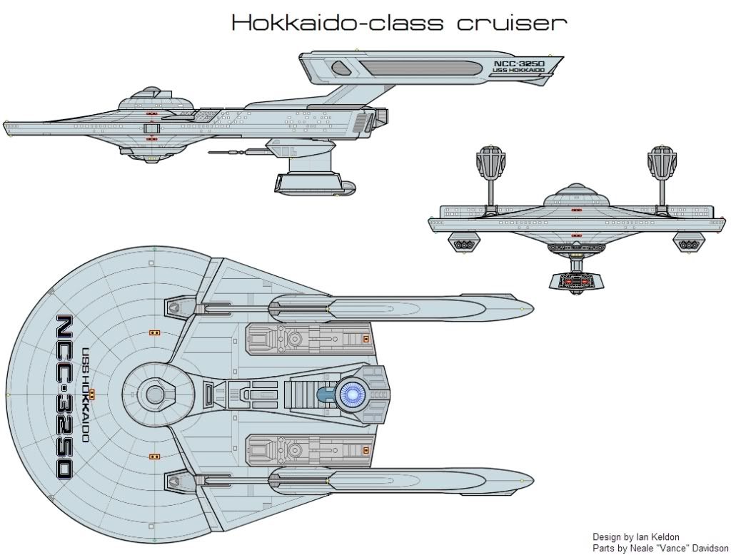
That one was a bit of a struggle to get to come out right, given how much modding I had to do to some parts to get it to all fit together. The Bridge dome and "bulge" gave me fits for over an hour until I was satisfied.
I've got another one to upload and post soon as I can get my connection and Photobucket account to cooperate.
Chippewa-class scout is awesome.
Chippewa-class scout is awesome.
I'd like to see that hull as a secondary hull without the bridge--perhaps with a flat saucer and raised nacelles. Having warp and impulse both be secondary hull mounted with no shuttlebay isn't a design you see often...

Separating lines and colors on different layers will help. Also learn to play with the Tolerance control that comes up with the paint bucket, magic wand and recolor tools. That will give you finer control over how wide or narrow the focus of the tool is regarding color similarity.
Another thing you can do is literally transfer colors from the color tool kits to the black and white.
Open both files - a color and a b/w. Use the eyedropper to select a color on the color toolkit sheet. Then just click on the b/w sheet, select the paint bucket and click on what you want to color in. Again, play with the Tolerance on the paint bucket tool to compensate for spots that don't get painted - JPG artifacts and such.
One last trick is to take all his toolkit sheets, both b/w and color, and convert them to a common DPI. That will allow full cross-compatibility between them. The b/w sheets are done at 72dpi but the color ones are at 200. I converted everything to 300 (Image menu>Canvas size>Resolution) and then "prepped" every sheet for PdN by deleting the white background and systematically selecting all the related views of a given part and cutting/pasting them to separate layers. Re-save in PdN's native file format. Now I don't have to go nuts trying to create weird shaped sections when I want to quickly copy/paste a specific part.
Layers in PdN always gives me fits. I keep getting the "checkerboard" when I try to isolate parts (even using layers) for editing, so I merge parts in regular Paint and hand paint out the pixels I don't want. Then I go into PdN for coloring and downcoversion of the final image.
And, yes, the Tolerance tool is a great boon. I'm getting the hang of it slowly with what I think are pretty good results (the Yamato's secondary hull should be blue-grey not brown-grey).
I'll keep experimenting and hopefully improving. Does anyone know if Vance will be doing any more color toolkits?
Your Welcome and very Nice designs
We use essential cookies to make this site work, and optional cookies to enhance your experience.