• Welcome! The TrekBBS is the number one place to chat about Star Trek with like-minded fans.
    If you are not already a member then please register an account and join in the discussion!

My Enterprise I

erifah

Captain
Captain
I took another look at my entry for the Enterprise F contest:
JPEGEnterpriseGsweptback.jpg


And I decided to start from scratch, using the scanned image of the original pencil sketch.

Its a work-in-progress, and it is going VERY fast. (It's like drawing out something from memory instead of laboring to make something new.) I think that by doing it "from memory", I have idealized certain shapes and forms that actually were NOT there in the first ship.

I enjoy using the best elements from my "F" while redoing shapes and exploring other ideas.

Speaking of other ideas, I like having the ring around the saucer. But I don't know yet what it is there for...

GracePriseJPGstudy2copy.jpg
 
By "ring" I assume you mean what appear to be cut-outs around the rim of the saucer. Aesthetically, it could be quite a cool idea. What their purpose might be baffles me as well as you. :-) Seems more like a feature on a passenger liner. But, I do kind of like the idea of how it would look...it's different...and different can be good sometimes.

It definitely has that pre-Enterprise J look to it. Really nice work.
 
Follow-up...and who's to say you can't have some design aspect to a ship just because it looks cool? It could be a sort of identifier for the Fleet's Flagship. And each section could pertain to specific functions/operations of the ship. Just a thought. :-)
 
By "ring" I assume you mean what appear to be cut-outs around the rim of the saucer.

Thanks! Yes, right now it does look like cut-outs. I haven't developed the attachments points connecting the ring to the saucer. They are placeholders so it looks like a bigger, single saucer with slots.

I prefer to think in terms that what I've drawn has a believable purpose, and doesn't just look good - but then again, I think that most things that look cool do so because they are functional.

With this ring, it IS functional and serves a purpose - I just don't know what it is!:p
 
Typically, I'm not fond of "F" designs that are too close to "J." I'm not a fan of J leaving aside the question of G, H, and I.

That out of the way, this is stunning. Quite frankly, if this form had been the basis for J, I would unreservedly approve. This feels right where J feels wrong.

As a bit of constructive criticism, I'm feeling the Nacelles are bit too D, but I don't have better idea. So I wouldn't call that a suggestion for a change, but more along the lines of something to thing about. Beyond that, I can't find fault with what you've done here.

I think you've improved on the J concept. Maybe you should think of it in terms of Enterprise K?
 
As a bit of constructive criticism, I'm feeling the Nacelles are bit too D, but I don't have better idea. So I wouldn't call that a suggestion for a change, but more along the lines of something to thing about. Beyond that, I can't find fault with what you've done here.

Thanks! I think the nacelles are too D-like as well, but they were the best place-holders that suggest what they should "feel" like. My nacelles from the contest "F" are great for what I wanted to accomplish, but I want to go in a different direction now.

I have some ideas I'll be rolling out later, that don't look too much like a dog's wanker. I'm looking for a overall thin and delicate look, with nacelles specifically that almost seem too small for such a large ship.
 
You sure like taking on the big names, don't you?

I'll start with the design elements that I like.
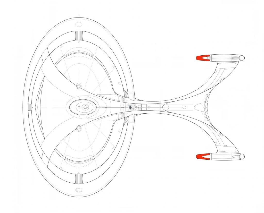
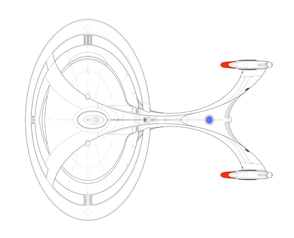
I like how the aft of the nacelle pylons curves to help create the shape of what I'm guessing is aft impulse drive and what also looks like the rear shuttle bay.
I also like how the aft of the primary hull kinda evokes the shape of the back of the Galaxy class's neck, but is apparently supposed to be more flattened to fit with what I'm guessing is supposed to be a neck-less design.
And I like the cut-outs on the primary hull. To me, I think they could be akin to those recessed windows introduced on the Intrepid class, but much, much bigger. I imagine that they could have observation decks, shuttle bays, weapons emplacements, etc. recessed throughout these cutouts.

The things I'm not a fan of are the short nacelles and the elliptical saucer. If it were up to me, the J would have a stretched ellipse like the Sovereign class instead of the elliptical saucer like the Galaxy class, and that is probably the one thing about Doug Drexler's design (other than the thin nacelle pylons) that I didn't really like. I prefer the stretched saucer to the elliptical saucer, and if the J has it, then that suggests if I were to design other ships from that era, I would have to use the same elliptical style for many ships of that era, and if the J's predecessor has an elliptical saucer, this might suggest that the stretched saucer is no longer used as much; which I would feel compelled to follow, or risk making any of my designs from that era seem less believable/inconsistent from designs already established (though if that were the case, well I would just accept it. And try to justify reasons to continue putting in a few ships with longer primary hulls as well;)).

But considering that you are the designer of this ship, and that you are trying to show a transition between this ship to the J, well, what can I say? It is your job as the designer to use the design elements that you like while also trying to make this ship a believable ancestor to the J, which is not an easy task.

Same thing with the short nacelles. I would have preferred longer nacelles, but again you are the designer, and if you love this design element, then I have to accept it (or leave it, which I haven't decided to do yet), because that is basically how fandom goes, and I believe in accepting designs even if they have design elements that I personally wouldn't have used, because that is also what makes them unique.

About the only other design that I can think of that I consider a contender for the Enterprise-I would be the Independence class. And given how well done this Enterprise-I already looks, even though she isn't even finished, she might prove to be a strong contender for the title.
 
You sure like taking on the big names, don't you?

Darn right I do.

Thanks for the input. I am experimenting with the nacelles the same way that college girls experiment with lesbianism in their Freshman and Sophomore years - we all know they're just one drink away from discovering something interesting, but will it really seem so cool in the morning?

What I've come up with so far are nacelles with balls. (No, seriously.) I'll post an update later, but I think the idea will work, and is sufficiently esoteric to suggest "future technology" without losing functional believability.
 
I think I've figured out what the ring around the saucer is for.

I'm not certain, but I've decided I'm pretty sure it has something to do the "Temporal Warp Drive" - a warp propulsion system so advanced, it allows you to arrive at almost any destination 7 minutes before you've left your point of origin.
 
It is evolving.

(Sure wish I could - this being a monkey and scratching for fleas gig is the PITS.)raft

The colors and some of the lines "pop" more than I might want in a final version. I wanted things to stand out so I can more easily see and contemplate the shapes and how they interact with each other.

But for a ship this big, things should be very smooth and subtle when she's all done. And it's supposed to be a BIG ship - but no where NEAR as massive as the Enterprise J. She's supposed to follow a trend of Starfleet design for her time, yet still be primitive compared to what's coming in the quantum leap of the J.

Of course, this ship has Temporal Warp Drive, and that takes balls. So I gave it a set of balls. I'm hoping this makes it sufficiently different than warp nacelles we've seen in the past.


EnterpriseI74.jpg
 
Last edited:
I guess my two cents would be:

-looks a LOT like the E-J shown to us in Enterprise, unless I'm remembering that incorrectly. I'd have to see side-by-side to say how much, but pretty similar. I guess that could be the idea, but I'd have left more room for the design to become that way by the time it gets to J, rather than having it 99% there already.

-If they're still using the letter scheme by then, they'd likely skip the letter I and go straight from H to J. One of those things you usually do in those sorts of lettering schemes, as the I looks too much like the 1. O vs 0 is equally problematic :)
 
I guess my two cents would be:

-looks a LOT like the E-J shown to us in Enterprise, unless I'm remembering that incorrectly. I'd have to see side-by-side to say how much, but pretty similar. I guess that could be the idea, but I'd have left more room for the design to become that way by the time it gets to J, rather than having it 99% there already.

This bad boy? Yes, that is the direction I'm going.

It might be possible to pull mine back a tad away from where the J ends up. But if mine is the immediate predecessor to the J, there needs to be some commonality so that the J is the logical successor. (Unless, of course, there's a storyline that postulates a drastic change in development of Starfleet spacecraft. Good for dramatic storytelling. After all, the Ent-E doesn't really follow from the D.)

USS_Enterprise-J_display.jpg


untitled1b1.jpg
 
... One of those things you usually do in those sorts of lettering schemes, as the I looks too much like the 1.

One would hope that, by the 25th Century, they would have figured out a solution for that.:guffaw:

It's not really a problem you solve, though. I looks like 1, and also a lower-case l. So they usually avoid it altogether...

As for the commonality? I get what you were going for, just my opinion that it looks TOO similar, more of a close interpretation rather than design lineage. I'd vote for trying to incorporate more difference, so that the J looks like next in the line, rather than just your version but polished up more...
 
Did some work on her today.

I had to revert to an earlier saved image, as the most current one corrupted and wouldn't open anymore. So much work lost. *sigh*

Anyway, I made changes to the warp nacelles.

I also worked on the 7 hangar deck bays on the rear, and the two hangar deck bays on the saucer.

EnterpriseIRevised71711.jpg
 
:D
I'm starting to feel a creeping sense of unease and concern about what she's gotten herself into.
 
If you are not already a member then please register an account and join in the discussion!

Sign up / Register


Back
Top