-
Welcome! The TrekBBS is the number one place to chat about Star Trek with like-minded fans.
If you are not already a member then please register an account and join in the discussion!
You are using an out of date browser. It may not display this or other websites correctly.
You should upgrade or use an alternative browser.
You should upgrade or use an alternative browser.
korb's surplus depot
- Thread starter korblborp
- Start date
like the comic books?I don't know why--but that last image screams Gold Key--I love it!
That's a beautiful take!
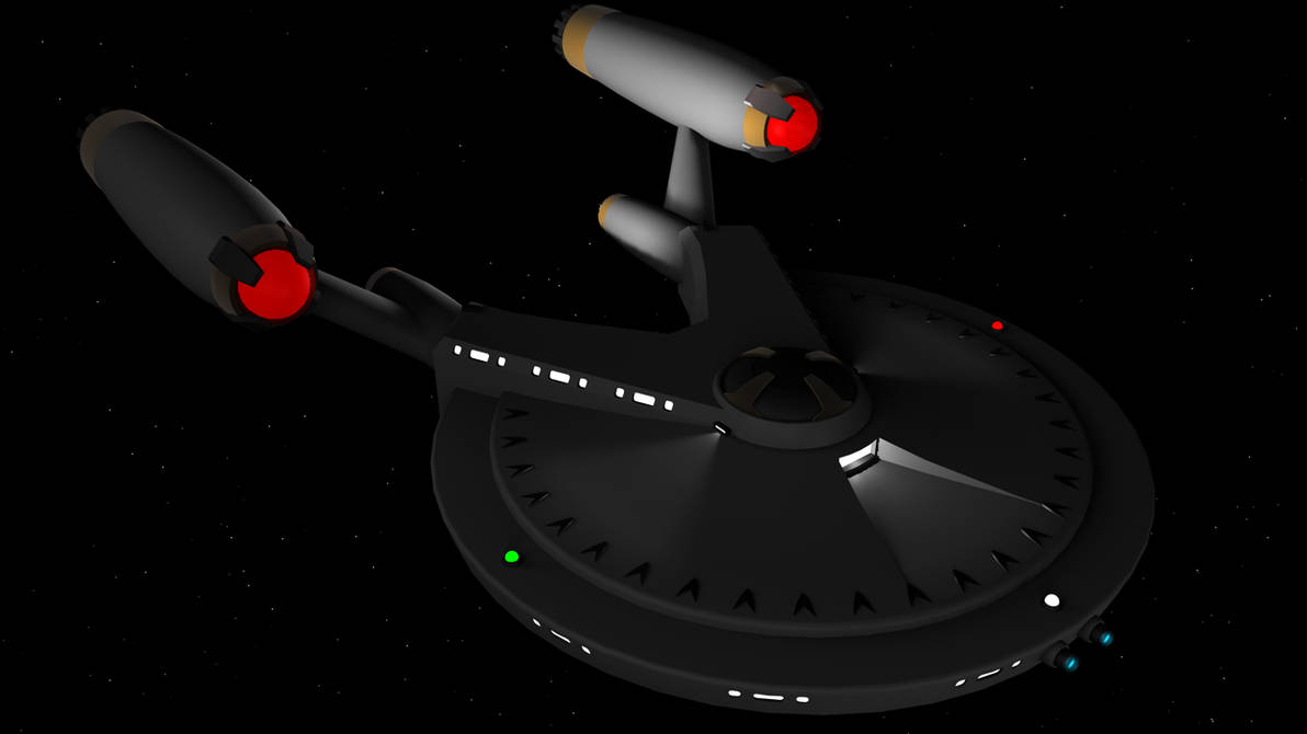
was poking through my dA account and came across this render of my version of the USS Franklin from ST:Beyond
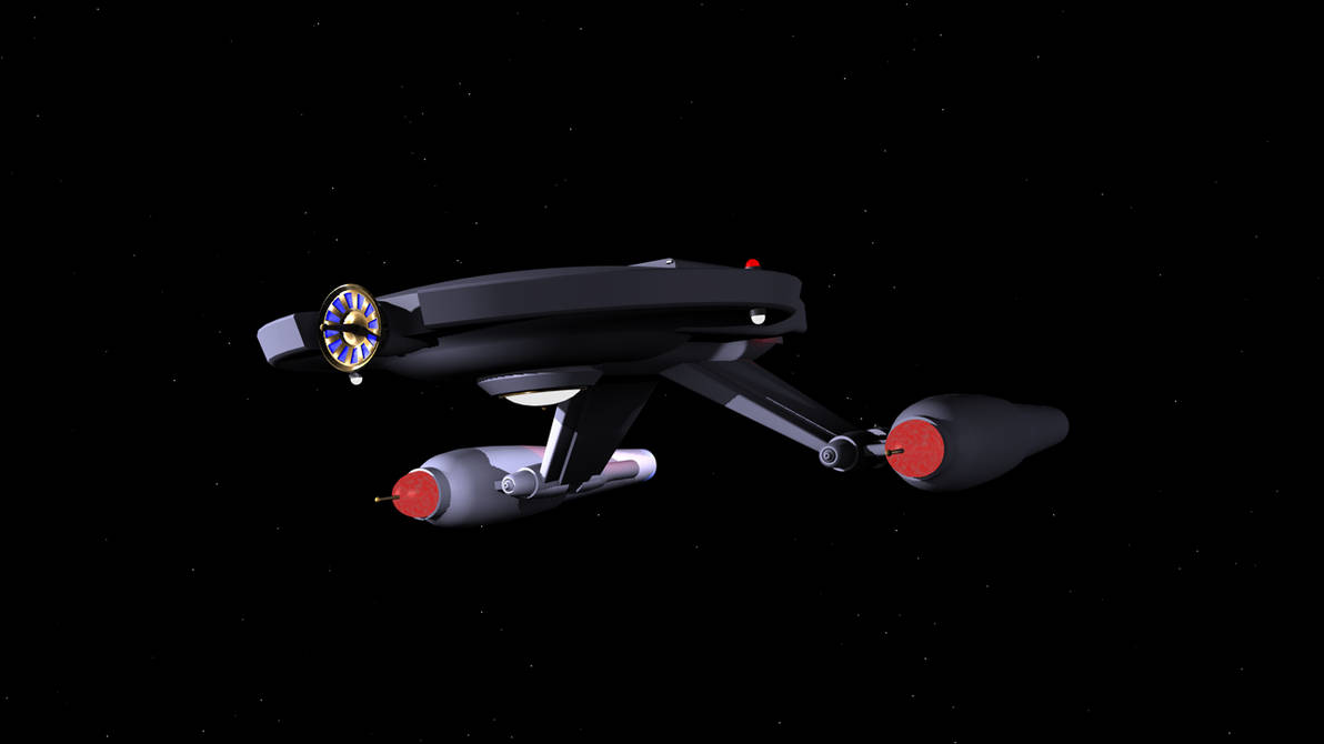
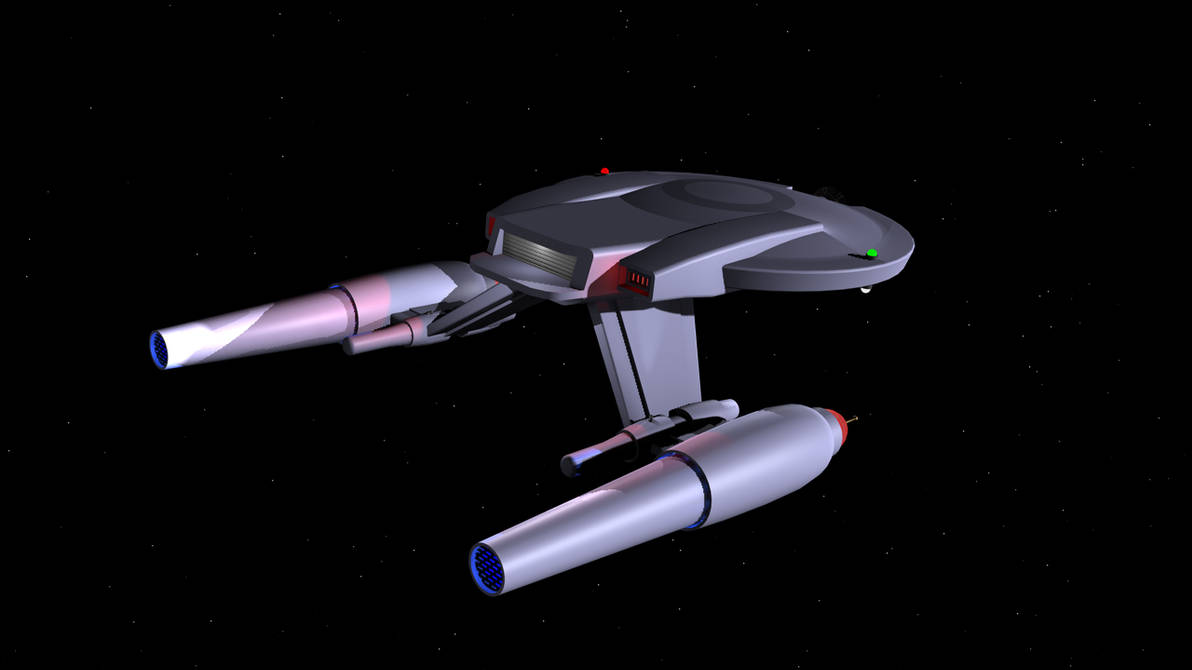
and also a couple of my take on what turned out to be the Shenzhou, based on some really low quality images in some previewvid. i imagined her a LOT smaller than she turned out to be, four decks max.
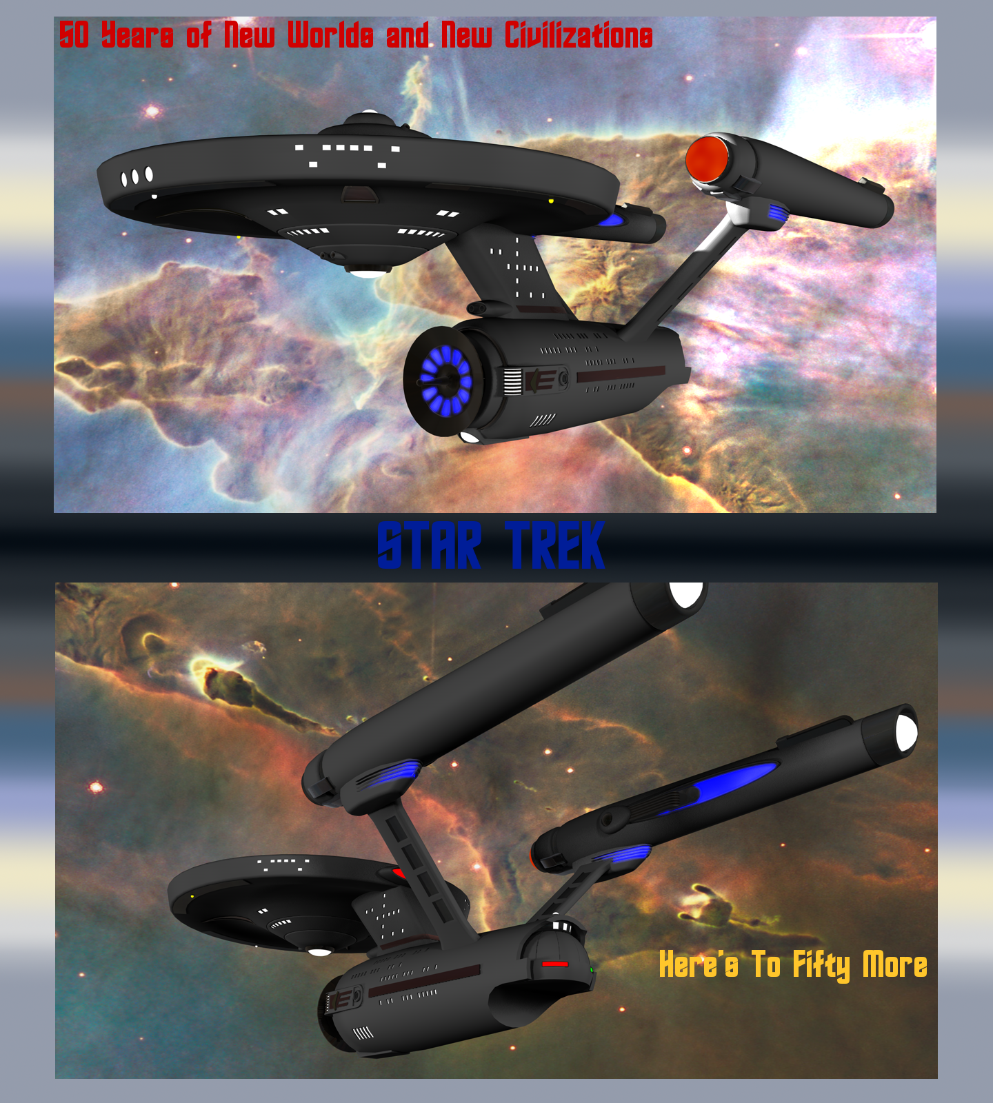
poster image made for the Fiftieth, with a model of the Enterprise i had been trying to do some kind of art deco stuff with
dave metlesits/thefirstfleet's on dA's Polaris, made from parts of the above
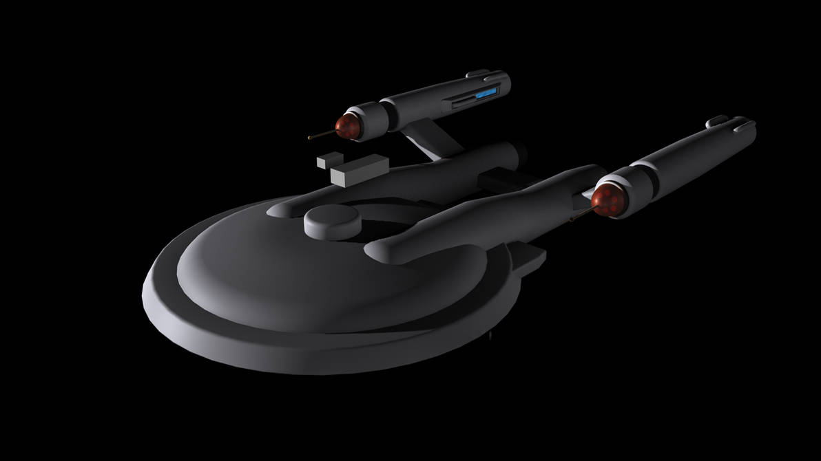
and a couple from an old "fix the NX class" project
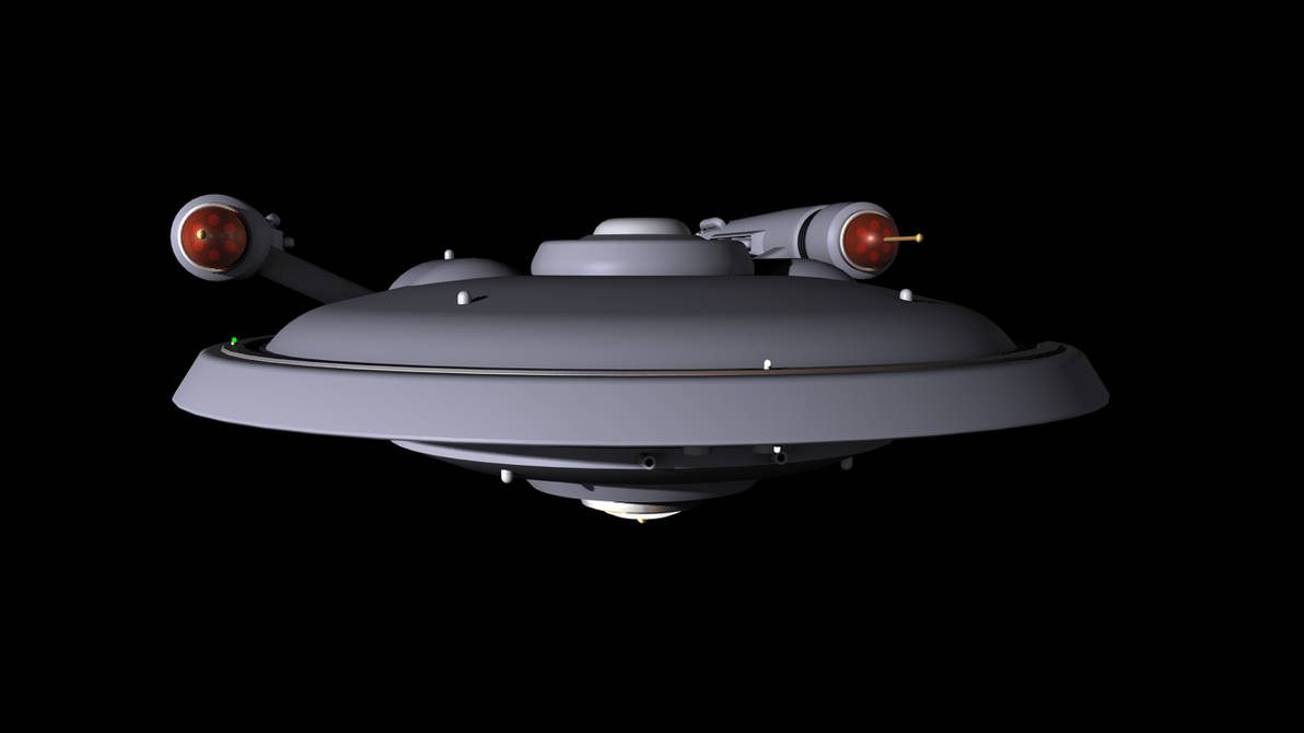

and also a couple of my take on what turned out to be the Shenzhou, based on some really low quality images in some previewvid. i imagined her a LOT smaller than she turned out to be, four decks max.


poster image made for the Fiftieth, with a model of the Enterprise i had been trying to do some kind of art deco stuff with

dave metlesits/thefirstfleet's on dA's Polaris, made from parts of the above

and a couple from an old "fix the NX class" project


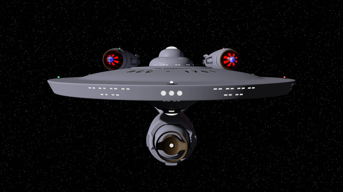
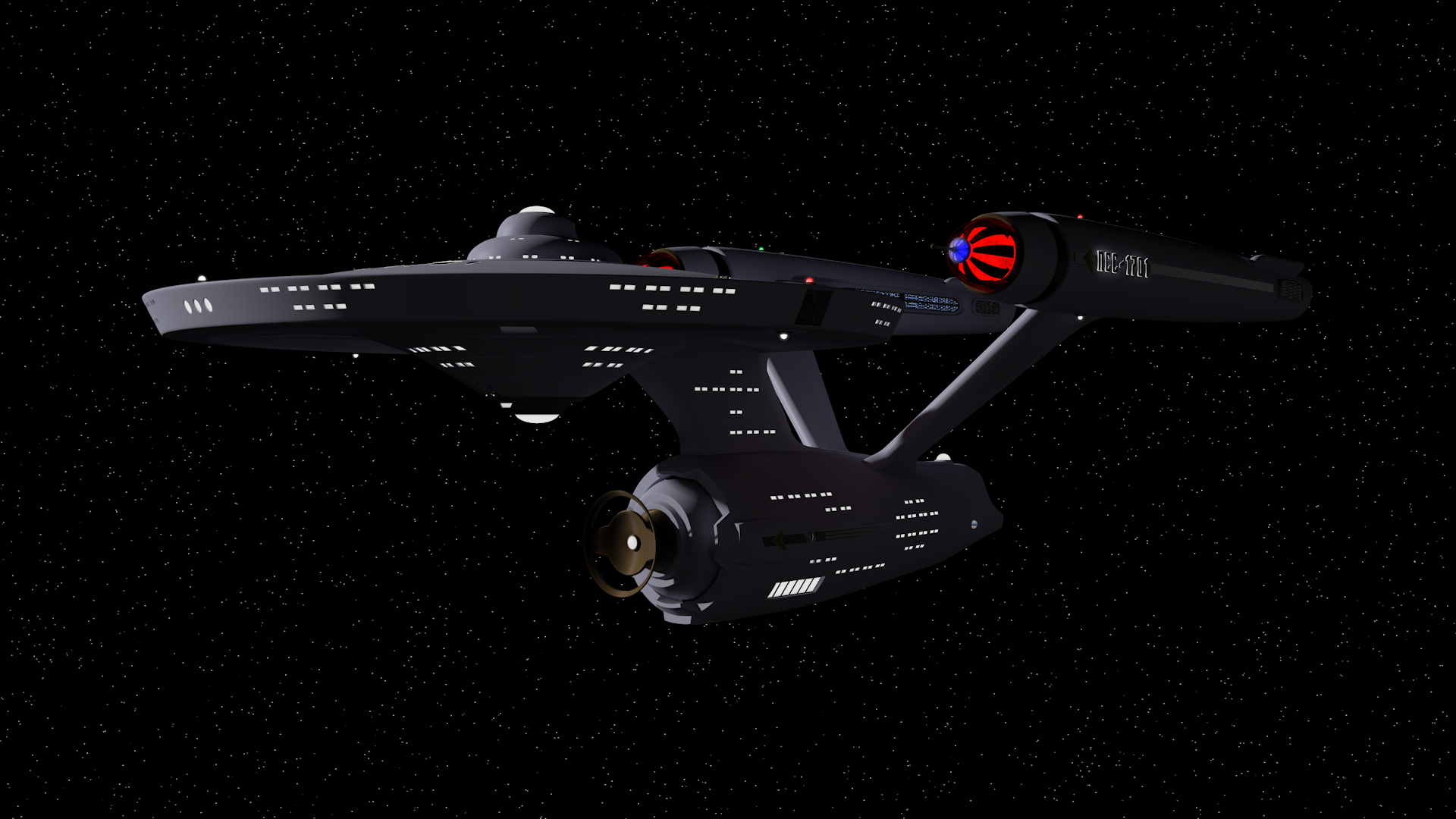
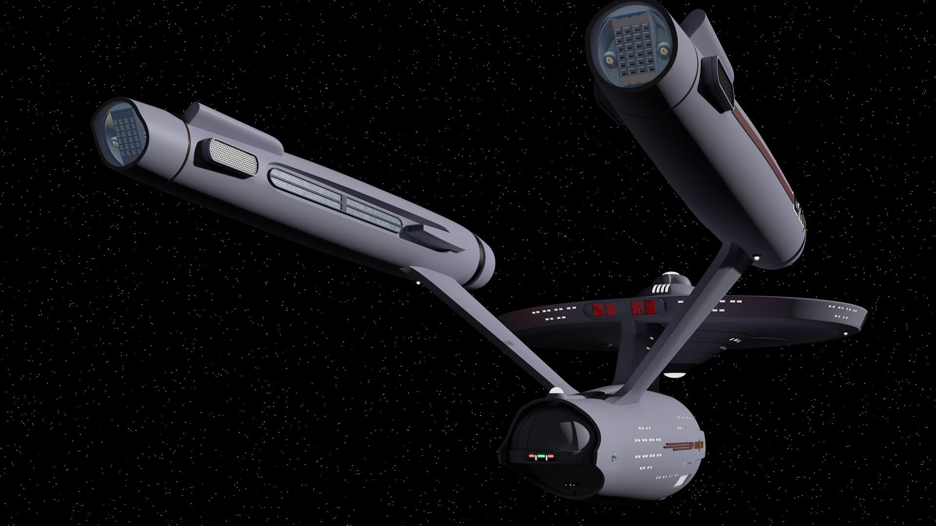
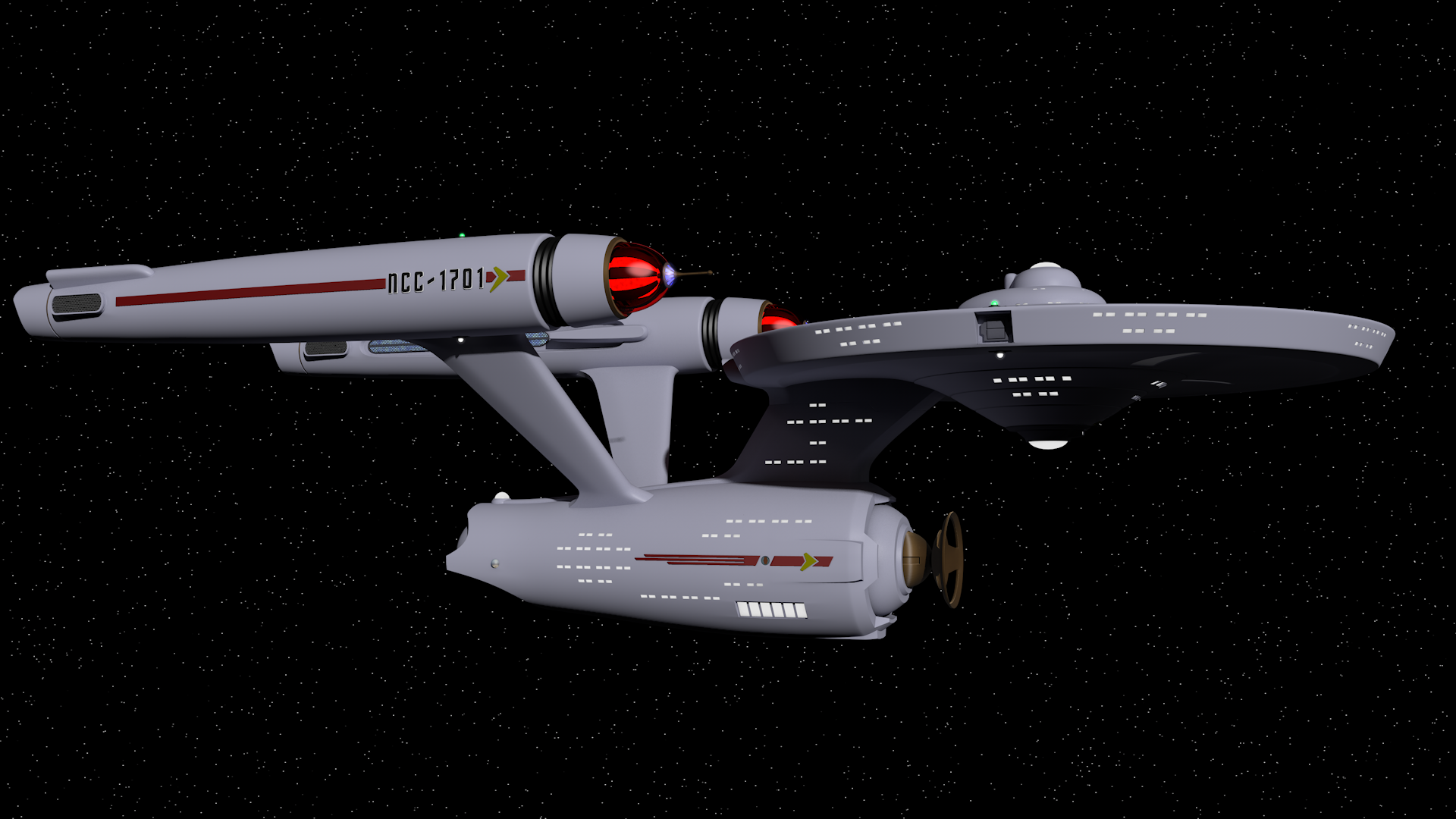
Working on the *USS Entente* a little while ago put me in mind to go back to working on this, which i started a few years ago. in fact, the Entente's warp nacelles started as part of this project, i copied them over, and then copied them back with the continued work done on them.
not meant to be a "screen/filming model accurate" thing, or a fixing it thing, just sort of an amalgamation of things and ideas from different versions, as well as my own. the dish being the main sensors, the main nav deflectors being the "spikes" on the bussard collectors... the shuttlebay is a whole separate unit from the secondary hull, set inside, and it's bigger than the entente's, at least the doors. the entente has more side space, and at least two levels of hangar space. saucer separation, thingies, whatsits. there's little details i some places i haven't finished, but...
i did put a hard stop on that "oh it has to be bigger" nonsense. she's only a few meters longer than the OG, at 295.


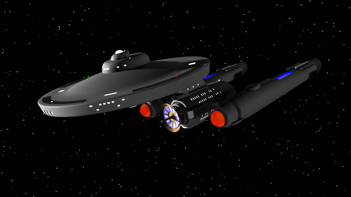
of course, after mostly finishing off the USS Enterprise, i had to make a Saladin/Hermes (the only real difference between the two is the Hermes only have the forward phasers). some little alterations from Mr. Joseph's ogs. i decided that since the neck is basically substituting for the main engineering section of the Connie secondary hull, all that equipment means there's no room, or reason, for windows. and also it still separates. i also figured that since they are meant to perform almost the same sort of mission profile as a full Constitution class, it needed at least one shuttle bay, and since i like symmetry, i gave it two. each one can fit two type F shuttle craft, with some workbees tucked in corners. although the captain of this particular Saladin class , Cdr. Greene, may have replaced one or more shuttles (as well as several redundant subsystems and labs) with extra torpedoes and antimatter charges....
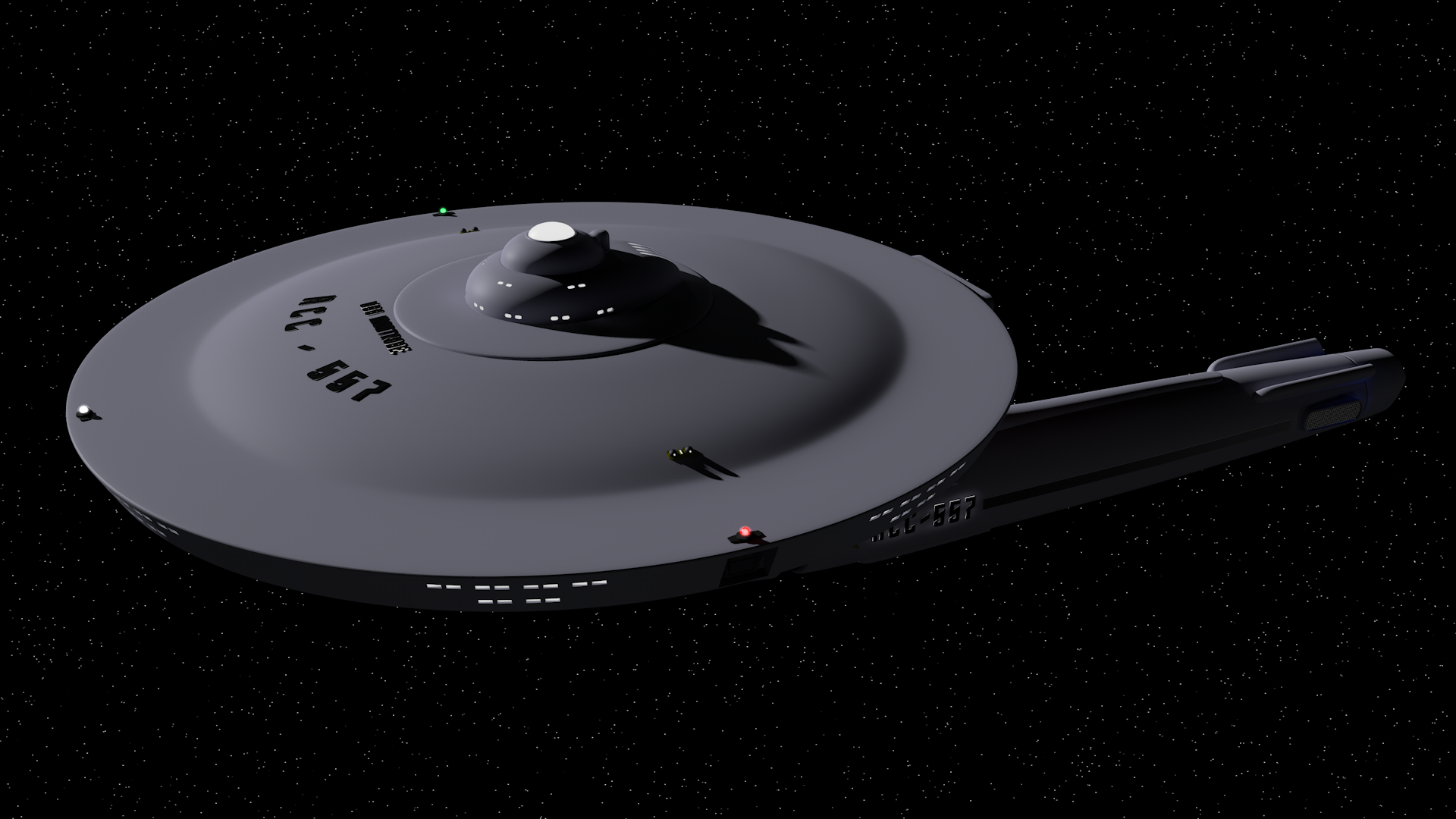
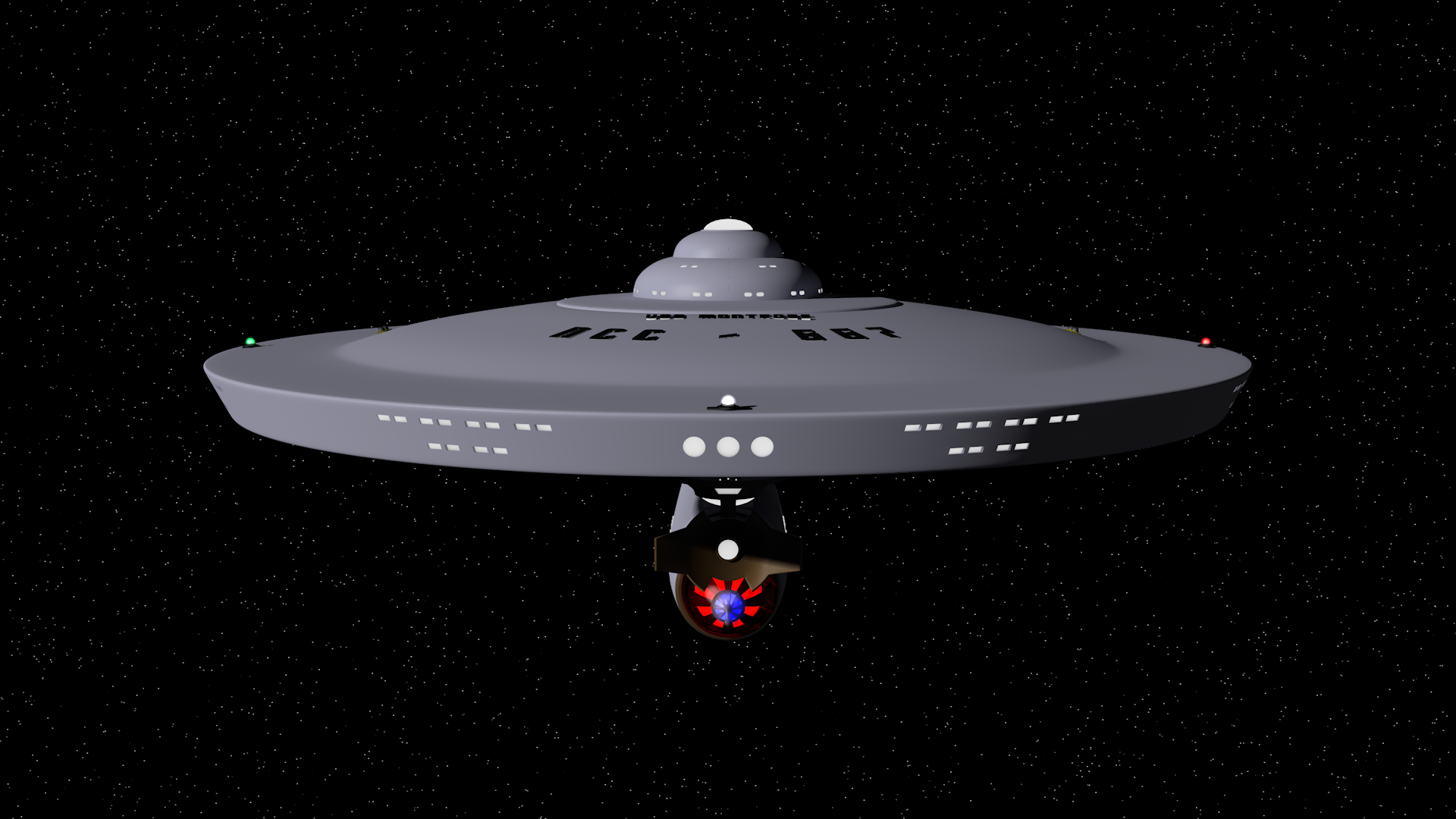
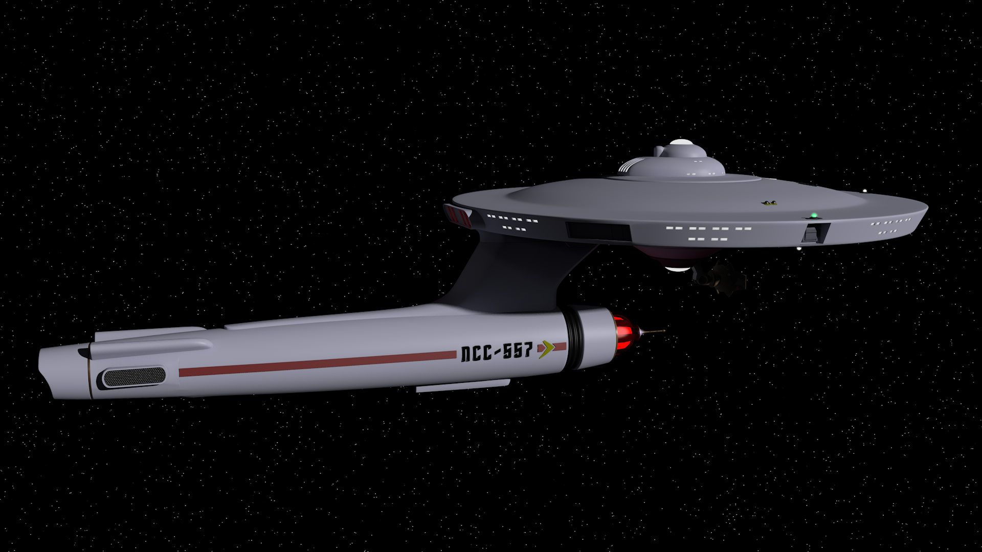
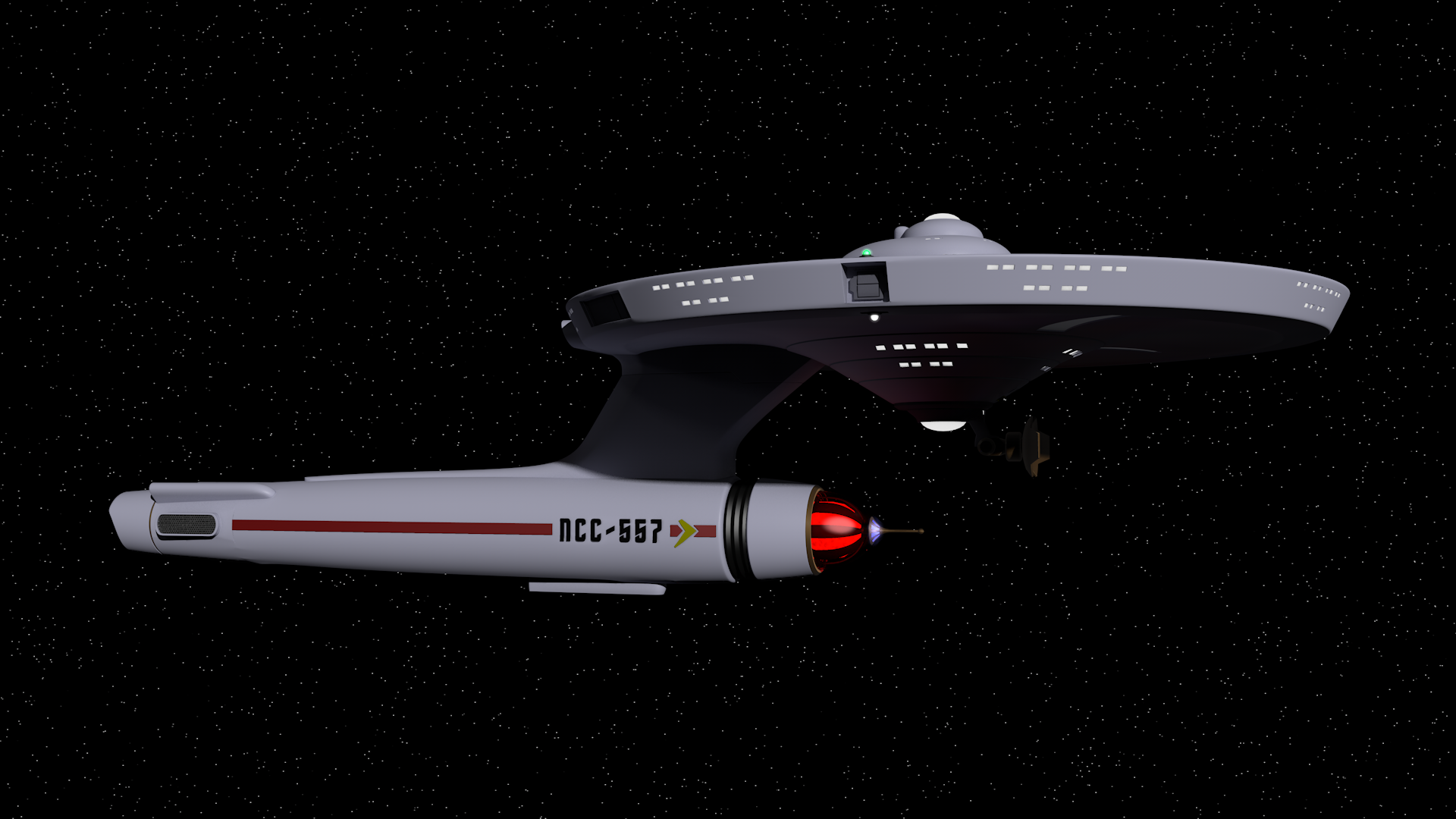
Your modeling work is obviously pretty good and I love seeing the variety you bring to ship design for the TOS era, but I gotta say, seeing the out-of-universe Star Trek title logo font used on the ships themselves is a little funny. I mean, I love the font, but it doesn’t exactly have the best legibility and I have a hard time believing Starfleet would use it for their ships’ livery.
roger, switching to wingdingsYour modeling work is obviously pretty good and I love seeing the variety you bring to ship design for the TOS era, but I gotta say, seeing the out-of-universe Star Trek title logo font used on the ships themselves is a little funny. I mean, I love the font, but it doesn’t exactly have the best legibility and I have a hard time believing Starfleet would use it for their ships’ livery.
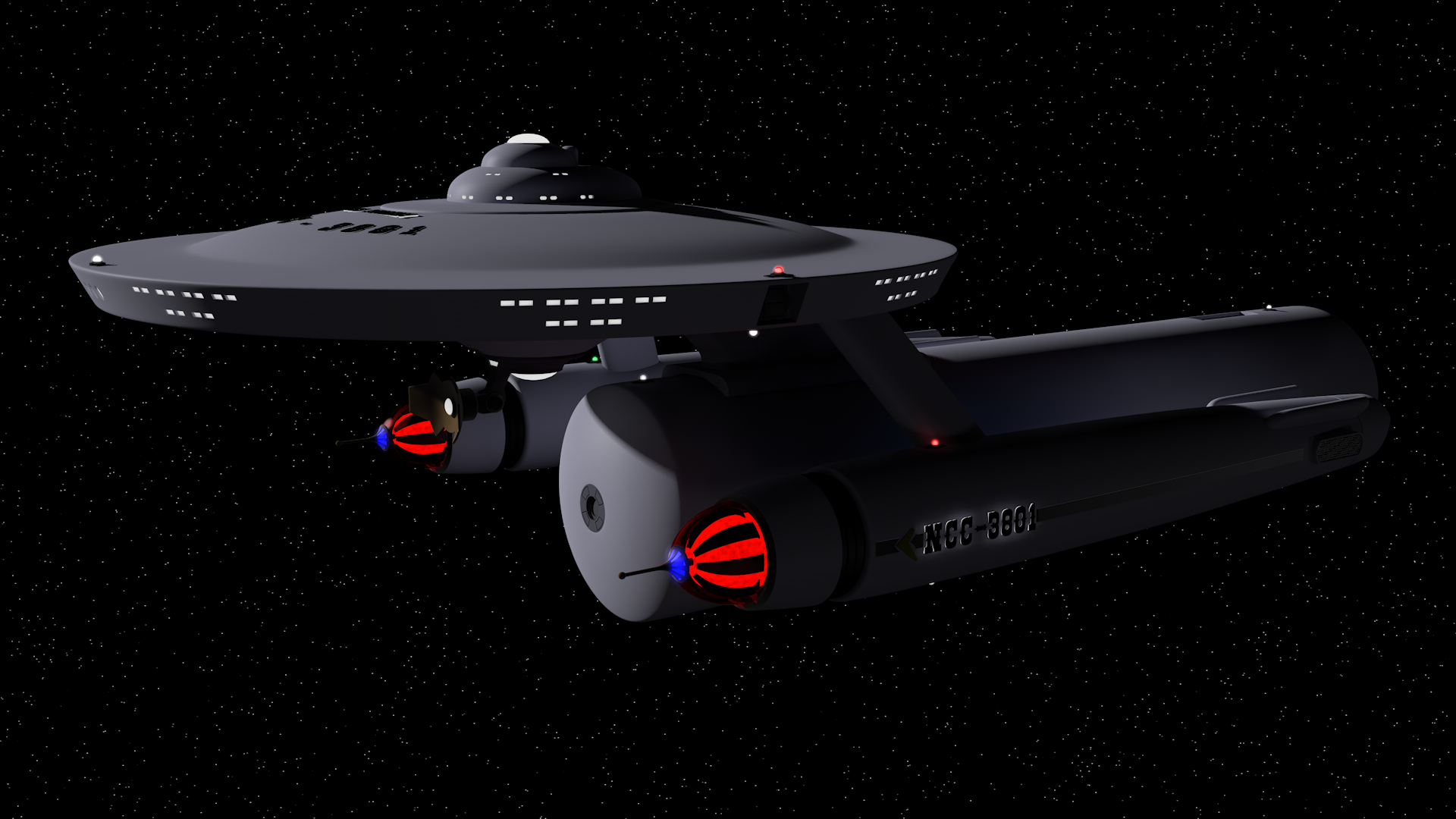
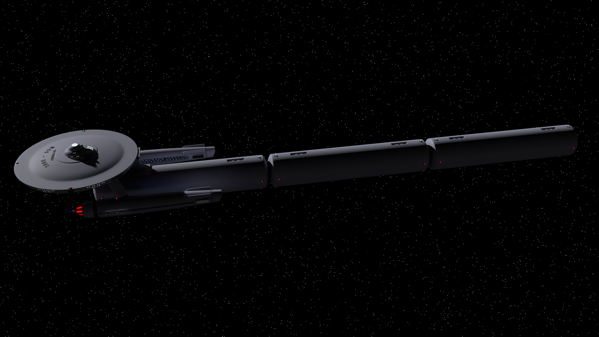
Of course, to round out the offerings from Mr. Joseph's Technical manual, a Ptolemy(THE Ptolemy)-class logistics tug. should make some pod variations, but i don't think they really are supposed to vary much, externally. it's funny that the "liner"/crew transport version is only supposed to carry three hundred persons, considering the size... retaining the two hangars of the Saladin seemed only sensible...

This page may prove useful to you; in particular, the "Starfleet 1" and "Starfleet 2" fonts are very close to the style of TOS & TNG ship lettering.roger, switching to wingdings
If you are not already a member then please register an account and join in the discussion!


