-
Welcome! The TrekBBS is the number one place to chat about Star Trek with like-minded fans.
If you are not already a member then please register an account and join in the discussion!
You are using an out of date browser. It may not display this or other websites correctly.
You should upgrade or use an alternative browser.
You should upgrade or use an alternative browser.
June Art Challenge - Venardhi
- Thread starter Venardhi
- Start date

It looks good now. What else would you want to add?
Shading!
--Alex
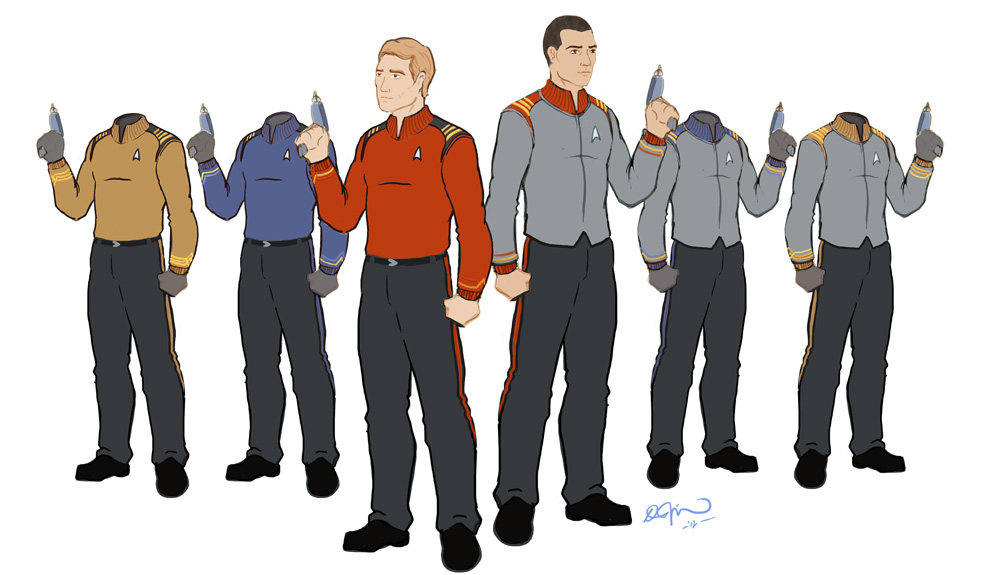
Cleaning it up, adding department color variants, showing the undershirt as a basic duty uniform variant, medical variant, etc. Mostly just making it look less messy/sketchy though.It looks good now. What else would you want to add?
Cleaning it up, adding department color variants, showing the undershirt as a basic duty uniform variant, medical variant, etc. Mostly just making it look less messy/sketchy though.It looks good now. What else would you want to add?
Right. Wasn't thinking. I'll shut up now. I think it's a good start, though...
Then you may want to change the rank insignias on the other two colors.
Not necessarily. The different colors are supposed to represent different divisions, so they could all be the same rank but in separate chains of command...or, the guy in gold has just been that rank longer than the other two and qualifies for Command.
They're all ranked as "Commander". If I get some time before the end of the week I'd still like to do some polishing and tweaking here and there, and the rank is on the list.
The shoulder ranking is through the bars, using a similar system to the 'pips' that have been used in the TNG+ era. The cuffs will be more distinctive, like TOS.
The shoulder ranking is through the bars, using a similar system to the 'pips' that have been used in the TNG+ era. The cuffs will be more distinctive, like TOS.

That's kinda cool. I like how the department color is worked into the rank insignia, but I wonder about the difference between Command Division Ensign and Command Division Lieutenant. Seems like maybe they'd both be a gold colored chevron... What am I missing?
Also, I wonder if it's a good idea in practice relying on color to denote rank given that many people (and I suppose entire alien races) are colorblind. Having low contrast medium tones against that gray color could lead to confusion as well...
--Alex
Also, I wonder if it's a good idea in practice relying on color to denote rank given that many people (and I suppose entire alien races) are colorblind. Having low contrast medium tones against that gray color could lead to confusion as well...
--Alex
")
My only nit to pick at this point is the belts. It's not that they're poorly done. I just don't like 'em. Just my personal opinion. I think All the Trek uniforms look better without belts, and that includes the movie maroons. When Jack Crusher wore it sans belt it was an improvement.
--Alex
--Alex

Similar threads
- Replies
- 6
- Views
- 564
- Replies
- 16
- Views
- 894
If you are not already a member then please register an account and join in the discussion!