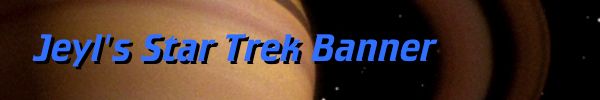
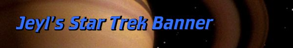
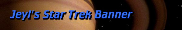
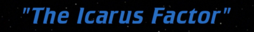
To those of you who might not know, we have a little thing going on that occurs every Monday called "Episode of the Week" where we review an episode of Star Trek: The Next Generation. Ever since I made my first post in January with "We'll Always Have Paris", I wanted to do something different rather than simply talk about the episode. I added stingers at the end that I felt were either the funniest or most meaningful of the episode that could be captured in a single screenshot or line. By the time EOTW got to the "Icarus Factor", I thought that simply typing in the title at the top of the post was a bit cheap so I decided to use the actual title of the episode in the post.
Fairly straight forward. Just grabbed a picture from trekcore.com (thank you!) and cropped out everything except the title. This was typically how I did my first two banners.
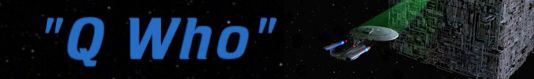
When it came time for my "Q Who" review, I decided to try something different. I still wanted to do the episode's title in space like the previous episodes, but I wanted to add something more to it that signified that this was "Q Who", so I grabbed another picture from trek core, went into Photoshop Elements and spliced the two images together.
Simple and efficient! But as all things go when you're doing something new on a constant basis, you always think of ways to improve your craft. One attempt at humor ended in embarrassment when I, and this is quite funny, "miss-represented" the Pakleds.
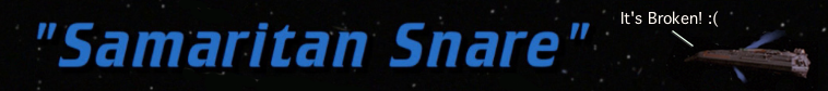
Someone brought to my attention days after the review that Pakleds don't use contractions, which I shamefully used here. Just goes to show that even a Trekkie like me can make the same mistake that all the writers of Star Trek can make. I thought about fixing the banner but decided not to because, like the episode, it is broken.")
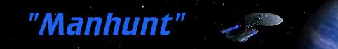
"Up A Long Ladder" presented me with a potential problem I should have anticipated. Titles over something that's not space. I could have easily erased the areas around the title and put it over blank space, but I was running a version of Photoshop Elements that was so out of date it kept on crashing every time I made a new layer. "Man Hunt" thankfully was I think the last Photoshop Elements image before I moved onto Acorn, where I decided to not only to make the size of the banners consistent from post to post, but also invest a little $ into this endeavor. Which brings us to...
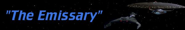
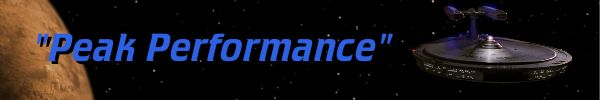
This was a big one for me because I wanted a shot of the Klingon Battle Cruiser facing off against the Enterprise D, but there were no shots where you could see both ships in their entirety. So for the K't'inga cruiser, I grabbed a screenshot from Star Trek: The Motion Picture and grabbed one of the Klingon ships approaching the cloud and flipped it to face the other direction. The Enterprise D is taken from "Peak Performance" when it's facing off against the Ferengi. While the quality may not be the best, I was happy with the result since I was creating a shot that never existed in the actual episode. I really got a cool sense of what it was like working with elements from other productions to work in your own.
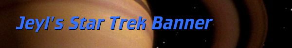
But the biggest change that's not immediately apparent is that I am recreating the titles from scratch. Since I've been doing this "Episode A Week" thing for a while and still creating the posts, I thought that a lot of these episodes aren't going to have their titles in areas where I want them, and I wanted more control of the titles in general. So I went and purchased "Crillee Italic LET" from myfonts.com for $39.96 and boy, what a difference it makes. When I recreate the title, I basically create two layers with the same title. One with the title in it's blue color, and another to give the title a black outline as seen in other episodes.
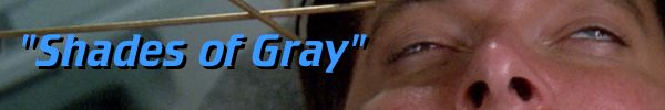
When it came time to do the infamous Shades of Gray, a title over space simply wasn't going to cut it. I wanted something that would not only showcase that this was in fact "Shades of Gray" that was being reviewed, but also use an image that would reflect just how dumb it all was. Than I thought "Ah ha! Riker with a stupid prop around his head making dumb eye gestures!"
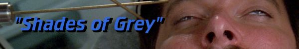
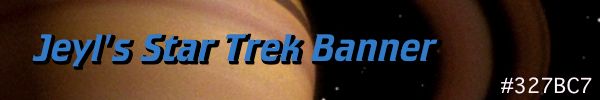
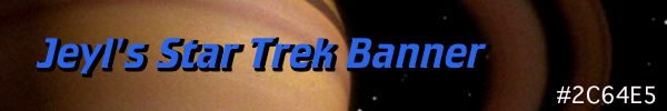
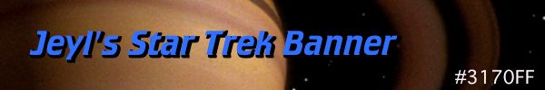
And yep, I spelled the "gray" wrong. Thankfully I caught this before I posted it, but I had to do it all from scratch since I didn't save the Acorn file itself. I bumped the brightness of the blue up a bit to see how that would work and thought it didn't really work as well as the original shade of blue. Unfortunately I was in such a rush to get the banner done before I headed out to work that I simply uploaded it to see what happens. Not bad, but I think I'm going to stick with the darker color blue and make the black areas more prominent.
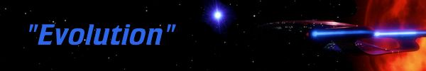
And what can I say about "Evolution"? It opens with a beautiful shot of the Enterprise in front of two suns, so I'll open Season 3 of EOTW with the same shot, only with the suns more spread out.
Already working on "Ensigns of Command" for next week and it won't even involve a space shot.
What do you think about the banners?
Fairly straight forward. Just grabbed a picture from trekcore.com (thank you!) and cropped out everything except the title. This was typically how I did my first two banners.
When it came time for my "Q Who" review, I decided to try something different. I still wanted to do the episode's title in space like the previous episodes, but I wanted to add something more to it that signified that this was "Q Who", so I grabbed another picture from trek core, went into Photoshop Elements and spliced the two images together.
Simple and efficient! But as all things go when you're doing something new on a constant basis, you always think of ways to improve your craft. One attempt at humor ended in embarrassment when I, and this is quite funny, "miss-represented" the Pakleds.
Someone brought to my attention days after the review that Pakleds don't use contractions, which I shamefully used here. Just goes to show that even a Trekkie like me can make the same mistake that all the writers of Star Trek can make. I thought about fixing the banner but decided not to because, like the episode, it is broken.
"Up A Long Ladder" presented me with a potential problem I should have anticipated. Titles over something that's not space. I could have easily erased the areas around the title and put it over blank space, but I was running a version of Photoshop Elements that was so out of date it kept on crashing every time I made a new layer. "Man Hunt" thankfully was I think the last Photoshop Elements image before I moved onto Acorn, where I decided to not only to make the size of the banners consistent from post to post, but also invest a little $ into this endeavor. Which brings us to...
This was a big one for me because I wanted a shot of the Klingon Battle Cruiser facing off against the Enterprise D, but there were no shots where you could see both ships in their entirety. So for the K't'inga cruiser, I grabbed a screenshot from Star Trek: The Motion Picture and grabbed one of the Klingon ships approaching the cloud and flipped it to face the other direction. The Enterprise D is taken from "Peak Performance" when it's facing off against the Ferengi. While the quality may not be the best, I was happy with the result since I was creating a shot that never existed in the actual episode. I really got a cool sense of what it was like working with elements from other productions to work in your own.
But the biggest change that's not immediately apparent is that I am recreating the titles from scratch. Since I've been doing this "Episode A Week" thing for a while and still creating the posts, I thought that a lot of these episodes aren't going to have their titles in areas where I want them, and I wanted more control of the titles in general. So I went and purchased "Crillee Italic LET" from myfonts.com for $39.96 and boy, what a difference it makes. When I recreate the title, I basically create two layers with the same title. One with the title in it's blue color, and another to give the title a black outline as seen in other episodes.
When it came time to do the infamous Shades of Gray, a title over space simply wasn't going to cut it. I wanted something that would not only showcase that this was in fact "Shades of Gray" that was being reviewed, but also use an image that would reflect just how dumb it all was. Than I thought "Ah ha! Riker with a stupid prop around his head making dumb eye gestures!"
And yep, I spelled the "gray" wrong. Thankfully I caught this before I posted it, but I had to do it all from scratch since I didn't save the Acorn file itself. I bumped the brightness of the blue up a bit to see how that would work and thought it didn't really work as well as the original shade of blue. Unfortunately I was in such a rush to get the banner done before I headed out to work that I simply uploaded it to see what happens. Not bad, but I think I'm going to stick with the darker color blue and make the black areas more prominent.
And what can I say about "Evolution"? It opens with a beautiful shot of the Enterprise in front of two suns, so I'll open Season 3 of EOTW with the same shot, only with the suns more spread out.
Already working on "Ensigns of Command" for next week and it won't even involve a space shot.
What do you think about the banners?