I'm guessing that the "chrome" front ends of the nacelles are actually a glass-like surface reflecting space in this image - and that when the ship gets revved up there is a spinning light-effect inside. I'm guessing "spinning" because of the blades we see inside the nacelle fronts in the teaser trailer.
I think the secondary hull is about the same volume, relative to the saucer, as on the TOS ship. It looks smaller because of the way it tapers and flattens toward the back. The TOS secondary hull was a little small, too, in terms of the design balance - Jefferies and Probert fattened that secondary hull up in the Phase II and TMP refit version.
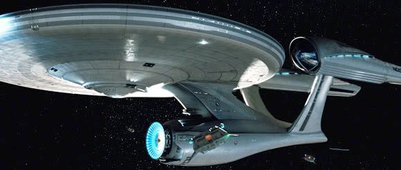
It looks like the saucer lacks the concavity of earlier versions of the NCC-1701 and NCC-1701-A. The saucer bottom is just flat, with the lower convex area simply emerging from that plane. That, along with the way the pylons and neck sweep into the secondary hull rather than appearing to simply butt against it, is probably why some people see resemblances to Picard's Enterprise and other later ships.
I'll take this over the Enterprise E any day of the week.
But stepping back, the most remarkable aspect of this is that a whole new design team coming in to do their own take on the aesthetic of a four-decade-old TV show chose to produce yet another Enterprise that no one could mistake for anything other than "Star Trek's" signature ship. Don't look like "Star Wars," don't look like "Battlestar Galactica." Looks like the Enterprise.
That in itself speaks to the strengths - and, okay, "timelessness" - of the original design by Matt Jefferies, regardless of the exact lines or details of the model.
I completely agree with you. Well said.
No, this isn't a 'mirror universe' Plum, I do 100% agree with you.

I had noticed the subtle curving of the TOS/TMP saucer was missing from the Kelvin pics, so this flatness carries onto the top of the saucer too, I reckon. This part of the saucer design survived right through from the original Matt Jeffries design to the TMP era. And as someone who drew the big E a lot, that aspect of the ship was always hell, HELL, to get right proportionally. Even doing it in CG is a huge pain (I gave up). It's a part of the design I have the hardest time accepting, funny enough. And funny it isn't the rather Ford muscle car nacelle astetic.
Last edited:


")
") )!
)!