"I have always believed that writing advertisements is the second most profitable form of writing. The first, of course, is ransom notes..."
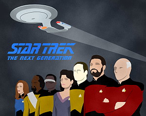
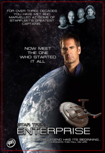
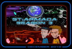
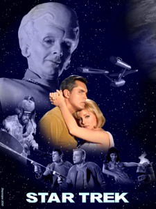
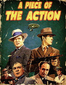
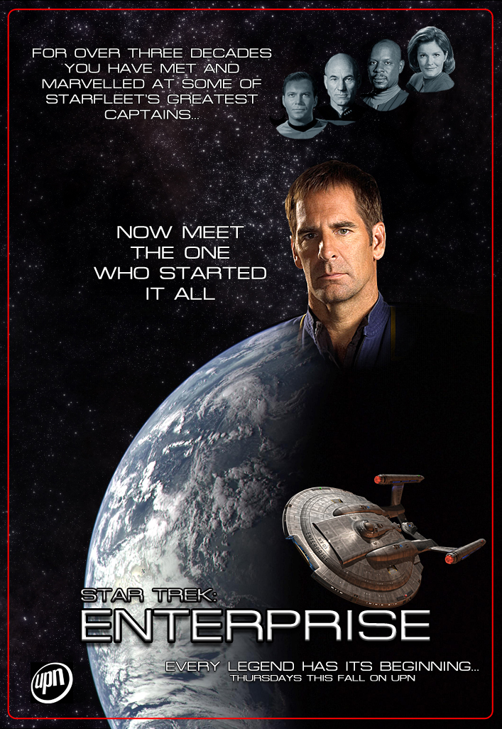
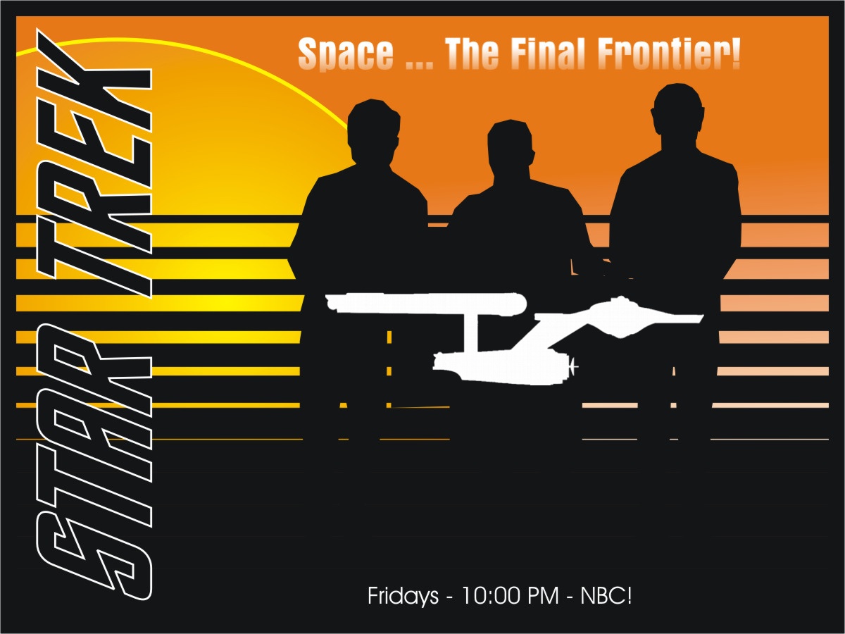
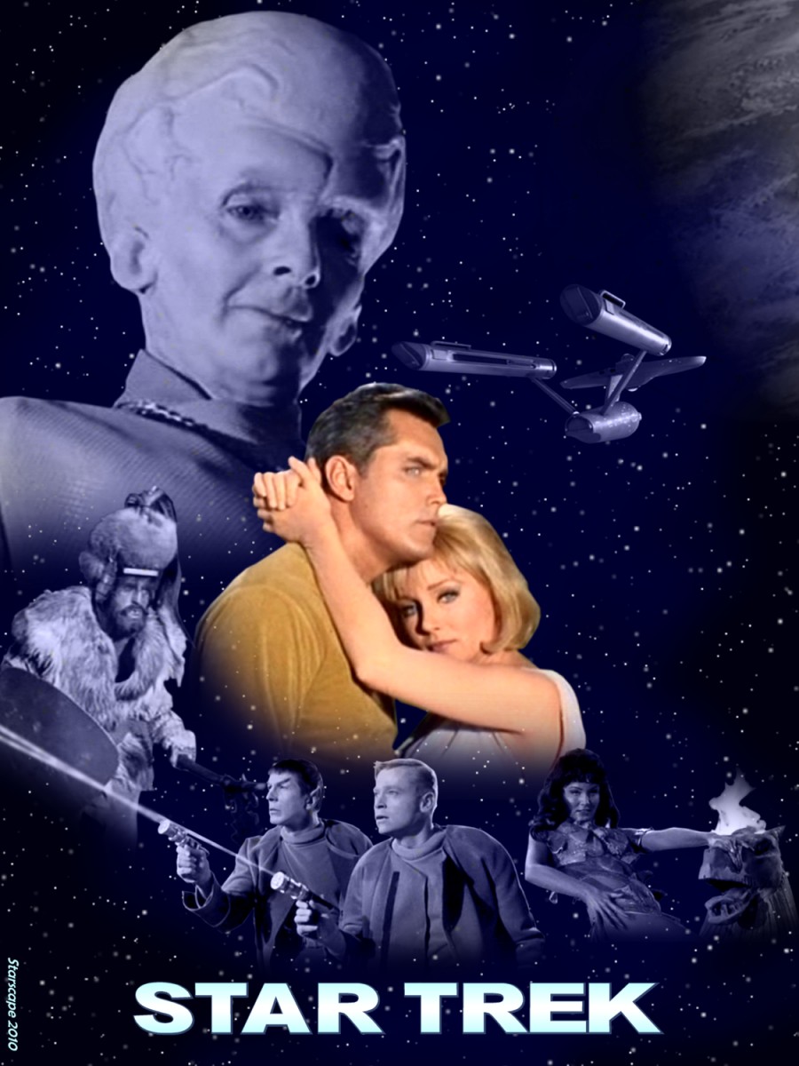
After a long (and hopefully profitable!) absence, Ihlecreations stormed last month's challenge, and earned the right to create this month's - one which he also hoped would be 'profitable': promoting Star Trek. It was open to interpretation, and we have as many interpreters, it seems, as the United Nations!
"Bring on the obscene movies, murals, postcards, neckties, samplers, stained-glass windows, tattoos ... anything!"
Entries could consist of anything Trek-related, as long as it made you want to watch, and it looks like we may need some free time for these results ...
--------
B.J.
Klaus

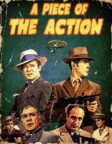
Ptrope
S3CTION31
Starscape
The Lensman
After a long (and hopefully profitable!) absence, Ihlecreations stormed last month's challenge, and earned the right to create this month's - one which he also hoped would be 'profitable': promoting Star Trek. It was open to interpretation, and we have as many interpreters, it seems, as the United Nations!
"Bring on the obscene movies, murals, postcards, neckties, samplers, stained-glass windows, tattoos ... anything!"
Entries could consist of anything Trek-related, as long as it made you want to watch, and it looks like we may need some free time for these results ...
--------

B.J.
Klaus
Ptrope

S3CTION31
Starscape
The Lensman
")
 .
. .
.")


