Why I voted for the following posters:
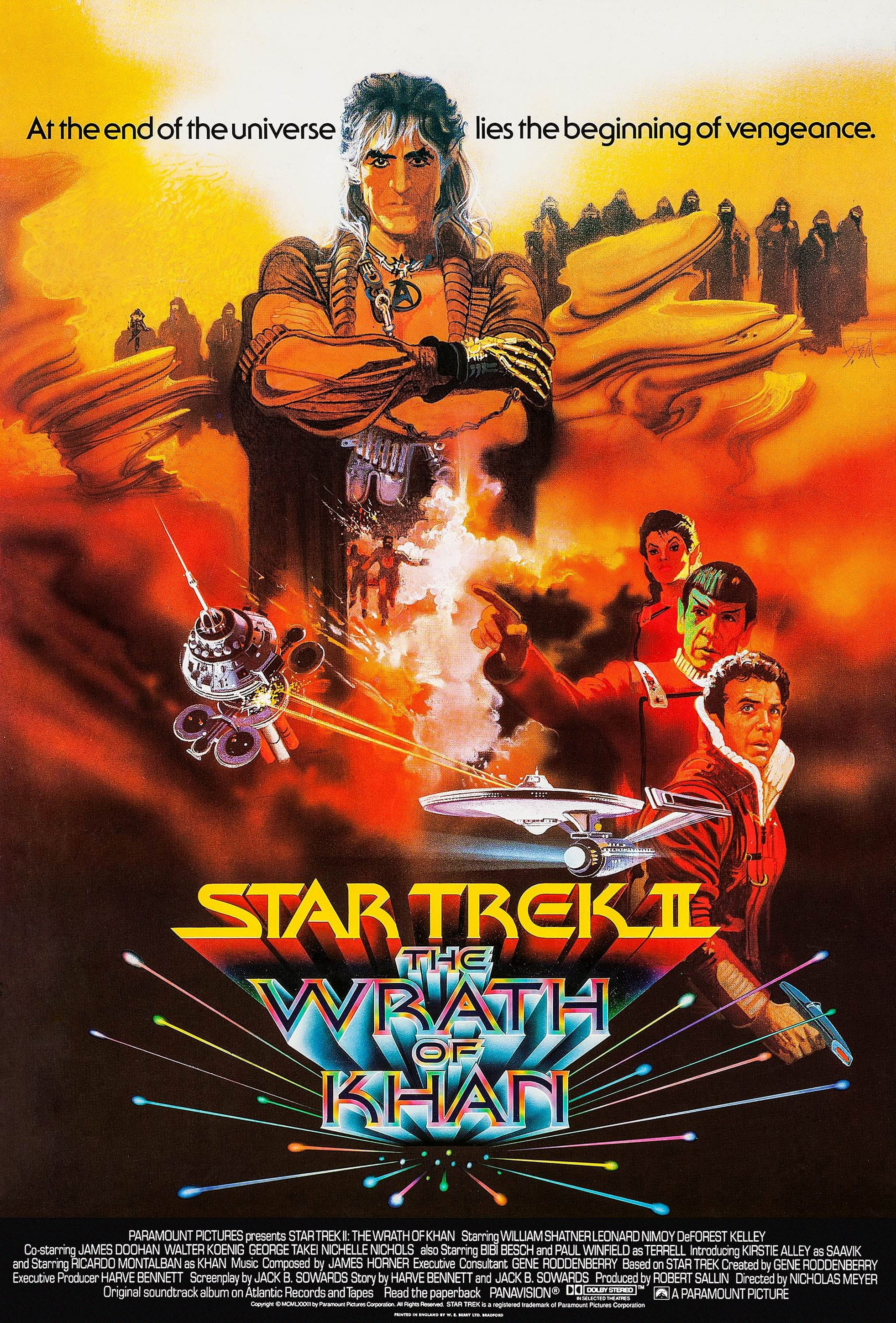
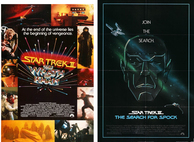
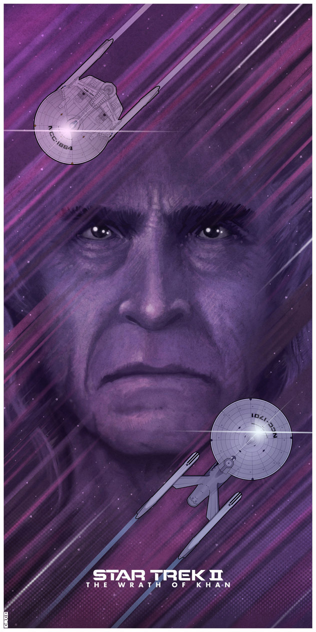
TWOK (almost perfect, but they had to have Enteprise firing on something, no matter how disproportionate or immaterial it was, but they weren't going to spoil Reliant, or have a giant head of Khan (or Spock) being hit on by phasers as that would look dumb. Still, the tag line is perfect in its simplicity.)
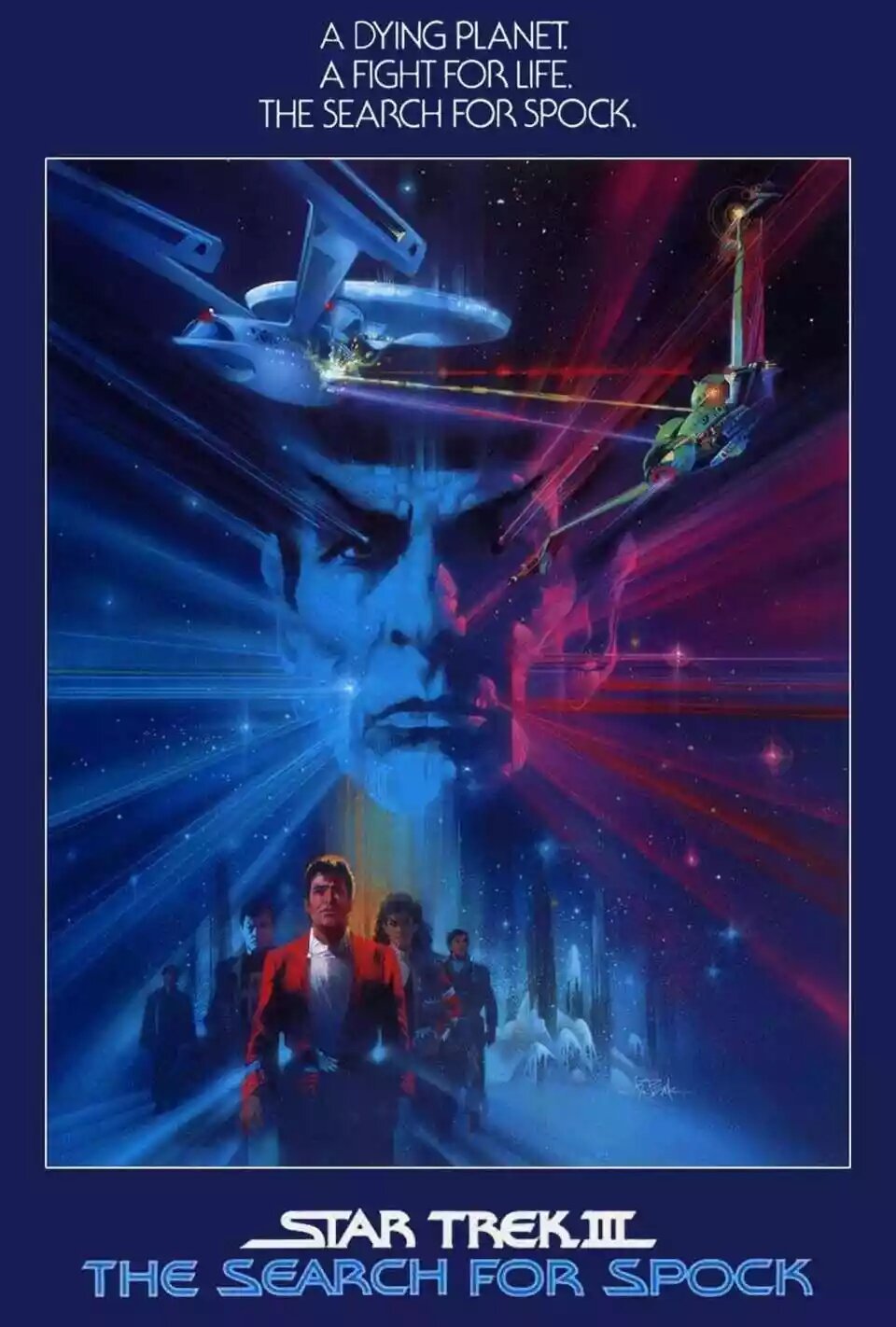
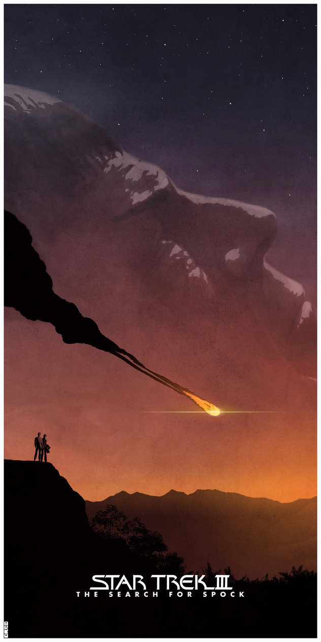
TSFS (really suits the story. Great three tag lines. A damaged Enterprise firing red, gold, and blue phasers onto the Klingon ship, a planet background whose details are deliberately and artistically murky, and the crew looking properly bemused. And there are those lines coming out from behind everyone again (not since TMP) except it's not a foggy day. )
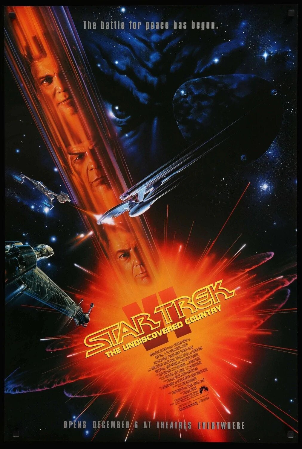
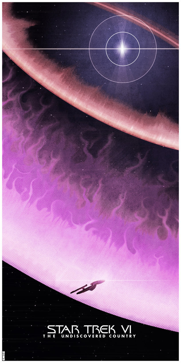
TUC (in the vein of TMP but more refined and with better connection to the story.) The use of the Klingon head implies a neat vulnerability that's directly related to a key plot issue, and has a certain stylish look too.
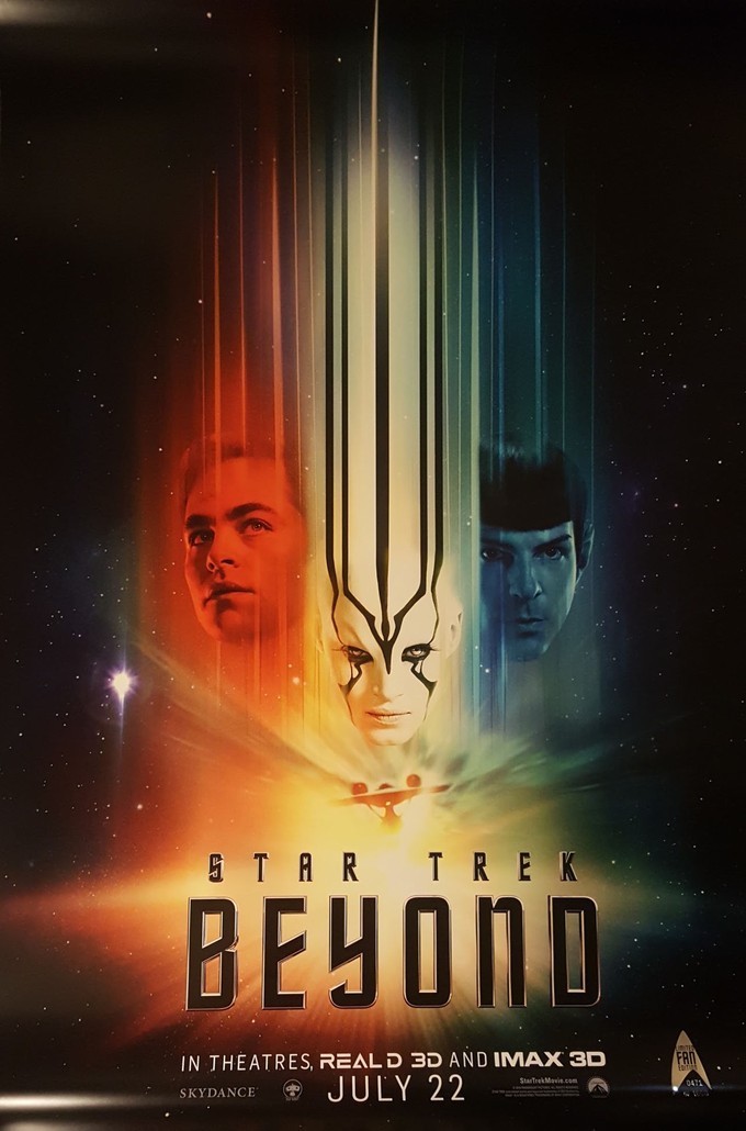
STB - The first may easily be the weakest part of the film if not all the posters, as it's too much a rehash of TMP and there's no tag line to pique interest... but the second shows a robust crew montage and something rather more lively and interesting than dank teal/orange puke palette, revealing very little but promising excitement that it actually delivers on and it's a shame more people didn't see it at the time. This second poster is a solid one for sure.
Why I didn't vote for the others (keeping most to design work and how they relay the story):
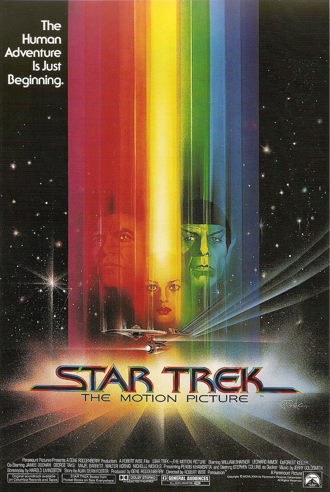
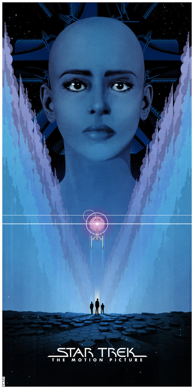
TMP - 1979 and the height of disco had unicorn puke everywhere and the poster isn't telling much, apart from "Oh look, it's a shiny new ship" - which admittedly had more in its favor in 1979... I'm sure people were asking "Where's McCoy" Who's the lady? Is she a villain?"
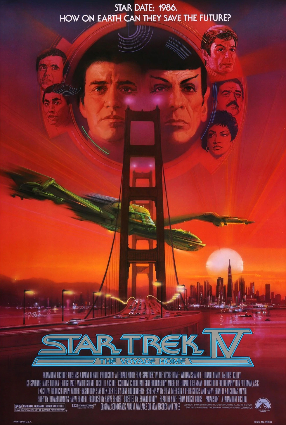
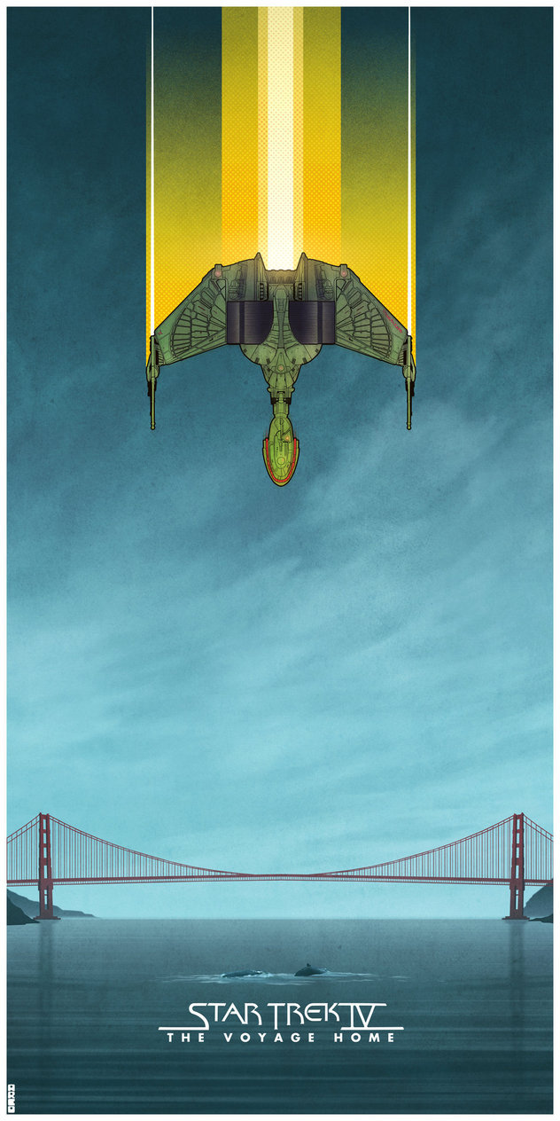
TVH - not sure if the perspective is correct between Klingon ship and bridge, but the artwork for the crews' countenances is largely awful. Maybe not "awful", but "not quite right". The overall image relays part of a scene, leading viewers to wonder "How do they end up there?"
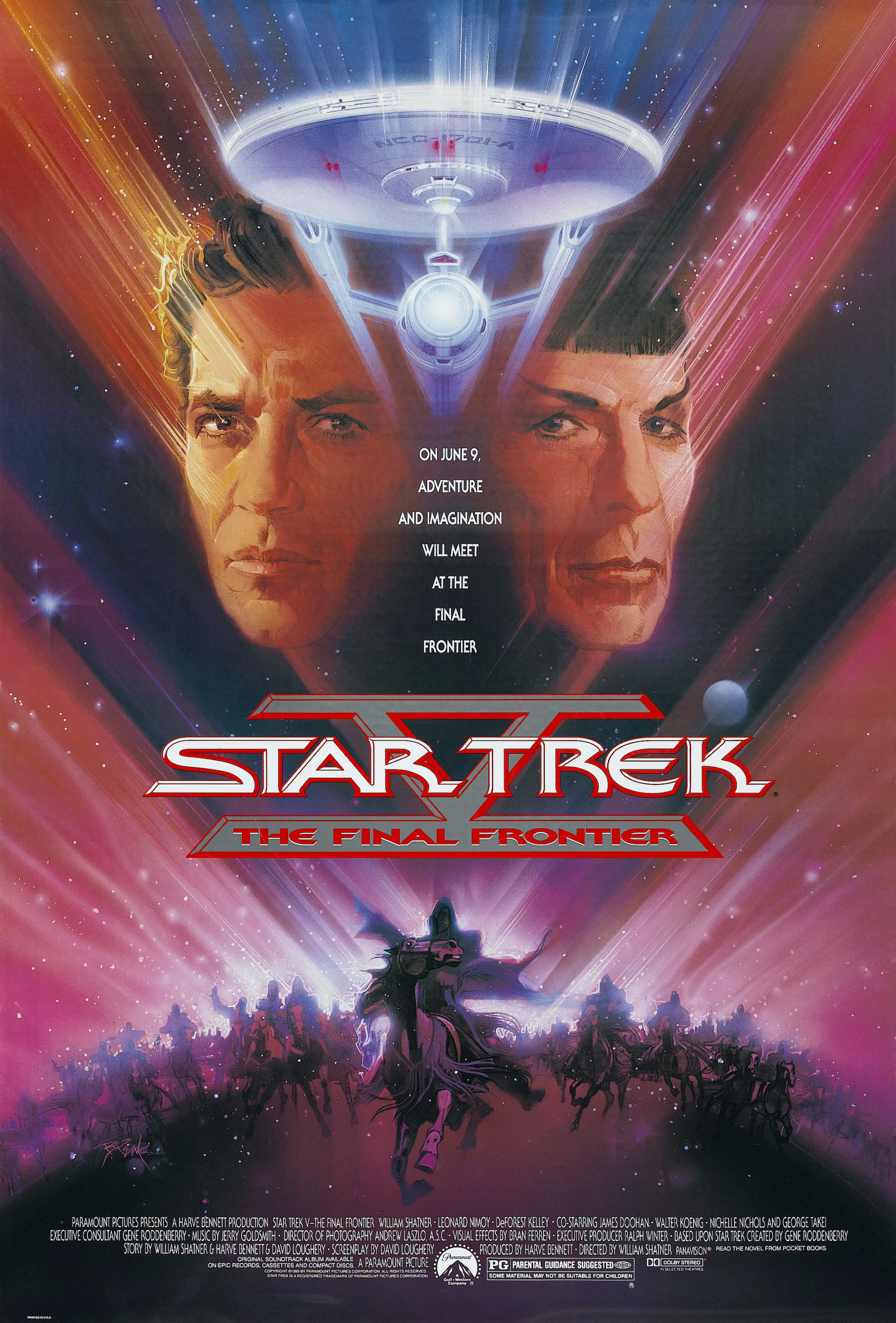
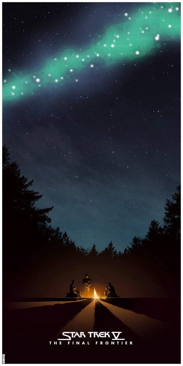
TFF - more iffy facial artwork (was it an 80s thing?), and apparently the movie is about a bunch of horseback riders floating in space... wheeeeeeee! And by now, there's a recurring theme of prominent poster elements having long semi-opaque lines emanating from them yet it's not a fart joke... (or, in other words, the excessive fog effect for non-foggy background was making the overall effect too busy...)
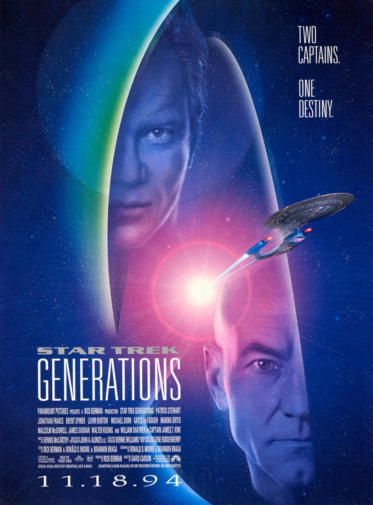
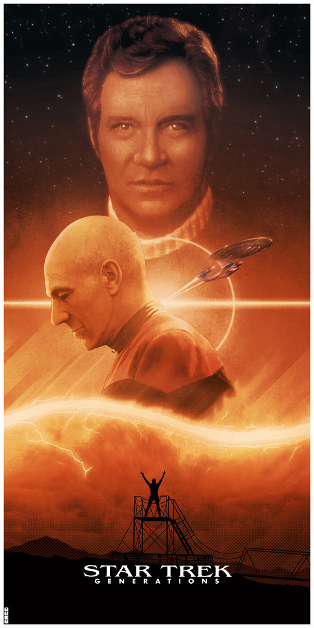
GEN - Well, the lines emanating from something are still there but this time it's a giant lens flare worthy of Photoshop v1.0 slapping you in the face. Definitely a lot of hype for the two captains... then people saw the flick.
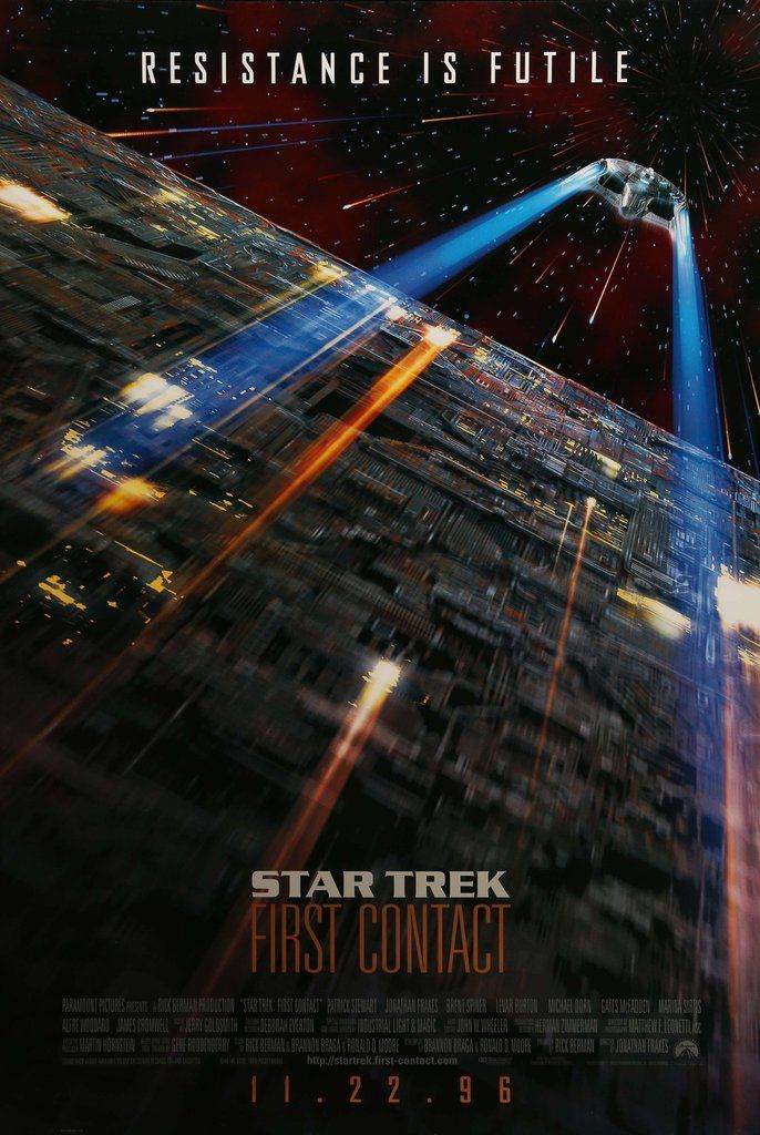
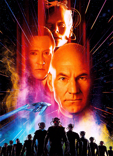
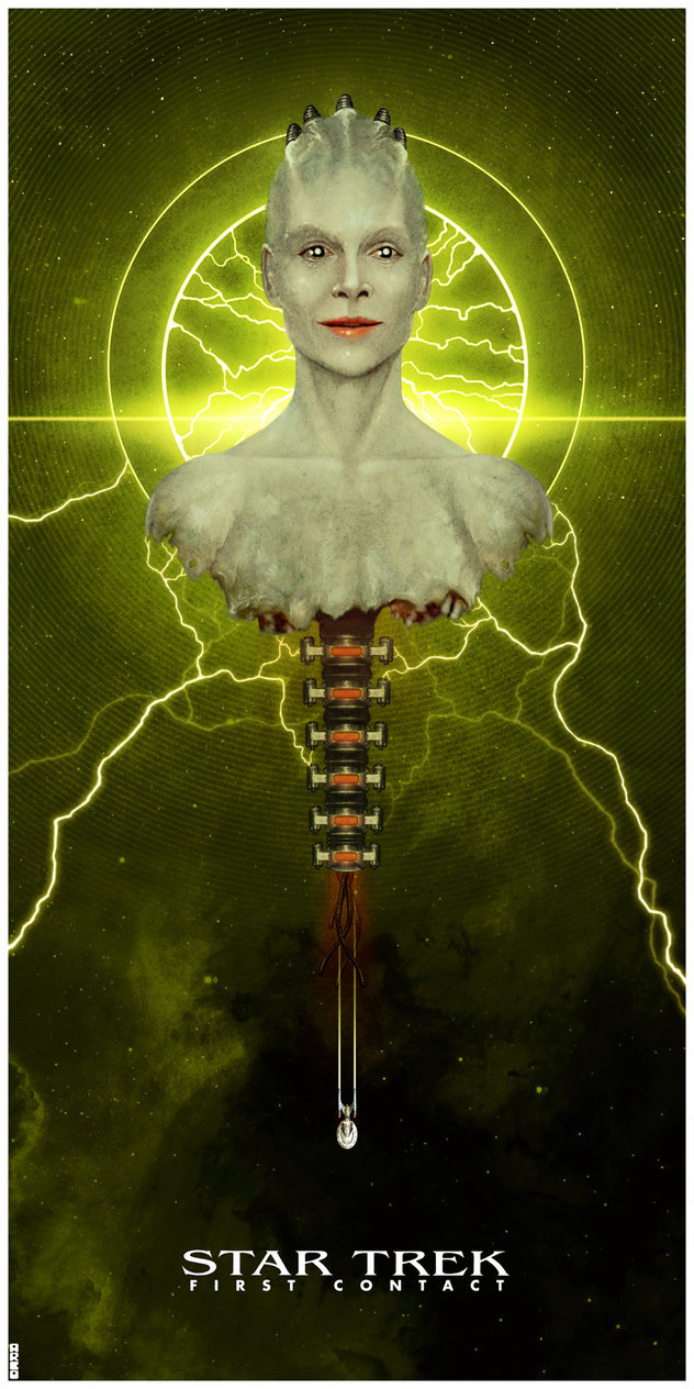
FC - The first one is engaging and promising, it's also too much a tease given how the movie transpires after the first two minutes. I mean, the new ship is being chased by a Cube as if it's no match. Sorta suggests a monstrous threat, but instead we spend a couple hours spouting fan favorite one-liners and dumb jokes, some token time travel fluff, and giving us less of that excitement they say we want. The other poster, with Borg Queen, Picard, Data, Sybok's army now marching in the designer V-shape instead of on horseback... and the ship with more stink lines fleeing something (Zephram's ship?!!) is just there.
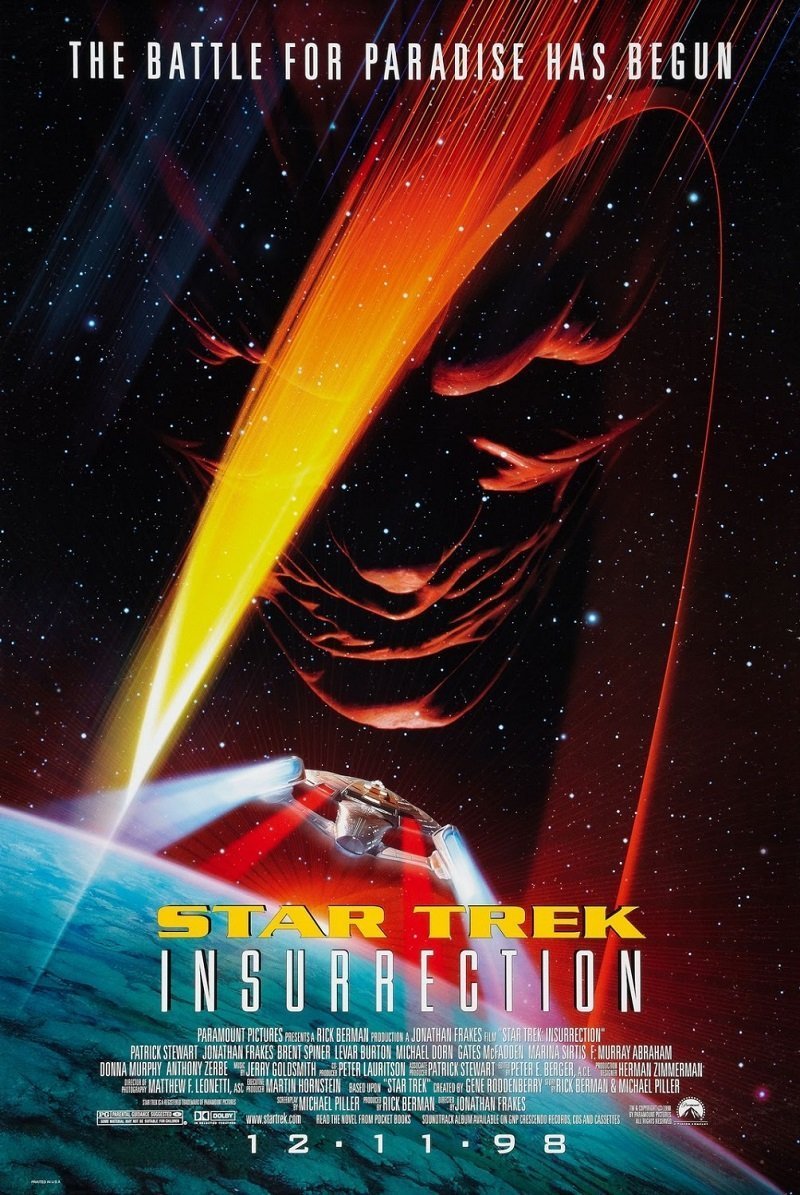
INS - Definitely the second time a previous poster was used as inspiration, only this time it's not TFF's but TUC's. And with a far more muddled and messy plot than anything TUC could have hoped to have accomplished and it was a bit of a muddied mess too. Nitpick aside, the ship flying TOWARD the baddie is actually exciting, even with the fart lines again - and coupled with teal/orange, as if this poster is advertising HVAC services or something. Ru'afo looking down sells a menace, and without F Murray Abraham, Ru'afo wouldn't have come across with anything approaching menace at all.
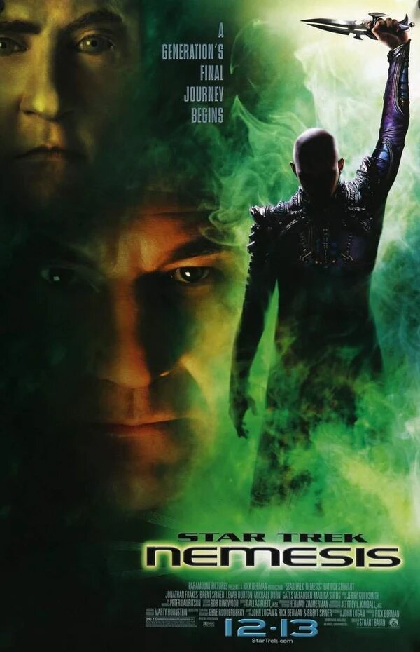
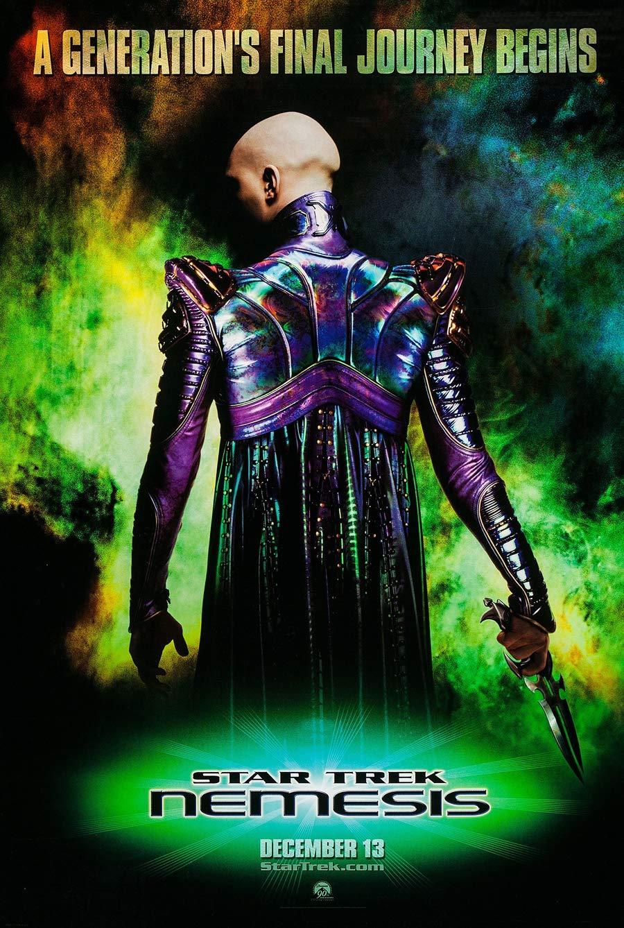
NEM - Yeah, even for the promotionals, they knew this movie was going to tank faster than a tiny piece of neutron star chucked into the Atlantic. The vomit green and peach complementary palette is more reminiscent and iconic of the Borg, so seeing that again will really be scary, probably. The second one with the big image of Shinzon in his Studio 54 robe and mooning the audience has even more obvious cheap Photoshop effects for the lame tag line. Even the stink lines around the title come across uninspired. And both use a font different than the one used in the film. If that's the biggest spoiler to hide...
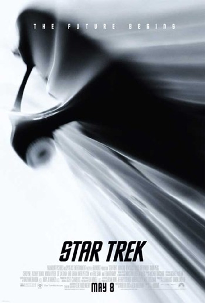
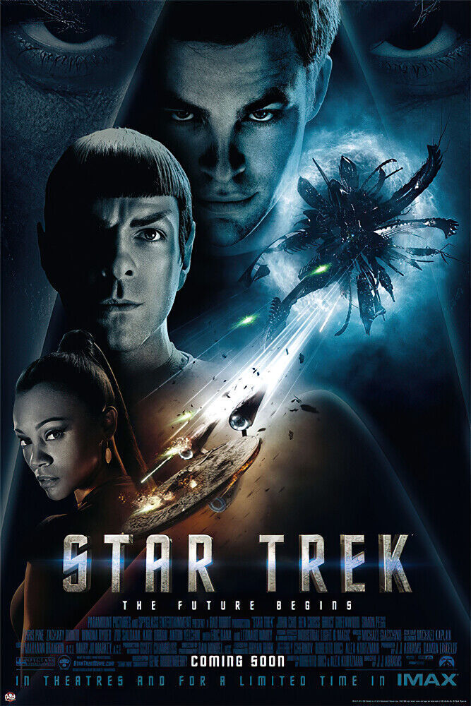
ST09 - Somehow, "The future begins" doesn't seem as intriguing or as thoughtful as "The Human Adventure is Just Beginning". It's not very thematic, is it? Also, the ship looks like something driven by Casper the Friendly Ghost. Or a fever dream. Or looks like an art beer bottle top opener, which is oddly apropos...
STID - I miss taglines, but the one with a montage of cast photos and John Harrison looking all evil and walking away from rubble is quite good. The trio make it look like they're on a hunt to find him, and the facial expressions are great. The other one where he looks like Neo's backside and mooning the camera made me think of Borg rather than "Oh look, San Francisco is smashed more than my ex on any given weekend."
TWOK and TSFS used these posters as well:
The more common ones; TWOK's not as nice as the artwork and this version of TSFS is lacking something... the stories couldn't be more epic, though.