• Welcome! The TrekBBS is the number one place to chat about Star Trek with like-minded fans.
    If you are not already a member then please register an account and join in the discussion!

Earth Ships

Kaziarl

Commodore
Commodore
So, I have no skills what so ever when it comes to images like you guys do, but I like to think I can describe them with words well enough. But at the moment I'm stumped.

I've been trying to imagine an earth starship that seems like something we'd build in however many years it takes us to start exploring space. I don't want it to be clean and pretty like most of the Federation ships from Star Trek are. Not that I don't like them of course, just want something a little more gritty.

I especially like the Earth Force ships from B5, and the Prometheus and Daedalus from Stargate, but I don't want to just take those. I'd like to come up with something unique.

So, I'm asking you guys. From a visual point of view, what do YOU think earth starships will look like in 100 or 200 years. Submarine like? Aircraft carrier like? Something different? What do you feel is a most likely design path us meager humans will take?

Thanks in advance.
Kaziarl
 
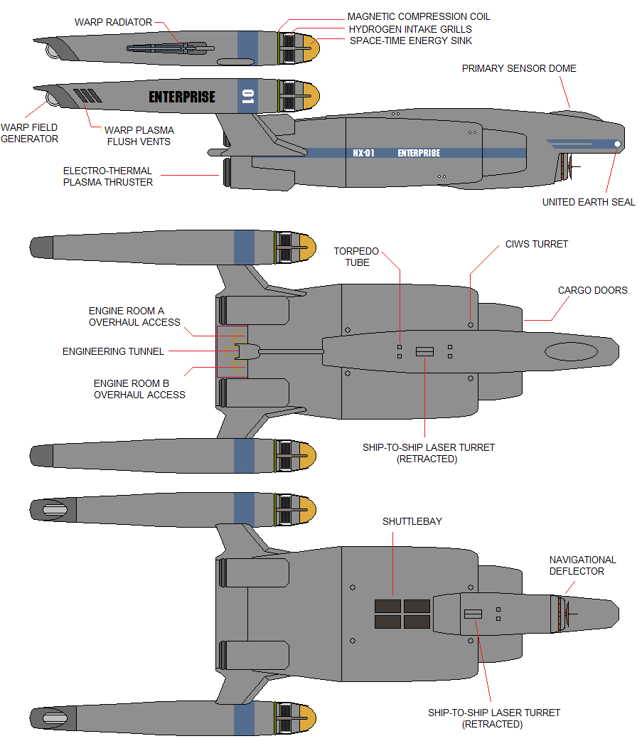
NX-01_WIP4Labeled.png


Or are we talkin' non-Trek here?
 
I thought that was implied when saying not clean and pretty like most trek ships, but I could have been more clear. Interesting take on the NX-01 though.

Sojouner, I'm guessing that ship uses rotation to create gravity? Looks like it would. It probably says so in the thread, but I just sort of skimmed the pictures.
 
For me I think we'll still be building pretty clean looking ships for some time. Smooth, more organic ships will always look more advanced to our eyes compared to blocky, pipe covered hulks. I recently built a ship loosely based on the Palamino from Disney's movie The Black Hole, but I made it a bit more 'near future' and gave it a NASA style outward appearance. It has a rotating centre section for gravity and the nose section separates and becomes a lander. Here's a couple of pics and part of an animation I am making with it...

http://www.flickr.com/photos/axeman3d/5140121784/
http://www.flickr.com/photos/axeman3d/5244589103/
http://www.flickr.com/photos/axeman3d/5249575558/
 
Nice, Axeman! I really like that design. My only nitpick is that it was hard to tell in the animation that the large section was actually rotating. I didn't see it moving until I went full-screen.
 
It bugs me too. I added some detail on the outside to show movement, but you rarely see it. I plan to add some recessed lighting so you can see it at all times.
 
Great design, Axeman. I must be honest, I've been getting rather burned out in the Trek-verse lately, and
have been attempting to invent my own. One line has ended up loosely based on 50's rockets and old Asimov short stories,
where the solar system is still a huge, interesting place. Anyway, this is very similar to the "look" I was aiming for.
Awesome.
 
I'm chuffed that everyone likes it, it gives me more impetus to finish the animation and then get back to detailing my new Miranda concept.

I got burned out making Trek stuff some time ago, I tend to make it now just when the whim takes me. Recently I've been using my mates work on Flickr as my inspiration, making 3D versions of things that they have pained or described. Usually they're not that complex and dont take long to make, since I have the attention span of SQUIRREL!

This one didn't take long to make, but I spent an extra few hours adding a bit more detail and a detailed flightdeck after it became clear it was popular and that I was going to make an animation with it. Even the animation is based on a painting, the blue lit asteroid field was someone else's baby that I just made in 3D.
 
It bugs me too. I added some detail on the outside to show movement, but you rarely see it. I plan to add some recessed lighting so you can see it at all times.

I could see it, but yeah, a little extra detail with more contrast would certainly help. Some lights or decals or something.
 
^Hence why NASA likes to paint big black and white stripes on their rockets. To make it easier to see if it rolls during flight.
 
Very nice Klaus, I dont remember that one but it kicks the ass of the Daedelus class as far as I'm concerned. I didn't go for the black & white squares myself as they're more for test vehicles rather than production vehicles. It smacks of those early V2 rocket tests that you always see footage of.
 
In my original thread, I acknowledged the Conestoga design, and did not take credit for the base design (pictures of which have been floating around the web since at least Season 1 of ENT). The Conestoga has long been a well-known design among fandom here on the TrekBBS Art forum, and I took an oft-heard fan statement ("The Conestoga would have made a better NX") to its conclusion, making changes I deemed necessary to romanticize the design a bit.
 
If you are not already a member then please register an account and join in the discussion!

Sign up / Register


Back
Top