DS9 - Enigma Tales by Una McCormack pre-release thread

Discussion in 'Trek Literature' started by Enterprise1701, Oct 27, 2016.

  1. Burning Hearts of Qo'nOs

    Burning Hearts of Qo'nOs Commodore Commodore

    Joined:
    Mar 15, 2017
    Location:
    Burning Hearts of Qo'nOs
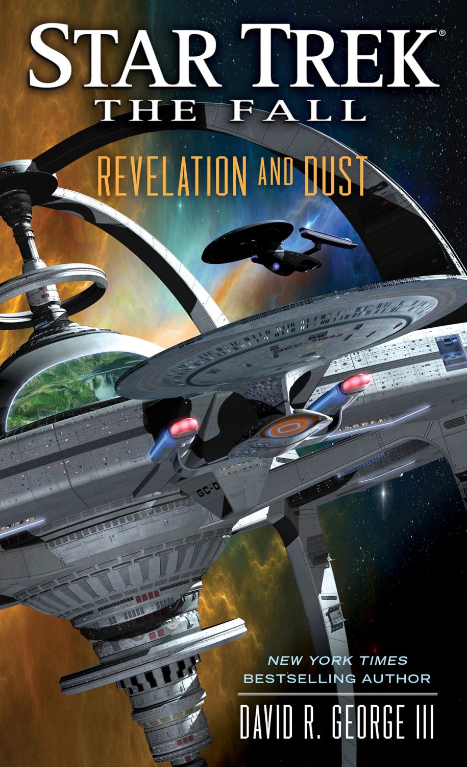
    I actually like seeing ships on the covers too, but they often get used in really boring ways. Also something that drives me a little batty is every time DS9-2 is on the covers, the scaling is so boring looking. It never looks like a MASSIVE space station with the vanilla camera angles they use.

    I think the best combination is single character plus a shot of a ship/station or space element like a planet or something.
     
    Jinn and Kilana2 like this.
  2. Hardtarget

    Hardtarget Lieutenant Junior Grade Red Shirt

    Joined:
    Apr 19, 2017
    A bit off topic but I believe there has been one "ok" use of the scale of nuDS9:
    [​IMG]

    The new station looks awful in the cover to DS9: Ascendance though, that's for sure. and in Sacraments of Fire it looks fine but it's completely alone on the cover so you can't tell scale in any way sadly.
     
  3. Burning Hearts of Qo'nOs

    Burning Hearts of Qo'nOs Commodore Commodore

    Joined:
    Mar 15, 2017
    Location:
    Burning Hearts of Qo'nOs
    While the composition and shapes are pretty pleasing to the eye here, I still don't really feel like it conveys a real sense of scale with the single point perspective. In this shot, I would have tried to bring the camera lower and tilted up towards the Robinson and DS9 creating two point perspective so distance will look like it stretches in two directions. Then get closer to the Robinson and showing more detail and presence, the ship itself would seem bigger making the station behind it seem more massive, with a few ships in the far background. Then you get scale at all distances within frame.

    As presented through the camera angles, textures, and lighting, these look like toys set up in a diorama.

    Or imagine a shot from the core facing outwards where you can see the park in frame behind the glass (off to the side) and then the pylons extending out into the far distance and then climbing to the top. These kind of shots I feel would give more scale.
     
    Idran and Jinn like this.
  4. David cgc

    David cgc Admiral Premium Member

    Joined:
    Apr 3, 2002
    Location:
    Florida
    Oddly enough, compared to the design sketches, it looks like it's about twice as big as it should be in that picture.
     
  5. Burning Hearts of Qo'nOs

    Burning Hearts of Qo'nOs Commodore Commodore

    Joined:
    Mar 15, 2017
    Location:
    Burning Hearts of Qo'nOs
    Well this just throws my view of everything into question.
     
  6. JD

    JD Fleet Admiral Admiral

    Joined:
    Jul 22, 2004
    Location:
    Arizona, USA
    That is definitely better than the one we actually got. If you put that together in an hour, then I really do have to question how much time was spent on the book's official cover.
     
  7. Brefugee

    Brefugee No longer living the Irish dream. Premium Member

    Joined:
    Oct 12, 2007
    Ten minutes.
     
  8. JD

    JD Fleet Admiral Admiral

    Joined:
    Jul 22, 2004
    Location:
    Arizona, USA
    I think the most frustrating thing about these bad covers, is that we did get some great ones in past.