• Welcome! The TrekBBS is the number one place to chat about Star Trek with like-minded fans.
    If you are not already a member then please register an account and join in the discussion!

Double hulled starship

That's better...but the ends of the hulls just hanging off the end there still look awkward to me.
Agreed...

Either cut those curved sections off so that the aft end faces directly aft, or put some sort of "pod" or module on the ends.

Something about the way the ship is now makes me have the same response I have if, for example, I see someone walking pigeon-toed, or looking at me cross-eyed. It just strikes me as "uncoordinated."

I DO like the suggestion from above about making the nacelle attachments part of a single curved section... though I wonder if perhaps simply terminating the aft-leading curved pylons at that big "c" shape might not be better...
render10yaaaaaaaa.jpg
 
Yeah the pylons ending like that pointing outwards just looks very odd. :cardie:

If you insist in leaving them like that ;) I would suggest attaching the warp nacelles at the end of the pylons, instead of branching off of them.
 
I think cutting it off at the c would work very well. It keeps its distinctive design and shape and unique look without being cumbersome or throwing the look off.
 
:eek: I didn't expect so many replies. Good to see there's interest; at least it means the thing isn't dull. :D

I'll make a few proper renders the next time, but I'm a bit strapped for time right now but still wanted to show something. So I've got a simple animation to show the ship from different angles. Oh, yes, my animation skills are even worse then nonexistent, I am well aware. ;)

Download here. MOV, 3.7MB

And a few screenshots:


The straight nacelles seem to fit best. I've eliminated the pylons; the nacelles are now attached straight to the catamaran hulls, below the centerplane. This still isn't right; they look tacked on the upper view, so I'll still have to echo the shape somehow, or make a stronger connection. But I believe it looks more promising then with pylons. The catamarans have been beefed up a bit; the back end looks more solid and cohesive now. I've changed a few shapes here and there and I've made the whole thing bigger in the Y-axis. Not too much; it still needs to have a slim profile. But it's not that huge of a ship, so a bit of thickness is good, I think.

Any comments on the changes? what's better? what's worse?
 
I feel the aft needs some serious reconsideration; it's not the fault of the nacelles that they don't look right, but those curved pylons are part of the problem, too. Though of all three designs, I like the straight-nacelled version the best.

By the way, what program are you using?

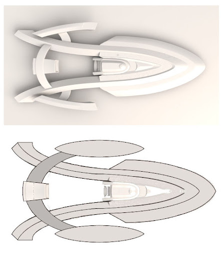
The aft is problematic, yes; I'm still fiddling with it. I can simply straighten it out toward the end; but that would be too easy. I think it makes the whole thing stand out so I'm a bit inclined to at least keep that part. But I agree, curved nacelles is perhaps too un-Federation like; I've gone for the straight ones.

I use modo.

The curved catamarans don't seem to serve a purpose. Maybe attach the nacelles to the end of them instead of using pylons at the mid length? Also, the entire ship needs more of a vertical element. It's too flat. Maybe have the catamarans curve down as well as out?

Well, being aesthetically pleasing is a purpose in and of itself, as well. ;) You're right in that it needs a vertical element. After much trial and error, I've decided to put the nacelles down, add a much more prominent secondary hull and made the whole thing higher in the Y-axis. Does it look better?

I'd rather have the impulse engines on the tips of the catamarans (straightened out NX-Class style) & the #3 "straight" nacelles mounted on the dorsal side of the catamarans at a slight thirty degree angle. Dual navigation deflectors (see "U.S.S. Phobos / Loknar-Class TMP Refit".)

I don't like dual navigation deflectors; one is quite enough I think. It also makes the engineering hull look as if the ship's 9 months pregnant. Of twins. ;)

Perhaps a tiny deflector in the saucer. The idea about the impulse engines on the end of the catamarans is a good one, after all, with them coming out of the saucer and the shuttlebay where it is, there's hardly any room to put them in the traditional area. As a matter of fact, that's what I did.

I was thinking with the pylons... curve them out as they are, but straightern them out 1/2 way through...

...as for purpose, easy to figure out once it's done ;)

I can simply make them straight, but that will make the rest look much more traditional. I'll do it as a last resort, but first I'm still trying to make it work.

And yes, purpose can be figured out afterward. ;) I am leaning toward some sort of Akira successor or relative (obviously), probably after the TNG era. Perhaps in the Movie universe, who knows. Depends on if the design will fit enough or not.

Think along the lines of the "Rebel-Class" seen below.

http://www.feymanshipyards.com/CruiserRebel.html

Hmm, I don't think I'll be going in that direction. Nacelles sweeping back and up give me a more of a "soaring majestically through space" feeling. That's good for something like the Enterprise, but this ain't no enterprise. And it's not a Romulan warbird, either. I'm trying to keep it elegant instead of clunky but also rugged instead of majestic. Elegant and rugged. Difficult combination, now that I think of it. Oh well. :D

[...]
it looks like they need some sort of follow-though. They need to DO something... maybe the nacelles need to be more integrated with them.

Yes, it doesn't look very cohesive yet, I agree.

When they curve inward they create this weird angle, combined with the roll bar's angle, and you're left with just a ton of different angles all in one area.

Your ship looks good. Not really what I'm going for, though; it's very curvy. I agree that it still has too many angles. Some will have to be eliminated.

Here's a quick and dirty sketch of where I think you should go with your wonderful bi-hull design. I think this approach would eliminate the feeling that the pylons & nacelles are just sort of "stuck on" somehow.

It looks interesting, but also off, somehow. Probably because the curved rollbar dominates too much when there's no shape to break them up. Both the Akira and the NX class also breaks up the pylons/rollbar for that purpose. I'm actually inclined to simply fill the empty space right up to the catamarans, remove the nacelles and give it a bit more mass in the back so it'll look like a primitive Wells class.
However, I have tried to cut off the catamarans a little bit after the rollbar, but it simply looked even more odd then it does now. I'd have to straighten the ends up for that to be workable, and I'm not inclined to do that yet. ;)

Yeah the pylons ending like that pointing outwards just looks very odd. :cardie:

If you insist in leaving them like that ;) I would suggest attaching the warp nacelles at the end of the pylons, instead of branching off of them.

It does. And I insist. ;) I'd like to try and make it so that they do fit. After all, the double hulls on the Akira are very, very odd also, if you look at them separately.

And for those I couldn't think of a big reply: thank you for your comment.
 
I really like the new tweaks. I'm too tired to find the right words, but it seems to flow a lot better.
 
These updates are better, but the way to nacelles are stuck onto the end of the hull like that makes them seem like somewhat of an afterthought. Almost like the part where the two connect is unfinished.
 
Looks like a 25th or 26th century version of the Akira class :) :techman:

May i suggest Tsunami or Ryoko class? :)
 
Last edited:
I like the side profile. It's giving me a very strong Aventine vibe. The latest placement of the nacelles and the new shape for them is working well. Good luck finding a way to attach them to the hull!
 
I've done a few tweaks. Lots still to do, the nacelles, weapons pod, engineering bulge and the entire top have hardly been touched. I've sprinkled a few details on the hull; they are by no means final, obviously, but they might be useful to see the scale.


It all takes longer then I'd like since I'm really still learning how to do it. I'm a webdesigner, not a product designer. ;) And while I've dabbled with a few WIP's, none have ever come past the "nice shape, now let's try something else" phase. So I have no idea how to do any detailing; I'm making it up as I go.

It took me ages to figure out how to do those temporary windows and the engineering bulge is really giving me fits at the moment. Edge weights and cut loops are giving me completely different volumes; how am I ever going to carve details out of it without freezing the whole shebang or completely messing up the curves? Oh well; I'll just let the whole thing sit for a while; it'll probably go a lot smoother in a week or so. Perhaps I should just start over again and try parametric modeling. ;)

And while I'd like this thing to be original, the hardest part is to make it actually fit in the lineup. Still not sure about that.

Any tips, thoughts, comments?
 
Edge weights and cut loops are giving me completely different volumes; how am I ever going to carve details out of it without freezing the whole shebang or completely messing up the curves?

Freeze the whole shebang and carve parts into it; that's what I do. :lol: And if you ever get the chance to look at the Starship Spotter where you cna see the wireframes of the models used for the shows, that's exactly what the VFX artists did, too.
 
Quick little update on the nacelle.

Did some other stuff too. The lettering for the escape pods etc. was a disaster; my pc couldn't cope with the huge amount of vertices modo's text tool generated (or when imported from illustrator, which is better, but not by much) and since I had already painstakingly placed each and every one by hand (instances aren't usable with differing numbers and such), I've had to modify the number and full text on each and every one of them. Deleting verts, merging verts, deleting some more verts, merging some more verts. Until either a balance was reached or my temper exploded. Still don't know which came first.

I dislike the fact that the standard font (Bitstream's Millenium, or are my sources wrong?) of Starfleet ships is so rounded. And that the difference between an O and D is hardly discernible. From a typographic perspective, this particular type family is horrible. The fact that it's a cheap font, however, pleases me immensely. :D


But more on that later. For now, a test of the nacelle. I still have to put some Bussard in the front. And something at the back... And I don't know what to do with the texture on the transparent part yet. Still, I think this could be a nice start. What do you think?


Last edited:
I like the side profile. It's giving me a very strong Aventine vibe.

Thank you. I find that a big compliment; from the side and 3/4th the Aventine is a remarkably beautiful ship. (From the top, a bit less so, I recently discovered. But then, every ship has it's lesser angles, do they not?)

May i suggest Tsunami or Ryoko class? :)

Hmm tsunami doesn't do much for me, and I haven't got the faintest idea what or who Ryoko is :blush:. I've opted to go for the "Odyssey", named both for the ship the buggers rammed in DS9 and the kickass but ugly ship on Stargate SG-1.
 
Last edited:
Hmm tsunami doesn't do much for me, and I haven't got the faintest idea what or who Ryoko is :blush:. I've opted to go for the "Oddysey", named both for the ship the buggers rammed in DS9 and the kickass but ugly ship on Stargate SG-1.

Unless I am mistaken, references to characters from Kajishima Masaki's "Tenchi Muyo!" series, which included the characters Tsunami-kami-sama, one of the three Choushin 'goddesses' of the series, and Ryoko Hakubi, a quite lovely but also quite aggressive space pirate created by Tsunami's sister Washu.

yep ^__^
 
If you are not already a member then please register an account and join in the discussion!

Sign up / Register


Back
Top