-
Welcome! The TrekBBS is the number one place to chat about Star Trek with like-minded fans.
If you are not already a member then please register an account and join in the discussion!
You are using an out of date browser. It may not display this or other websites correctly.
You should upgrade or use an alternative browser.
You should upgrade or use an alternative browser.
Donny's TOS Enterprise Interiors
- Thread starter Donny
- Start date


Donny, I'm curious how you're going to handle the main patient ward in sickbay? Are you going to add in a few more patient beds to fill out the space, or insert a bulkhead at the location of the typical camera setup like James Cawley did for the set tour?
Most likely the bulkhead with a doorway. Not sure how it was done on the set tour, but in my past renderings I've added a bulkhead and I like the cozy results. Considering that the wards in TNG, Voyager, and Ds9 had only maybe 3-4 beds, I think it's good to stick with tradition. I may, however, play with the space a little before deciding and see if a larger space and therefore more beds feels better.
FWIW, here's how I handled it in the past, and will most likey be doing this time around too:
I don't know, but perhaps someone else on the thread will.Does anyone know why the flats were 10 feet tall? It seems, at least, that other earth-bound shows made some effort to simulate home and office interiors..
Its canonAlso; I doubt it's new, but I really like that coving near the ceiling. A great way to finalise an unfinished area of the set.
")

Shame on me! I thought I knew all the ceiling occurances in TOS
I don't know for sure, but I would imagine that the extra 2feet above a standard ceiling height means that the tops of the walls are not seen when the set is filmed from across a room. It also allows a greater freedom of camera angles without having to worry about inserting ceiling piecesDoes anyone know why the flats were 10 feet tall? It seems, at least, that other earth-bound shows made some effort to simulate home and office interiors.
NB I did not
View attachment 5125 ;
I rely on the collective wisdom of this thread.

The cabinet window that resides between the examination room and the intensive care ward has always been a tricky thing to pull off. Basically, it was never lit from inside, and was lit from behind with a spotlight in the whichever of the two rooms they weren't filming in. Also, it seems as if one side of each of the glass panels is translucent, and the other side opaque. Luckiliy, I was able to pull a few strings in the game engine and mimicked the lighting pretty well. Here's the cabinet in both closed and open positions:


Also got the major props of the intensive care ward out of the way, with a whole lot of customization and interaction built in. I've made it with late Season 3 vibe, with the darker lighting and yellow counter tops. I do have options to set it to the grey Season 1 and 2 countertops. EXCITING SIDE NOTE: I think at this point it's making sense to start doing the work for the player choose which Season they'd like to see the sets in. Building variables into each of these assets so that their textures and other attributes can be changed on the fly will make this a whole lot easier later. This may excite some of you
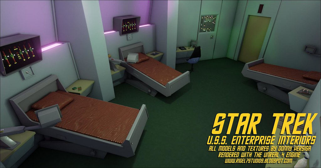
(Note in this first shot the bed on the left is pivoted forward at an angle, whereas the bed on the right is flat. This is part of some functionality I've built in to satisfy the fact that we see the beds at both angles in the series)


Here are things to note in regards to interaction/dynamics:
1) Clicking the push button on the foot of the beds pivots the beds up or down. We see the beds set to different angles throughout the series, so I can imagine that they were adjustable. And now I've given function to those push buttons that were glued to the foot of the beds.
2) Clicking on the viewer arms pivots them in and out
3) Clicking on the display viewer hoods above each bed turns them on and off, complete with sound effects, pulsating Respiration and pulse indicators, and the arrows that move up and down as if it was getting readings off of a patient.
4) I need your thoughts on this one: I have optional functionality built in to cycle the color of the lights shining up from either side of the display hoods. We never saw this in the show, but we did see those lights set to different colors in different episodes, notably green and magenta. Should I abandon this, since we didn't see it in the series, and just stick to one color or the other?
Here's a bird's-eye-view of the sickbay complex so far. Enjoy!

As a note, once I get the office and laboratory built, I'm going to experiment with extending the intensive care ward out, following the arc, and seeing if I can't get it match up in a pleasing way with the open end of the medical lab, making the entire sickbay complex a complete (although oddly shaped) circle. Doesn't really make sense space-wise like Franz Joseph's version does, but again, I'm trying not to worry too much about how things would be realistically constructed in a given deck of the actual Enterprise. Honor the show first, make pleasing visuals (from a first person perspective) second. Third priority is then to make sense realistically as much as the first two things allow.
Also got the major props of the intensive care ward out of the way, with a whole lot of customization and interaction built in. I've made it with late Season 3 vibe, with the darker lighting and yellow counter tops. I do have options to set it to the grey Season 1 and 2 countertops. EXCITING SIDE NOTE: I think at this point it's making sense to start doing the work for the player choose which Season they'd like to see the sets in. Building variables into each of these assets so that their textures and other attributes can be changed on the fly will make this a whole lot easier later. This may excite some of you
(Note in this first shot the bed on the left is pivoted forward at an angle, whereas the bed on the right is flat. This is part of some functionality I've built in to satisfy the fact that we see the beds at both angles in the series)
Here are things to note in regards to interaction/dynamics:
1) Clicking the push button on the foot of the beds pivots the beds up or down. We see the beds set to different angles throughout the series, so I can imagine that they were adjustable. And now I've given function to those push buttons that were glued to the foot of the beds.
2) Clicking on the viewer arms pivots them in and out
3) Clicking on the display viewer hoods above each bed turns them on and off, complete with sound effects, pulsating Respiration and pulse indicators, and the arrows that move up and down as if it was getting readings off of a patient.
4) I need your thoughts on this one: I have optional functionality built in to cycle the color of the lights shining up from either side of the display hoods. We never saw this in the show, but we did see those lights set to different colors in different episodes, notably green and magenta. Should I abandon this, since we didn't see it in the series, and just stick to one color or the other?
Here's a bird's-eye-view of the sickbay complex so far. Enjoy!
As a note, once I get the office and laboratory built, I'm going to experiment with extending the intensive care ward out, following the arc, and seeing if I can't get it match up in a pleasing way with the open end of the medical lab, making the entire sickbay complex a complete (although oddly shaped) circle. Doesn't really make sense space-wise like Franz Joseph's version does, but again, I'm trying not to worry too much about how things would be realistically constructed in a given deck of the actual Enterprise. Honor the show first, make pleasing visuals (from a first person perspective) second. Third priority is then to make sense realistically as much as the first two things allow.
Last edited:
EXCITING SIDE NOTE: I think at this point it's making sense to start doing the work for the player choose which Season they'd like to see the sets in.

Great job! I agree with the suggestion of day/night modes. What I had thought of was the LED lighting on the Boeing Dreamliners and how that transitions through a long flight. But some other thoughts on those lights are they could be otherwise therapeutic depending on the patient condition/illness. They could be part of a sterilizing field. Maybe they are air vents that recycle and sterilize the air. Stuff like that.
My other suggestion has to do with the ceiling lighting. I've thought before with how they tended to light the sets with spotlights and colored gels on grey walls, that actual spotlights might be a part of a on-camera version of the ceiling. Enterprise used spotlights all over the place, so it's canon in that respect. You could use both area light panels, either smooth or grated, and then supplement them with either externally housed spots, or directional recessed spots (both exist in the real world, of course).
My other suggestion has to do with the ceiling lighting. I've thought before with how they tended to light the sets with spotlights and colored gels on grey walls, that actual spotlights might be a part of a on-camera version of the ceiling. Enterprise used spotlights all over the place, so it's canon in that respect. You could use both area light panels, either smooth or grated, and then supplement them with either externally housed spots, or directional recessed spots (both exist in the real world, of course).
These renders are fantastic and this overhead view is the cherry on top!Here's a bird's-eye-view of the sickbay complex so far. Enjoy!
As a note, once I get the office and laboratory built, I'm going to experiment with extending the intensive care ward out, following the arc, and seeing if I can't get it match up in a pleasing way with the open end of the medical lab, making the entire sickbay complex a complete (although oddly shaped) circle. Doesn't really make sense space-wise like Franz Joseph's version does, but again, I'm trying not to worry too much about how things would be realistically constructed in a given deck of the actual Enterprise. Honor the show first, make pleasing visuals (from a first person perspective) second. Third priority is then to make sense realistically as much as the first two things allow.

However, that triangular section does look odd. Although there was the occasional tight corner in the TOS sets (Charlie's cabin or the Alternate Factor's Engine Room spring to mind) Matt Jefferies went to some lengths to avoid them from Season 2 onwards.
Could the the rear wall of the Examination Room be shifted to more closely align with the wall behind bed#3 or would that cause problems elsewhere?
The layout of the areas not seen on screen (such as the rear wall of the examination room) is still a WIP. Once I get the entirety of the on-screen areas of sickbay complete, I will experiment with the layout more. Thanks for the suggestion!These renders are fantastic and this overhead view is the cherry on top!
However, that triangular section does look odd. Although there was the occasional tight corner in the TOS sets (Charlie's cabin or the Alternate Factor's Engine Room spring to mind) Matt Jefferies went to some lengths to avoid them from Season 2 onwards.
Could the the rear wall of the Examination Room be shifted to more closely align with the wall behind bed#3 or would that cause problems elsewhere?
BTW, love the idea to continue the ward round in a semi-circle to meet the lab. It's not easy to justify the weird angles of the ward area, but this might well do it!The layout of the areas not seen on screen (such as the rear wall of the examination room) is still a WIP. Once I get the entirety of the on-screen areas of sickbay complete, I will experiment with the layout more. Thanks for the suggestion!
I think you'd need at least 2 additional turns to make it seem natural. However, given the irregular shape of the room to begin with, I doubt it would stand outYou could also just angle that rear wall to meet the end wall of the ward.

That's the air-conditioning!!From an overhead dolly shot (as the crew rush around just after they take the probe on board) in the original cut of WNMHGB the ceiling lights seem to be hidden behind grates.

Similar threads
- Replies
- 482
- Views
- 58K
- Replies
- 43
- Views
- 11K
If you are not already a member then please register an account and join in the discussion!